
15 Rust and Terracotta Living Room Ideas for a Warm Earthy Feel
Rust and terracotta are having a real moment, and unlike a lot of trend colors, they’re actually easy to live with long-term. They read as warm rather than dated, and they pair naturally with wood, brass, and cream tones most people already own. The most common mistake is going all-in on color and forgetting the room still needs contrast and breathing room — that’s what turns “warm” into “cave-like.”
Build the palette in layers: wall, floor, furniture, then accents. You can stop at whatever level of commitment suits your space and budget.
1. A Rust-Colored Accent Wall
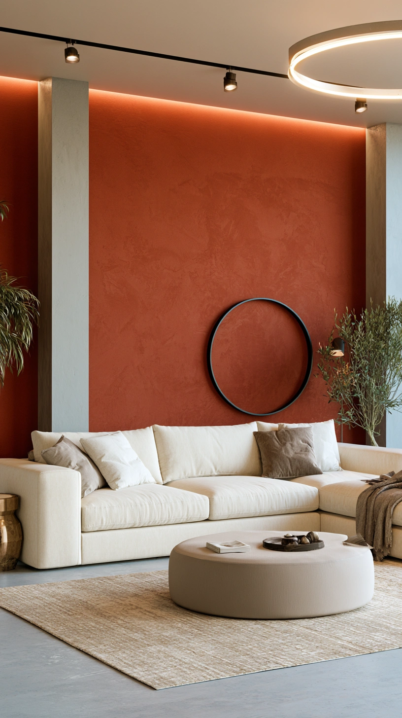
Paint one wall, not four, unless the room is large and gets plenty of natural light. The wall your seating faces works best — that way the color is part of the view, not something you sit with your back to.
What to know before you paint:
- Test a large poster-board sample before committing to the wall — rust reads very differently under warm vs. cool lighting.
- Go matte or eggshell, not satin or gloss. Rust in a glossy finish throws hard reflections and looks patchy under overhead light.
- Prime over any existing dark or bright color first, or expect a third coat.
| Paint | Finish | Approx. cost (2 coats, one wall) |
|---|---|---|
| Sherwin-Williams “Cavern Clay” | Matte/Eggshell | $60–90 |
| Farrow & Ball “Red Earth” | Estate Emulsion | $110–150 |
| Behr “Adobe Brick” | Matte | $50–75 |
2. Terracotta Tile Flooring
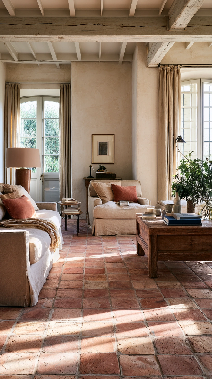
This is the biggest commitment on the list, and the one with the biggest payoff, since flooring sets the tone for everything built above it.
Your main options:
- Genuine terracotta tile — authentic look and feel, porous, needs sealing. Roughly $8–15/sq ft installed.
- Terracotta-look porcelain — nearly identical appearance, far more stain- and scratch-resistant. Roughly $6–10/sq ft installed.
- Vinyl plank or peel-and-stick tile — budget and renter-friendly option. Roughly $2–5/sq ft, DIY-installable in a weekend.
If you go with genuine terracotta, seal it after installation. It’s porous and will stain from spills, coffee, or pet accidents if left untreated — a real concern in a room you actually use daily.
3. Warm Neutral Walls as Support
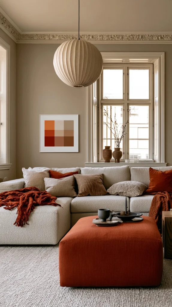
Every strong accent color needs somewhere for the eye to rest. That job goes to your remaining walls.
Good pairings:
- Warm white (Behr “Swiss Coffee”)
- Soft taupe (Sherwin-Williams “Natural Tan”)
- Pale sand or greige tones
Avoid: cool greys and blues on the supporting walls — they’ll fight the rust and terracotta instead of framing them. Even a “neutral” that leans cool can make the accent color look muddy by comparison.
4. Rust-Toned Upholstery
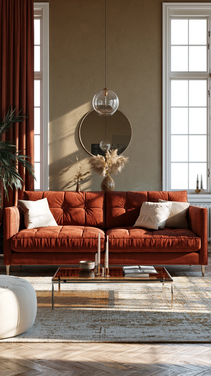
A full sofa in rust is a bigger commitment than a pillow. If you’re not ready for that, start smaller.
Ways to bring in the color, from lowest to highest commitment:
- A single rust-toned accent chair (easiest to change later)
- A slipcover over an existing neutral sofa
- Full reupholstery in rust boucle or corduroy — both are widely available right now and add texture on top of color, unlike a flat linen or cotton in the same shade
Fabric tip: boucle and corduroy hide daily wear better than smooth linen, which matters if this is a family living room rather than a formal one.
5. Terracotta Decorative Pottery
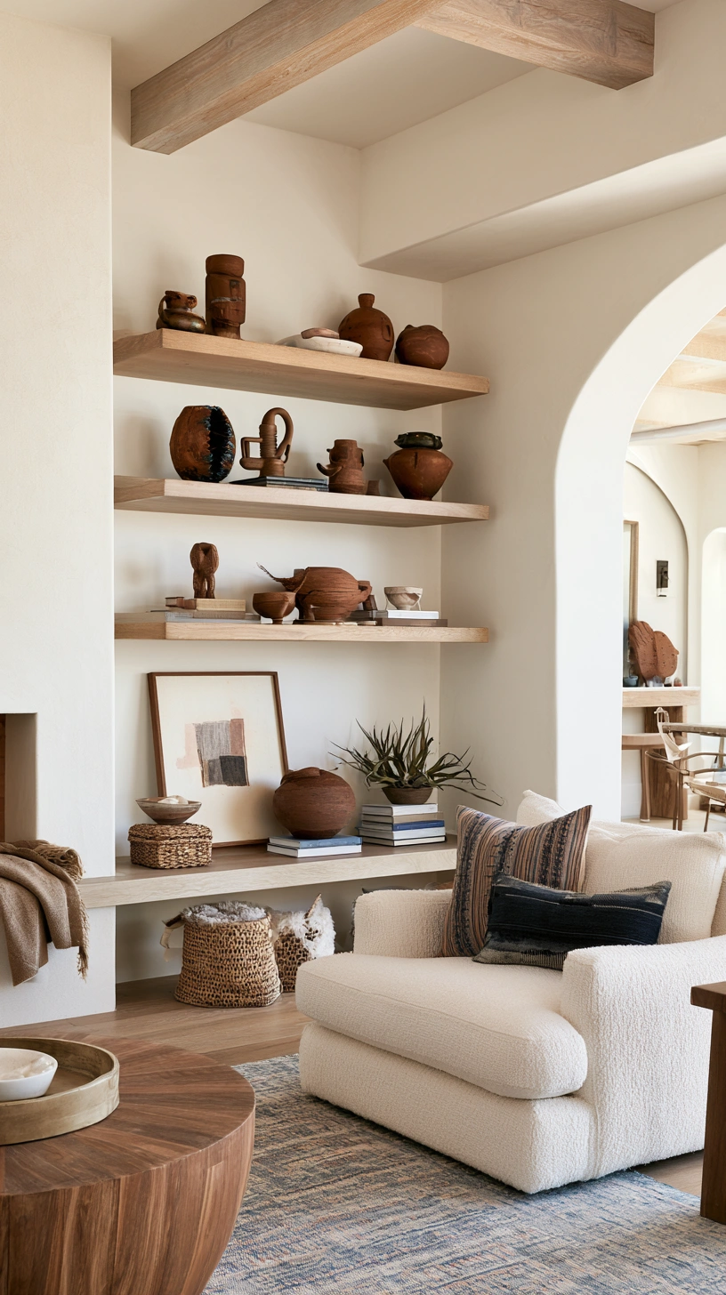
Look for genuine handmade or hand-finished pieces rather than mass-produced glossy versions. The slightly uneven surface and matte finish is what reads as artisanal instead of big-box.
Styling rule: cluster 3–5 pieces of varying height on a console or shelf, rather than spacing single pieces evenly around the room.
- Grouped objects read as curated.
- Scattered single pieces read as leftover clutter.
- Vary height and width within the cluster — three identical vases in a row looks like inventory, not styling.
6. Warm Wood Furniture
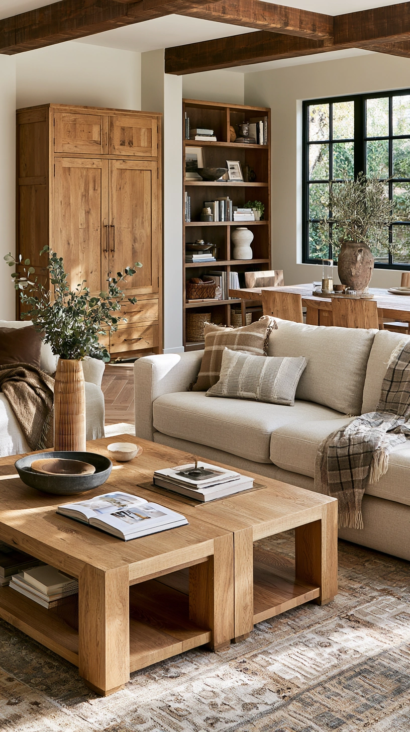
Oak, walnut, and teak all pair naturally with rust and terracotta without needing to match exactly.
Mixing wood tones on purpose:
- Pairing two different woods (say, a walnut coffee table with oak shelving) tends to look more intentional than forcing everything to match.
- If refinishing existing furniture, a warm walnut or teak oil finish over lighter wood is a manageable weekend project — no full stripping required.
- Keep hardware (handles, legs) in a consistent metal finish across pieces even if the wood tones vary, to tie mismatched furniture together.
7. Rust-Orange Throw Pillows
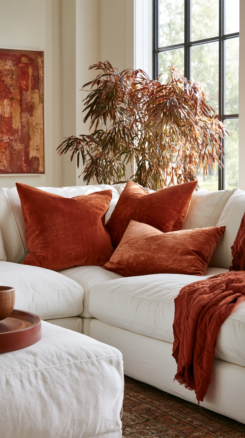
The cheapest, lowest-risk way to test this palette before painting a wall or buying furniture.
How to layer pillows well:
- Mix at least two shades within the rust-orange family — a burnt orange next to a deeper rust reads as intentional layering.
- Vary texture too: one linen cover, one boucle, one velvet.
- Odd numbers (3 or 5) on a sofa tend to look more natural than even, symmetrical pairs.
| Pillow type | Approx. cost per cover |
|---|---|
| Basic cotton/linen blend | $15–25 |
| Boucle or textured weave | $25–40 |
| Velvet | $30–50 |
8. A Natural Fiber Area Rug
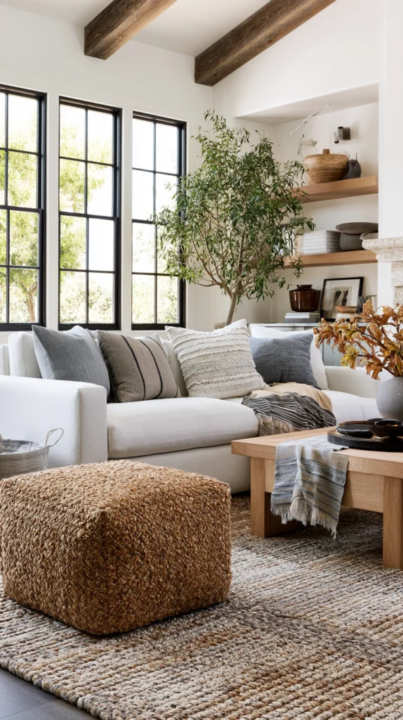
Jute, sisal, or a flatweave wool in earth tones grounds the palette without competing with it.
Sizing it correctly matters more than color:
- All four legs of your main seating pieces should sit on the rug.
- A rug too small for the seating group is one of the most common styling mistakes, in any color scheme.
- Standard living room rug sizes run 8×10 ft or 9×12 ft — measure your actual seating footprint before buying rather than guessing.
Avoid: heavily patterned or brightly colored rugs — they’ll fight your wall and furniture choices instead of supporting them.
9. Warm Brass or Copper Hardware
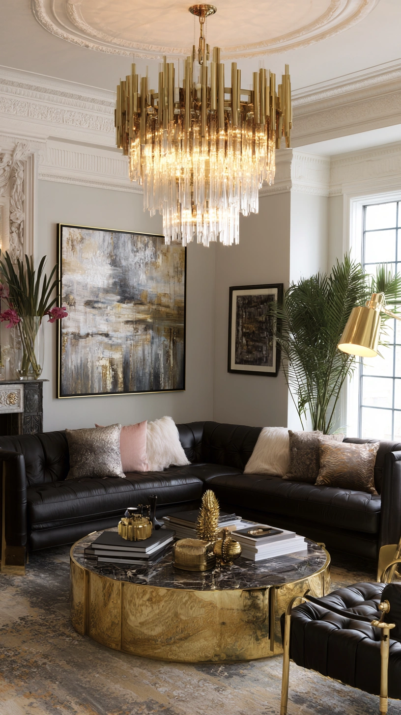
Cabinet pulls, lamp bases, and picture frame edges are an easy, cheap swap.
- Replace cool metals (chrome, nickel, black) with warm brass or copper throughout the room.
- A set of cabinet pulls runs roughly $20–50 and changes how the whole room reads.
- Solid brass patinas over time, which most people in this style actually want. If you’d rather it stay bright and even, look for a lacquered or PVD-coated finish instead.
10. Living Plants for Contrast
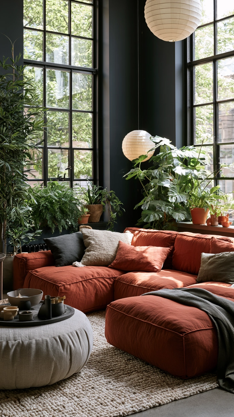
Green is the color rust and terracotta most need nearby — without it, a heavily warm-toned room can start to feel flat.
Best plant choices for this palette:
- Fiddle leaf fig — bold leaf shape reads well against warm walls
- Rubber plant — low maintenance, similarly bold foliage
- Snake plant — near indestructible, good for low-light corners
Avoid: delicate ferns or trailing plants with small leaves — they tend to disappear visually in a room this saturated.
11. Terracotta-Finished Wall Sconces
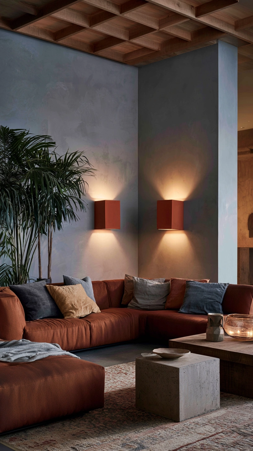
Wall-mounted lighting adds ambient light without taking up floor or table space — genuinely useful in smaller living rooms where every surface already has a job.
- Choose sconces in terracotta or warm ceramic finishes to match the palette.
- Pair with warm 2700K bulbs specifically. Anything cooler will make the terracotta finish look grey instead of warm.
- Position at roughly eye-seated height (about 60–66 inches from the floor) for the most flattering ambient glow.
12. Rust-Toned Curtains
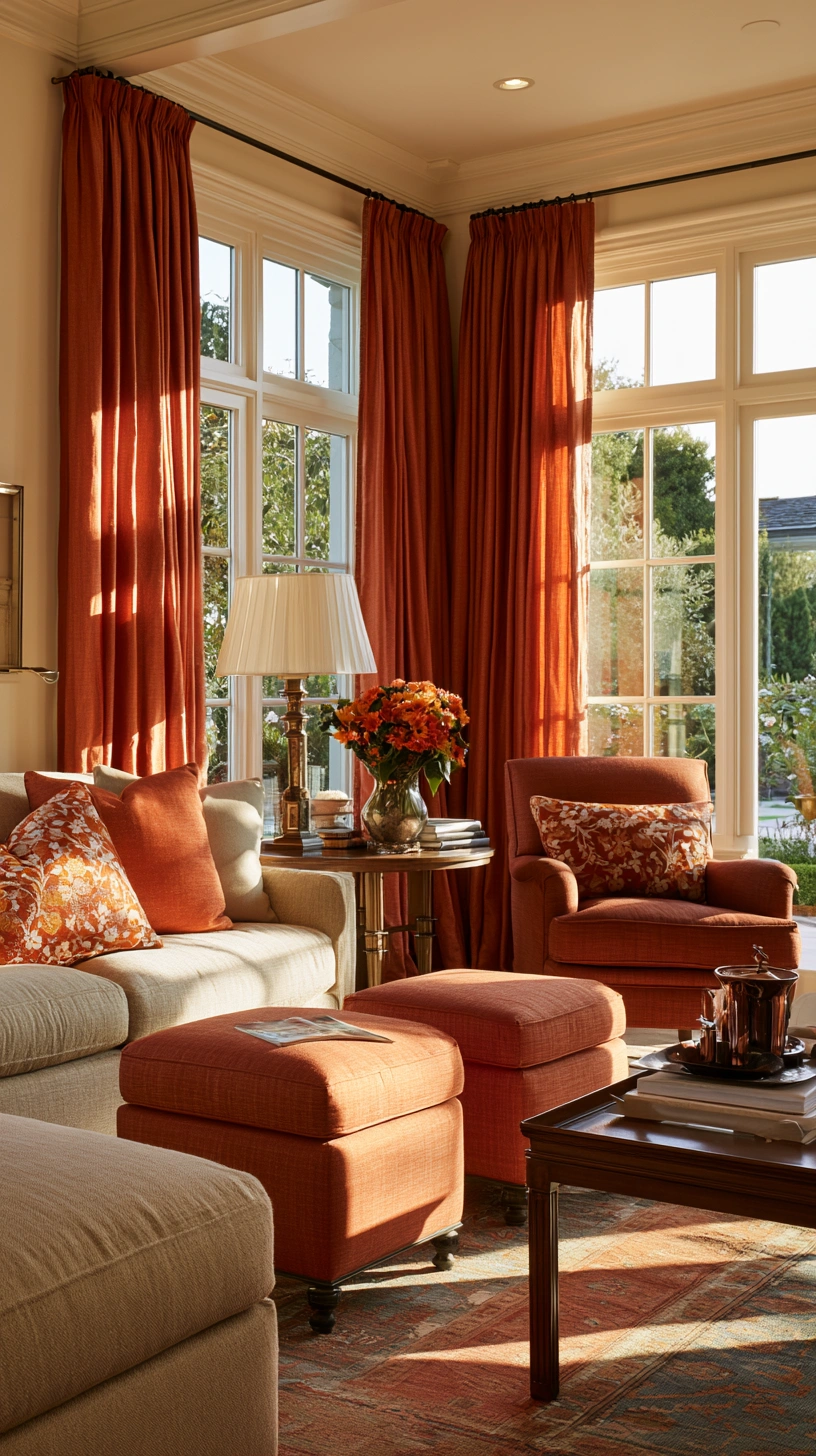
Full-length curtains in rust or terracotta soften hard window lines and carry the palette vertically.
Installation details that matter:
- Mount the rod close to the ceiling, not directly above the window frame — this makes both the window and the room read taller.
- Curtains should just brush the floor, or pool slightly for a more relaxed look — stopping short above the floor looks unfinished.
- A room with a strong accent wall benefits from curtains that extend that color rather than introducing a new one.
13. A Graduated Earth-Tone Palette
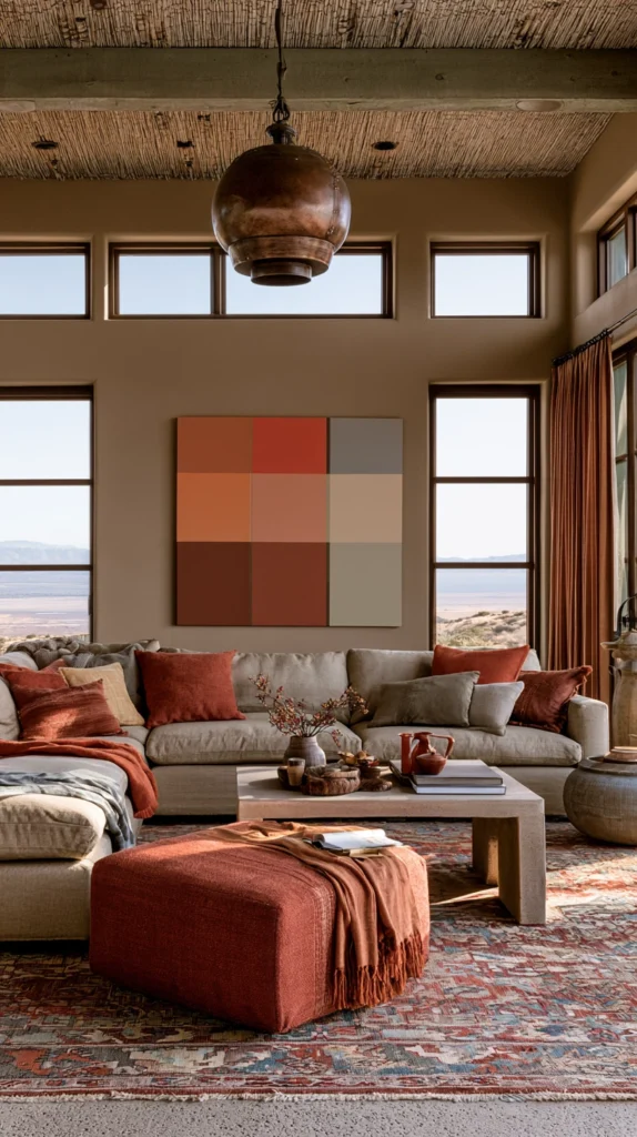
For rooms where one flat wall color feels too simple, consider graduated shades on different walls or sections.
- Deeper rust near the floor, transitioning to lighter terracotta or sand tone higher up — similar to how natural clay or sandstone actually looks.
- This is a more advanced painting technique and generally worth hiring a professional for, unless you’re comfortable with careful masking and blending yourself.
- A simpler DIY version: paint the lower third of the wall (wainscoting height) in the deeper tone and the rest in the lighter one, with a clean painted or trim line between them.
14. Layered Natural Textures
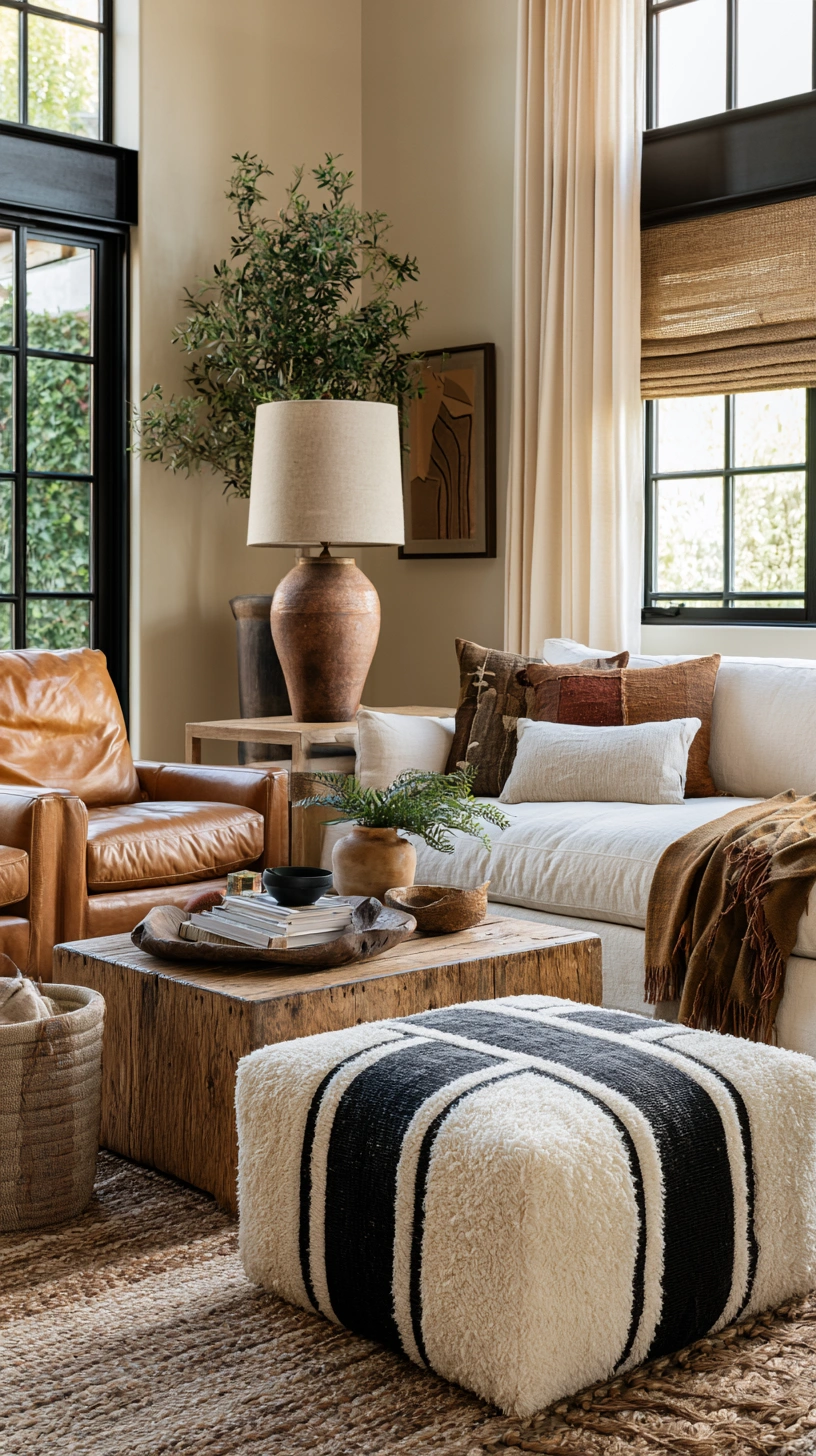
Woven baskets, leather accents, and raw wood together prevent a rust-and-terracotta room from reading as flat or one-note.
Texture checklist for the room:
- Something rough (jute, woven basket)
- Something smooth (leather, glazed pottery)
- Something grained (raw or oiled wood)
- Something soft (linen, boucle, wool)
The goal is variety in texture, not just color. A room that’s all smooth surfaces in warm tones looks less finished than one mixing rough, smooth, and soft materials together.
15. Bringing It All Together
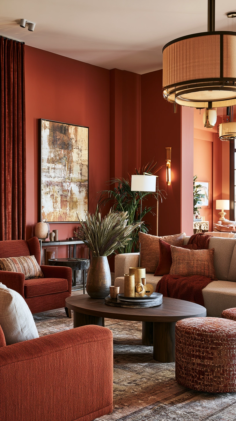
The rooms that pull this palette off well share one thing in common: restraint on repetition.
- Use rust or terracotta on 2–3 major elements only — a wall, a rug, a sofa — and let brass, wood, cream, and green do the rest of the work.
- Overcommitting to the color on every surface is what tips a warm room into feeling heavy rather than cozy.
- Start with the cheapest, lowest-risk changes first — pillows, a plant, a few pottery pieces — before committing to paint or flooring.
Living with the smaller changes for a few weeks before committing to the bigger ones (paint, tile, furniture) is the easiest way to confirm the palette is actually one you want to wake up to every day, not just one that photographed well on a moodboard.
Quick Reference: Budget by Commitment Level
| Commitment level | Examples | Approx. total cost |
|---|---|---|
| Low (test the look) | Pillows, one plant, 2–3 pottery pieces | $80–150 |
| Medium (partial commitment) | Accent wall, rug, sconces | $250–500 |
| High (full transformation) | Flooring, upholstery, curtains, full wall coordination | $1,500+ |
Common Mistakes to Avoid
- Using rust or terracotta as the only color in the room. Without a neutral (cream, warm white) and a cool counterpoint (green plants, brass with a slight patina), the palette can start to feel heavy rather than warm.
- Mixing warm rust with cool-toned grey furniture. The undertones clash more than people expect — check furniture swatches against your actual wall color in daylight before buying.
- Skipping the sealer on genuine terracotta tile or pottery. Both are porous and will stain permanently if left untreated, especially in a living room with food, drinks, or pets.
- Going glossy on paint. A glossy or satin finish on a saturated rust wall throws hard light reflections that read as patchy rather than rich. Matte or eggshell holds the color better.
- Forgetting scale on accent pieces. A single small terracotta vase on a large console looks lost. Cluster pieces or size up rather than scattering small items across a big surface.
Maintenance Notes for Natural Materials
Rust and terracotta living rooms lean heavily on natural, porous materials — clay, unsealed wood, natural fiber rugs — which need slightly more care than synthetic alternatives, but reward it with a look that actually improves with age rather than looking worn out.
- Terracotta tile and pottery: reseal every 1–2 years depending on foot traffic and use.
- Jute and sisal rugs: vacuum regularly on a low-suction setting; these fibers can fray under a beater-bar vacuum head.
- Raw or oiled wood furniture: a light coat of furniture oil every 6–12 months keeps the finish from drying out and cracking.
- Brass hardware: leave it unlacquered if you want the patina to develop naturally; wipe with a brass polish only if you prefer to keep it bright.
Frequently Asked Questions
Does rust and terracotta work in a small living room? Yes, as long as you keep the palette to 2–3 major elements rather than covering every surface. A single accent wall plus warm wood and brass accents will read as cozy rather than cramped in a smaller space, especially if you keep the remaining walls in a warm neutral to maintain some visual breathing room.
What colors pair well with rust and terracotta besides neutrals? Deep forest green, muted teal, and mustard yellow all work as secondary accent colors without competing with the warm base palette. Avoid pastels, which tend to look washed out next to a saturated earth tone.
Is this palette suitable for a north-facing room with less natural light? It can work well precisely because warm tones compensate for cooler, dimmer natural light. Lean toward the lighter end of the rust and terracotta spectrum, and prioritize warm-temperature bulbs (2700K or lower) throughout, since a north-facing room will read cooler under any daylight-mimicking bulb.