
13 Pumpkin Spice Color Palettes for Your Workspace
Pumpkin spice as a color story is more versatile than the name suggests.
It’s not just orange. It’s the whole range — burnt sienna, warm cream, toasted nutmeg, cinnamon brown, dusty sage, muted rust. Used well, these tones create a workspace that feels grounded and warm without tipping into seasonal-theme-park territory.
The thirteen palettes below each work differently depending on what your space already has. Some are high contrast. Some are muted and layered. Some are designed around a single accent color and a lot of neutral. Each one includes specific hex codes, product direction, and the logic behind why the combination works.
For more fall room ideas across the rest of the home, the home design section on StyleTasteStudio has seasonal content for the living room, bedroom, kitchen, and dining room that pairs well with workspace changes.
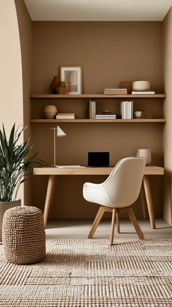
1. Burnt Sienna and Warm Cream
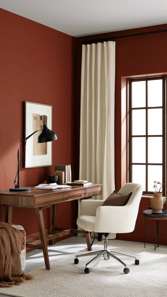
This is the most wearable version of a pumpkin spice palette — one deep warm orange-brown paired against a soft, slightly yellow-toned cream.
The sienna does all the work. The cream keeps it from feeling heavy.
Use burnt sienna (#8B4513 to #C45C26 range) for one accent wall, a desk pad, or your chair. Bring in the cream through curtains, a lamp shade, or a chunky throw. The contrast between the two tones is high enough to feel intentional but both sit in the same warm temperature family, so they never fight.
This combination photographs beautifully for video calls because the warm tones read as natural skin-flattering light on camera.
Works best with: natural wood, matte black hardware, linen fabric Avoid: anything cool-toned — grey, silver, or bright white will break the warmth immediately Budget to implement: $20–$60 (desk pad + throw)
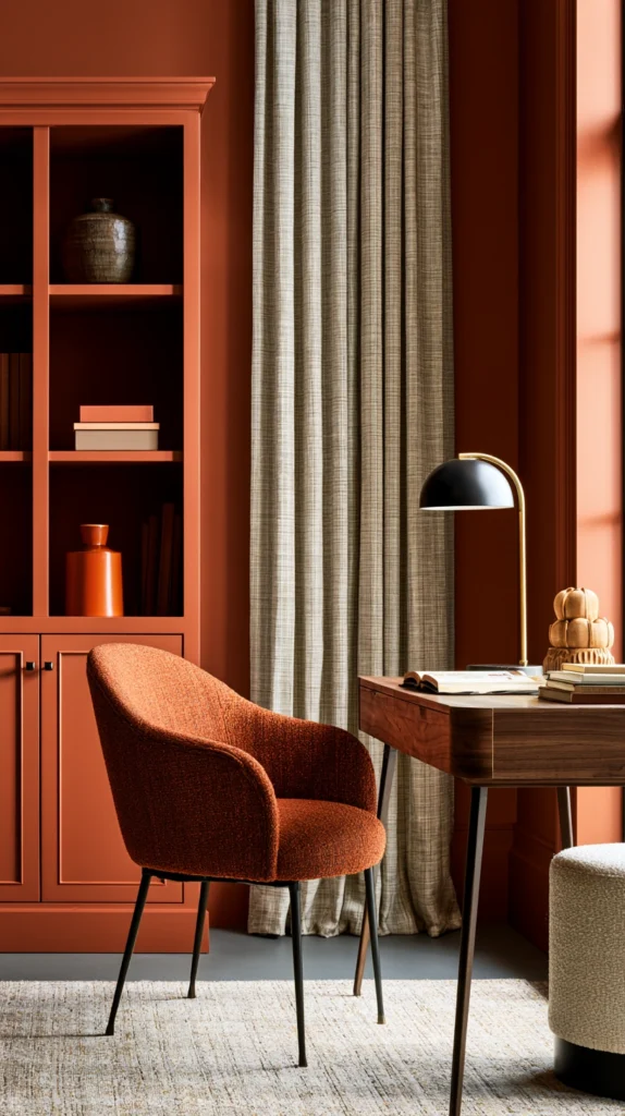
2. Pumpkin Orange and Charcoal
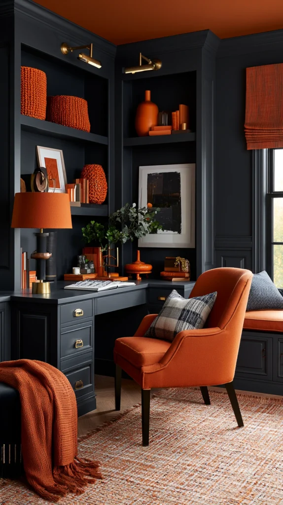
This is the boldest palette on the list. It works because charcoal is warm enough to hold orange without making it feel garish.
True pumpkin orange (#E8722A range) is a high-saturation color that needs a strong neutral to anchor it. Cool grey doesn’t work — it makes orange look cheap. Charcoal (#36312C, with a brown undertone rather than a blue one) is the correct partner.
Use orange sparingly — one accent object, a single wall, or a set of accessories. Let charcoal carry the majority of the space through a desk surface, shelving, or a large rug. Add a thin line of warm brass in hardware or lamp details to bridge the two.
This palette suits people who work well with visual stimulation. It’s energizing rather than calming, which makes it better for creative or fast-paced work than for deep reading or writing.
Works best with: brass, dark walnut wood, matte finishes Avoid: combining pumpkin orange with glossy black — it reads as Halloween rather than autumn Budget to implement: $30–$80 (accessories and accent pieces)
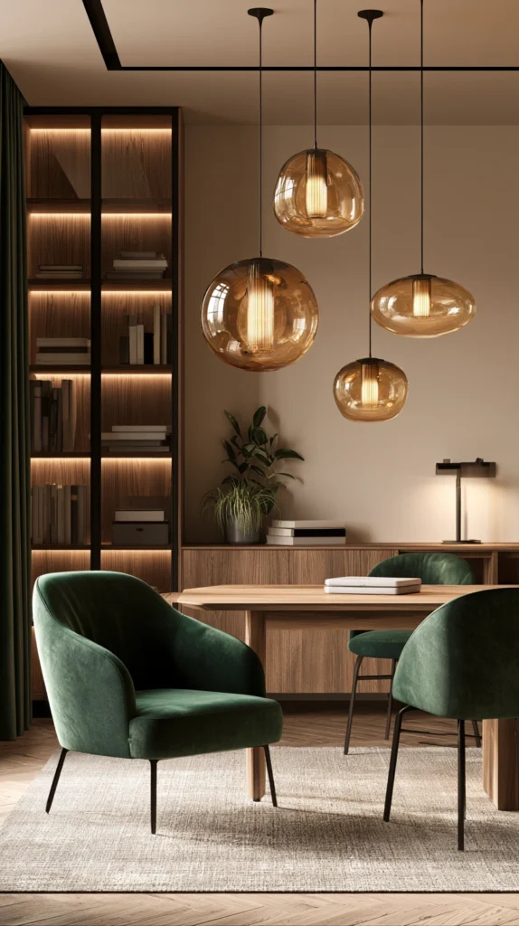
3. Cinnamon and Dusty Sage
This palette is underrated. The combination of cinnamon-brown (#7B3F00 range) and dusty sage (#8FA885 range) reads as fall without using a single orange tone.
Sage is the unexpected partner here. It’s cool enough to contrast cinnamon’s warmth, but muted enough that it doesn’t create tension. Together they feel like a walk in a November forest — earthy, calm, slightly moody.
Use cinnamon for wood tones, leather accessories, or a wall color. Bring sage in through a plant pot, a pinboard fabric cover, or a single printed throw pillow on a reading chair. This palette works especially well in home offices that double as guest rooms or creative studios because it’s livable at all hours, not just during the workday.
Works best with: raw linen, unfinished wood, aged brass Avoid: clean white — it makes sage look grey and cinnamon look flat. Use warm cream instead. Budget to implement: $15–$50
4. Toasted Nutmeg and Ivory
This is the quietest palette on the list. Every tone sits close together on the value scale — nothing jumps, nothing shouts.
Toasted nutmeg (#8B6348 range) is a medium warm brown that functions almost as a neutral in this palette. Ivory (#FFFFF0 to #F5F0DC range) is warmer than white but lighter than cream. Together they create a monochromatic warmth that makes a workspace feel like it’s been lived in and thought about over time.
It’s a palette that rewards texture. Because the tones are so close in value, the visual interest comes entirely from material contrast — smooth ceramic against rough linen, glossy wood against matte wall paint, woven rug against flat desk surface.
Use this palette if your office gets strong natural light. The subtle tone differences read clearly in good light. In a darker room, the palette can become muddy and undifferentiated.
Works best with: layered textiles, mixed wood finishes, warm candlelight Avoid: cool artificial lighting — it desaturates the warm undertones and makes the palette look grey Budget to implement: $25–$70
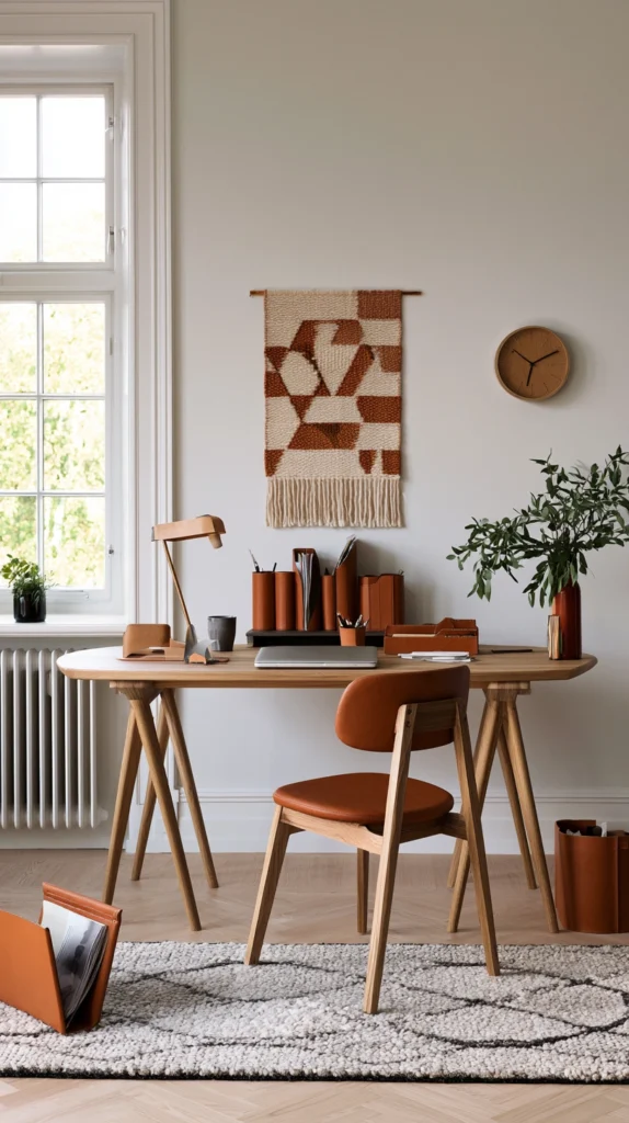
5. Rust and Natural Linen
Rust (#B7410E to #C0392B, leaning orange-red rather than pink-red) is one of the strongest fall workspace colors available — and it’s one of the few saturated tones that works well against a purely natural, undyed background.
Linen in its natural state is a warm oat-beige that sits in perfect temperature alignment with rust. There’s no color clash because natural linen contains the same warm undertones as rust — it reads as the muted version of the same family.
Use rust through a single object: a ceramic desk lamp, a throw pillow, a painted bookshelf or cabinet in a rust chalk paint (Rust-Oleum Chalked in “Barn Door” is a close match). Bring linen through curtains, a fabric pinboard cover, or a natural linen desk pad.
This palette handles natural wood extremely well — any warm wood tone from pine to walnut sits comfortably in this combination without needing any additional bridging color.
Works best with: warm wood in any tone, woven baskets, matte ceramic Avoid: mixing rust with burgundy — they’re close enough in temperature to clash rather than contrast Budget to implement: $20–$65
6. Caramel and Warm White
Caramel (#C68642 range) is a more accessible version of pumpkin orange — lighter, more golden, less saturated. It doesn’t demand as much from the space around it.
Warm white (#FDF5E6 range, sometimes called “old lace”) provides a backdrop that keeps caramel from feeling dark or heavy. This is the palette that works in small offices or offices with limited natural light because the warm white opens the space while the caramel keeps it from feeling clinical.
Implement caramel through leather accessories — a small leather notebook cover, a caramel-toned mouse pad, a leather desk organizer. These items are available in abundance during fall retail seasons and tend to be well-made because they’re designed to last rather than be seasonal.
Bring warm white in through walls or large fabric elements. If repainting isn’t an option, a large warm white canvas print or a cream linen curtain achieves a similar effect.
Works best with: gold or brushed brass hardware, honey-toned wood, warm white walls Avoid: bright white — it makes caramel look yellow-orange rather than golden Budget to implement: $25–$60
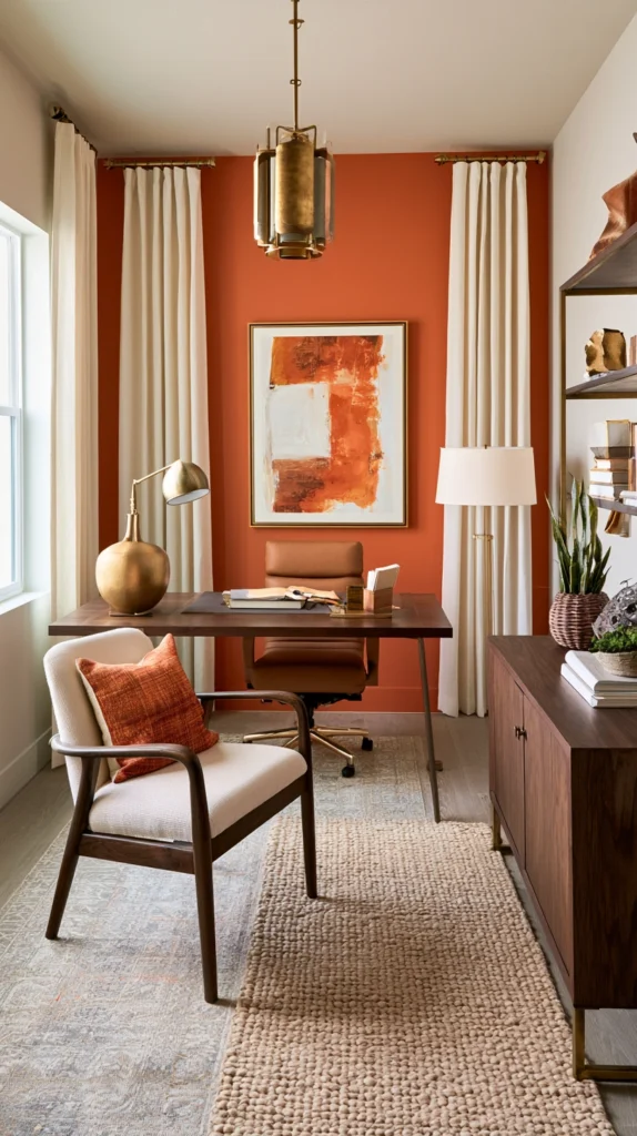
7. Deep Terracotta and Cream with Black Accents
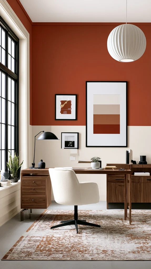
This is the most design-forward palette on the list. Three colors, clearly defined roles.
Deep terracotta (#C65D3A range) is the hero — it has more brown in it than standard terracotta, which makes it more sophisticated and less nursery. Cream is the field it sits against. Black is the fine line that sharpens the whole composition — used only in thin hardware, frame edges, or desk accessories.
The black accent is the detail most people skip, which is also why their terracotta-and-cream setups look flat. Black creates a defined edge that the eye reads as intentional curation rather than casual arrangement. It should appear in no more than two or three small places — not as a dominant color.
Use this palette in an office where you want a strong visual identity. It’s confident without being aggressive. It photographs well and holds up across seasons because terracotta and cream are year-round comfortable even when the pumpkin spice association fades.
Works best with: matte black frames, dark walnut, brushed gold Avoid: mixing terracotta with brown — the tones sit too close and create visual confusion Budget to implement: $30–$90
8. Amber and Forest Green
Amber (#FFBF00 range) and forest green (#228B22 to #355E3B range) is a fall palette that owes more to leaves than to spice — and that’s what makes it different from the others on this list.
Amber reads gold-orange in warm light. Forest green reads almost black in low light and deep jewel-green in good light. Together they feel autumnal without being explicitly “fall decor.”
This palette works particularly well in home offices with plant collections. Adding a rubber tree, a pothos, or a fiddle leaf fig in a green-glazed ceramic pot ties the living material into the color story rather than treating plants as a separate design element.
Use amber through a desk lamp with an amber glass shade, amber glass votive holders, or a honey-oak wood surface. Bring forest green through a single upholstered piece — a chair cushion, a throw pillow, or a pinboard cover in a dark green linen.
Works best with: brass, warm oak, natural ceramic Avoid: pairing with red tones — red plus green reads as Christmas rather than fall Budget to implement: $30–$75
9. Warm Mocha and Soft Blush
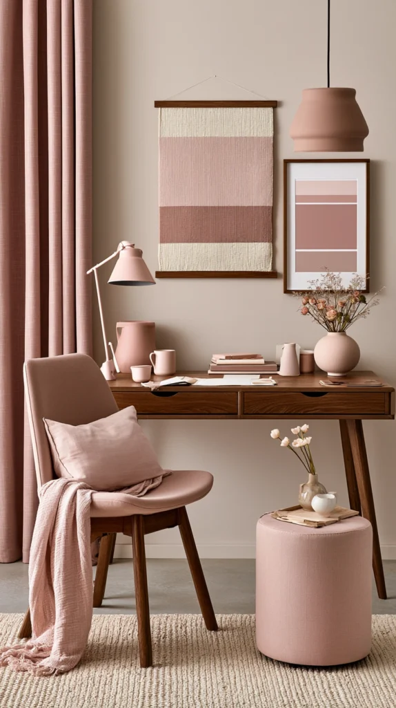
This palette runs counter to what most people expect from a pumpkin spice color story. It’s quieter, softer, and warmer in a feminine direction.
Warm mocha (#967259 range) is a medium brown with pink undertones — not cold taupe, not orange-brown, but something between the two. Soft blush (#E8C4B8 range, not pink but a very warm pink-adjacent cream) pairs with it in a way that’s unexpected for fall but completely consistent with the warm temperature of the season.
This combination works well in home offices used for creative or writing work — the palette is restful rather than energizing, which suits long single-task sessions better than high-stimulation work environments.
Bring mocha in through wood tones, a leather chair, or a fabric desk pad. Blush can enter through a ceramic desk lamp, a single throw pillow, or a printed canvas in those tones. Keep everything matte — gloss finishes in this palette tip into looking plasticky rather than warm.
Works best with: light blonde wood, brushed rose gold hardware, undyed linen Avoid: mixing with cool grey — it pulls the blush toward pink-pink rather than warm-blush Budget to implement: $20–$55
10. Spiced Plum and Warm Sand
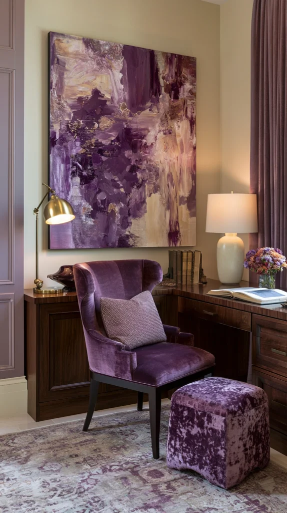
Plum in its deeper, spiced form (#7B3F5E range — more brown than purple, more burgundy than violet) is a legitimate fall color that most workspace guides don’t include.
Paired with warm sand (#C2A882 range), it creates a palette that feels like the end of autumn — darker, moodier, but still warm. This combination suits home offices used for evening work, since it looks its best in lamp light rather than bright daylight.
Use spiced plum sparingly — a single printed throw, a velvet cushion on a reading chair, or a framed art print in plum and sand tones. Let sand carry the majority of the space through larger surfaces like a rug or curtains.
This palette pairs well with dark wood (mahogany, dark walnut, ebony-stained pine) and aged brass. Light wood or blonde finishes can make it feel disconnected because the overall value range is too different.
Works best with: dark wood, velvet and silk textures, gold accents Avoid: this palette in rooms with very little natural light — it can feel heavy without the contrast light provides Budget to implement: $25–$70
11. Golden Yellow and Chocolate Brown
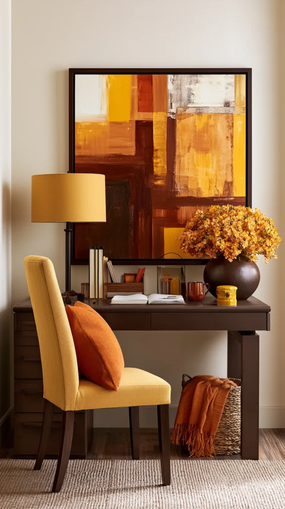
This is the most straightforwardly autumnal palette on the list — the exact colors of a maple leaf at its peak.
Golden yellow (#F4A825 range) and chocolate brown (#3D1C02 range) have been a fall combination for obvious reasons. But the version that works in a workspace is considerably more restrained than a seasonal decoration setup.
Use golden yellow in small quantities — a desk lamp with a yellow shade, a single printed canvas, a yellow ceramic pen holder. Use chocolate brown as the dominant tone through furniture, a large rug, or a wall color. The ratio should be roughly 80% brown to 20% yellow, with neutral fill (warm white or cream) making up the rest.
This palette performs well in productivity-focused workspaces because brown is visually receding and calming while yellow provides the periodic stimulation that prevents the workspace from feeling too flat and uninspiring.
Works best with: matte black, warm oak, woven natural fiber accessories Avoid: adding orange to this palette — three saturated fall tones together tips into visual overload Budget to implement: $20–$60
12. Copper and Greige
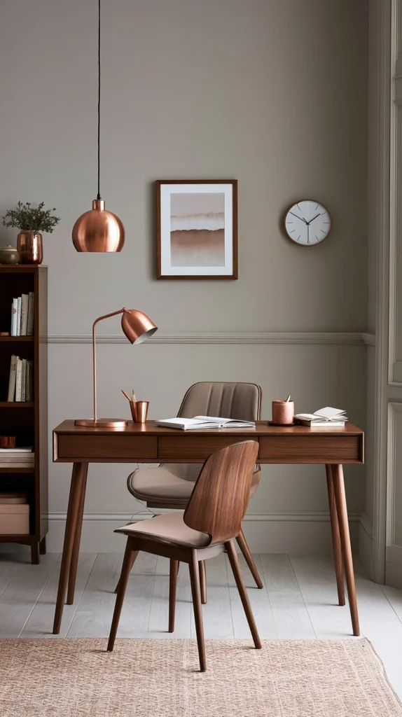
Copper (#B87333 range) used well is one of the most refined fall workspace tones available. Used badly, it looks like hardware store pipe fittings.
The key is pairing it with greige — warm grey-beige (#C4B9A8 range) rather than pure grey or pure beige — and keeping copper strictly in metallic or metallic-adjacent finishes rather than painted surfaces.
Copper works in desk lamps, a wall clock, pen holders, bookends, and small hardware details. It shouldn’t cover large surfaces. Greige should be the dominant backdrop — as a wall color, a large rug, a fabric panel, or curtains.
The combination reads as warm and modern simultaneously. It doesn’t feel specifically seasonal the way most fall palettes do, which makes it a good choice if you want a workspace that feels fresh in October but doesn’t need to be changed in December.
Works best with: dark oak, matte ceramic in warm tones, woven rattan Avoid: mixing copper with rose gold — two similar warm metallics in the same space reads as indecisive Budget to implement: $25–$80 (copper accessories are widely available and hold up well)
13. Harvest Orange, Ivory, and Aged Brass
This is the most layered and complete palette on the list. Three colors, each with a specific role, that together create a workspace with genuine warmth and visual depth.
Harvest orange (#D2691E range — more red-brown than pure orange) is the statement color. Ivory (#FFFFF0 range) is the breathing room. Aged brass is the accent that ties warm and neutral together.
The palette works because harvest orange is warm enough to feel seasonal but dark enough to avoid reading as bright or childlike. Ivory provides contrast without the sharpness that bright white would bring. Aged brass appears in hardware, lamps, and small accessories — not as a dominant surface but as a consistent thread running through the space.
Use harvest orange through a painted accent wall (Sherwin-Williams “Copper Harbor” SW 6631 is a close match), a large area rug, or a set of upholstered chair cushions. Keep ivory in curtains, a desk pad, and wall paint on non-accent walls. Let brass appear organically in whatever hardware and accessories you already have, or add it through a single lamp and a pair of small bookends.
For more on how fall color palettes work across a full interior — not just the desk area — the small kitchen fall makeover ideas and fall dining room wall art guide on StyleTasteStudio both use overlapping warm palettes that extend this same color story into adjacent rooms.
Works best with: dark walnut, woven linen, matte ceramic in cream or ivory Avoid: adding cool-toned metallics — chrome or silver breaks the warmth of this palette immediately Budget to implement: $40–$100 for a complete palette implementation
Final Thoughts
The pumpkin spice palette works in a workspace because the underlying tones — warm browns, muted oranges, earthy greens, cream neutrals — are genuinely calming and grounding, not just seasonally trendy.
The palettes that last beyond October are the ones built on proportion. One statement color at 20%, one dominant neutral at 60%, and texture and material filling the rest.
Start with what you already own. Pull out anything warm-toned, group it at the desk, and see what’s missing before buying anything new. Most workspaces are one or two additions away from a cohesive fall palette rather than a full redesign.
Browse more home design and seasonal decor ideas in the home design section on StyleTasteStudio.