
13 Dark Grey Couch Living Room Ideas That Make the Most Dominant Piece in the Room Work Harder
A dark grey couch is the most purchased living room sofa in America.
It is practical. It hides dirt. It goes with everything in theory. It photographs well in showrooms. It feels like a safe, smart, inoffensive choice.
And then it arrives in the living room and sits there looking exactly like what it is. A large, dark, neutral object that dominates the room without directing it. That absorbs light without contributing warmth. That goes with everything in theory but somehow makes nothing look particularly good in practice.

The dark grey couch is not the problem.
The room built around it is.
A dark grey couch in the right room, surrounded by the right colours, materials, and lighting, is one of the most sophisticated and liveable pieces of furniture a living room can contain. It grounds the space. It provides a strong visual anchor. And it creates a neutral foundation that genuinely supports almost any direction you choose to take the rest of the room.
These 13 ideas show exactly how to build that room.
Why the Dark Grey Couch Is So Hard to Style and How to Fix It
The dark grey couch fails in most living rooms for one specific reason.
People treat it as a neutral and then fill the room with other neutrals. Beige walls. Cream throw. White curtains. The grey couch disappears into a sea of non-colour and the whole room looks washed out and undefined.
Grey is not a quiet neutral in the way beige is. It is a strong, cool tone that needs either warmth or contrast to come alive. Left in a room of similarly pale, similarly neutral tones it looks cold, flat, and like the beginning of a design scheme that never arrived.
The fix is commitment. Commit to warmth around it and the grey reads as sophisticated and grounded. Commit to contrast and the grey reads as strong and graphic. Commit to a specific colour direction and the grey becomes the anchor that holds everything else together rather than the dominant piece that overwhelms everything it sits beside.
1. Warm Terracotta and Rust Tones Against the Grey
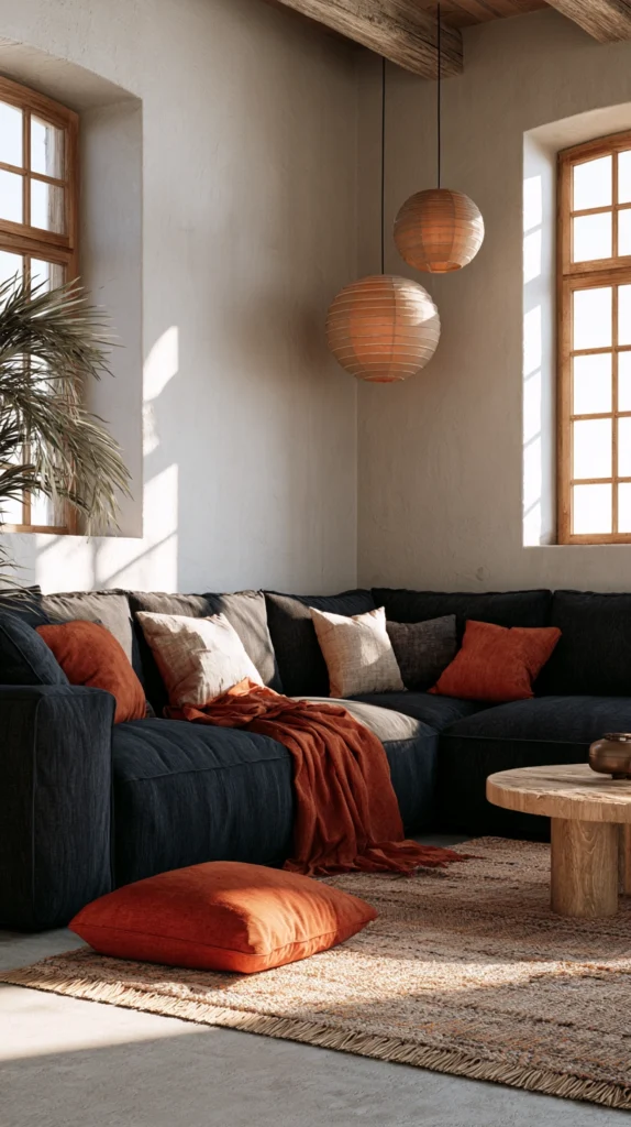
The most immediately transformative pairing for a dark grey couch is warm terracotta and rust.
The cool temperature of the grey and the warm temperature of terracotta create a contrast that looks completely intentional and completely alive. Neither colour needs to fight for dominance. The grey grounds the room. The terracotta warms it. Together they produce a living room that feels both sophisticated and genuinely welcoming.
Bring terracotta in through cushions first. Three or four cushions in varying terracotta tones, from pale dusty terracotta through deeper burnt sienna, placed on a dark grey couch immediately change the entire character of the room. The warm cushions make the grey look considered rather than industrial.
Extend the terracotta beyond the cushions. A large terracotta-toned rug anchoring the seating area. A terracotta ceramic vase or lamp base. A terracotta-painted wall or deep terracotta-toned wallpaper. The more consistently the warm tone appears around the grey couch, the more deliberate and designed the room reads.
Add natural materials that carry their own warmth. Rattan side tables. Jute or sisal rugs. Wooden coffee tables in warm honey tones. Clay and earthenware ceramics on the shelves. These materials hold the terracotta palette in their natural tones without any specific styling effort.
Why terracotta and rust work with dark grey:
- The temperature contrast between cool grey and warm terracotta is visually dynamic
- Terracotta appears across multiple natural materials without any forced styling
- The combination reads as simultaneously contemporary and warmly timeless
- Works across minimalist, Boho, Mediterranean, and earthy naturalistic styles equally
- Easy to introduce gradually through cushions, then accessories, then larger elements
2. Deep Forest Green Walls With the Grey Couch
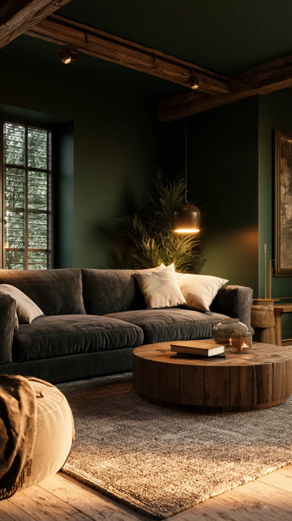
A dark grey couch against deep forest green walls creates a living room of extraordinary richness.
The two colours are close enough in temperature and value to feel harmonious rather than contrasting. Both are dark. Both are strong. But the green brings the life and the organic warmth that pure grey lacks. Together they create a depth and complexity that neither achieves alone.
This combination is most powerful when the forest green goes wall to ceiling without any interruption. No dado rail breaking the colour at chair height. No white ceiling creating a disconnected lid. The green walls and the grey couch exist in the same enveloping dark space and the room feels like an intimate jewel box rather than a box with coloured walls.
Lighten the scheme with natural materials. A pale oak coffee table with visible grain. Cream and oatmeal linen cushions on the grey couch. A large cream ceramic floor vase. The pale natural tones floating in the dark room create exactly the right balance between drama and livability.
This combination suits period homes with original features. A Victorian living room. An Edwardian terrace. A house with cornicing and fireplaces and sash windows. The dark green and grey palette honours that architecture without pastiche.
3. Warm Wood Tones That Do the Heavy Lifting
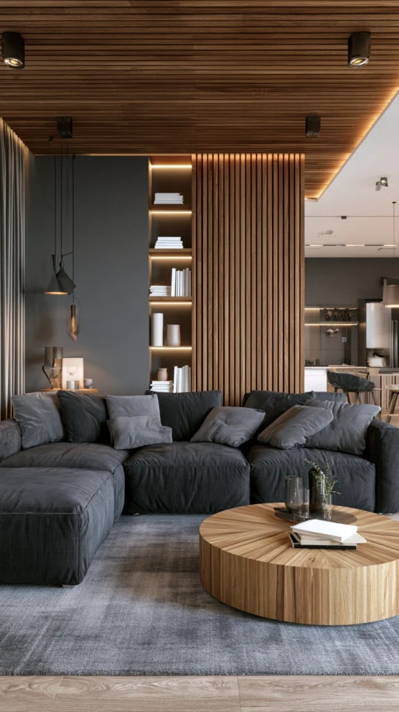
Wood is the material that most reliably rescues a dark grey couch from feeling cold.
Not dark, stained, heavy wood. Warm, medium-toned wood with genuine grain. The honey tones of oak. The amber warmth of cherry. The rich red-brown of walnut with visible figure.
A warm wood coffee table in front of a dark grey couch changes the entire feeling of the seating area. The grey is still grey but it is no longer cold. The wood beside it does the work of a warm colour without requiring paint or cushions or any particular styling effort.
Build on the wood. A warm wood media unit or sideboard. Floating wood shelves on the walls. A wide plank oak floor or warm wood-effect flooring. A wood-framed mirror above the fireplace. The more warm wood appears in the room the more the dark grey couch reads as a deliberate design choice rather than a default one.
The coffee table directly in front of the couch is the highest-impact wood element because it occupies the space the eye travels to most directly from the sofa. A round or oval coffee table in warm oak or walnut sits in that space and visually connects the couch to the rest of the room without any intervening neutral gap.
4. Blush Pink and Dusty Rose Accents
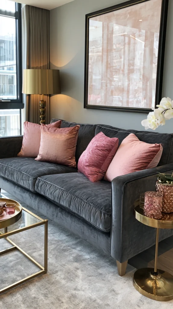
The pairing of dark grey and blush pink is one of those combinations that looks like it should not work until it does.
Blush pink has enough warmth to contrast with the cool grey but enough muted softness to avoid the jarring brightness that a strong pink would create. It is the colour that sits between pink and beige, warm enough to feel distinctly coloured, soft enough to feel entirely grown up.
Against dark grey the blush reads as romantic and sophisticated simultaneously. The grey provides the seriousness that stops blush from feeling sweet. The blush provides the warmth that stops the grey from feeling cold.
Introduce blush through cushions and throws on the couch. Blush velvet cushions on a dark grey velvet couch is one of the most immediately beautiful combinations available. The similar texture with contrasting colour creates a richness that mixed fabrics would not produce as effectively.
Extend the blush into artwork. A large-scale botanical print with dusty rose flowers against a pale background. A framed abstract in blush and cream. The blush in the artwork echoes the blush in the cushions and ties the room together.
Add brass or gold metallic accessories. A brass table lamp. Gold-framed mirrors. Brass candlestick holders on the mantle. The warm metal connects the blush and the grey and prevents either from feeling isolated.
5. Bright White Walls That Make the Couch Pop
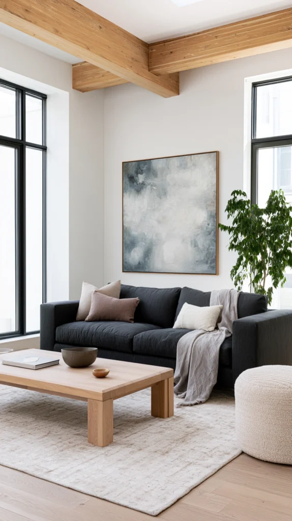
The simplest and most graphic approach to a dark grey couch is the starkest possible contrast.
Bright white walls. Nothing soft, nothing warm, nothing pale and neutral. Pure, clean white that creates maximum contrast with the dark grey couch and lets the sofa read as a strong deliberate element rather than blending into a muted background.
This is the contemporary, Scandi-inspired approach to the dark grey couch. The grey against the white reads as graphic and considered. The room feels clean, edited, and precisely designed.
The key is not neutralising the contrast with too many soft elements. A sheepskin throw over the couch arm. A pale wood coffee table. A single large plant in the corner. These elements provide texture and warmth without softening the essential contrast between the white walls and the dark grey couch.
Limit the colour palette to three elements. Dark grey couch. White walls and ceiling. One accent colour in the cushions and a single repeated accessory. More colours than this and the graphic simplicity that makes this approach work is lost.
Monochrome artwork, black and white photography, abstract prints in charcoal and white, continues the high-contrast theme into the decoration and makes the whole room read as a single considered design scheme.
6. Navy Blue and the Dark Grey Couch
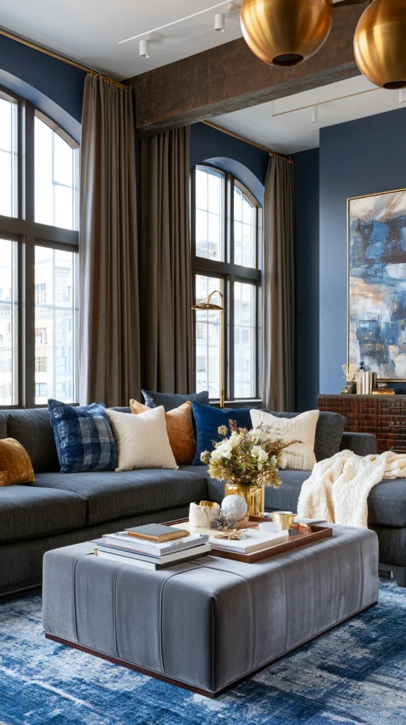
Navy blue and dark grey is a combination that divides people.
Both are dark. Both are strong. Together they can look heavy, serious, and slightly intimidating rather than warm and inviting.
But when the navy is introduced thoughtfully rather than as a dominant wall colour, the combination produces something genuinely elegant. Navy as an accent rather than a background. Navy cushions and throws on the grey couch rather than navy walls behind it.
The relationship reverses in certain rooms. A navy wall in a room with good natural light and warm wood tones provides a strong, sophisticated backdrop for a dark grey couch that sits in front of it. The two darks overlap but the difference between them is clear enough that the couch reads as the foreground element and the wall reads as the background.
Warm the navy-grey combination aggressively. Brass and gold metallic accessories throughout. Warm wood tones in every piece of furniture. Cream and natural linen textiles on the couch and windows. Without this warming the combination can feel like a corporate lobby. With it, it feels like a private members club.
7. A Statement Patterned Rug That Anchors Everything
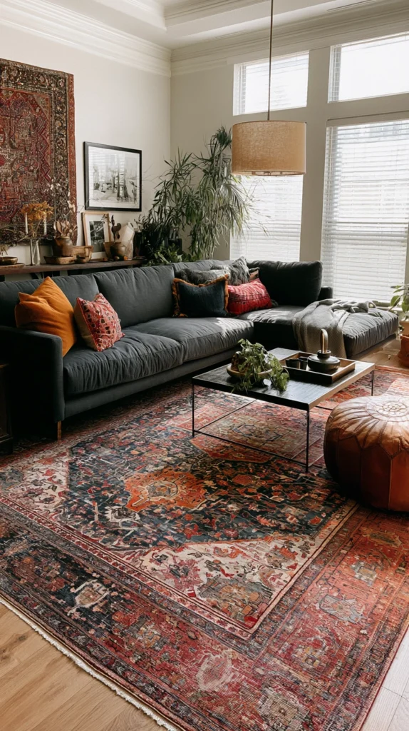
A dark grey couch sitting on a plain floor looks unanchored.
The sofa dominates the room without a visual counterpart beneath it. The eye reads it as too heavy for the light floor below. The balance is off.
A bold, patterned rug beneath the seating area fixes this immediately and does more to unify the room than any other single addition.
The rug choice is the most important styling decision in a dark grey couch living room. It is the element that introduces pattern, anchors the furniture arrangement, and provides the colour direction the room needs to feel complete.
A vintage or antique-style rug with deep jewel tones, burgundy, sapphire, forest green, and ochre woven into a complex pattern, introduces colour into a neutral room in the most natural and convincing way possible. The colours in a vintage rug have been softened by age and they read as part of the room’s fabric rather than a deliberate addition to it.
A geometric rug in terracotta, mustard, and cream over a dark grey couch creates a graphic, contemporary look. A large abstract rug in warm neutrals and soft earth tones creates a sophisticated, editorial quality. A natural jute or sisal rug with a printed border adds texture without strong colour.
The rug should be large enough that the front legs of the couch and all the chairs in the seating arrangement sit on it. A rug too small for the furniture arrangement is one of the most common living room design mistakes and one of the most visually disruptive.
8. Mustard Yellow as the Accent Colour
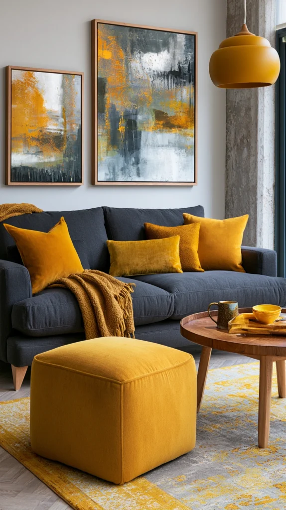
Mustard yellow is one of the most effective accent colours for a dark grey couch living room.
Not bright, primary yellow. Not lime or acid yellow. Mustard. The deep, warm, slightly brownish yellow that is found in autumnal leaves and old oil paintings and the glazed surfaces of artisan ceramics.
Against dark grey the mustard reads as warm, rich, and confident. It is the colour that announces itself without shouting. On a dark grey couch a single large mustard cushion has more visual impact than three small cushions in any paler tone.
The mustard accent works because it sits at the warm end of the spectrum where grey is definitively at the cool end. The temperature contrast between the two is immediately dynamic in a way that grey paired with other cool or neutral tones can never be.
Extend the mustard beyond the cushions into accessories. A mustard ceramic vase. A mustard-toned throw in a textured knit. A small mustard side table. A framed print where mustard or ochre appears prominently. The accumulation of the accent colour across multiple small elements in a room creates a cohesive palette that feels designed rather than decorated.
9. A Layered Textural Approach in Tonal Neutrals
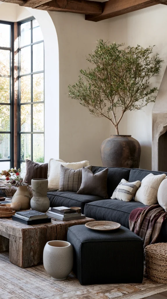
Not every dark grey couch living room needs a contrasting accent colour.
The textural, tonal neutral approach, where every element is within the same family of warm greiges, off-whites, and natural tones but varies dramatically in texture, creates a living room of quiet, layered sophistication that colour contrast cannot achieve.
The principle is this. If there is no colour contrast to create visual interest, texture must do the work instead. The room needs enough variation in surface quality that the eye keeps finding new things to rest on and appreciate.
A dark grey velvet couch. A natural jute rug with visible weave. Linen curtains with the soft crinkle of natural fibre. A chunky wool throw over the sofa arm. A smooth ceramic lamp base. A rough wooden coffee table with visible grain and knots. A glossy vase catching light beside a matte painted wall.
Every element is warm neutral in colour. Every element is different in texture. The room achieves visual richness through material variety rather than colour variety and the result is calm in a way that a more colourful room can rarely match.
This approach is the most forgiving of changes over time. Adding or removing one accent colour from a tonal room is a decision. In a room already defined by its tonal neutrality, new accessories simply join the existing palette without disrupting the scheme.
10. Burnt Orange and Copper for an Autumn Palette
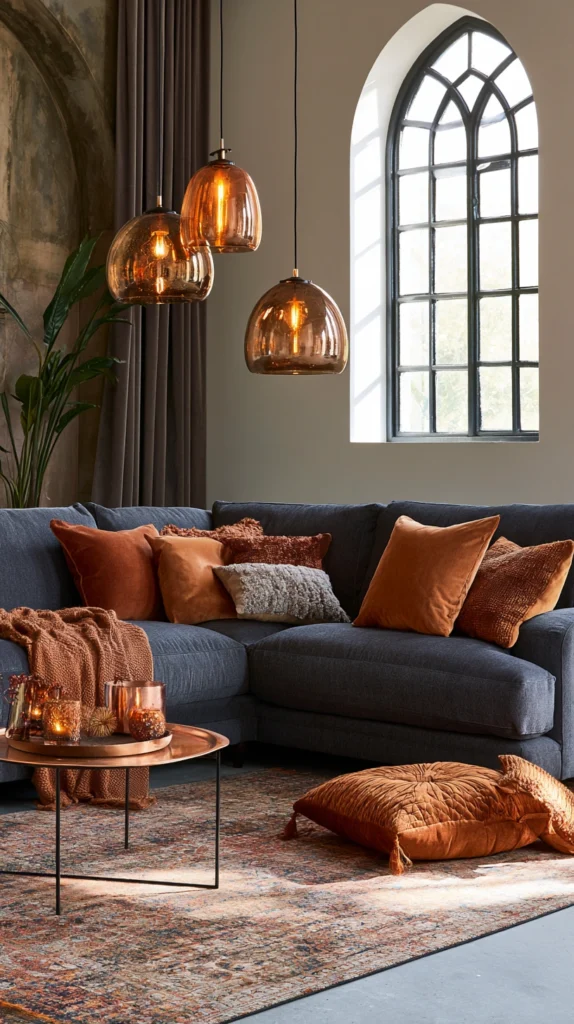
The dark grey couch in an autumn palette is one of the most warmly beautiful living room schemes available.
Burnt orange cushions on the grey couch. Copper accessories catching the light. A deep amber rug anchoring the floor. Warm ochre in the artwork. The palette of a forest in October translated into a living room.
This combination works because it treats the dark grey couch as the shadow in a landscape that is otherwise lit by warm, reddish-orange autumn tones. The grey provides the depth and grounding. Everything else glows.
Copper is the key metallic for this palette. Brass is too yellow. Chrome is too cool. Copper sits in exactly the right place between warm and metallic that it connects the burnt orange accents and the dark grey couch in a single warm, organic thread.
Use real copper where possible. A copper pendant light above the seating area. A copper-rimmed mirror. Copper candle holders. The genuine material develops a patina over time that deepens the palette and makes the room feel more settled and considered as the years pass.
11. All Dark and Moody With Layered Lighting
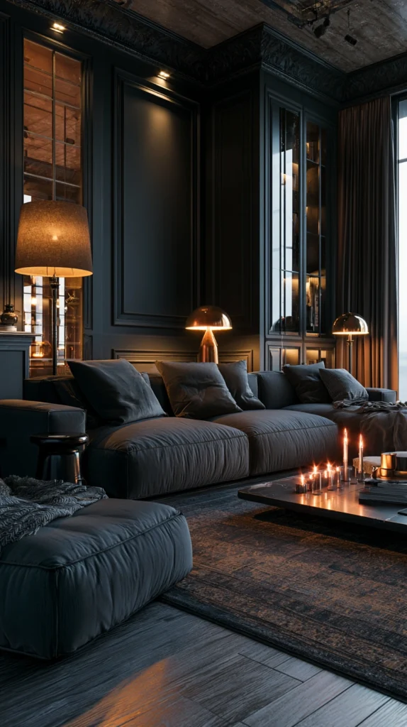
The dark grey couch in a dark, moody room is a design decision that most people are too cautious to make and too interested to resist looking at.
A dark charcoal or near-black wall. The dark grey couch. Dark curtains in the same tonal range. A dark patterned rug. Almost everything in the deep end of the tonal scale.
This sounds like a recipe for a depressing room. It produces, when executed with the right lighting, one of the most atmospheric and beautiful living rooms possible.
The lighting is the entire key. Multiple light sources, none of them overhead or bright, creating pools of warm amber light throughout the dark room. A floor lamp behind the couch. Table lamps on every surface. Candles on the coffee table and the mantle. LED strip lighting behind shelving units.
The dark room with layered warm lighting feels like a candlelit cave or a private bar in the best hotel you have ever stayed in. Everything is intimate. Everything glows. The dark grey couch disappears into the dark room in a way that makes it feel like part of the architecture rather than a piece of furniture placed in a space.
This approach is not for rooms with limited natural light or for households that prefer a bright, airy atmosphere. But for a household that values atmosphere and intimacy over openness, a dark, moody living room built around a dark grey couch is genuinely transformative.
12. Sage Green and Natural Linen for a Calming Palette
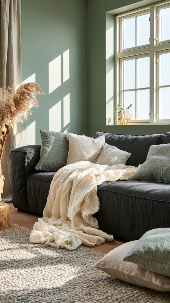
The dark grey couch in a sage green and natural linen palette creates a living room that feels like it was designed by someone who meditates regularly.
Sage green is one of the most calming colours available for a living room. It has enough colour to feel distinctive but enough grey in it to feel restrained. It does not demand attention. It simply sits there being quietly beautiful and making everything around it feel slightly calmer.
Sage green walls behind a dark grey couch create a cool, gentle backdrop. The grey couch reads as grounded and serious without the combination ever feeling heavy. The green provides exactly enough warmth and life to prevent the grey from feeling cold.
Natural linen everywhere. Curtains in natural undyed linen that falls in loose folds. Cushion covers in linen slub fabric in cream and pale oatmeal. A linen throw draped over the couch arm. The linen texture adds warmth to the cool palette and connects the room to natural materials in a way that synthetic fabrics cannot.
Add living plants throughout the room. The sage green palette already references nature. Actual plants in terracotta pots reinforce and extend that reference into the living room in the most direct way possible. A large fiddle leaf fig in the corner. Trailing pothos on a shelf. Small succulents on the coffee table. The plants breathe life into a palette that might otherwise feel slightly still.
13. Jewel Tones and Gallery Wall Above
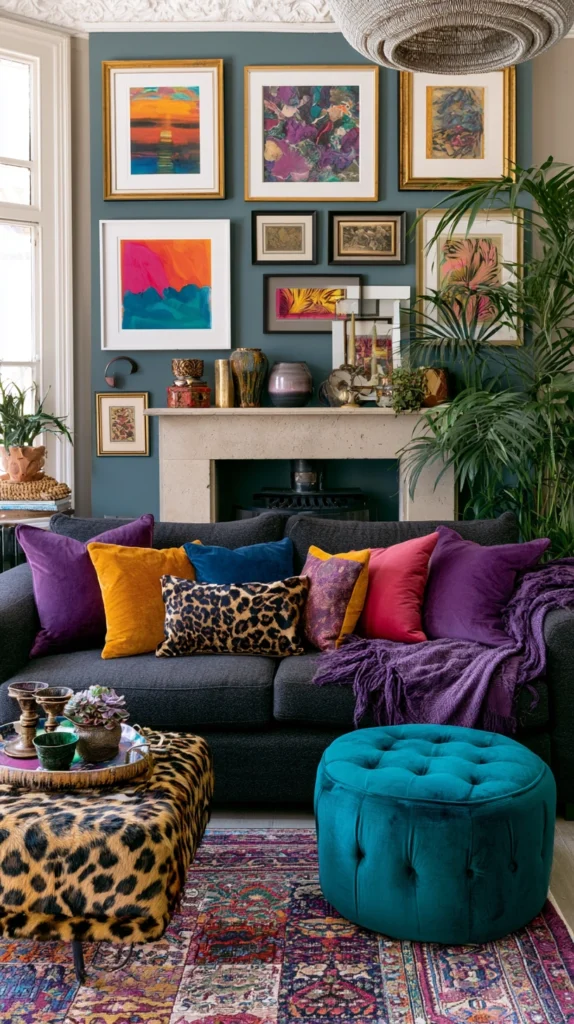
The dark grey couch as the foundation for a jewel-toned living room is the most maximalist and most visually rewarding option on this list.
Jewel tones, the deep, saturated colours of precious stones, sapphire, emerald, ruby, amethyst, and topaz, need a strong neutral foundation to read correctly. Against a pale neutral background jewel tones can feel garish or mismatched. Against a dark grey couch they feel exactly right. The grey is dark enough to support them. Cool enough to show them off. Strong enough to hold the palette together.
Jewel-toned cushions in varying sizes across the dark grey couch. A deep emerald or sapphire armchair that faces the couch. A jewel-toned patterned rug in the centre of the seating arrangement. The combination of multiple jewel tones feels maximalist but cohesive because all jewel tones share the same quality of depth and saturation.
A gallery wall above the dark grey couch completes the scheme. A collection of artwork in frames that vary in size and material but share a colour palette that echoes the jewel tones below. Mix original pieces with prints. Mix photography with illustration. Mix large and small. The gallery wall brings the jewel-toned palette upward from the couch level and distributes it across the wall behind, creating a living room where the couch and the wall behind it read as a single designed composition.
How to Style a Dark Grey Couch for Maximum Impact
The couch styling is as important as the room it sits in.
A dark grey couch with the wrong cushions looks as uninspired as a dark grey couch in the wrong room. And a dark grey couch styled correctly can make a mediocre room look considerably better than it is.
Cushion count matters. Too few cushions and the couch looks bare and unloved. Too many and it looks like a cushion shop. For a standard three-seater dark grey couch, five to seven cushions is the right number. Three matching cushions across the back and two accent cushions in front of them. Or an asymmetric arrangement of varying sizes that looks curated rather than paired.
Vary the cushion sizes. A mix of large fifty by fifty centimetre squares, medium forty by forty centimetre squares, and a small rectangular bolster creates more visual interest than a row of identical sizes.
Vary the textures without varying the palette too widely. Velvet, linen, knit, and woven cushions in the same colour family look richer and more layered than identical-fabric cushions.
Drape rather than fold throws. A throw folded neatly over the arm of a couch looks staged. A throw draped loosely with one end falling toward the floor looks lived in and genuinely inviting.
Common Mistakes With Dark Grey Couch Living Rooms
Surrounding it with other cool neutrals. Grey with beige, grey with cream, grey with more grey. The cool couch needs warm contrast, not more cool tones around it.
Choosing a rug that is too small. A rug that only fits under the coffee table with the couch floating behind it is almost always wrong. The couch needs its front legs on the rug to connect the seating arrangement visually.
Using overhead lighting only. A dark grey couch in a room with only overhead lighting looks flat and gloomy. Layer multiple warm light sources at different heights.
Matching everything to the grey. A dark grey couch does not need a grey rug, grey walls, and grey accessories. It needs something to contrast with and support it, not more of the same tone.
Ignoring the wall behind the couch. The wall directly behind the sofa is the backdrop for the entire seating arrangement. A gallery wall, a large piece of artwork, a statement paint colour, or interesting architectural detail transforms the couch from a standalone piece into part of a composed visual scene.
Under-investing in the coffee table. The coffee table sits directly in front of the couch at eye level for anyone seated. An uninspiring coffee table undermines a well-styled couch. The table should be as carefully chosen as the couch itself.
Quick Summary
- Terracotta and rust tones create temperature contrast with the cool grey that makes both colours come alive
- Deep forest green walls envelop the grey couch in organic warmth and extraordinary depth
- Warm wood tones in the coffee table and furniture do more to warm a grey couch than any other single element
- Blush pink and dusty rose provide romantic warmth that the grey makes sophisticated rather than sweet
- Bright white walls create graphic contrast that makes the dark grey couch read as a strong deliberate choice
- Navy blue works best as an accent on the couch rather than as a dominant wall colour behind it
- A bold patterned rug is the most important single styling addition to any dark grey couch living room
- Mustard yellow is the highest-contrast, most visually dynamic accent colour for a cool grey couch
- Tonal neutrals in varying textures create sophisticated quiet richness without any accent colour at all
- Burnt orange and copper accessories translate the autumn palette into a warmly beautiful living room scheme
- Dark walls with layered warm lighting create the most atmospheric and intimate version of this room
- Sage green walls with natural linen create a calming, nature-referencing palette around the grey couch
- Jewel tones on the couch and a gallery wall above create the most maximalist and visually generous result
- Style the couch with five to seven cushions in varying sizes and textures, and drape throws rather than folding them
- Contrast, not matching, is always the correct approach to a dark grey couch
The dark grey couch is not the obstacle.
It is the opportunity.
It is a strong, generous, neutral anchor waiting for a room to be built around it with some commitment and some colour.
Build that room and the dark grey couch stops being the furniture that goes with everything and nothing simultaneously.
It becomes the best piece in the room.