
15 Blue and Brown Bedroom Ideas That Feel Warm, Calm, and Completely Grown Up
Blue and brown is the combination that should not work as well as it does.
Blue is cool, airy, and expansive. Brown is warm, earthy, and grounding. They come from opposite ends of the emotional colour spectrum. One suggests sky and water. The other suggests soil and wood.
And yet together they produce bedrooms that feel more balanced, more liveable, and more genuinely restful than almost any other colour combination available to a bedroom designer.
The reason is simple. Blue calms. Brown warms. In a bedroom where you need both the mental quiet of cool tones and the physical warmth of natural materials, blue and brown delivers both simultaneously without any compromise.
This is not a trendy combination. It does not belong to a particular decade or design movement. It has been working in bedrooms for as long as people have built rooms that look out at sky through windows framed in wood.
Here are 15 ways to make it work in yours.
Why Blue and Brown Works So Well in a Bedroom
The bedroom has one job above all others.
It needs to feel like a place where you can genuinely rest.
Not a room you collapse in because there is nowhere else to go. Not a room that is tolerable enough to sleep in. A room that actively draws you toward rest the moment you step inside it.
Blue contributes the mental calm. Studies consistently show that blue environments reduce heart rate and lower cortisol levels more effectively than almost any other colour. The eye reads blue as receding rather than advancing, which makes walls feel further away and the space feel more open and breathing.
Brown contributes the physical warmth. The wood tones, leather textures, and earthy pigments that carry the brown in this combination signal warmth, safety, and the presence of natural materials. They make a room feel inhabited and protective rather than cool and open.
Together they create a bedroom that is simultaneously expansive and cocooning. Open and warm. Calm and alive.
That is a difficult balance to achieve with any other colour combination.
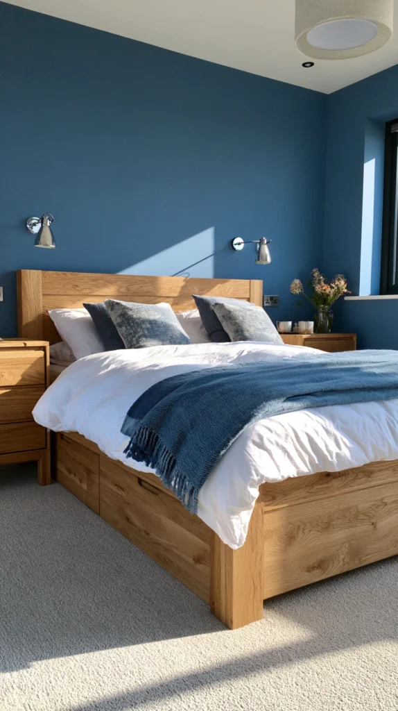
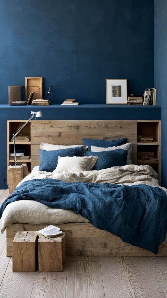
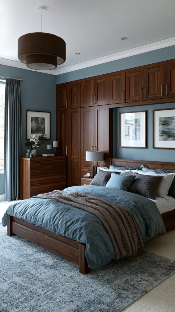
1. Navy Blue Walls With Warm Walnut Furniture
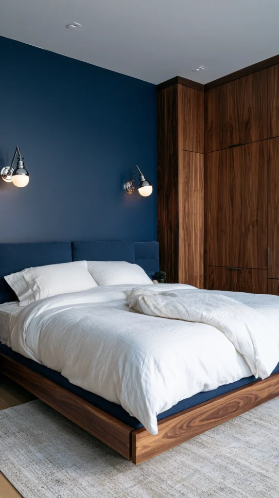
This is the blue and brown bedroom combination that most reliably produces a result worth photographing.
Deep navy blue walls in a matte finish create an instant sense of intimacy and depth. The room contracts slightly in the best possible way. The walls feel close without feeling oppressive.
Against that navy, warm walnut furniture does extraordinary work. A walnut bedside table. A walnut dresser with simple lines. A walnut bed frame with a low headboard. The warm orange-brown tones of walnut pop against navy in a way that lighter woods simply do not. The contrast is immediate and beautiful.
The combination has a quality that feels both contemporary and timeless. It does not belong to any particular decorating era. It looks as right in a modern apartment as in a period house. It suits a masculine aesthetic without excluding a feminine one.
Keep the bedding in warm whites and natural linens. The neutral bedding sits between the navy walls and the walnut furniture without competing with either. Add a single deep tan or caramel leather cushion on the bed for the finishing element that ties both colours explicitly together in one object.
What makes navy and walnut work:
- Navy walls in matte finish create depth without gloss reflections
- Walnut’s orange-brown undertones are the warmest possible contrast to cool navy
- Natural linen bedding in off-white sits comfortably between both colours
- Brass hardware on furniture and fixtures adds warmth and connects wood to wall
- A leather or suede throw in tan or caramel ties the whole palette explicitly together
2. Soft Powder Blue Walls With Rattan and Cane Furniture
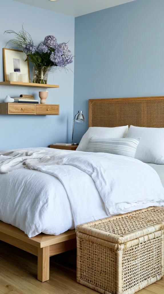
Where navy and walnut is dramatic, powder blue and rattan is gentle, sun-warmed, and quietly beautiful.
Powder blue has a softness that deeper blues lack. It reads as warm in a way that feels counter-intuitive for a cool colour. In morning light it has an almost luminous quality. In evening light it settles into something deeper and more restful.
Against powder blue, rattan and cane furniture bring the warmth of natural fibres and the organic quality of handmade objects. A rattan headboard. A woven cane dresser. A bamboo bedside table. These materials have a honey-brown warmth that complements powder blue beautifully without the heavier, more formal quality of solid wood furniture.
This combination suits coastal, Boho, and Scandinavian bedroom styles equally well. It has a lightness and ease that heavier colour combinations cannot match. The bedroom feels like a room that catches a sea breeze even in a landlocked city.
Add jute or seagrass rugs, linen curtains in natural cream, and a few trailing plants in terracotta pots. The combination of powder blue, rattan, natural fibres, and terracotta creates a bedroom that feels genuinely effortless.
3. Slate Blue Bedding With Dark Espresso Wood
The dark espresso wood bedroom with slate blue bedding is a combination of extraordinary richness.
Deep, almost-black espresso furniture, a heavy wooden bed frame, dark wood bedside tables, a low dark dresser, creates a bedroom with real presence and gravitas. Furniture this dark can feel oppressive without the right contrast.
Slate blue bedding provides exactly that contrast. Slate blue sits between blue and grey, with enough grey to feel neutral and enough blue to feel genuinely coloured. Against espresso wood it reads as cool and fresh without being stark or cold.
The dark furniture and slate blue bedding produce a bedroom that feels like it belongs in a high-end hotel. Considered, calm, and quietly luxurious. The kind of room where everything looks exactly where it should be.
Add a concrete or stone-coloured rug to anchor the floor. Dark wood floors beneath if the room allows. Warm bedside lighting in brushed silver or chrome rather than brass, which can feel too warm against the cooler slate blue.
4. Denim Blue Accent Wall With Natural Oak
The denim blue accent wall behind the bed is the entry point for anyone who wants blue and brown without committing to all four walls.
Denim blue is one of the most liveable shades in the blue family. It is honest, unpretentious, and genuinely comfortable to live with every day. It does not demand attention the way a deeper navy does. It simply provides a warm, slightly faded backdrop that makes everything in front of it look better.
A denim blue wall behind the bed paired with natural oak furniture is a combination of relaxed, easy beauty. Oak in its natural light tone has a golden warmth that sits beautifully against denim blue. The contrast is softer and less formal than navy and walnut but no less considered.
This combination is forgiving. It works with almost any bedding. It suits almost any style of room. And because it requires only one wall of paint rather than four, the commitment is minimal and the impact is still significant.
5. Cornflower Blue Walls With Leather Headboard and Accessories
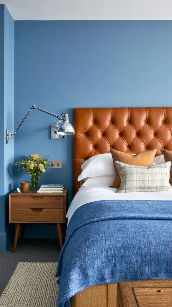
Leather is the material that most directly brings the brown into a blue and brown bedroom.
A leather headboard in cognac, tan, or mid-brown against cornflower blue walls creates a combination that is warm, considered, and quietly sophisticated. The leather introduces a tactile, material quality that fabric headboards cannot replicate. It ages beautifully. It develops a patina. It gets better as the years pass.
Cornflower blue has a brightness and optimism that deeper blues lack without the candy sweetness of sky blue. It is the blue of a clear summer afternoon. It brings light into a bedroom rather than absorbing it.
Extend the leather beyond the headboard. A leather photo frame on the bedside table. A tan leather tray holding small objects. A cognac leather chair in the corner. These brown leather accents scattered around a cornflower blue room create a coherent theme without the room feeling matched or formulaic.
6. Teal Blue and Rich Chocolate Brown
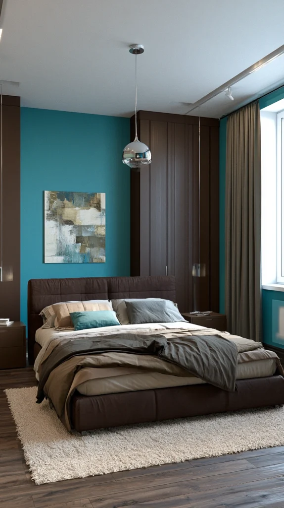
Teal and chocolate is the blue and brown pairing with the most glamorous associations.
Teal sits at the junction of blue and green, with enough green to feel warm and organic and enough blue to feel cool and sophisticated. Against rich chocolate brown it creates a combination that reads as genuinely luxurious and deeply considered.
A chocolate brown upholstered bed with teal walls. Or teal upholstery against warm brown panelled walls. Either configuration produces a bedroom with a richness and depth that neither colour achieves alone.
This is the combination for a larger master bedroom where the scale of the room demands something with presence and gravitas. In a smaller room teal and chocolate can feel heavy. In a generous space it feels exactly right.
Gold or brass fixtures and accessories connect the two colours and add warmth to both. A brass pendant over the bed. Gold-framed mirrors. Brass drawer pulls on a dark wood dresser. The warm metal brings out the warmth in the brown and the warmth hidden within the teal simultaneously.
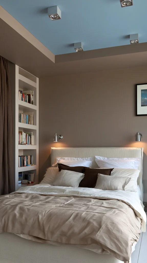
7. Pale Blue Ceiling With Warm Brown Walls
Most blue and brown bedrooms put the blue on the walls and the brown in the furniture.
Invert this and something interesting happens.
Warm brown walls in a terracotta-adjacent tone, or a warm medium brown with yellow undertones, create a grounded, earthy bedroom that feels instantly cocooning. Then a pale blue ceiling above, the palest possible blue, barely more than white with a blue suggestion, opens the room upward.
The effect is of lying in a warm brown earth looking up at an open sky. It is deeply instinctive. Primally comfortable. The brown surrounds and protects. The blue above gives space and air.
This configuration particularly suits lower-ceilinged rooms where a dark ceiling would feel oppressive. The pale blue ceiling reads as receding rather than advancing, making the ceiling feel higher than it is while the warm brown walls keep the room feeling grounded and warm.
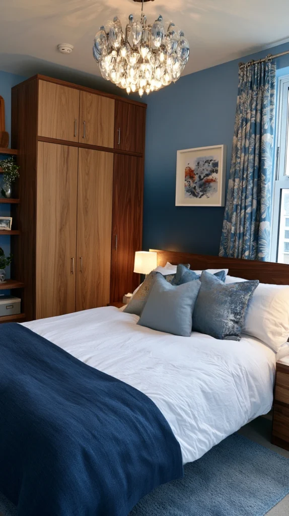
8. Indigo Blue With Raw Wood and Linen
Indigo sits deeper than navy. It has a blue so dark that it reads almost purple in certain lights. It is one of the most atmospheric and complex colours in the blue family.
Against raw, unfinished wood it creates a combination that is organic, deeply natural, and quietly extraordinary.
Raw wood, the unfinished, lightly oiled, visible-grain wood of a craftsman-made bed or a timber-framed headboard, has a warmth and honesty that polished or painted wood does not. The rawness of the material connects the bedroom to the natural world without any mediation or refinement.
Indigo and raw wood together feel like a room in a craftsman’s studio or a considered rural retreat. The depth of the colour and the honesty of the material speak the same language. Add heavy linen bedding in natural flax and the bedroom becomes a complete expression of natural materials, deep colour, and genuine calm.
9. French Blue With Antique Oak and Patinated Leather
French blue is the blue of Provençal farmhouses, of painted wooden shutters, of the warm South of France.
It is dusty rather than bright. Slightly greyed. Faded-looking even when freshly painted. This faded quality is what makes it so beautiful and so different from cleaner, more saturated blues.
Against antique oak furniture with its own centuries of colour and patina, French blue creates a bedroom that feels like it has always existed. Like it was not designed or decorated but simply accumulated over time into something beautiful.
Add patinated leather accessories, a worn leather armchair, an old leather travelling trunk at the foot of the bed, a leather-bound journal on the bedside table, and the room acquires an atmosphere of lived-in elegance that no new combination of colours and materials can fake.
This is the blue and brown bedroom for people who love things that look old, feel used, and carry evidence of a life lived among them.
10. Sky Blue With Driftwood Tones
Sky blue and driftwood is the coastal blue and brown bedroom.
Sky blue in its softest, most airy form. The blue of early morning before the day has properly started. Paired with the bleached, sun-faded, salt-washed tones of driftwood. Grey-brown. Almost white in some lights. The colour of wood that has been through something and emerged beautiful rather than damaged.
This combination has a lightness and spaciousness that heavier blue and brown pairings lack. The room feels like it is breathing sea air. Like the window should open onto ocean rather than street.
Driftwood tone furniture is widely available and suits this palette precisely. A whitewashed or limed oak bed frame. A pale grey-brown driftwood mirror. Bleached wood flooring or pale wood-effect tiles.
Add white bedding, sheer linen curtains, and white-painted walls beside the sky blue. The combination of sky blue, driftwood, white, and natural linen creates the most genuinely coastal bedroom possible without a single piece of nautical decoration.
11. Dusty Blue With Terracotta and Warm Wood
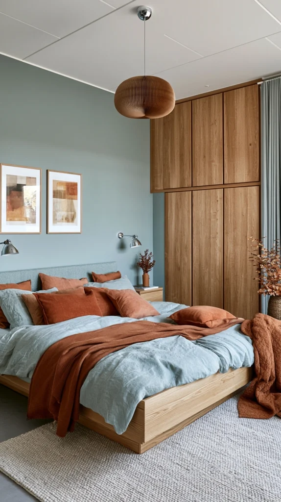
Dusty blue and terracotta is a three-way combination where the brown comes from the terracotta rather than from furniture alone.
Dusty blue walls in a muted, slightly greyed tone. Terracotta accessories, pots, ceramics, cushion covers, a terracotta-toned rug, scattered throughout the room. Warm oak or pine furniture connecting the two.
The three-way combination of dusty blue, terracotta, and warm wood creates a bedroom that feels naturally warm without any of the elements individually being dramatically bold. The dusty blue is gentle. The terracotta is earthy. The wood is honest. Together they create a room that feels quietly alive in a way that two-colour combinations sometimes cannot.
This palette suits bedrooms in older houses with character, in cottages and farmhouses, and in any bedroom where the goal is warmth and effortless livability rather than dramatic impact.
The terracotta element is the key that unlocks the brown in this combination. Without it the dusty blue and warm wood bedroom is pleasant but slightly expected. With terracotta added the three colours create something that feels genuinely Mediterranean in the best possible way.
12. Blue-Grey With Dark Walnut and Bronze Accessories
Blue-grey is the most sophisticated and restrained member of the blue family for bedroom use.
It is barely blue. Primarily grey, with just enough blue to prevent it from reading as cold or corporate. In different lights it shifts between a cool grey and a clear blue. This mutability is part of what makes it so liveable as a bedroom wall colour.
Against dark walnut furniture, blue-grey creates a refined, adult bedroom with a quiet authority. Nothing shouts. Everything works. The blue-grey recedes calmly. The dark walnut grounds with warm weight. The combination asks nothing of the person in the room except to rest.
Bronze accessories complete the triangle. Bronze light fittings. Bronze drawer pulls. A bronze-framed mirror above the dresser. Bronze is the warmest of the metallic finishes and in a blue-grey and dark walnut bedroom it functions as the element that connects the cool wall colour and the warm wood in a single metallic tone.
This is the blue and brown bedroom for the person who prefers precision and calm over expressiveness and drama.
13. Cobalt Blue With Tan Linen and Camel Throws
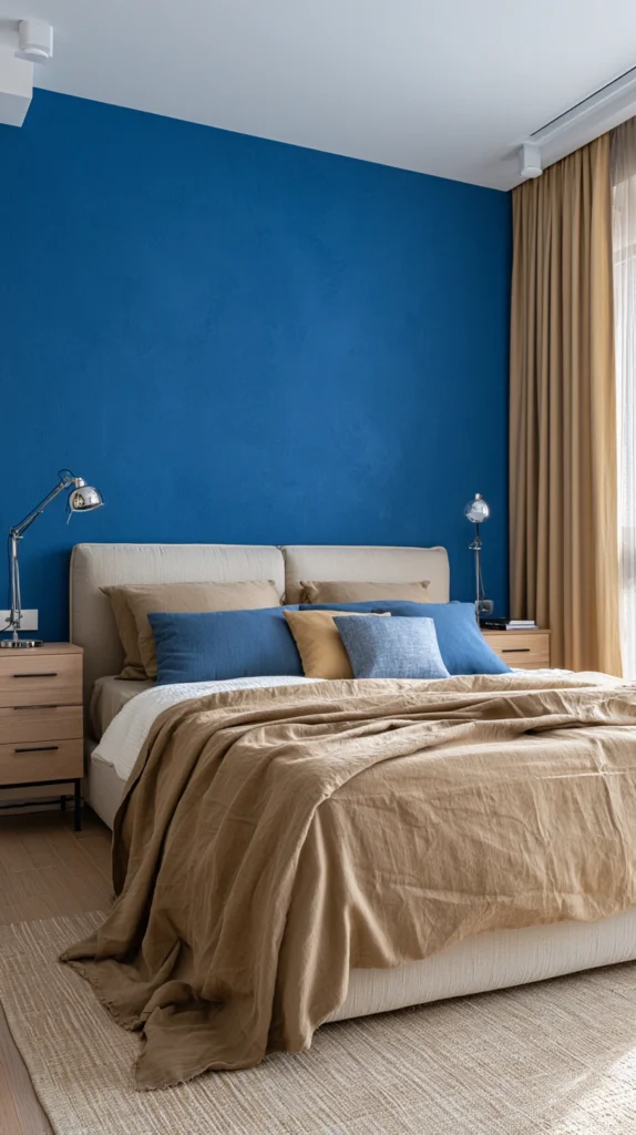
Cobalt blue is the boldest blue on this list.
Clear, saturated, unapologetically vivid. It does not whisper or suggest. It states.
In a bedroom this level of saturation needs careful handling. Too much cobalt and the room feels relentless. The right amount, a cobalt headboard rather than four cobalt walls, or cobalt cushions and accessories rather than cobalt paint, creates energy and vitality without exhaustion.
Pair cobalt blue elements with tan linen bedding and camel-coloured throws for the warmth that cobalt on its own lacks entirely. The tan and camel earth tones are soft enough not to compete with the bold cobalt but warm enough to prevent the room from feeling cold.
This combination suits a bedroom that should feel alive rather than restful. A guest bedroom where impact matters more than daily habitation. A younger person’s bedroom where energy is appropriate. A bedroom in a holiday property where the expectation is excitement rather than the familiar comfort of home.
14. Ocean Blue With Driftwood Grey and Aged Brass
Ocean blue is the deep, complex blue of open water. Not the bright Mediterranean. Not the pale sky. The deep, shifting blue of the Atlantic in autumn. Mysterious, layered, constantly changing.
Paired with driftwood grey furniture and aged brass accessories, ocean blue creates the most atmospherically complex bedroom on this list.
Driftwood grey, the grey-brown of weathered timber, neither warm nor cold but somewhere interesting between both, sits with ocean blue in a way that echoes the meeting of sea and shore. The aged brass of light fittings, mirror frames, and handles echoes the warm tones of afternoon light on water.
This is a bedroom with a genuine sense of place and mood. It belongs to the coast in a way that is felt rather than stated. No anchors or rope or shells. Just the colours that the sea and the shore and the late afternoon light actually are.
15. Layered Blues and Browns From Lightest to Darkest
The most sophisticated approach to a blue and brown bedroom does not choose one blue and one brown.
It uses multiple tones of both.
A bedroom where the blue moves from pale sky blue on the ceiling through soft powder blue on three walls to a deeper denim or slate accent wall behind the bed. Where the brown moves from blonde natural wood on the floor through honey oak furniture to a dark walnut headboard and near-black leather accessories.
This tonal layering creates a bedroom that has genuine depth. The eye moves around the room finding new relationships between tones. The overall impression is one of richness and complexity that a two-tone room cannot achieve however well chosen the two tones are.
The layering of multiple blues and multiple browns within a single bedroom works because both colour families are internally consistent. Blues relate to each other. Browns relate to each other. And the blue family and the brown family have the same fundamental relationship at every point along their tonal ranges. The combination simply holds.
This approach requires more confidence and more decisions than any other blue and brown bedroom idea. But it produces the result that most completely realises the potential of this pairing.
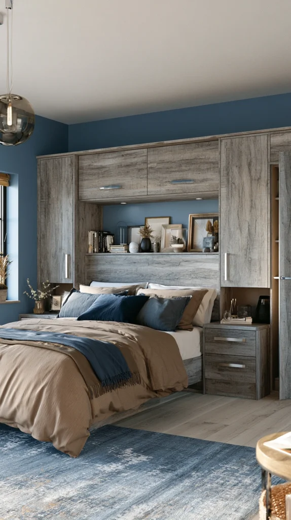
How to Find the Right Balance of Blue and Brown
The ratio of blue to brown matters as much as the specific shades chosen.
An equal split of blue and brown in a bedroom can feel unsettled. The two colours compete rather than one leading and the other following.
The most successful blue and brown bedrooms have a clear lead colour and a clear supporting colour.
Blue leads in the majority of beautiful blue and brown bedrooms. Blue on the walls, blue in the bedding, blue as the dominant impression. Brown supports through the wood of the furniture, the leather of the accessories, the natural fibres of the rugs and throws.
This ratio gives the room the calm of the dominant blue while the brown elements prevent the coolness from becoming coldness. The blue sets the mood. The brown makes it liveable.
Reverse the ratio when warmth is the primary goal. Brown walls or brown panelling with blue used as the accent colour in cushions, throws, and artwork creates a warmer, earthier bedroom where the blue provides the freshness and relief.
Common Mistakes in Blue and Brown Bedrooms
Choosing a blue that is too bright. Electric or royal blue in a bedroom is energising rather than restful. Blue in a bedroom should lean toward the muted, the dusty, or the deep rather than the vivid and saturated.
Using brown as only one element. A blue room with a single brown piece of furniture reads as a blue room with a piece of brown furniture in it. For the combination to work as a palette the brown needs to appear in multiple places. Furniture, accessories, textiles, and flooring together establish brown as a genuine participant in the scheme.
Ignoring the undertones. Blues with green undertones clash with warm browns. Blues with purple undertones can look surprising against yellow-toned woods. Test the specific blue against the specific brown in the actual room before committing.
Forgetting the neutrals. White, cream, natural linen, and stone grey are the neutrals that allow blue and brown to breathe. A bedroom that is only blue and brown without any neutral relief can feel dense. Let the bedding, the ceiling, or the floor provide neutral space.
Over-matching. A bedroom where every blue is exactly the same blue and every brown is exactly the same brown feels rigid and uncomfortable. Varying the tones within each colour family creates naturalness and ease.
Quick Summary
- Navy and walnut is the most reliably beautiful blue and brown combination for bedroom photography
- Powder blue and rattan creates a light, coastal, effortlessly warm bedroom with natural textures
- Slate blue bedding against dark espresso wood produces hotel-level richness and calm
- A denim blue accent wall behind the bed is the lowest-commitment, highest-impact entry point
- Cornflower blue walls with leather accents scattered around the room creates warmth without formality
- Teal and chocolate brown is the most glamorous pairing and suits generous master bedrooms
- Pale blue ceiling over warm brown walls inverts the expected configuration with extraordinary results
- Indigo and raw wood with natural linen creates an organic, craftsman quality that feels deeply restful
- French blue with antique oak and patinated leather creates a room that appears to have accumulated over time
- Sky blue and driftwood tones is the most genuinely coastal combination without any nautical decoration
- Dusty blue with terracotta accents and warm wood creates a three-way Mediterranean warmth
- Blue-grey with dark walnut and bronze accessories is the most refined and quietly sophisticated option
- Cobalt blue works best as an accent rather than a wall colour and needs tan and camel to warm it
- Ocean blue with driftwood grey and aged brass creates atmospheric complexity that feels like coastal light
- Layering multiple tones of both blue and brown produces the richest and most sophisticated result of all
- Blue should typically lead with brown in strong supporting role for the most restful result
- Always test your specific blue against your specific brown in the actual room before committing
Blue and brown is not a safe choice.
It is a confident one.
It says the room was designed by someone who understands that calm and warmth are not opposites. That sky and earth belong together. That a bedroom can feel simultaneously open and held.
Get the balance right and this is the bedroom you never want to leave in the morning.
And the one you are always glad to come back to at the end of the day.