15 Two-Toned Kitchen Cabinet Ideas That Feel Designer
The single-colour kitchen is the safe choice.
It is the choice that ensures nothing clashes, that provides the widest possible resale appeal, that cannot be described as wrong. It is also, in many cases, the choice that produces a kitchen that is correct without being interesting. That does what a kitchen is supposed to do without doing anything unexpected.
The two-toned kitchen is the choice with a point of view.
It says that the kitchen has a visual hierarchy. That the upper cabinets serve one design purpose and the lower cabinets serve another. That the island is distinct from the perimeter. That the larder cupboard is the room’s feature piece while everything else plays a supporting role.
This visual hierarchy is what professional kitchen designers always create. Not because they are being contrarian. Because a kitchen with a clear visual structure, one where the eye knows where to look and what is most important, looks genuinely designed rather than merely specified.
Two-toned cabinets are the most accessible route to this visual structure for the kitchen owner who wants a kitchen that looks like a designer made the decisions.
Here are 15 ideas that produce that result.
Why Two-Toned Kitchen Cabinets Look More Designed Than Single-Colour Ones
The single-colour kitchen’s limitation is its visual uniformity.
When every cabinet is the same colour, the eye has no way to establish hierarchy. Everything is equally prominent. The larder that should be a feature reads the same as the filler strip beside the dishwasher. The island that should anchor the room reads the same as the wall unit above the hob.
The two-toned kitchen creates visual hierarchy by differentiating between the elements. Upper and lower cabinets in different tones make the lower cabinets, which are typically at a more prominent visual height and carry more of the storage and countertop function, look more grounded and more important. The upper cabinets in a lighter or more neutral tone recede slightly, which makes the upper wall area feel taller and the kitchen feel more open.
An island in a contrasting tone becomes the kitchen’s focal point by definition. The contrast between the island and the perimeter cabinets makes the island read as a specific piece of furniture within the kitchen rather than an extension of the same cabinetry run.
These visual effects are what professional designers create with colour. The two-toned approach makes them achievable without any specialist knowledge beyond the ability to choose two colours that work together.
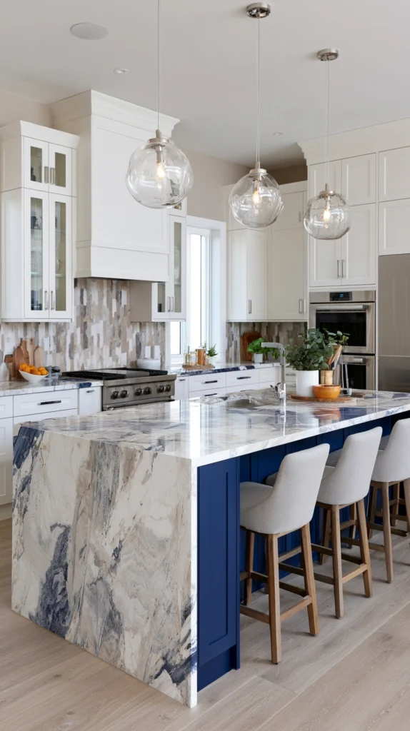
1. Navy Blue Lower Cabinets With White Uppers
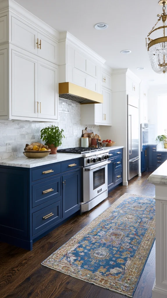
The most widely replicated two-toned kitchen combination of the past decade is the one that established the blueprint for everything that followed.
Navy blue lower cabinets. White upper cabinets. The colour does everything the two-toned principle requires. It grounds the kitchen. It provides the warmth and depth that makes a kitchen feel genuinely lived-in rather than showroom-new. It gives the white uppers a specific brightness by contrast that the same white cabinets against a white wall would not have.
The navy lower cabinets also make the countertop material look more considered. Against navy, a white marble countertop has the contrast it needs to read as a deliberate choice rather than a default. Against a pale lower cabinet, the same white marble countertop merges into the pale ground and the material’s quality is lost in the uniformity.
Hardware on navy lower cabinets should be warm. Brass or unlacquered gold that catches the light and adds a warm metallic note to the navy’s cool depth. Chrome would be too cool against the navy and would make the combination feel corporate rather than warm.
Why navy lower with white upper is the founding two-toned kitchen combination:
- The dark lower and pale upper mimics the natural light gradient of most kitchens, where lower surfaces are in shadow
- Navy has warmth in its depth that pure grey and pure black do not provide
- The white upper cabinets reflect natural light from windows into the kitchen without the heaviness that dark upper cabinets create
- Brass hardware on navy is one of the most consistently beautiful material combinations in any kitchen style
- The combination works in Shaker, flat-front, and raised-panel cabinet styles equally
- It photographs well, which matters for resale and for the daily pleasure of a kitchen that looks as good as it functions
2. Forest Green Lower Cabinets With Cream Uppers
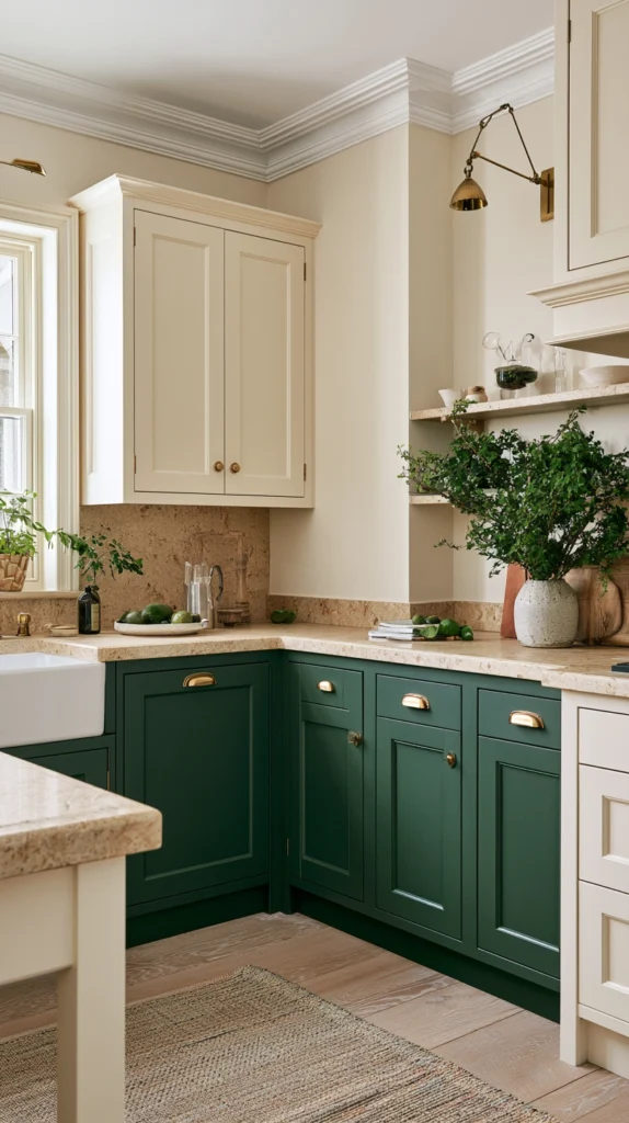
The green kitchen has arrived with force and shows no sign of retreating.
Forest green in its most atmospheric, slightly dark, blue-inflected version is the colour that makes a kitchen feel like a room that belongs specifically to a person who made a specific and confident aesthetic decision. Against cream uppers it has the warmth and the domesticity that the same green against white would lack.
Cream softens the combination of dark green cabinets in a way that white does not. The slight yellow undertone of cream connects to the yellow undertones often present in dark greens and creates a colour relationship of organic coherence. The kitchen feels warm. The green reads as rich rather than cold.
This combination suits the kitchen that wants to feel connected to the natural world. The country kitchen in a period house. The farmhouse kitchen with natural timber worktops and stone tile flooring. The contemporary kitchen that wants some of the warmth of the traditional kitchen without any of the period pastiche.
3. Dark Base Cabinets With Glass-Front Upper Cabinets
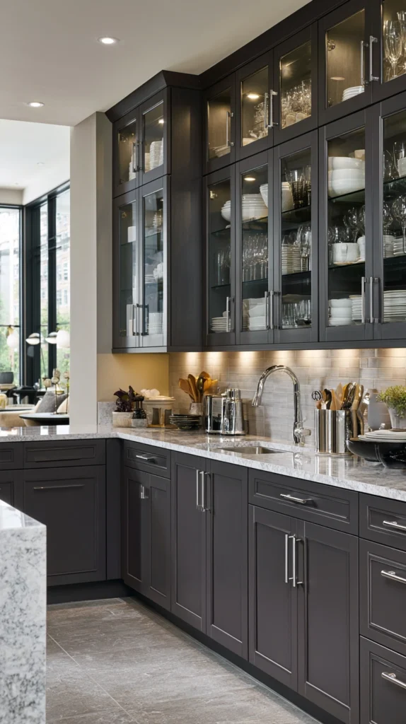
The transition from dark lower cabinets to glass-front upper cabinets creates a two-toned effect in a different dimension from colour alone.
The opacity of the lower cabinets and the transparency of the glass-front uppers create a material transition that is as visually significant as a colour transition. The contents of the glass-front cabinets, the stacked white plates, the organised glassware, the line of spices, become part of the kitchen’s visual composition in a way that the closed upper cabinet does not allow.
The glass-front cabinet in a two-toned kitchen works best when its contents are genuinely worth displaying. The well-organised glass cabinet with consistent crockery and uniform storage jars is a beautiful kitchen element. The same glass cabinet with a random collection of mismatched objects is not.
Dark lower cabinets in forest green, navy, or warm charcoal beneath glass-front upper cabinets in a natural timber or a white painted frame create the kitchen’s most considered visual hierarchy. The dark base grounds the room. The transparent upper lets the room breathe above the worktop line.
4. Warm Charcoal Lowers With Natural Oak Uppers
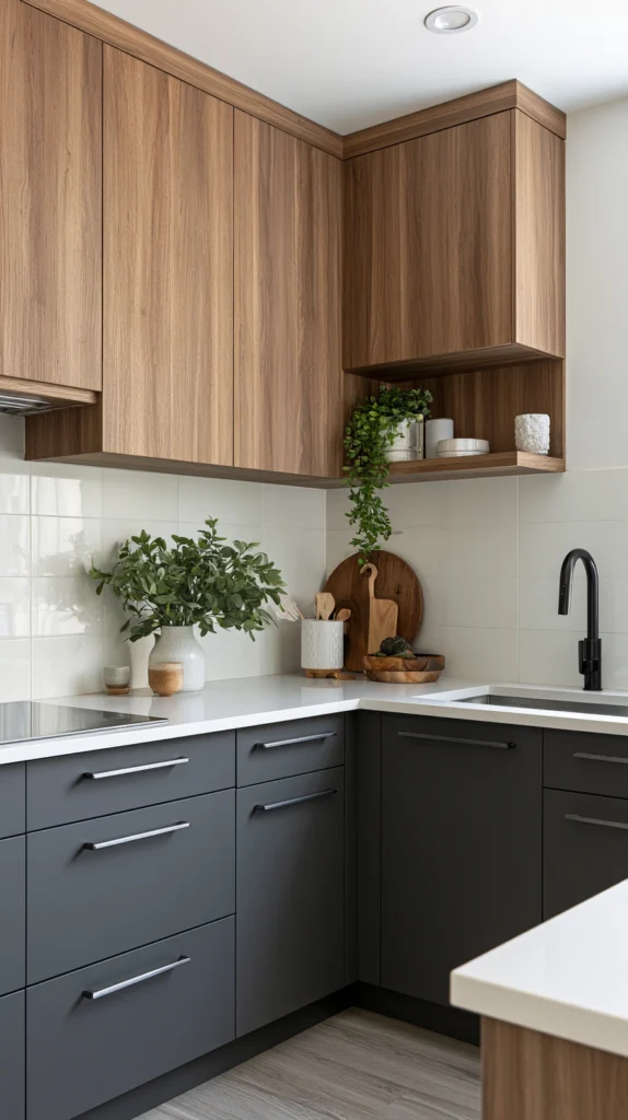
The combination of painted lower cabinets and natural timber upper cabinets is the two-toned approach that adds a material dimension to the colour contrast.
Warm charcoal lower cabinets, in a grey with genuine warm undertones rather than a cool corporate grey, against upper cabinets in natural oak, warm ash, or walnut veneer, create a kitchen that combines the graphic confidence of painted cabinetry with the natural warmth of real timber.
The timber upper cabinets warm the kitchen in a way that painted cabinets cannot. The grain of the wood, its natural variation in tone, the way it responds differently to direct and indirect light, all create a surface of genuine material interest alongside the smoother, more uniform painted lower cabinets.
This combination suits the contemporary kitchen that wants warmth without the heaviness that an all-dark kitchen can produce. The lower cabinets anchor the room in a rich, dark tone. The upper cabinets lighten and warm the room above the worktop line.
5. Terracotta Lower Cabinets With White Uppers
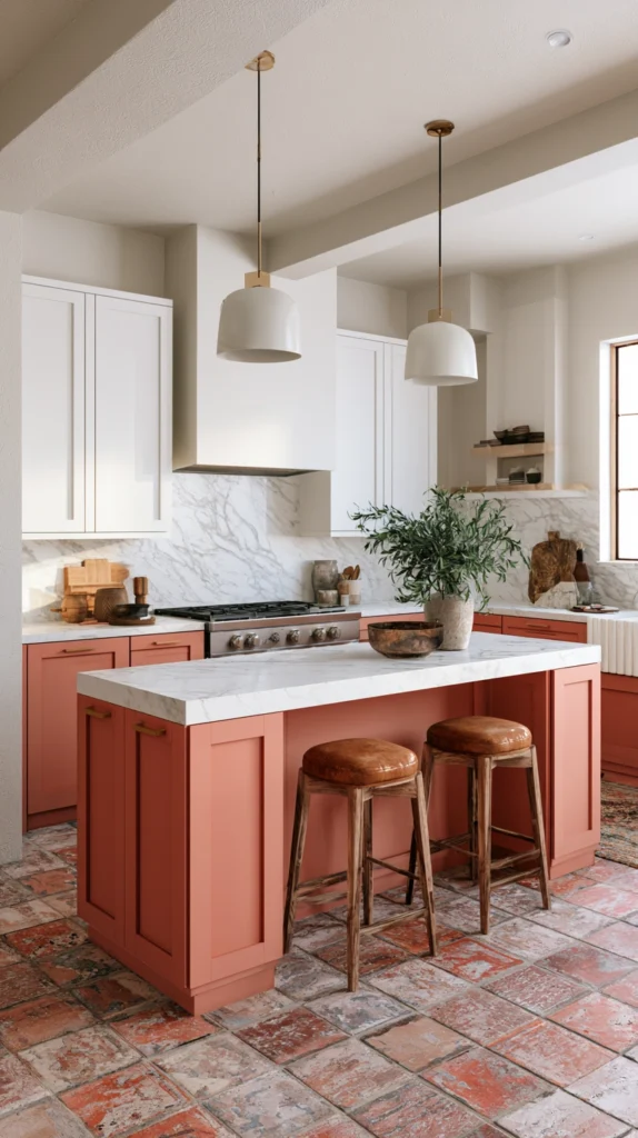
Terracotta in a kitchen was bold when it first arrived and has become only more appealing as evidence has accumulated that it works as well as it looks.
A warm terracotta lower cabinet, the specific orange-red-brown of clay fired in a kiln, against white upper cabinets and a white tile splashback creates a kitchen with the warmth and domesticity of a Mediterranean farmhouse kitchen filtered through a contemporary kitchen format.
The terracotta is not a trendy colour in the superficial sense. It has been present in domestic ceramic and architectural tradition for centuries. In a kitchen it reads as warm and genuine rather than fashionable.
The countertop choice with terracotta lower cabinets matters significantly. White marble or a pale natural stone provides the maximum contrast and the most specifically beautiful relationship with the terracotta. A warm timber worktop provides a more organic and slightly less formal relationship. A dark charcoal or nearly black countertop creates the most dramatic version of the terracotta lower kitchen.
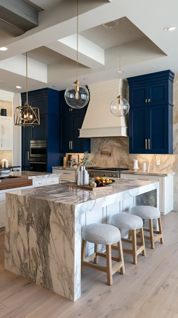
6. A Contrasting Island in a Sea of Neutrals
The island in a contrasting colour to the perimeter cabinets is the most impactful single two-toned decision available in a kitchen that has an island.
The island is already architecturally distinct from the perimeter cabinetry. It stands free in the room rather than against a wall. It typically has seating on one side and a different worktop configuration from the perimeter. These architectural distinctions already make it the kitchen’s focus.
A contrasting colour on the island amplifies this focus. The island that is dark navy or forest green in a kitchen of white or cream perimeter cabinets reads immediately as the room’s centrepiece. Every other decision in the kitchen, the lighting, the seating, the styling, organises itself in relation to the contrasting island.
The island colour should be in the same family as the colours that would work for the perimeter’s own two-toned approach. Navy works as an island colour in a white perimeter kitchen. Forest green works as an island colour in a cream perimeter kitchen. The island picks up the colour that the perimeter’s lower cabinets would have worn in the full two-toned approach and concentrates it in the room’s focal piece.
7. Sage Green Lowers With Warm White Uppers
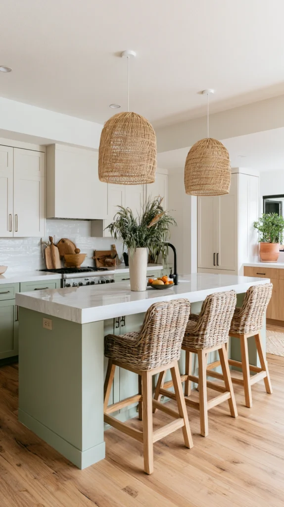
Sage green is the green for the kitchen that does not want to commit to the full drama of forest green.
It is quieter. More muted. Less assertive. It belongs to the family of greens that reads as warm and calming rather than vivid and energising. In a kitchen it creates warmth without drama, which is exactly the quality that many people want in the room where they cook and eat every day.
Against warm white upper cabinets, sage green lower cabinets create a kitchen palette that is gentle, organic, and specifically appealing in the natural light of a kitchen that faces south or west. In the afternoon sun the sage and the warm white together create a colour relationship of natural, easy beauty.
Sage green also ages well in a kitchen context. Unlike very dark or very saturated colours that can feel more dated as trends shift, the muted, earthy quality of sage green sits outside the trend cycle in the same way that natural materials do.
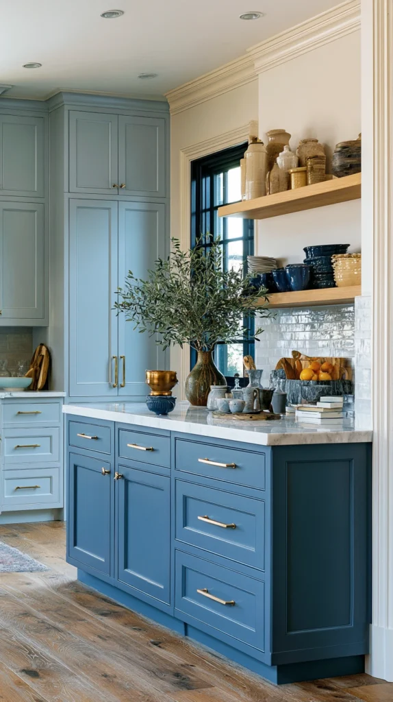
8. Slate Blue Lowers With Light Grey Uppers
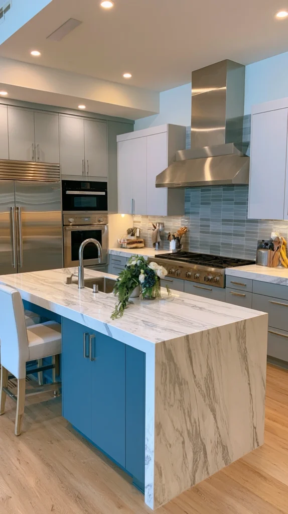
The slate blue and light grey two-toned kitchen is the most sophisticated and most restrained of the darker lower cabinet approaches.
Slate blue, sitting between grey and blue with a slight green undertone in many versions, is a colour of genuine complexity that changes significantly in different light conditions. In morning light it reads as clearly blue. In evening lamplight it deepens toward grey-blue. This mutability is part of what makes it beautiful.
Against light grey upper cabinets, which sit in the same cool tonal range as the slate blue, the combination is tonal rather than high-contrast. The upper and lower cabinets are clearly different but clearly related. The kitchen reads as a cohesive composition in a cool, sophisticated palette rather than as two strongly contrasting elements.
This combination suits the contemporary kitchen that wants depth and sophistication without the warmth or the country associations that greens, navies, and terracottas carry. It is the kitchen for the person whose aesthetic is specifically cool and specific.
9. Black Lowers With White Uppers for Maximum Contrast
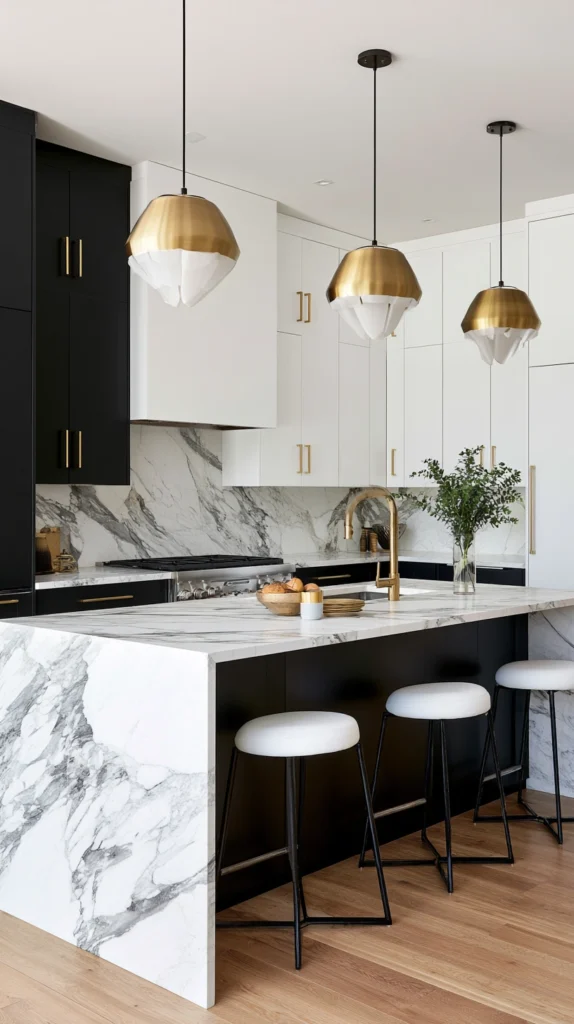
The black and white two-toned kitchen is the most graphic and most dramatically contrasting version of the lower-darker, upper-lighter approach.
Pure black, or very near-black in a charcoal that reads as black in most light conditions, against white upper cabinets creates the maximum tonal contrast available in any two-toned kitchen. The kitchen is vivid, graphic, and immediately confident in a way that no softer combination can match.
This is the kitchen for the person who wants the kitchen to make a statement that is unmistakable. There is no ambiguity in the black and white kitchen. The decision has been made absolutely and the room exists completely within it.
Black lower cabinets in a Shaker style with simple bar handles in brushed brass or matte black. White upper cabinets in the same Shaker profile. A white marble countertop with dark grey veining that connects the black of the lower cabinets to the white of the uppers. The result is a kitchen of extraordinary graphic precision.
10. Warm Taupe Lowers With Off-White Uppers
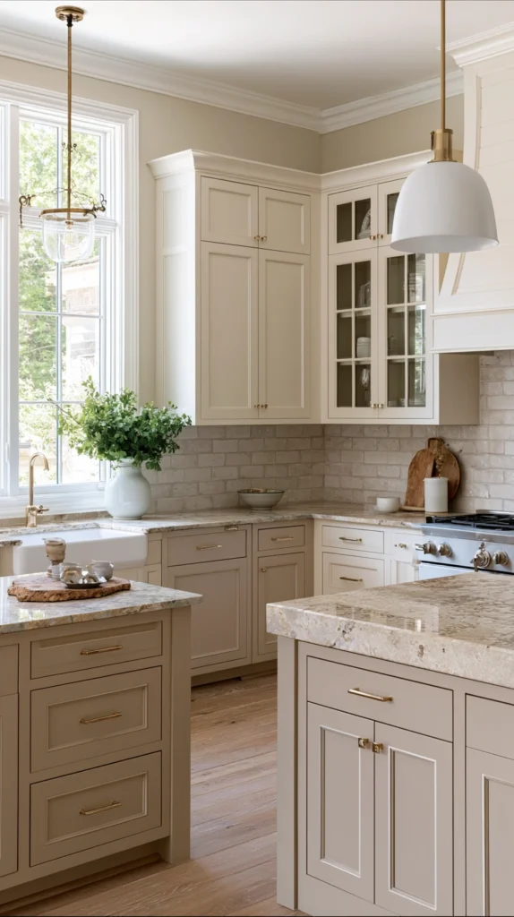
The most accessible and most universally liveable two-toned kitchen is the one that uses tonal variation within a warm neutral palette rather than colour contrast between distinct hues.
Warm taupe lower cabinets, in the grey-beige-brown family with a warm, slightly pink undertone, against off-white upper cabinets in a complementary warm tone create a kitchen that reads as two-toned without the definitive colour commitment that darker lower cabinet choices require.
This is the two-toned approach for the person who wants the visual sophistication of the differentiated kitchen without the bold colour commitment. The kitchen reads as designed rather than as a statement. It suits a wider range of countertop materials and floor colours than more vivid combinations. It ages well and suits most property types and buyer sensibilities for resale.
The taupe and off-white combination also makes the most of natural light in a way that darker combinations cannot. In a kitchen with good natural light the pale, warm tones glow and the tonal difference between the upper and lower units is clear without any dramatic contrast.
11. A Painted Island With Timber Surround in a White Kitchen
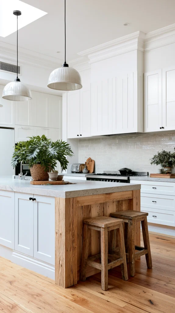
The all-white kitchen with a timber island is a different expression of the two-toned principle where the contrast is in material rather than colour.
A white perimeter kitchen with an island in natural timber, or with the island’s base in natural timber while the countertop matches the perimeter’s colour, introduces warmth through material contrast rather than through paint colour contrast.
The timber island in a white kitchen reads as warm, natural, and genuinely domestic in a way that a painted island in the same colour as the perimeter cabinets does not. The material change is the design decision.
This combination is specifically appropriate for the kitchen that wants warmth but is uncertain about committing to a colour on the lower cabinets. The timber island allows the warmth to be concentrated and contained in the kitchen’s focal piece while the perimeter remains in the white or near-white that the owner feels most confident with.
12. Terracotta Island in a Cream Perimeter Kitchen
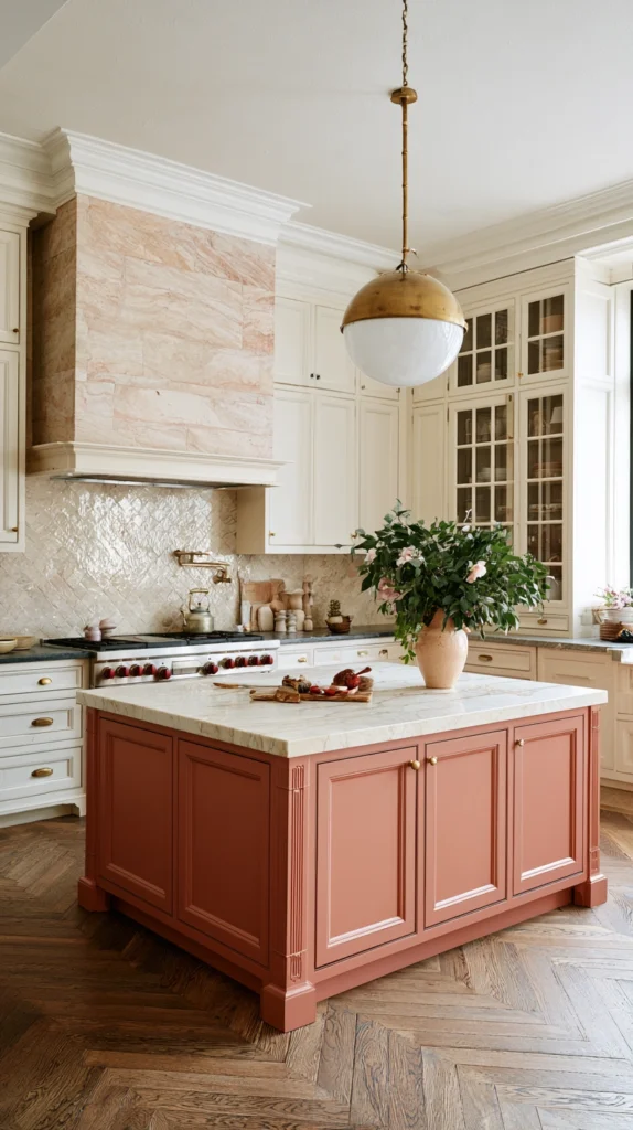
The terracotta island within a cream perimeter kitchen is the two-toned approach that creates the most warmly Mediterranean and most domestic feeling kitchen available.
The cream perimeter is warm, generous, and slightly old-fashioned in the best sense. The terracotta island within it is the specific, warm accent that gives the cream kitchen a focal point and a visual event.
This combination suits the kitchen that wants to feel genuinely domestic rather than professionally designed. The cream and terracotta palette belongs to kitchens where things are cooked seriously and where the room is used as a gathering place rather than as an architectural showpiece.
13. Midnight Blue Uppers With Warm White Lowers
The conventional two-toned formula, darker lower and lighter upper, has a reversal that produces a completely different effect.
Midnight blue upper cabinets against warm white lower cabinets creates a kitchen with a dramatic overhead presence and a grounded, light base. The eye goes immediately to the dark upper cabinets, which read as a defined ceiling to the kitchen’s upper zone rather than as the transparent or recessive zone that lighter upper cabinets create.
This reversal suits the kitchen where the upper zone has significant architectural interest, interesting cornice details, high ceilings, or significant glass frontage that rewards being highlighted rather than receded. The dark upper cabinets make the most of these architectural qualities.
It also suits the kitchen where the worktop and lower zone should feel as light and as open as possible, where the counter area benefits from maximum brightness and the overhead storage is secondary in the kitchen’s use pattern.
14. Dark Larder Cabinet as a Feature Piece in a White Kitchen
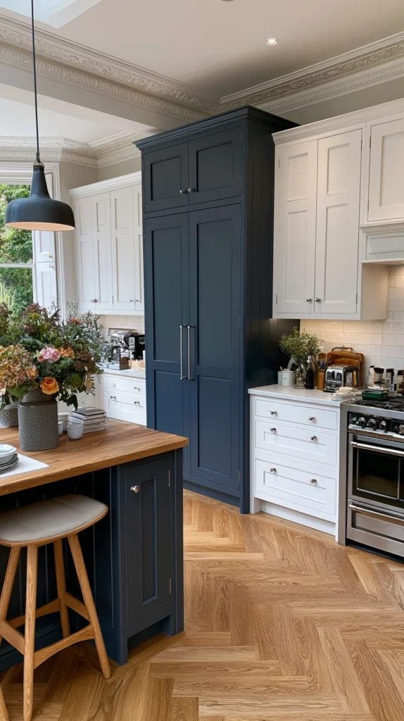
The feature larder cabinet in a contrasting colour within an otherwise single-colour kitchen is the two-toned approach that most specifically creates a designed focal point with the minimum of commitment.
A white or cream kitchen with one larder cabinet or pantry unit in a dark contrasting colour, navy, forest green, or charcoal, creates a visual focal point that the eye goes to immediately. The larder is the most architecturally significant element of many fitted kitchens, the tallest unit, the one that reaches floor to ceiling with the most visual presence.
Emphasising the larder through colour makes the most natural design decision the room’s most explicit design decision. The most prominent element is highlighted. The rest is context.
This approach also allows the kitchen to be refreshed with a different focal colour at a lower cost than repainting all lower cabinets. The single unit painted in a new colour creates an entirely different kitchen character.
15. Coordinated Tones Rather Than Contrasting Colours
The most sophisticated two-toned kitchen in the complete sense is not the one with the highest contrast between its two tones.
It is the one where the two tones are clearly differentiated but clearly related. Where one tone is the deeper, more prominent version of a shared colour family and the other is the lighter, more recessive version of the same family.
Dusty blue lower cabinets with powder blue upper cabinets. Deep sage lower cabinets with pale sage uppers. Warm charcoal lower cabinets with pale grey uppers. The tonal variation within the same colour family creates the visual hierarchy of the two-toned kitchen without the drama of high contrast.
This approach is the one that most easily accommodates uncertainty about bold colour choices. The person who loves the sage green kitchen but is uncertain about forest green can use pale sage uppers with a slightly deeper sage lower and achieve the two-toned visual structure while staying within a comfortable, gentle palette.
The coordinated two-toned kitchen also resolves the practical concern about the kitchen looking dated. Related tones within a conservative colour family date more slowly than high-contrast combinations of vivid and pale. The kitchen is in the style of the moment without being so specifically of the moment that it looks wrong five years later.
How to Choose Your Two-Toned Combination
The decision between two-toned combinations begins with the lower cabinet colour, which carries the most visual weight and creates the kitchen’s primary colour identity.
The lower cabinet colour should relate to the kitchen’s context. The materials in the room, the flooring, the countertop, the splashback, all inform the right lower cabinet colour. A warm timber floor and a warm marble countertop wants a warm lower cabinet colour. A cool slate floor and a pale quartzite countertop wants a cooler lower cabinet tone.
The upper cabinet colour should be chosen to complement rather than to compete with the lower. In most cases the upper is lighter than the lower, providing the visual relief that allows the kitchen to feel open above the worktop line. The specific relationship between upper and lower, high contrast or low, determines the kitchen’s character more than the specific colours.
Test both colours in the actual kitchen before committing. Paint large swatches of both colours on the actual surfaces and observe them through a full day of the kitchen’s normal light. The morning light. The afternoon light. The artificial light of the evening cooking hour.
Common Mistakes in Two-Toned Kitchen Cabinet Design
Choosing two colours that fight rather than complement. A warm-toned lower cabinet against a cool-toned upper creates a visual conflict rather than a designed contrast. Both tones should be in the same temperature range or one should be clearly neutral.
Getting the hardware finish wrong. The hardware connects the upper and lower cabinets visually even when they are different colours. Inconsistent hardware finishes, matte black on one and polished chrome on the other, create a disjointed quality. Consistent hardware throughout provides visual continuity across the colour difference.
Not considering the countertop. The countertop sits at the junction of the upper and lower cabinets and its colour must work with both. A countertop that suits the lower but conflicts with the upper is a countertop that undermines the two-toned design.
Using two very similar tones. Two tones that are too close in value create a kitchen that reads as though the paint did not quite match rather than as a deliberate two-toned design. The differentiation must be clear enough to read as intentional from across the room.
Painting the wrong cabinets the bold colour. Dark upper and light lower is a valid design choice but it is a more demanding one than dark lower and light upper. The heavier visual weight overhead makes the kitchen feel lower and more enclosed. For most kitchens, the darker colour below and the lighter colour above is the approach with the greatest margin for success.
Quick Summary
- Navy lower with white upper is the foundational two-toned combination that established the formula and still delivers reliably
- Forest green lower with cream upper creates a warm, organic kitchen that reads as both contemporary and traditionally rooted
- Dark lower cabinets with glass-front upper cabinets create a material and transparency contrast alongside the colour contrast
- Charcoal lower with natural oak upper adds a material dimension to the colour contrast by combining paint and real timber
- Terracotta lower with white upper brings Mediterranean warmth and domesticity to the two-toned formula
- A contrasting island in a sea of neutral perimeter cabinets is the highest-impact single two-toned decision for a kitchen with an island
- Sage lower with warm white upper creates the gentlest and most universally liveable version of the green kitchen
- Slate blue lower with light grey upper is the most sophisticated and most tonal approach for a cool-palette kitchen
- Black lower with white upper creates the most graphic and most dramatically contrasting two-toned kitchen available
- Warm taupe lower with off-white upper achieves the two-toned design hierarchy within a warm neutral palette with no bold colour commitment
- A timber island in a white perimeter kitchen uses material contrast rather than colour contrast as the two-toned differentiator
- A terracotta island in a cream perimeter kitchen concentrates the warm accent in the kitchen’s focal piece
- Dark upper with warm white lower reverses the conventional formula to create dramatic overhead presence and a light, open base zone
- A single dark larder cabinet in an otherwise single-colour kitchen is the minimum commitment two-toned approach with maximum focal impact
- Coordinated tones within the same colour family rather than high contrast between different colours is the most sophisticated two-toned approach
The two-toned kitchen is not a decorating trick.
It is the application of visual hierarchy to the room’s most architecturally complex space.
The upper cabinets play a different visual role from the lower ones. The island plays a different role from the perimeter. The larder plays a different role from the base units. Acknowledging these different roles through colour is not complicating the kitchen. It is clarifying it.
The kitchen with a clear visual hierarchy, one where the eye knows where to look and why, looks more designed than any single-colour kitchen however precisely its one colour was chosen.
Two tones. Clear differentiation. The right hardware. That is the designer kitchen.
It was always that simple.