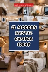
13 Blue Camper Interior Ideas That Feel Bright and Airy
Blue is one of the few colors that genuinely expands a small space rather than closing it in — but only when it’s handled correctly. The wrong blue in a camper reads as cold, nautical in a clichéd way, or simply dark.
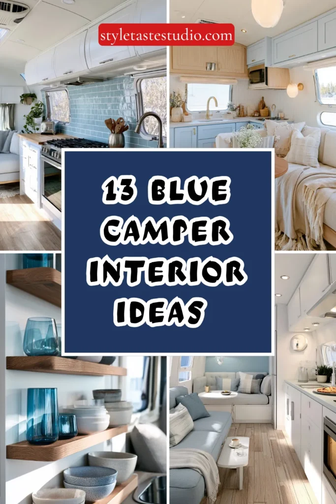
The right blue, paired with the right materials and light sources, makes a 200 square foot camper feel like it has twice the breathing room. These ideas focus on specific shades, material pairings, and practical applications that deliver that bright, airy quality across every area of the camper.
1. Paint One Wall in Soft Cerulean and Leave the Rest White
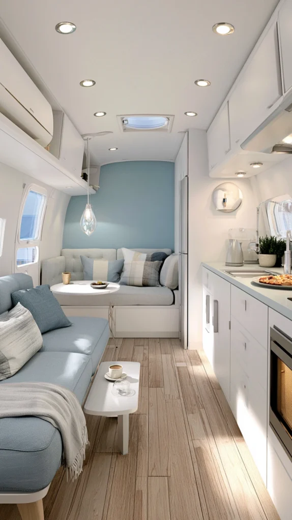
The instinct in a small space is often to keep everything neutral, but a single wall in a considered blue shade can actually make the overall space feel larger by creating depth. The key is choosing the right blue — soft cerulean, sometimes listed as “sky blue” or “powder blue” on paint chips, sits in the range between too-pale-to-register and too-saturated-to-live-with.
Benjamin Moore’s Breath of Fresh Air (OC-24) and Sherwin-Williams Atmospheric (SW 6505) are two of the most consistently recommended options for small spaces because they stay true to a warm sky tone rather than shifting green or gray under artificial light. Apply to the wall behind the bed or the main seating area — the wall you face most often when relaxing. Keep all remaining walls a clean warm white rather than a stark cool white, which would make the blue read colder than it is.
For camper walls specifically, use a peel-and-stick paint or a satin-finish latex with a primer coat. Camper walls often have a slight texture from factory finishing that benefits from primer to prevent uneven absorption and blotchy color.
Tip: Test the paint on a 12×12-inch section of the actual wall and observe it at three different times — morning natural light, afternoon light, and evening with interior lighting on. Blues shift more dramatically than most colors across different light conditions.
Budget: $25–$60
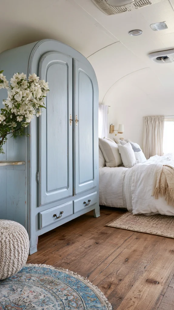
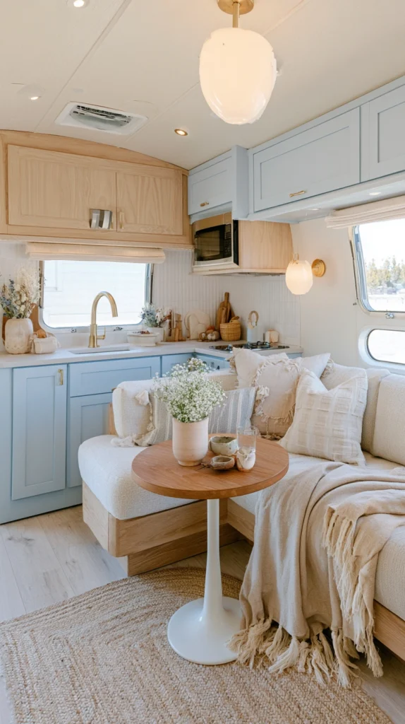
2. Use Navy as an Anchor Color in Small, Intentional Doses
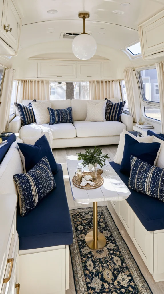
Navy blue is a completely different animal from sky or cerulean blue — it’s deep, grounding, and can easily tip a small space into feeling enclosed if overused. Used in small doses against a mostly light interior, though, it creates exactly the kind of contrast that makes an airy palette feel sophisticated rather than washed out.
The best places for navy in a camper are throw pillow covers, a single upholstered bench cushion, a small area rug, or window valances. These are all replaceable, moveable, and visually bounded — navy appears as an accent rather than a dominant tone. Pair it with warm white, natural linen, and brass or rattan hardware to prevent the navy from reading as cold or overly formal.
Avoid navy on large fixed surfaces — walls, cabinetry, or countertops — unless the camper has exceptional natural light from multiple large windows. In average camper lighting, navy on a large surface will absorb more light than it reflects and work against the airy quality you’re building toward.
Tip: A navy and white stripe pattern reads as fresh and graphic rather than heavy — striped navy throw pillows or a striped runner rug introduce the color with built-in visual lightness that solid navy doesn’t provide.
Budget: $30–$80 for accent pieces
3. Install Light Blue Subway Tile Peel-and-Stick Backsplash in the Kitchen
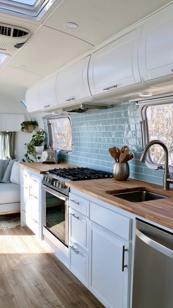
The camper kitchen is typically the zone with the least visual personality — flat cabinet faces, a builder-grade countertop, and nothing on the walls. A peel-and-stick backsplash in a pale blue subway tile pattern addresses all of that in an afternoon without permanent modification.
Smart Tiles and Aspect are the two most reliable peel-and-stick tile brands for RV and camper use. Both manufacture products specifically designed to handle the moisture and temperature variation of small kitchens, and both offer adhesive backing that removes cleanly without damaging surfaces underneath. Look for their pale blue or glass-look blue colorways — these reflect light back into the kitchen rather than absorbing it the way darker tiles would.
A standard camper kitchen backsplash area runs roughly 18–24 inches tall and 36–48 inches wide, which translates to approximately 4–6 square feet. Smart Tiles sell in panels of about 10×10 inches, so a kitchen project typically requires 8–12 panels. Cut with scissors for straight edges and a craft knife for curves around outlets.
Tip: Wipe the existing wall surface with isopropyl alcohol and allow to fully dry before applying. Even slight grease residue from cooking — which accumulates quickly on camper kitchen walls — will prevent proper adhesion at the edges.
Budget: $35–$75
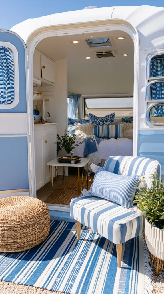
4. Layer Blue and White Textiles for a Coastal Without the Clichés
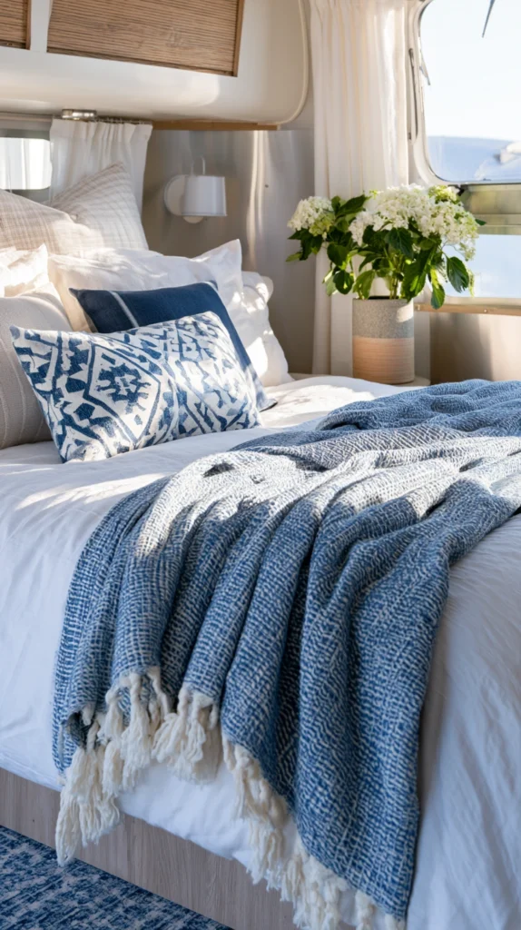
Blue and white textile combinations have a long history of reading as coastal or nautical — and in many camper interiors they tip into anchor-print and rope-knot territory that feels more like a themed hotel room than a personal space. The way to use this pairing without the clichés is to focus on texture and pattern scale rather than motif.
Start with solid white bedding as the foundation — a white cotton duvet cover or a white linen quilt as the base layer. Add a blue throw blanket in a chunky knit or waffle weave texture across the foot of the bed. Then bring in a single patterned pillow in a blue-and-white geometric or abstract print rather than anything representational. This builds the color story through texture and shape rather than nautical symbols.
For the seating area, a white slipcover on a bench cushion with one or two blue pillow covers maintains the same palette logic. The discipline here is limiting pattern to one surface — either the bedding or the seating, not both.
Tip: Linen-cotton blend textiles in white and blue age better in a camper than pure cotton — they wrinkle less with travel, soften with washing rather than becoming stiff, and hold their color through repeated washing more reliably.
Budget: $45–$130
5. Replace Cabinet Faces with Pale Blue Shiplap or Beadboard Panels
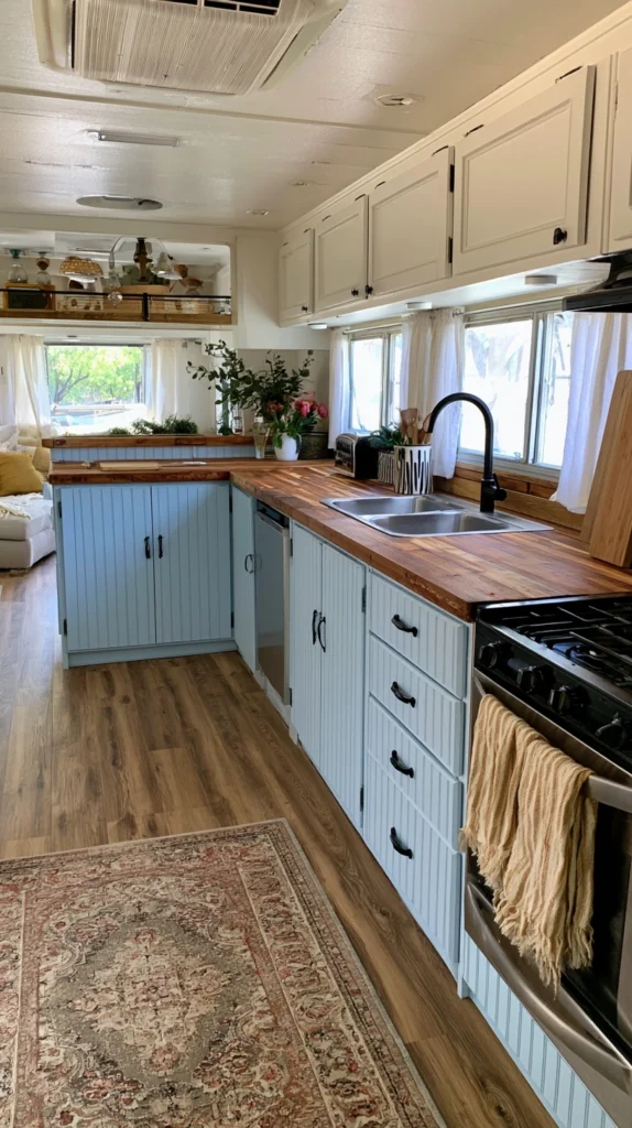
Cabinet doors in most production campers are flat MDF faces with minimal visual interest. Replacing them with shiplap-style or beadboard panels painted in a pale, muted blue creates a cottage or farmhouse quality that feels intentionally designed rather than factory-produced.
This is a more involved project than most on this list but still within reach for a weekend. Remove existing cabinet doors, measure each face, and cut 1/4-inch MDF shiplap or beadboard panels to match. Paint with two coats of a pale blue — Farrow & Ball’s Borrowed Light or Behr’s Rainfall are good references for the right tone — before reinstalling using the original hinges and hardware holes. The result looks fully custom despite using inexpensive materials.
If full cabinet replacement feels like too large a commitment, apply the same beadboard panel treatment only to the lower cabinet doors and leave upper cabinets in their original finish or repainted white. The visual contrast between lower blue cabinets and upper white cabinets is a detail common in high-end kitchen design and translates well to camper scale.
Tip: Use a satin or semi-gloss finish on cabinet panels rather than matte — cabinetry in a camper kitchen takes regular wiping down, and matte paint shows grease and cleaning marks far more readily than a reflective finish.
Budget: $60–$150
6. Hang Sheer Blue or White Curtains to Diffuse Light Without Blocking It
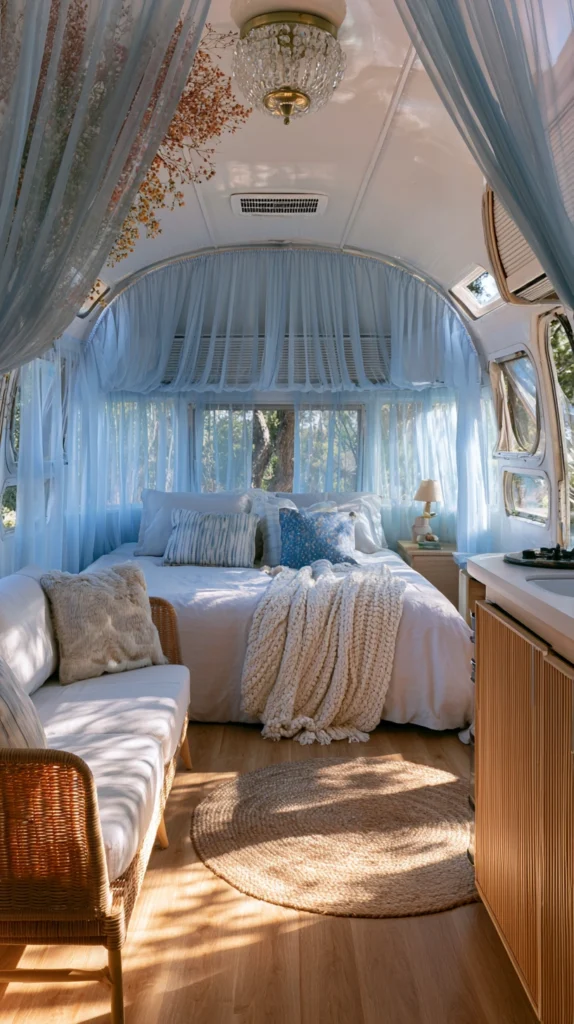
The curtain choice in a camper has a disproportionate effect on how bright and airy the space feels. Heavy curtains block light entirely when drawn, which kills the atmosphere. But going without any curtains leaves the space feeling exposed and unfinished. The solution is sheer or semi-sheer curtains that diffuse light rather than stopping it.
A pale blue sheer panel — the kind typically sold for bedroom windows with a white or light blue voile fabric — filters direct sunlight into a soft scattered glow that makes the interior feel larger and more luminous. During the day, they can be drawn fully without significantly dimming the space. During evenings, pair them with a simple roller shade behind for privacy when needed.
For camper window installation without permanent hardware, use a spring tension rod inside the window frame (for windows with sufficient depth) or a slim aluminum curtain rod mounted with Command strips above the frame. Both approaches avoid drilling and can be repositioned if the curtain placement isn’t right.
Tip: Buy curtains 20–30% longer than the window height and let them pool slightly on the floor or fold at the sill. This technique — common in interior design — makes ceilings feel taller and windows feel larger than they actually are.
Budget: $20–$60 per window
7. Choose a Blue and White Geometric Rug for the Main Floor Area
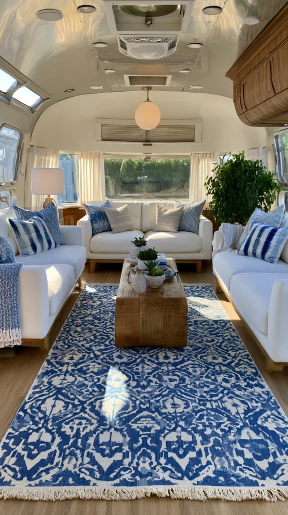
The floor is the largest single surface in most campers and often the most visually neutral — which is both an opportunity and a risk. A rug in a blue and white geometric pattern introduces the color palette at floor level where it grounds the space without competing with the walls and ceiling.
Geometric patterns in blue and white — diamond grids, simple stripes, Moroccan-influenced lattice, or abstract block prints — work better in a modern airy camper than organic or representational patterns because they read as graphic and contemporary. Look for low-pile or flat-weave construction (dhurrie or kilim style) which lies flat without bunching, cleans easily, and doesn’t add visual weight the way a plush rug does.
For sizing, a 3×5 or 4×6 rug placed in the main living area — not extending into the kitchen or bedroom — is typically proportional to a standard camper layout. A rug that’s too small floats awkwardly on the floor; one that fills the entire living zone can make the space feel busier rather than more defined.
Tip: Use a thin felt rug pad underneath on vinyl or hardwood camper floors. It prevents shifting during travel, protects the floor surface, and adds a small amount of cushion underfoot that flat-weave rugs lack on their own.
Budget: $35–$110
8. Add Blue Glassware and Ceramics as Open Shelf Accents
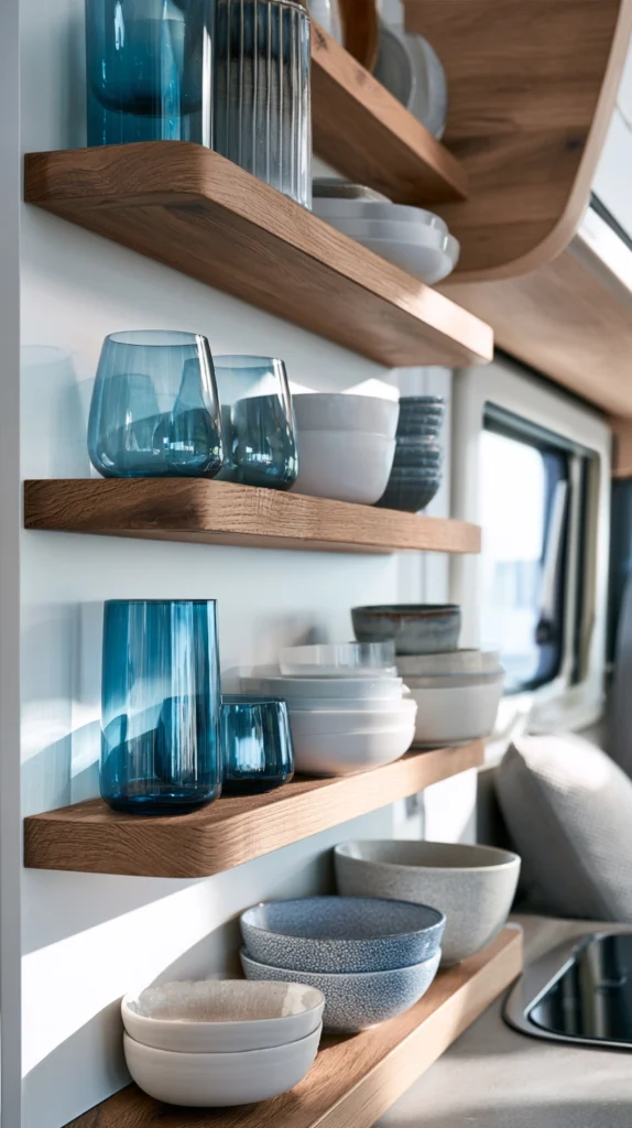
Open shelving in a camper kitchen or living area creates a styling opportunity that closed cabinets don’t — the objects on the shelf become part of the visual design. Blue glass and ceramic pieces catch and scatter light in a way that opaque objects don’t, adding to the airy quality of the palette while also functioning as everyday objects.
Cobalt blue glassware — drinking glasses, a small vase, a pitcher — placed on an open shelf or along a windowsill creates concentrated spots of jewel-toned color that read as intentional and collected rather than decorated. Pair them with white ceramic mugs and natural wood cutting boards to maintain the material balance. The goal is a shelf that looks like it holds things you actually use, not a shelf that looks staged.
Sea glass-inspired pieces in pale aqua or dusty teal work for a softer effect than cobalt. These are more muted and blend more easily with a pale blue palette throughout the space — cobalt is more graphic and works better against white or natural wood backgrounds where the contrast registers.
Tip: Secure glassware on open shelves with a thin lip rail — a strip of wood or metal approximately 1/2 inch tall glued along the shelf edge. This prevents pieces from sliding off during travel without requiring storage of every item you own.
Budget: $25–$65
9. Paint Existing Furniture Pieces in a Chalky Dusty Blue
If the camper has any freestanding or semi-fixed furniture — a small dresser, a storage cabinet, a bedside table — painting it in a chalky, low-sheen dusty blue creates a vintage-inspired piece that fits directly into a modern airy palette without requiring replacement furniture.
Chalky paint finishes (Rust-Oleum Chalked, Annie Sloan Chalk Paint, or similar) require minimal prep compared to standard paint — light sanding and no primer in most cases — and dry to a soft matte texture that reads as aged and handmade rather than spray-painted. Dusty blue in the chalky spectrum sits between gray-blue and powder blue, which is a more sophisticated and versatile tone than a bright primary blue.
After painting, apply a clear wax or matte topcoat to seal the finish. Without sealing, chalky paint marks and scuffs easily — tolerable for a decorative piece at home but not for camper furniture that moves with every trip. One coat of Rust-Oleum Chalked Matte Top Coat is sufficient for most camper furniture use.
Tip: Distress the painted edges lightly with 220-grit sandpaper after the final coat dries to reveal the wood or original finish underneath. This technique makes the piece look like something found and restored rather than something painted last weekend.
Budget: $15–$45 per piece
10. Use Blue Washi Tape or Peel-and-Stick Wallpaper for Temporary Accent Details
Not every camper occupant owns their unit or wants permanent modifications — and not every modification needs to be permanent to be effective. Blue washi tape and peel-and-stick wallpaper both allow significant visual change with zero permanent commitment.
Washi tape in solid pale blue or a blue-and-white geometric pattern applied in geometric configurations on a white wall — framed rectangles, diagonal grids, chevron arrangements — creates the look of a painted accent detail for under $15. It removes cleanly from most painted and laminate surfaces without leaving residue or damaging the finish underneath.
Peel-and-stick wallpaper goes further — covering a full wall section or the inside of a cabinet in a blue and white botanical, stripe, or geometric print creates a fully finished look that’s reversible. NuWallpaper and RoomMates are two brands that have tested well in camper use for adhesion without damage. Measure carefully and add 10% to your order for pattern matching and cuts.
Tip: Store leftover rolls of peel-and-stick wallpaper for future touch-ups. The adhesive on these products can be reactivated slightly with a damp cloth if edges lift, and having the same pattern available for repair prevents mismatched sections.
Budget: $10–$60
11. Introduce Blue Through Outdoor-Indoor Transitional Pieces
The distinction between indoor and outdoor in a camper is thinner than in a home — people move between the two constantly, and what’s visible through the windows becomes part of the interior palette. Carrying the blue color story into outdoor pieces that sit at the threshold makes the space feel more continuous and intentional.
A blue-and-white striped outdoor cushion on a camp chair just outside the door, a solid dusty blue outdoor throw draped over an awning chair, or a blue melamine dinnerware set used for both indoor meals and outdoor eating extends the palette beyond the four walls of the camper. These pieces are also inherently weather-resistant and easy to clean, which makes them practical for the in-between zone of camper living.
Melamine and enamelware in blue and white are particularly well-suited for this use. Both materials are lightweight, stackable, and visually consistent with the airy blue palette — and both are common enough to be found affordably at Target, World Market, or camping supply retailers like REI and Camping World.
Tip: Dedicate a small wall-mounted or hanging organizer near the camper door specifically for outdoor-to-indoor transitional items. When the blue outdoor cushion, the throw, and the dinnerware have a consistent home, they reinforce the design rather than creating clutter.
Budget: $30–$85
12. Add a Blue Painted Ceiling Detail for an Unexpected Airy Effect
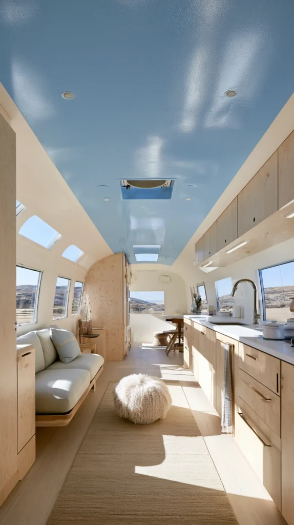
The ceiling is the most underutilized surface in camper design — and painting it a pale sky blue is one of the oldest tricks in residential interior design for making a room feel taller and more open. The effect in a camper is even more pronounced because of the compressed vertical height typical in most units.
A pale blue ceiling — think the color of a slightly hazy sky rather than a vivid clear one — works because it visually recedes upward rather than pressing down the way a white ceiling with warm undertones can. Benjamin Moore Palladian Blue (HC-144) and Sherwin-Williams Misty (SW 6232) are both widely used for this application and sit in exactly the right tone range.
Apply ceiling paint with a small roller in a low-VOC formula — ventilation is limited during application in a camper and standard latex paint fumes accumulate quickly in a small enclosed space. Roll in two thin coats rather than one thick coat, which prevents drips on walls and furniture below.
Tip: Tape off the ceiling carefully where it meets the walls and run a thin line of the same ceiling blue approximately 2–3 inches down the wall before transitioning to white. This technique — called “sky washing” — blurs the ceiling-to-wall boundary and makes the ceiling appear even taller and more expansive.
Budget: $20–$50
13. Combine All Blue Elements with Warm Whites and Natural Materials to Prevent a Cold Result
This is less a single idea and more the governing principle that determines whether a blue camper interior feels bright and airy or cold and institutional. Blue, used without warm counterbalancing materials, drifts toward the latter — especially in a camper where natural light is limited and windows are small.
The warm white on surrounding walls and trim should have a slight cream or yellow undertone — not a stark cool white, which would amplify the blue’s cooler temperature. Benjamin Moore White Dove (OC-17) and Sherwin-Williams Alabaster (SW 7008) are two of the most reliable warm whites that pair well with a range of blue tones without looking yellow in daylight.
Natural materials play an equally important role: rattan, jute, light pine wood, linen, and natural cotton all carry warm undertones that prevent blue from dominating the temperature of the space. A camper that combines pale blue walls, warm white trim, a jute rug, natural wood shelves, and linen textiles doesn’t feel cold — it feels like the inside of a very good beach house, which is exactly the quality a bright and airy blue camper should aim for.
Tip: When in doubt, add warmth through lighting before adding more material. A lamp with a 2700K bulb in a blue-accented space does more to prevent a cold read than any additional textile or wood accent, and it’s adjustable in a way that painted walls are not.
Budget: $0 — this is a decision, not a purchase
Final Thoughts
Blue is one of the most rewarding palettes to work with in a small camper space — but it rewards intention more than volume. The difference between a blue camper that feels bright and airy and one that feels cold and cramped almost always comes down to shade selection, the warmth of surrounding neutrals, and how much natural light the space gets.
Start with the largest surfaces first — a wall, the ceiling, or the floor — and build the smaller details around what you see. Blue works best in a supporting role as much as a starring one, and the campers that pull this palette off most successfully are usually the ones where you feel the lightness before you consciously notice the color.