
15 Black and Cream Decor Ideas That Feel Timeless and Elegant
Black and cream is the colour combination that never arrives and never leaves.
It is not a trend. It has not had a moment, peaked, and retreated to the embarrassing archive of dated choices that date other colour schemes. Every decade produces rooms in black and cream that look right for their time and right for every subsequent time that comes after.
This is because black and cream are not really colours in the conventional sense. They are the absence of colour and the presence of all colour simultaneously, combined in a way that creates contrast without conflict, drama without aggression, elegance without coldness.

The room that is black and cream well is a room that looks designed without looking decorated. Considered without looking laboured. Beautiful in a way that does not depend on any specific aesthetic movement or cultural moment to explain it.
These 15 ideas build that room.
Why Black and Cream Works in a Way That No Other Two-Colour Combination Quite Does
The first reason is contrast.
Black and cream have the largest possible tonal difference of any two colours that still feel warm together. Pure black and pure white create a contrast so stark it feels graphic rather than warm. Black and cream, because cream has warmth in its undertone, create a contrast that is strong without being harsh. The eye reads the difference clearly and immediately. The room has definition.
The second reason is warmth.
Cream is white with warmth added. The yellow, red, and brown undertones in cream make it feel inhabited and organic in a way that pure white does not. Against black, cream glows. It reads as warmer than white against the same dark background because the warmth in its undertone is amplified by the surrounding darkness.
The third reason is versatility.
Black and cream work as a foundation for any style. The specific character of the room, traditional, contemporary, minimalist, maximalist, Scandi, Southern, coastal, dramatic, restrained, is determined by the forms of the furniture, the texture of the materials, the nature of the patterns, and the accessories chosen. The black and cream palette serves all of these directions without asserting a specific identity of its own.
1. A Cream Linen Sofa With Black Accent Pillows
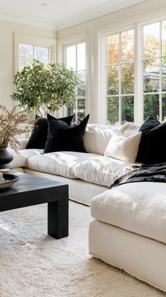
The cream linen sofa is the anchor of the black and cream living room.
It provides the room’s primary seating, its largest single piece of furniture, and the warm element around which the black accents organise themselves. The cream sofa makes the room feel inhabited and soft. The black accents make it feel considered and precise.
The linen fabric is specifically right for the black and cream palette. Its natural, slightly rough texture has the warmth and organic quality that cotton canvas, velvet, and synthetic alternatives lack. The weave of the linen is visible, and the slight variation in the fabric creates a surface that is interesting at close range as well as at the room-spanning distance from which a sofa is usually seen.
Black accent pillows on a cream sofa create the sharpest version of the palette’s essential contrast. A cluster of three black pillows against the cream sofa arm, with two cream pillows at the other end, creates an asymmetric arrangement that is dynamic and balanced simultaneously.
The pillows should vary in texture while maintaining the black and cream palette. A matte cotton black pillow. A velvet black pillow. A cream linen pillow with black embroidery detail. These textural variations within the two-colour constraint create visual complexity without introducing additional colour.
Why a cream linen sofa with black accents is the best living room anchor for this palette:
- Cream linen establishes the warm base from which the black accents create contrast
- The linen texture is warm and organic in a way that specifically suits the black and cream palette
- Black accent pillows create the palette’s essential contrast at the room’s visual centre
- The arrangement can be adjusted seasonally without changing any fixed element of the room
- The cream sofa suits every style from traditional to contemporary within the same colour framework
- Linen improves with age and washing in a way that most sofa upholstery fabrics do not
2. Black Painted Walls With Cream Curtains and Mouldings
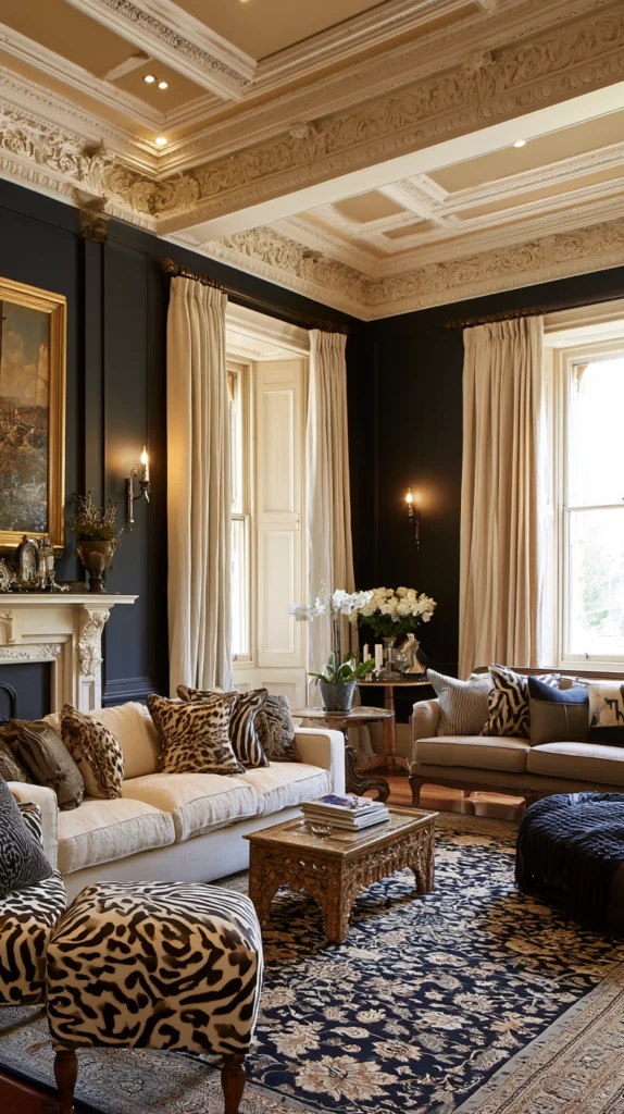
The most dramatic expression of the black and cream palette is the fully painted dark room with cream elements providing the contrast.
Black walls create the envelope. Cream curtains, cream painted mouldings and cornices, cream ceiling, and cream architectural details provide the relief that prevents the room from feeling oppressive and give the eye warm, pale surfaces to rest on within the surrounding darkness.
This is the black and cream room in its most classical and most theatrical form. The panelled library with black-painted walls and cream trim. The formal drawing room with dark walls and pale plasterwork. These are rooms that have existed for centuries in exactly this combination and they look as right today as they did when they were first designed.
The cream elements in a black-walled room should be genuinely cream rather than white. White against black creates a graphic, contemporary contrast. Cream against black creates a warm, rich, specifically traditional contrast that suits the theatrical quality of a room with fully dark walls.
Floor-to-ceiling cream curtains in a heavy linen or silk-effect fabric provide the most generous version of the cream element against black walls. Their height and volume create the warmth and softness that the dark walls cannot provide and the vertical fall of the curtain fabric adds to the room’s sense of height.
3. Black and Cream Geometric Wallpaper
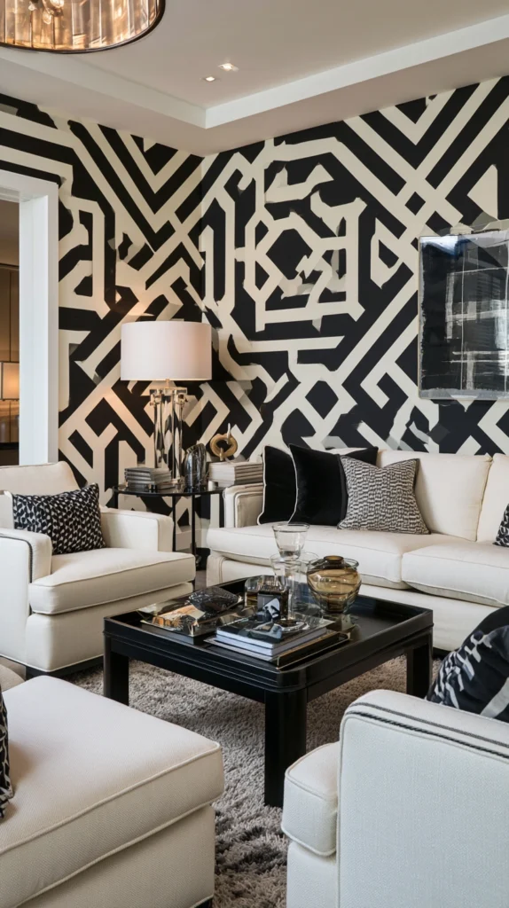
The geometric wallpaper in black and cream is the pattern expression of the palette that is furthest from decoration in the conventional sense.
It is not floral. Not illustrative. Not narrative. It is pure form and contrast. The logic of the geometric pattern, its repetition, its precision, its self-evident mathematical structure, gives the room an intellectual quality that the softer, more organic expressions of the black and cream palette do not have.
A large-scale geometric in black and cream works better in a small room than a large one. In a small room the geometric pattern creates the impression of a much more considered space than the room’s actual dimensions would suggest. The pattern fills the room with visual complexity and the room reads as more interesting than its size.
In a large room the same large-scale geometric can feel overpowering. A smaller-scale geometric repeat or a more restrained pattern suits larger rooms where the geometry does not need to do the work of making the room feel considered all by itself.
The colour balance within the pattern matters. A pattern with equal amounts of black and cream feels graphic and contemporary. A pattern where cream dominates with black accents feels warmer and more traditional. A pattern where black dominates feels more dramatic and more moody.
4. A Black and Cream Stripe in Any Room
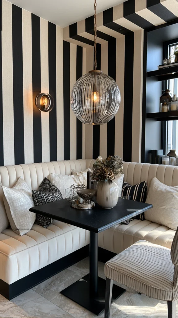
The stripe is the oldest and most enduring pattern application in any room and the black and cream stripe has a specific, specific quality that coloured stripes do not.
It reads as architectural. The vertical stripe on a wall makes the ceiling appear higher. The horizontal stripe on a cushion or rug makes the surface appear wider. The diagonal stripe on the floor makes the room appear to move. These effects are strongest in high-contrast combinations, and black and cream is the highest-contrast warm combination available.
A black and cream striped wallpaper on the walls of a dining room creates a room with immediate formality and presence. The same stripe in fabric on a bench creates a casual elegance that feels both traditional and completely current.
The width of the stripe determines its character. Thin stripes of one to two centimetres in equal widths are delicate and refined. Wide stripes of ten centimetres or more are bold and contemporary. Varying widths, where the black and cream bands are not equal, are more dynamic and more interesting than uniform widths.
The ticking stripe in narrow black on cream, originally the fabric used for mattress covers and pillows, has a specifically domestic and historically rich quality that suits farmhouse and traditional interiors. The bold graphic stripe in equal black and cream widths suits contemporary and Scandinavian interiors. The same colour combination serves different styles through the proportion of the stripe alone.
5. A Black Dining Table With Cream Upholstered Chairs
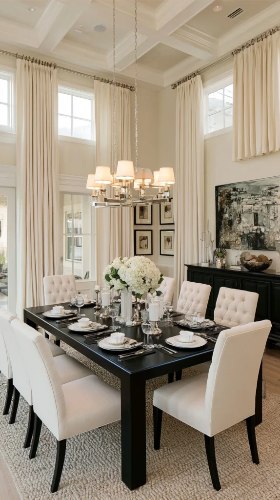
The dining room that combines a black table with cream upholstered chairs is one of the most elegant combinations in any domestic interior.
The black table, whether ebonised wood, lacquered wood, black powder-coated metal, or black granite, provides the graphic, architectural anchor of the room. The cream upholstered chairs, with their fabric covering the seat and ideally the back of each chair, provide the warmth and softness that the black table alone cannot.
The combination works because the two elements serve different functions. The table is a horizontal surface primarily seen from above or at table level when seated. The chair is primarily seen from a standing or seated distance. Together they create a visual composition from above, black table surface, cream chair cushions, that is as beautiful when seen from the doorway as a deliberately composed still life.
The chair fabric should be a warm cream in a texture that handles the wear of dining. A thick linen or linen-look fabric. A velvet that can be brushed clean. A technical fabric in cream tones that resembles a natural textile but handles the inevitable food and drink exposure of a dining chair without staining.
The black table legs and the cream chair fabric create the palette’s essential contrast at floor level. Black lacquered chair legs on a cream chair connect the two elements, each chair becoming a miniature version of the room’s overall palette.
6. Black Bookshelves Against a Cream Wall
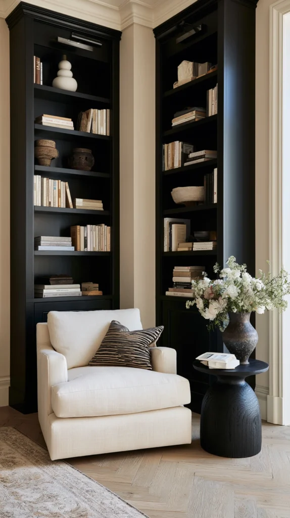
The black bookshelf against a cream wall is the literary room’s version of the black and cream palette applied at maximum visual richness.
Books are already multiple colours. The spines of a collection of books produce an irregular, unpredictable palette of reds, blues, greens, oranges, and neutrals that cannot be controlled in the way that other room accessories can be. Against a cream wall this complexity reads as warm and characterful. Against a black shelf the same books are elevated by the contrast between their varied colours and the dark surface beneath them.
A black bookshelf against a cream wall creates a visual composition where the bookshelf is clearly the design element and the cream wall is clearly the background. The shelf does not disappear into the wall the way a cream shelf on a cream wall does. It is an architectural presence, a composition of dark structure and coloured content.
Books arranged on a black shelf with an occasional cream object, a ceramic, a plant pot, a framed print, provide the relief that prevents the bookshelf from being purely a dense wall of colour. The cream objects against the black shelf maintain the palette’s essential two-colour conversation within the display itself.
7. Cream Walls With Black Architectural Details
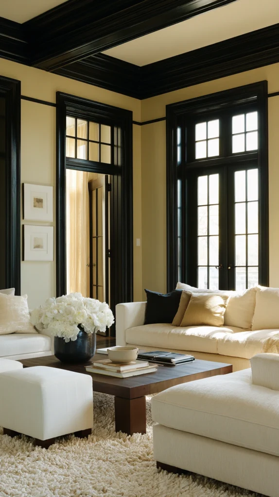
The reverse of the dark wall room is the cream wall room where the architectural details, the mouldings, the cornices, the window architraves, the door frames, are painted in black rather than the conventional white that matches the walls.
This approach produces a room of extremely sophisticated graphic precision. The black architectural details define the room’s structure, emphasising the geometry of the ceiling plane, the framing of each window, the movement from wall to wall through the doorway. The cream walls provide the warm, enveloping surface between these black graphic elements.
The effect is specifically modern in its quality despite the traditional elements it uses. Mouldings and cornices are historical architectural features. Painted black against cream walls rather than white they become contemporary graphic elements as much as historical ones.
This treatment works most powerfully in rooms that have genuine architectural detail. A room with no mouldings and no cornices painted in this way loses the graphic interest that the black detail creates. A room with substantial mouldings and a detailed cornice becomes extraordinary when those details are articulated in black against a warm cream field.
8. A Black and Cream Kitchen in Classic Shaker Style
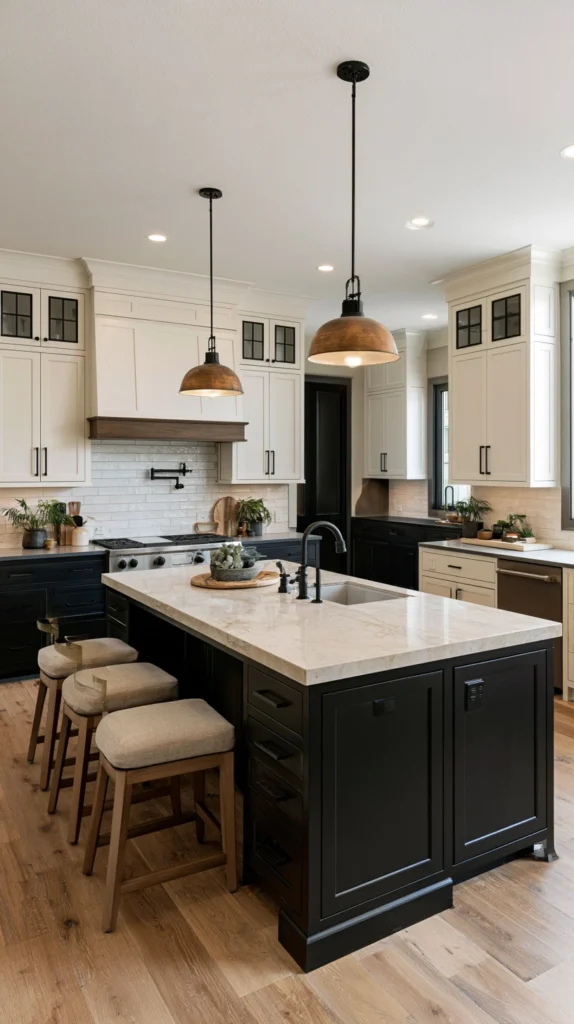
The Shaker kitchen in black and cream is the most enduring kitchen design available. Not because the Shaker style is the only possibility but because the combination of the Shaker door profile, which reduces the cabinet to its most essential form, with the black and cream palette, which reduces the colour to its most essential contrast, produces a kitchen of extraordinary purity.
Black lower cabinets and cream upper cabinets with white marble or cream quartz worktops is the most common version of this combination and one of the most beautiful kitchens available at any price point. The black grounds the kitchen. The cream upper cabinets keep the room feeling light and open. The marble or quartz worktop provides the natural warmth and pattern that neither of the painted surfaces provides.
Reverse the arrangement for a different character. Cream lower cabinets with black upper cabinets is less common and creates a more dramatic, more contemporary kitchen where the upper cabinets create a strong architectural presence overhead.
All-black cabinets with cream walls and cream worktops creates the most dramatic version of the black and cream kitchen. The kitchen is an object in the room rather than a surface applied to the walls. This is the most committed version and the most rewarding one when the commitment is made.
9. Black Hardware Throughout in Consistent Finish
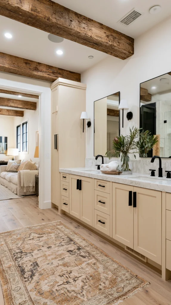
The hardware choice in a black and cream interior does more to determine the room’s final character than any single large element.
Matte black hardware throughout, on cabinet doors, on windows and doors, on light switches and socket covers, on curtain poles and rings, creates a consistent graphic element that appears at every human-scale surface across the whole interior. This consistency produces a room where the black appears deliberately rather than accidentally, at every point where the hand or the eye makes contact with the building’s surfaces.
The matte finish is important. Polished or satin black hardware has a reflective quality that in a cream interior creates a series of small mirror surfaces that complicate the palette rather than reinforcing it. Matte black absorbs light and reads as a consistent flat tone against the cream backgrounds of wall, cabinet, and furniture.
The scale of the hardware should suit the scale of the room. Heavy, substantial hardware in a small room creates a room of overstated precision. Delicate hardware in a large room is lost. Scale the hardware to the room and the furniture it is applied to.
10. A Cream Bedroom With Black Headboard and Side Tables
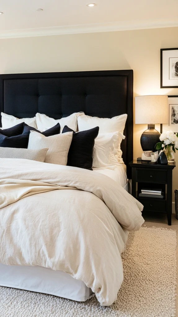
The cream bedroom with black accents creates the most restful version of the black and cream palette in the most restful room in the home.
Cream walls, cream linen bedding, cream curtains, and a cream upholstered bench at the foot of the bed all establish the warm, enveloping quality that is specifically right for a bedroom. The black headboard and black side tables provide the definition and structure that prevent the all-cream bedroom from becoming shapeless and bland.
The black headboard against cream walls creates the same high-contrast focal point that makes the palette work in every other room. The bed is the room’s most important element, and the headboard defines its visual presence. A black headboard against cream walls is visible and architectural rather than merging into the background.
Black side tables with the warm cream of the bed and the walls create small points of graphic precision on either side of the bed. A warm lamp on each black side table casts amber light that flatters the cream palette and creates the warmth of the bedroom environment at its most restful.
The cream bedding should be layered generously. Multiple textures within the cream palette, cream linen duvet, cream waffle blanket, and cream knit throw, provide the warmth and comfort that a bedroom requires while maintaining the palette’s restraint.
11. Black and Cream in Pattern Mix
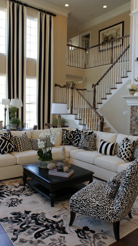
The most sophisticated expression of the black and cream palette combines multiple patterns rather than using a single dominant pattern or no pattern at all.
A black and cream stripe on the curtains. A different black and cream geometric pattern on the cushions. A black and cream botanical print on a single accent chair. These three patterns use only two colours, but in three different scales and three different motifs. The room reads as rich and complex without introducing any additional colour to create that complexity.
The pattern mix in black and cream succeeds because the shared colour palette is the unifying principle that holds disparate patterns together. A floral, a geometric, and a stripe in different colours create a chaotic mix. The same three patterns in the same two colours create a curated conversation between different graphic languages that speak a common vocabulary.
The scale of the patterns should vary. If the curtain stripe is wide, the geometric cushion should be small. If the chair fabric is large in its pattern repeat, the cushion fabric should have a smaller repeat. These scale variations within the colour constraint create the visual rhythm that makes the pattern mix feel composed rather than accumulated.
12. A Black and Cream Bathroom in Classic Style
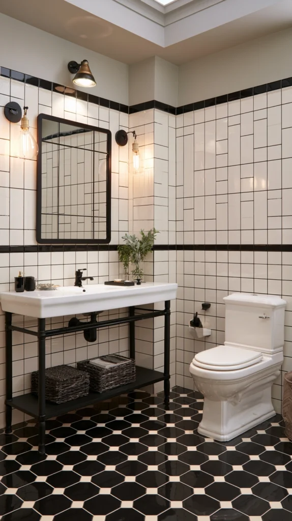
The black and cream bathroom has a specific historical reference that contributes to its enduring quality.
Edwardian and Victorian bathrooms, with their black and white encaustic floor tiles, their white ceramic fixtures, and their black painted ironwork, established the template for the black and cream bathroom before cream was explicitly named as an alternative to white. The tradition of strong tile contrast, warm ceramic, and dark metalwork in a bathroom is so deeply embedded in the history of domestic design that the black and cream bathroom reads as correct in a way that more recent bathroom colour schemes do not.
Black hexagonal floor tiles with cream grout create the most classically beautiful bathroom floor available. The black tile and the cream grout line create the same high-contrast pattern as the encaustic originals while the hexagonal form provides a visual richness that standard square tiles do not.
Cream wall tiles with black grout reverse the dominant colour and apply the same high-contrast logic to the vertical surface. White sanitary ware against cream tiles with black grout and black hardware creates a bathroom of consistent character across every surface.
13. Black and Cream in Textural Contrast
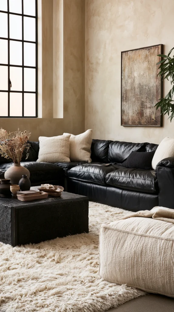
The most restrained version of the black and cream palette uses the two colours in surfaces of dramatically different textures rather than in different patterns or different architectural elements.
Cream walls in a matte, chalky paint finish. A black leather sofa with visible stitching and slight sheen. A cream wool rug with a deep, plush pile. Black cast iron radiators with their painted surface. A cream linen cushion with a raw edge. A black stone coffee table with its natural surface variation.
Each element is either black or cream. None of the elements introduce any additional colour. But the textural difference between the leather and the linen, between the matt paint and the polished stone, between the plush rug and the smooth radiator surface, creates visual complexity that is as rich as any pattern-based approach.
This textural approach to the black and cream palette produces the most tactile room. The eye travels from surface to surface registering the different qualities of each material. The room feels rich through material variation rather than through decoration.
It is also the most timeless version of the palette. Patterns date. Shapes date. Textures, in natural materials particularly, do not date in the same way. The room with cream linen, black leather, and natural stone looks as right in forty years as it does today.
14. A Black and Cream Dining Room With Candlelight
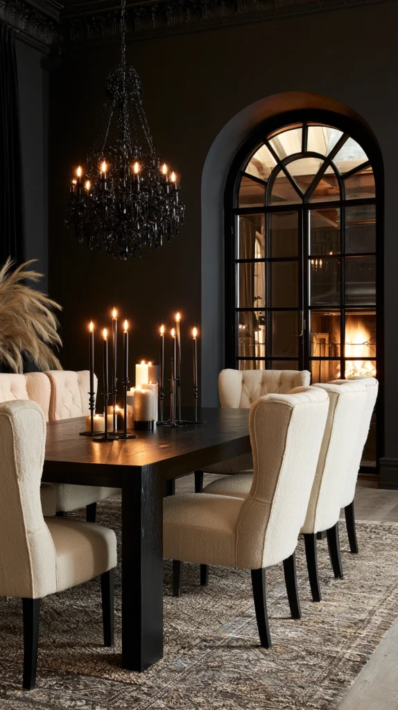
The dining room is the room in which the black and cream palette reaches its most complete and most beautiful expression.
Especially by candlelight.
The black dining room with cream architectural details and cream upholstered chairs is a room that is good in daylight. In candlelight it becomes genuinely extraordinary. The candles on the black dining table cast warm amber light that flatters the cream upholstery, deepens the black surfaces, and creates the specific quality of theatrical intimacy that no other room in the home can achieve at a dinner party.
Black walls absorb ambient light and the candles become the primary light source without competition from the room itself. The faces around the table are lit by the candle light. The cream chair upholstery reflects warm amber light. The black table surface reflects the candles in its own dark depth.
The table setting in this dining room should be simple. White or cream china on the black table surface. Crystal glassware that catches and multiplies the candlelight. Silver or black cutlery that suits both the dark and the pale elements of the room.
The dining room in black and cream at candlelight is the room that guests talk about when they talk about the dinner.
15. Black and Cream as a Continuous Through-Line in an Open Plan Space
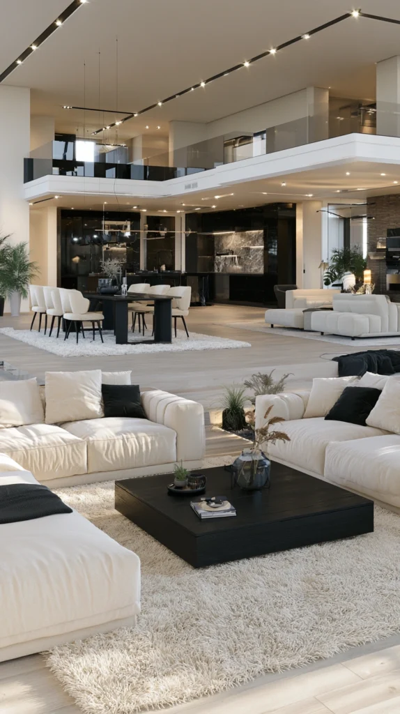
The open plan home, where living, dining, and kitchen areas share a continuous space, presents the specific challenge of making multiple functional zones feel unified rather than simply adjacent.
Black and cream applied as a continuous palette through an open plan space creates the visual unity that makes the zones read as one coherent interior rather than three rooms without walls.
The cream of the living room upholstery connects to the cream of the dining chairs connects to the cream of the kitchen cabinet upper units. The black of the living room coffee table and the fireplace hearth connects to the black of the dining table and the pendant above it connects to the black of the kitchen lower cabinets and the hardware throughout.
The palette moves through the space and the eye follows it. The same two colours, the same two tones, appearing at different scales and in different forms throughout the whole interior, creates the sense of a single designed space rather than an assembled collection of furniture and finishes.
This through-line quality is where the black and cream palette most completely demonstrates the quality that distinguishes it from other colour combinations. It is specific enough to create genuine coherence. It is versatile enough to serve living, dining, and cooking functions equally. And it is timeless enough to remain right across the years that the interior will continue to exist.
How to Balance Black and Cream in Any Room
The balance between black and cream in a room is not a formula but it has useful guidelines.
The dominant colour should cover approximately seventy to eighty percent of the surfaces. The accent colour covers the remaining twenty to thirty percent. In most rooms cream is the dominant colour and black is the accent. This is the warmer and more accessible version of the palette. In rooms where drama and formality are the primary goals, black can be the dominant colour with cream as the relief.
The sixty-thirty-ten rule of colour decoration applies loosely. Sixty percent dominant colour, cream. Thirty percent secondary colour, a warm neutral like natural timber or concrete that sits comfortably between the two without introducing a third colour. Ten percent accent colour, black. This proportion produces a room that feels considered without feeling constrained.
The black elements should be distributed rather than concentrated. A single large black element in a cream room, one black sofa, one black wall, creates a focal point rather than a palette. Multiple smaller black elements distributed across the room, black hardware, black side tables, black lamp bases, create the palette that makes the room feel cohesive rather than accidental.
Common Mistakes in Black and Cream Decor
Using pure white instead of cream. White against black creates graphic contrast. Cream against black creates a warm contrast. The warmth of the cream undertone is the specific quality that distinguishes black and cream from black and white. Never substitute white for cream in a room designed for this palette.
Mixing too many different creams. Different paints, fabrics, and ceramics produce different undertones within the cream family. Yellow cream, pink cream, grey cream, brown cream. These undertones can clash subtly and undermine the cohesion of the palette. Choose one cream undertone direction and maintain it throughout.
Concentrating the black in one area. A cream room with one black sofa has a black sofa, not a black and cream palette. Distribute the black through hardware, lamp bases, side tables, frames, and accessories to create the palette rather than a single accent.
Choosing patterns that date. The black and cream palette is timeless, but some patterns applied to it are not. Trendy geometric patterns, fashionable botanical prints, and specifically contemporary graphic motifs will date the room in a way that the palette itself does not. Choose patterns with genuine historical grounding or genuine geometric purity rather than patterns that are specifically of the moment.
Over-glossing the black elements. High gloss black creates reflections in a cream room that add visual complexity without adding visual warmth. Matte or satin finishes on black painted or lacquered surfaces suit the cream palette better.
Neglecting texture. A black and cream room without textural variation is a room that reads as flat regardless of its colour sophistication. Every surface should contribute a different tactile quality.
Quick Summary
- A cream linen sofa with black accent pillows in varying textures establishes the palette’s essential contrast at the room’s visual centre
- Black painted walls with cream curtains, mouldings, and ceiling creates the most theatrical and classically beautiful expression of the palette
- Black and cream geometric wallpaper creates intellectual, graphic precision that suits rooms of any size with different pattern scales
- A black and cream stripe in varying widths suits everything from farmhouse interiors with fine ticking to contemporary rooms with bold graphic widths
- A black dining table with cream upholstered chairs creates an elegant composition that reads as beautifully from above as from any other angle
- Black bookshelves against a cream wall create a literary room where the book colours read as vibrant against the dark shelf surface
- Cream walls with black architectural details in mouldings, cornices, and frames creates sophisticated graphic precision from traditional architectural elements
- A Shaker kitchen in black lower cabinets and cream upper cabinets with marble worktops is one of the most enduring kitchen designs available
- Consistent matte black hardware throughout ties the palette into every human-scale surface across the whole interior
- A cream bedroom with black headboard and black side tables creates the most restful version of the palette in the most restful room
- Pattern mixing in black and cream with varying scales of stripe, geometric, and botanical creates complex richness without any additional colour
- The classic black and cream bathroom with hexagonal tile floors references the Edwardian and Victorian tradition that established the template
- Textural contrast between leather, linen, stone, and plush in black and cream creates material richness without any pattern
- The black and cream dining room by candlelight is the most complete and most beautiful expression of this palette available in any room
- Black and cream applied as a continuous palette through an open plan space creates visual unity across multiple functional zones
- Cream should dominate at seventy to eighty percent with black distributed in smaller elements throughout rather than concentrated in one location
- Never substitute white for cream and never concentrate all the black in a single piece
Black and cream does not belong to any decade.
It does not belong to any style movement or any design personality or any particular cultural moment.
It belongs to rooms that want to look right permanently.
That is the only condition it requires.
Meet it and the room serves you for as long as you live in it.