
15 Inspiring Bedroom Color Schemes to Transform Your Space
Color has the power to completely reshape how a bedroom feels, from calm and cozy to bold and energizing.
A modern bedroom benefits from thoughtful color choices that support relaxation while reflecting personal style. The right color scheme doesn’t just look good — it influences how well you sleep, how rested you feel on waking, and how much you genuinely enjoy spending time in the room.
Whether you prefer soft neutrals or dramatic contrasts, the right scheme can elevate your space into a refined retreat.

Getting the color right means thinking beyond the walls. Bedding, furniture, flooring, lighting temperature, and natural light all interact with your chosen palette — a color that looks perfect on a paint chip can read completely differently in a north-facing bedroom versus a sun-flooded south-facing one. Always test paint colors in the actual room before committing.
Below are fifteen modern bedroom color schemes designed to inspire a fresh, stylish transformation, each with specific paint guidance, material recommendations, and practical styling notes.
1. Soft White and Warm Beige
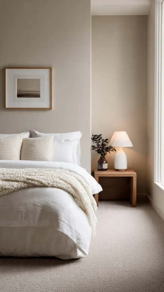
Soft white paired with warm beige creates a serene and timeless bedroom atmosphere that never goes out of style.
This scheme works beautifully in modern interiors where simplicity and comfort are the primary goals. White walls open up the room visually, while beige accents add warmth and depth without overpowering the space.
The key is choosing the right white. A pure, blue-toned white can feel clinical and cold in a bedroom — opt instead for a soft white with warm undertones, such as Benjamin Moore White Dove OC-17 or Farrow & Ball Pointing, both of which read as warm and inviting rather than sterile.
For the beige component, look for tones that sit in the warm sand and linen family rather than yellow-beige or pink-beige territory. Benjamin Moore Pale Oak OC-20 and Farrow & Ball String are both reliable choices that coordinate naturally with warm whites.
Use textured bedding in natural linen or cotton to keep the look inviting rather than stark. A woven jute or wool rug adds tactile warmth underfoot, and light oak or ash furniture in a natural finish completes the material palette without introducing competing color.
Lighting matters enormously in this scheme. Use warm white bulbs at 2700K throughout — cooler bulbs shift white and beige tones toward grey and strip the warmth that makes this combination so appealing.
2. Charcoal Gray and Crisp White
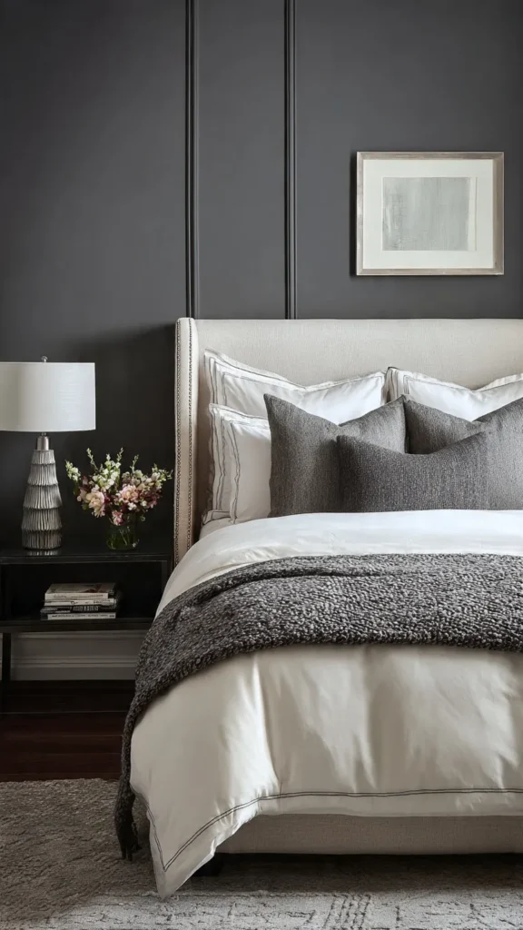
Charcoal gray brings drama and sophistication to a bedroom, especially when balanced with crisp white to prevent the space from feeling heavy.
This modern combination works well in bedrooms with clean lines and minimal décor. The contrast between dark and light is what gives the scheme its energy, and maintaining that contrast clearly — rather than letting it blur into mid-tones — is what keeps it feeling intentional.
Gray walls or an upholstered headboard in charcoal add richness, while white bedding and trim keep the space feeling fresh and well-lit. Farrow & Ball Down Pipe and Benjamin Moore Kendall Charcoal are both deep, sophisticated charcoals that avoid the blue or green cast that some grey paints develop under artificial light.
For the crisp white, use the same white on ceiling, trim, and bedding for a continuous clean contrast. Benjamin Moore Chantilly Lace OC-65 is the benchmark bright white that reads as clean rather than yellow.
Metallic accents in brushed chrome or matte black enhance the contemporary edge without introducing warmth that would soften the scheme’s sharpness.
Add one warm element — a timber side table, a wool throw in a warm neutral — to prevent the room from feeling cold despite its sophistication. This single warm note is the difference between a charcoal bedroom that feels like a luxury hotel and one that feels like an office.
3. Sage Green and Cream
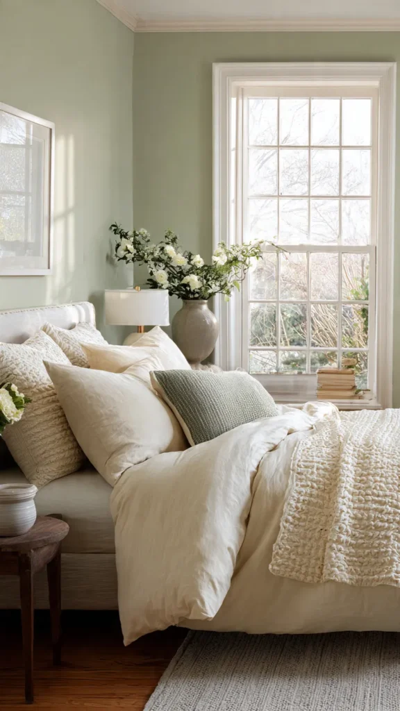
Sage green has become one of the defining bedroom colors of contemporary interior design, and for good reason — its calming, nature-inspired quality makes it one of the most genuinely restful colors available.
When paired with soft cream, it creates a soothing environment ideal for rest. The combination references the colors of the natural world — foliage, stone, soft earth — and brings that sense of calm into the room without any of the coldness that blue-green palettes can introduce.
This color scheme suits minimalist and organic modern designs equally well. It is one of the most versatile bedroom palettes available because it reads as fresh and contemporary while also feeling warm and grounded.
Paint options worth considering include Farrow & Ball Mizzle, Earthborn Sage, and Benjamin Moore November Rain — all of which sit in the muted, grey-green territory that reads as sophisticated sage rather than mint or lime.
Incorporate natural materials to reinforce the tranquil feel — linen cushion covers, an oak bed frame, a stone-look ceramic lamp base, and a wool or cotton rug in oatmeal or warm cream. These materials share the same earthy, natural quality as sage green and create a room that feels genuinely cohesive.
Avoid bright or saturated accessories in this scheme. A single deep olive throw or a terracotta candle is all the accent this palette needs — anything more vibrant pulls the room away from its quietly sophisticated character.
4. Navy Blue and Soft Gray
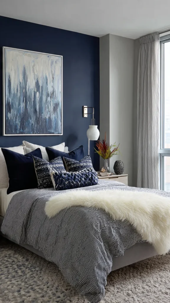
Navy blue offers depth and elegance, making it one of the most powerful choices for a modern bedroom statement wall or full room treatment.
Soft gray balances the intensity of navy, ensuring the room doesn’t feel too dark or enclosed. This is the key pairing principle: navy needs a lighter partner to prevent the room from absorbing too much light, and soft gray provides that balance without the harshness of stark white.
This pairing works well with streamlined furniture and subtle patterns. Navy and gray is a classically sophisticated combination that suits both traditional and contemporary bedrooms — the furniture silhouette and material choices determine which direction the room leans.
For navy, Benjamin Moore Hale Navy HC-154 is one of the most widely used and reliable options — it reads as a true, rich navy without green or purple cast. Farrow & Ball Hague Blue offers a slightly more complex, slightly greener navy that suits rooms with warm natural light.
Add white or light wood accents to maintain visual balance and brightness. A white linen duvet, pale ash nightstands, and simple white or brass lighting fixtures all work well within this scheme and prevent it from becoming visually heavy.
The soft gray component works best on the walls opposite the navy feature wall, on bedding in a soft stripe, or as the dominant floor covering color in a rug. Keep the gray warm rather than cool — a cool gray with navy can tip the room toward feeling cold and unwelcoming.
5. Blush Pink and Light Taupe
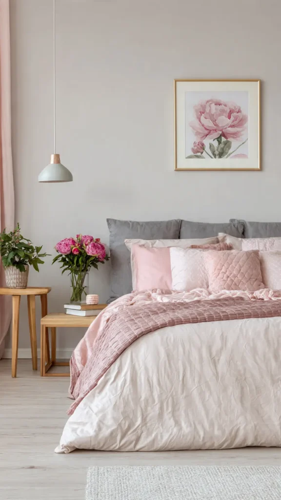
Blush pink brings warmth and softness to a bedroom, while light taupe grounds the look with a reliable neutral base that prevents the scheme from feeling overly sweet.
This combination feels genuinely modern when used in muted, sophisticated tones rather than the candy-bright shades that can make a blush palette look juvenile. The sophistication is entirely in the muting — the blush should sit closer to dusty rose or warm nude than to bubblegum pink.
Farrow & Ball Peignoir is the benchmark muted blush — barely-there pink with a slight grey undertone that reads as warm and refined rather than sweet. Paired with taupe in the Farrow & Ball Elephant’s Breath or Benjamin Moore Revere Pewter family, the combination is quietly luxurious.
Upholstered headboards in blush velvet or textured linen are one of the most effective ways to introduce the blush tone without committing to a pink wall. The upholstery adds tactile interest and warmth that a painted wall achieves less easily.
Matte finishes on walls and furniture hardware keep the design sophisticated and contemporary. Avoid anything glossy in this palette — shine introduces a sweetness that undermines the muted quality the scheme depends on.
Simple pendant lighting in aged brass or warm bronze completes the look and adds a metal accent that suits the warmth of both colors without introducing the sharpness that chrome would bring.
6. Black and Warm Wood Tones
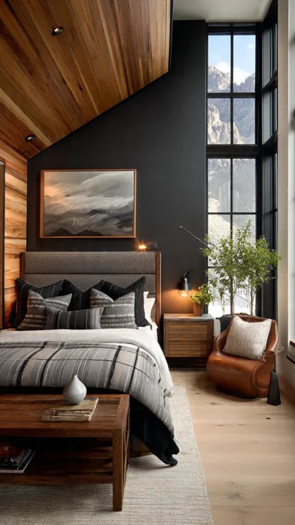
A black and warm wood color scheme creates a bold yet deeply inviting modern bedroom — one of the most striking combinations available when executed with confidence.
Black walls or substantial black accents provide the striking contrast that gives this scheme its drama. Warm wood tones — honey oak, walnut, teak, or ash — prevent the space from feeling cold or oppressive by introducing natural warmth directly alongside the darkness.
This scheme works especially well in urban, industrial-inspired, or contemporary interiors where architectural boldness is valued. It suits bedrooms with good natural light — the daylight bouncing off warm wood surfaces keeps the room from feeling like a cave even with dark walls.
For black walls, Farrow & Ball Railings is a warm, blue-black that reads as deeply sophisticated rather than flat. Benjamin Moore Onyx CC-60 sits slightly warmer and suits rooms with limited natural light where a purely cool black would feel heavy.
Soft lighting is essential in this scheme — warm Edison bulbs, bedside lamps with warm amber glow, and no harsh overhead white lighting. The lighting is what transforms a black bedroom from dramatic to genuinely cosy.
Neutral bedding in warm cream, oatmeal, or soft ivory provides the essential light relief without competing with the boldness of the black. Avoid cool white bedding, which creates a sharp, clinical contrast rather than a warm and inviting one.
7. Dusty Blue and White
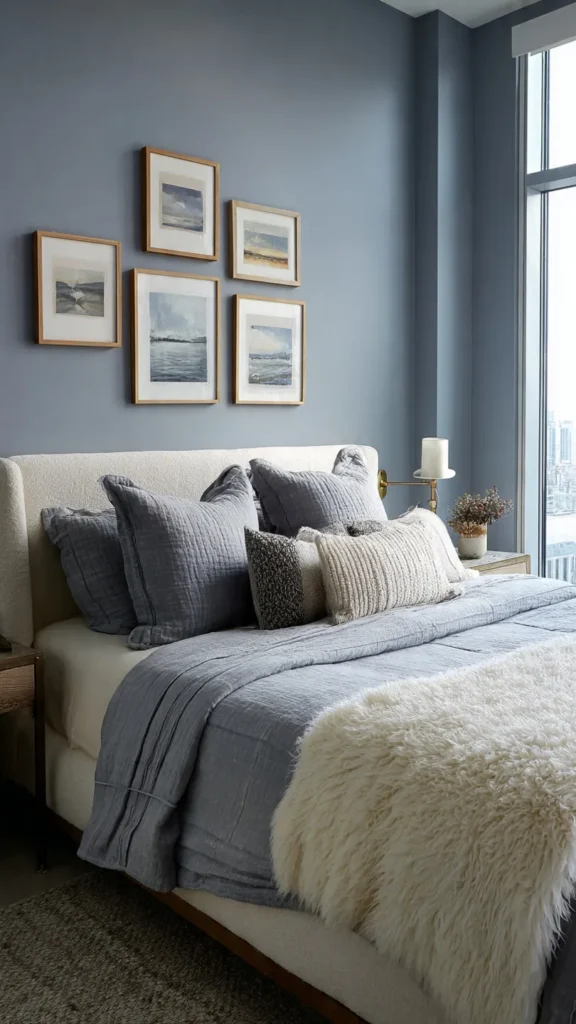
Dusty blue offers a gentle, restful alternative to stronger blues, making it one of the most universally appealing choices for a modern, relaxed bedroom.
Paired with white, it creates a clean and airy atmosphere that works in rooms of almost any size or orientation. Unlike saturated or navy blues, dusty blue retains its softness in rooms with variable light — it doesn’t shift dramatically between morning and evening the way deeper blues can.
This scheme is ideal for smaller rooms, as it reflects light while still adding color and character to the space. The combination of a light blue and white creates the maximum sense of airiness without sacrificing warmth entirely.
Paint choices worth considering include Farrow & Ball Borrowed Light — one of the most loved dusty blues in contemporary design — and Benjamin Moore Iceberg 2122-50, which sits in a similarly soft, grey-blue territory. Both work on all four walls rather than just as a single accent.
Keep furniture streamlined and décor minimal for a cohesive look. Rattan or white-painted furniture suits this palette particularly well, reinforcing the light, airy quality without introducing competing color.
Linen or cotton bedding in white or soft ivory completes the scheme. One or two dusty blue cushions in a slightly deeper tone than the wall add gentle layering without breaking the calm consistency of the palette.
8. Olive Green and Soft Gray
Olive green introduces a rich, earthy quality that feels both modern and deeply grounded — it carries the warmth of nature without the brightness of lime or the coldness of blue-green.
When combined with soft gray, the result is a balanced and sophisticated bedroom design that suits those who want color with genuine depth but without the boldness of a jewel tone.
This scheme pairs beautifully with matte black hardware, natural textiles, and understated artwork. The combination of olive and gray is inherently grown-up and calm — a palette that reads as considered and deliberate from the moment you walk into the room.
For olive, consider Farrow & Ball Chestnut or Benjamin Moore Dried Thyme — both sit in the complex, muted olive territory that reads as sophisticated rather than military. Avoid bright or yellow-dominant olives, which tip the palette toward something more casual than the scheme intends.
The soft gray component grounds the olive and prevents it from dominating. Use gray on surrounding walls with olive on the feature wall, or use gray as the dominant bedding color to balance an olive accent wall.
Matte black hardware on drawer pulls, bedside lamp bases in black ceramic, and dark-framed artwork all reinforce the depth of the palette without adding competing color. Natural textiles — linen, wool, cotton canvas — complete the material story.
9. Warm Terracotta and Cream
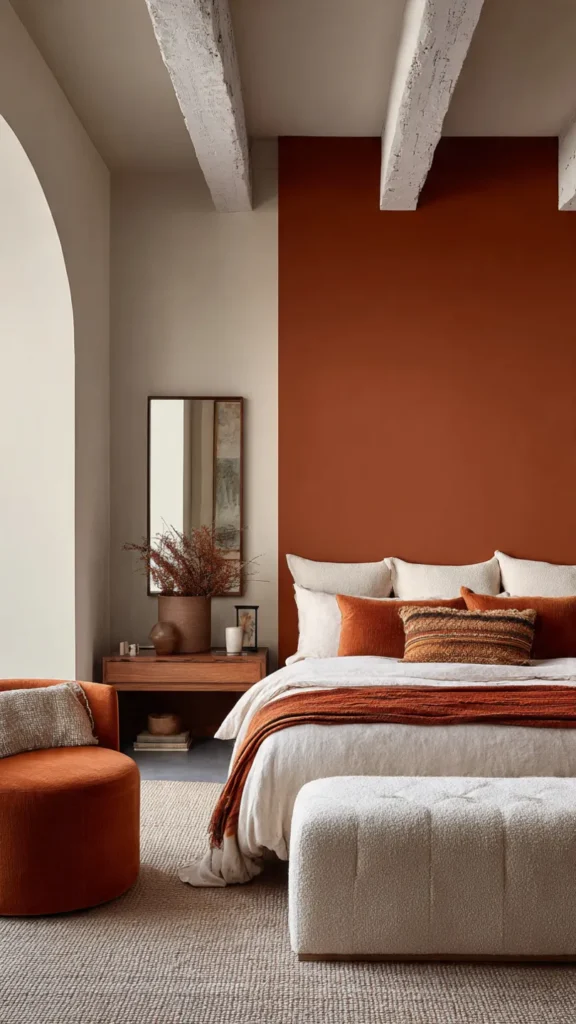
Terracotta adds unmistakable warmth and character to a bedroom, making it feel cozy and sheltered in a way that cooler palettes rarely achieve.
When paired with cream, terracotta maintains a modern aesthetic that feels fresh rather than rustic or overly earthy. The cream lifts the scheme and prevents the terracotta from reading as heavy or old-fashioned.
Use terracotta sparingly on an accent wall, in bedding, or through décor pieces to avoid overwhelming the space. A single terracotta wall with cream on the remaining three walls is the most effective application — it delivers the warmth and character of the color without the enclosed feeling that terracotta on all four walls can create.
Paint options include Farrow & Ball Red Earth, which is a refined, complex terracotta that avoids the overly orange territory, and Benjamin Moore Pueblo in a lighter strength for a softer application.
Light wood furniture — pale oak, ash, or whitewashed pine — complements this scheme beautifully and keeps the room feeling fresh. Dark timber would compete with the warmth of the terracotta rather than supporting it.
Cream linen bedding and a natural jute or wool rug complete the material palette. Keep accessories simple — a few ceramics in complementary earth tones, a trailing plant in a terracotta pot, and warm bulb lighting at 2700K.
10. Cool Gray and Icy Blue
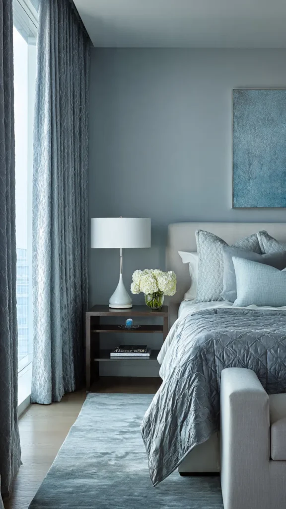
Cool gray and icy blue create a sleek, contemporary bedroom atmosphere with a calm, almost spa-like quality that is genuinely distinctive.
This combination is ideal for modern homes that favour clean lines and understated elegance. Where warmer palettes create cocooning intimacy, this cool combination creates space, clarity, and a sense of quiet order that suits those who find warm, earthy bedrooms overstimulating.
Gray walls provide a neutral foundation, while icy blue accents add the subtle color interest the scheme needs to avoid feeling flat. The key is keeping both tones light and close in value — a dark gray with a bright blue loses the calm consistency that makes this scheme work.
For the gray, Benjamin Moore Silver Chain 1472 and Farrow & Ball Purbeck Stone both sit in the cool, clean gray territory without tipping into blue or green. For the icy blue, Farrow & Ball Skylight and Benjamin Moore Icy Moon Drops work well as accent wall or bedding colors.
Incorporate glass, polished metal, and smooth fabrics to enhance the modern feel. A glass pendant light, chrome bedside lamps, and smooth cotton or silk-blend bedding all suit this palette particularly well.
Avoid warm materials in this scheme — natural oak, rattan, and linen all introduce a warmth that undercuts the cool clarity of the combination. If some warmth is needed for comfort, introduce it through a single cream or ivory cushion rather than through the furniture or floor.
11. Mocha Brown and Soft Ivory

Mocha brown brings depth, warmth, and a genuinely luxurious quality to a bedroom, while soft ivory keeps the space feeling light and inviting rather than heavy.
This scheme works especially well in modern bedrooms that lean toward a cozy, hotel-inspired aesthetic. The combination of deep warm brown and pale ivory is the palette of choice for many luxury hotel bedroom designers precisely because it feels both sophisticated and completely restful.
For mocha brown, consider Farrow & Ball Dead Salmon in its darkest applications, or Benjamin Moore Cocoa Bean 2100-10 for a rich, true mocha. Applied on one wall or as the headboard wall color, it creates immediate warmth and focus.
Use layered textiles and plush bedding to enhance comfort — this scheme rewards investment in quality bedding. A high thread count ivory cotton duvet, a chunky knit throw in a complementary warm brown, and velvet cushions in mocha or toffee tones all add to the layered richness the scheme is designed to deliver.
Simple, well-proportioned furniture keeps the design from feeling heavy. Avoid ornate or overly decorated furniture in this palette — the richness comes from color and textile layering, and clean-lined furniture lets that richness breathe.
Warm lighting is essential here. Bulbs at 2700K or the very warm 2400K used in hospitality settings reinforce the cocooning quality of this color combination and give the room its genuine hotel-bedroom feel.
12. Lavender Gray and White
Lavender gray offers a gentle, barely-there hint of color that feels simultaneously calm and refined — one of the most quietly beautiful bedroom palettes available.
Paired with white, it creates a light and modern bedroom that is ideal for relaxation. The lavender component is subtle enough that the room never reads as overtly purple — it simply has a warmth and softness that a straight gray lacks.
This scheme works particularly well in rooms with good natural light, where the lavender undertone becomes most visible and most beautiful. In rooms with limited natural light, increase the strength of the lavender gray slightly so the color reads clearly rather than disappearing into a flat neutral.
Farrow & Ball Mallow is a near-perfect lavender gray for this application — warm, soft, and complex without being definitively purple. Dulux Lavender Quartz and Benjamin Moore Violet Mist are both good alternatives at a more accessible price point.
Keep accessories minimal and choose sleek finishes to maintain a contemporary look. White or pale ash furniture, simple white ceramic lamps, and clean-lined bedding in white or ivory are all that this palette needs.
One or two deeper lavender cushions — still muted, still dusty rather than bright — add gentle depth and signal that the color choice is intentional rather than accidental.
13. Teal and Soft Sand
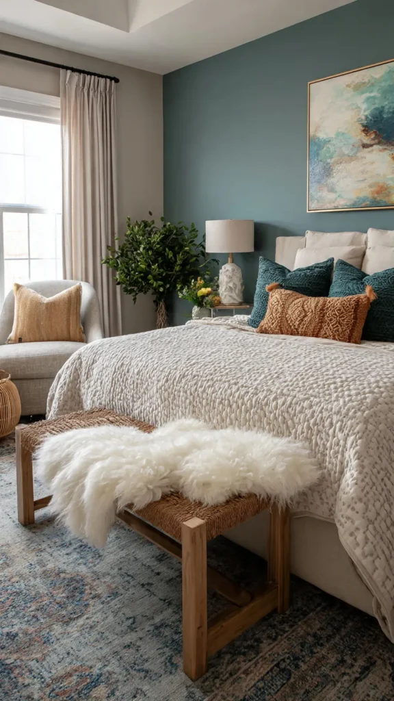
Teal brings genuine vibrancy and personality to a bedroom while remaining grounded enough for a rest space when handled with care and restraint.
Soft sand tones keep the teal anchored and prevent the scheme from feeling too energetic for sleep. The contrast between the richness of teal and the neutrality of sand is what gives this combination its appeal — each color makes the other look better.
This modern pairing adds energy and personality without overwhelming the bedroom. Teal works best in this scheme as an accent color on a single feature wall or in bedding and soft furnishings, balanced by neutral sand-toned flooring and furniture.
For teal, Farrow & Ball Vardo and Benjamin Moore Teal Ocean are both sophisticated, complex versions of the color that avoid the brightness of synthetic or overly blue-toned teals. At full strength on a feature wall, either reads as bold but controlled.
Subtle patterns in the soft furnishings — a geometric print cushion in teal and sand, a textured sand-colored rug with a simple repeating weave — add interest without breaking the calm of the palette.
Clean furniture silhouettes in light timber or white prevent the scheme from feeling cluttered. The teal and sand combination already provides all the visual interest the room needs — furniture should recede rather than compete.
14. Greige and Muted Charcoal

Greige — the versatile blend of gray and beige — is one of the most reliable modern neutrals available, offering the warmth of beige and the sophistication of gray without the limitations of either alone.
When paired with muted charcoal, it creates a layered and sophisticated bedroom look that has real depth and presence while remaining completely calm and restful. The combination is one of the most popular choices in contemporary hotel design for exactly this reason.
This scheme is perfect for contemporary interiors that favour subtle contrast over bold statements. The contrast between greige and charcoal is enough to create visual interest and definition without the high drama of black and white or the boldness of a jewel tone.
For greige, Benjamin Moore Revere Pewter HC-172 remains one of the most widely used and well-regarded examples — warm, complex, and completely versatile. Farrow & Ball Elephant’s Breath sits in similar territory with slightly more warmth.
For the muted charcoal, avoid pure black or very deep charcoal — the scheme works best when the charcoal retains some warmth and sits at a medium-deep tone. Farrow & Ball Mole’s Breath is an excellent choice that hits exactly the right depth.
Textured fabrics — boucle cushions, a chunky wool throw, a ribbed linen duvet cover — add the tactile dimension that makes a neutral palette feel rich rather than plain. Minimalist décor in simple forms completes the design without distracting from the layered color story.
15. Off-White and Pale Wood
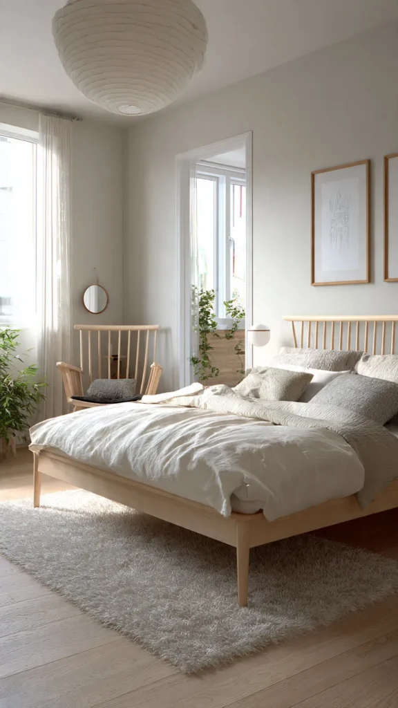
Off-white combined with pale wood tones delivers a fresh, modern bedroom with a distinctly Scandinavian influence — one of the most enduringly popular bedroom aesthetics because it creates spaces that feel simultaneously calm, warm, and completely contemporary.
This scheme emphasizes light, simplicity, and natural beauty above all else. Off-white walls reflect light generously throughout the day, and pale wood introduces the warmth and organic texture that prevent the scheme from feeling cold or clinical.
Off-white is a broader category than it might seem. The best off-whites for this scheme have a warm, slightly creamy undertone — Farrow & Ball All White is a classic choice, as is Benjamin Moore White Heron OC-57 and Dulux Jasmine White.
Pale wood — white-oiled oak, ash, or light beech — is the material that makes this scheme work. The grain and natural variation of real timber adds visual interest and warmth that no painted or laminate surface replicates convincingly.
Keep décor minimal and functional to maintain the clean, modern aesthetic. A simple ceramic lamp, one carefully chosen piece of art, and a linen duvet in off-white or very pale grey are all this scheme needs.
Introduce one very gentle accent if desired — a single dusty sage plant, a pale blush cushion, or a soft charcoal throw — but keep it quiet. The success of this palette depends on restraint, and restraint is what makes it feel so genuinely restful to spend time in.
Final Thoughts
Choosing the right bedroom color scheme is about more than visual appeal — it shapes how the space feels, how well you sleep, and how much you enjoy spending time in the room.
Modern bedroom design benefits from thoughtful combinations that balance comfort, style, and personality. The most successful schemes share one quality: they feel considered rather than assembled — every color, material, and finish has been chosen in relation to everything else in the room.
Test any shortlisted color in the actual room before committing. Paint two large swatches on different walls, live with them through different times of day and different lighting conditions, and make the decision from observation rather than from a paint chip under shop lighting.
Whether you prefer soft neutrals, earthy tones, or bold contrasts, these fifteen color schemes offer the inspiration and the practical starting points to transform your bedroom into a refined and restful retreat that genuinely reflects modern living.