
15 Cobalt Blue Room Ideas for a Bold Saturated Look That Commands Attention
Cobalt blue does not ask for attention.
It takes it.
The moment cobalt appears in a room, in any form, on any surface, at any scale, it is the first thing you see. Every eye in the room goes to it before anything else registers. The cobalt wall before the sofa in front of it. The cobalt vase before the table it sits on. The cobalt cushion before the chair it rests against.
This is cobalt’s specific quality. Pure, vivid, deeply saturated blue that is not teal and not navy and not royal and not sky. The blue that Yves Klein made his own. The blue of a ceramic tile in a Portuguese palace. The blue of Majorelle’s garden in Marrakech. The blue that reads as luminous even in low light.

In a room that uses cobalt well, the colour is not decorating. It is doing something.
Here are 15 ideas for rooms where cobalt is doing it brilliantly.
Why Cobalt Blue Commands the Rooms It Inhabits
Colour is not neutral in the way that many interior design approaches treat it.
Colour has temperature. Cobalt is cool. It reads psychologically as receding, as opening space, as depth without darkness. This means cobalt on a wall makes the wall appear to move away from the viewer rather than toward them. A cobalt room feels larger than the same room in a warm colour.
Colour has saturation. Cobalt at full saturation is one of the most vivid colours available in any paint or fabric range. This saturation creates visual energy. The cobalt room is not a calm room. It is an alert room. An alive room. A room that is doing something with its colour rather than simply providing a backdrop.
Colour has cultural resonance. Cobalt blue appears in the tiles of Islamic architecture, the ceramics of Delft and Talavera, the glazes of Chinese porcelain, the glass of medieval cathedrals, the pigment of lapis lazuli used in Renaissance masterworks. This cultural depth gives cobalt a specific gravity that less freighted colours lack.
The room with cobalt in it is a room in conversation with all of these histories simultaneously. Even if the occupant is not conscious of the conversation, the colour carries it.
1. A Full Cobalt Blue Feature Wall
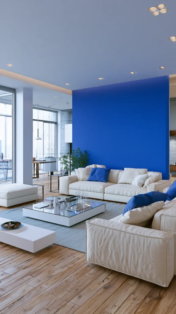
The cobalt feature wall is the entry point for every level of commitment to the colour.
One wall in full cobalt blue creates a focal point of extraordinary presence without requiring the room to surrender entirely to the colour. The cobalt wall behind the sofa in a living room. The cobalt wall behind the bed in a bedroom. The cobalt wall at the end of a dining room.
This single wall application allows the other three walls to remain in a neutral or complementary tone that gives the cobalt room to breathe and allows the furniture and the other elements of the room to be read against both a dark and a pale ground.
The cobalt feature wall is the application that most people who love the colour but lack confidence in it should start with. One wall. Full saturation. No compromise on the colour. The cobalt should be cobalt, not a toned-down or greyed version that hedges against the commitment. If you are going to paint a wall cobalt, paint it cobalt.
Why a full cobalt feature wall is the right starting point:
- One wall in cobalt changes the character of the whole room without requiring full commitment
- The cobalt behind the primary seating or sleeping element creates the maximum visual impact at the most-observed wall
- The remaining walls in neutral allow the cobalt to read as the bold decision it is rather than as a general room tone
- Starting with one wall builds confidence for extending the colour to more surfaces if the impact pleases
- Full saturation on one wall is more effective than diluted cobalt on all four walls
- The feature wall application works in every room from living room to kitchen to bathroom
2. Cobalt Blue Painted Cabinets in a Kitchen
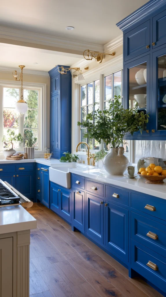
The kitchen is the room where bold colour on cabinetry has become the design decision that most transforms a domestic space in a single choice.
Cobalt blue kitchen cabinets are the most vivid version of this transformation. Where navy blue is sophisticated and moody, where forest green is naturalistic and warm, cobalt is genuinely bold. It is the kitchen that makes visitors stop in the doorway.
The combination of cobalt cabinets with white marble or bright white countertops creates the strongest possible contrast. The vivid blue and the bright white against each other produce a kitchen of extraordinary graphic clarity. Against copper or brass hardware the cobalt deepens and becomes even more jewel-like. Against chrome the cobalt reads as cleaner and more contemporary.
Lower cobalt cabinets with white upper cabinets is the approach that gives the kitchen the colour’s drama at floor level while keeping the upper walls and the overhead zone open and light. The reverse, cobalt upper cabinets with white lower cabinets, is less common but equally striking. The cobalt overhead creates a sense of being under a vivid blue sky.
3. Cobalt Accessories in an Otherwise Neutral Room
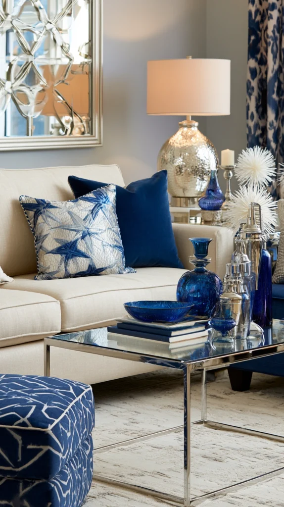
The neutral room with cobalt accessories is the most accessible cobalt interior application.
No painting required. No commitment to a single decision that affects the whole room. Cobalt in the room through the objects placed in it, adjusted and changed as confidence builds.
A pair of cobalt ceramic lamps on bedside tables in an otherwise cream bedroom. A cobalt vase on the kitchen counter against white walls. Cobalt blue books with their spines outward on a shelf. A cobalt ceramic bowl on the dining table as a centrepiece. A cobalt throw on a cream sofa.
These individual cobalt elements in a neutral room work because of the colour’s specific property of commanding the eye before anything else registers. Even a small amount of cobalt in a neutral room is visible from across the room. The small cobalt accent does not need to be large to make the room feel decisively different from the same room without it.
The accumulation of cobalt accessories over time, each one added as a specific decision rather than as part of a wholesale design change, eventually creates a room with a consistent cobalt accent theme that feels considered and deliberate rather than accumulated.
4. A Cobalt Blue Velvet Sofa
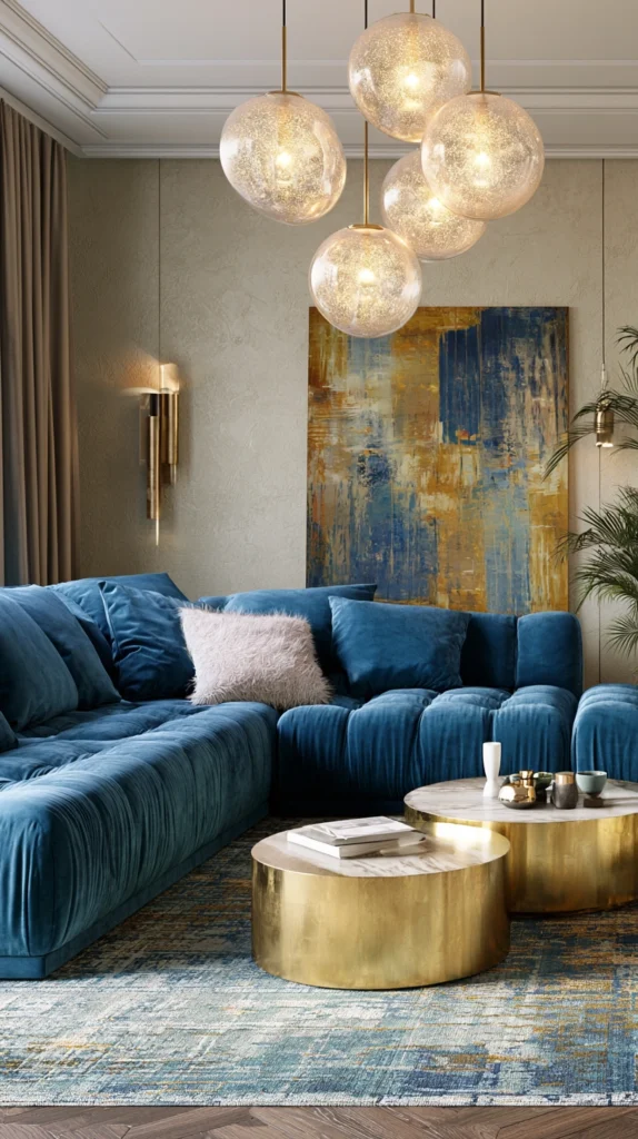
The cobalt velvet sofa is one of the most genuinely brave and most genuinely rewarding living room decisions available.
The combination of cobalt’s vivid saturation and velvet’s light-absorbing, depth-creating surface quality produces a sofa that appears to have its own luminosity. In daylight it is vivid and alert. In evening lamplight it deepens to a richer, more jewel-like version of itself. In candlelight it becomes extraordinary.
Against pale walls the cobalt velvet sofa reads as the room’s primary colour event and everything else organises itself in relation to it. Against dark walls, particularly against the deep charcoal or forest green that is cobalt’s most natural companion, the cobalt sofa creates a composition of extraordinary richness.
The cobalt velvet sofa requires confidence. People will sit on it and it will stay where it is and the room will be built around it. It is not a sofa that disappears into the room. It is a sofa that is the room’s reason to exist.
Cushions on a cobalt sofa should contrast rather than match. Warm brass or gold. Deep terracotta. Warm cream. Anything that provides relief from the vivid blue without competing with it.
5. Cobalt Tiles in a Bathroom or Kitchen Splashback
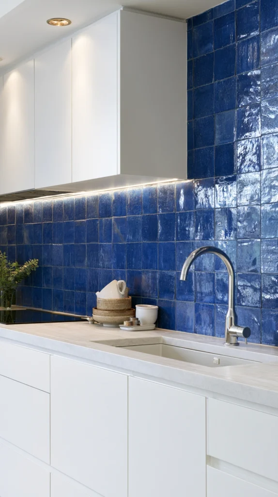
The ceramic tile tradition that gave cobalt some of its most beautiful historical applications, the Portuguese azulejos, the Moroccan zellige, the Delftware panels, is available in contemporary form through the range of cobalt-glazed tiles now produced by traditional and contemporary tile makers.
A cobalt tile splashback behind a kitchen hob or behind a bathroom basin creates a concentrated rectangle of vivid colour that is surrounded by the neutral tones of the kitchen or bathroom’s other surfaces. Within that defined rectangle the cobalt is at its most intense and most jewel-like.
Cobalt zellige tiles, with their irregular handmade surface that catches light differently at every angle, create the most beautiful version of the cobalt tile application. The slight variation in colour from tile to tile, the way the handmade surface creates micro-shadows that give the surface depth, makes zellige cobalt tiles significantly more beautiful than machine-perfect tile alternatives.
White grout with cobalt tiles creates the classic blue and white combination of the historical ceramic tradition. Cobalt grout with cobalt tiles creates a monochromatic field where only the tile edges are visible as a subtle pattern.
6. Cobalt Blue in a Gallery Wall
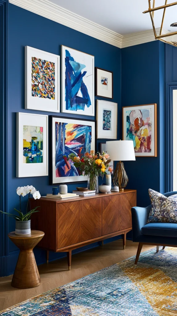
The gallery wall is where cobalt most effectively demonstrates its ability to make other colours look better.
A gallery of framed artworks on a cobalt blue wall creates a display where every colour in every artwork is enhanced by the saturated blue behind it. Warm colours, reds, oranges, and yellows, appear more vivid against cobalt than they would against a neutral wall. Whites and creams appear luminous. Blacks appear deeper.
The cobalt gallery wall is also a context where the specific blue-on-blue quality of certain artworks, photographs of sky, paintings with blue elements, prints with blue as a dominant tone, reads with particular richness. The blue in the artwork resonates with the blue of the wall behind it and the two blues in different tones and textures create depth rather than monotony.
Frame the gallery consistently to allow the cobalt and the artworks to be the visual events rather than the frames. Simple black, natural timber, or white frames all work against cobalt. Ornate frames add complexity that the already-vivid cobalt background does not need.
7. A Cobalt Blue Front Door
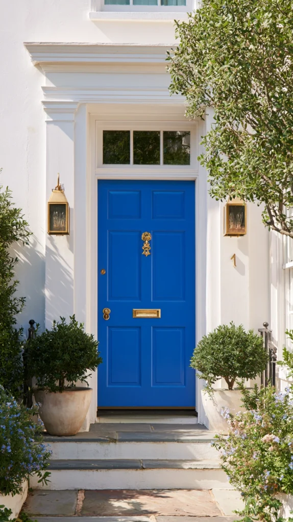
The front door is the room that most directly communicates the house’s character to the street.
A cobalt blue front door is the exterior design decision that most immediately establishes that the people who live here are not neutral in their aesthetic choices.
Cobalt on a front door is visible from the end of the street. Against white render or brick the cobalt reads with maximum vibrancy. Against a dark stone or dark brick the cobalt appears as a vivid jewel-like point of colour against a dark ground.
The cobalt front door is the commitment that requires no interior design skill. It is a front door. It is cobalt. The decision is the design.
Hardware on a cobalt door should be chosen to suit the door’s character. Polished brass creates the most historically resonant combination. Chrome creates a contemporary contrast. Matte black creates a graphic, modern combination of vivid colour and crisp neutral.
8. Cobalt Blue Bedding in a Neutral Bedroom
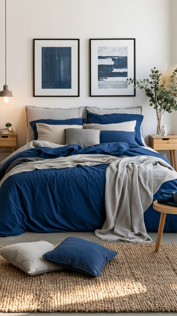
The neutral bedroom with cobalt bedding is the most direct route to cobalt’s visual energy in the room where it might be least expected.
Most bedding in most bedrooms is pale. Cream, white, and grey dominate because these tones feel restful and because the bedroom is theoretically a space of calm and rest.
The cobalt duvet cover in a neutral bedroom challenges this assumption. It introduces energy and visual alertness into the room. It makes the bed the room’s primary visual event in the way that a neutral duvet never can.
For the bedroom occupant who wants the room to feel genuinely alive rather than merely calm, cobalt bedding is a significant decision. For the occupant who finds very calm, very neutral bedrooms slightly dispiriting, cobalt is the solution.
Cobalt bedding with cream or white walls creates maximum contrast. Cobalt bedding against a dark grey or charcoal wall creates a moodier, more enclosing effect. The cushions against a cobalt duvet should introduce complementary warmth. Warm terracotta. Burnished orange. Deep gold.
9. Cobalt Blue Paint on Furniture as an Accent
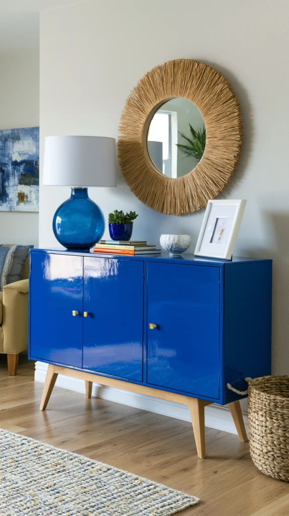
A piece of furniture painted in cobalt blue creates a single powerful focal point in a room that uses the colour nowhere else.
A cobalt blue dresser in a bedroom of warm neutrals. A cobalt side table in a living room of cream and natural timber. A cobalt blue chair in a room of deep greens. The painted furniture piece introduces cobalt’s visual authority at a human scale without any wall or surface requiring the colour.
The furniture painting approach is also the most reversible cobalt commitment. A cobalt wall is a significant undertaking to repaint. A cobalt dresser can be painted again in a different colour at minimal cost and effort.
The furniture piece to paint in cobalt should be chosen for its form as much as its function. A piece with interesting turned legs or carved details shows the cobalt colour against its form complexity. A flat-fronted cabinet in cobalt is a field of colour. A piece with dimensional form in cobalt is a sculptural object.
10. Cobalt and White Geometric Pattern
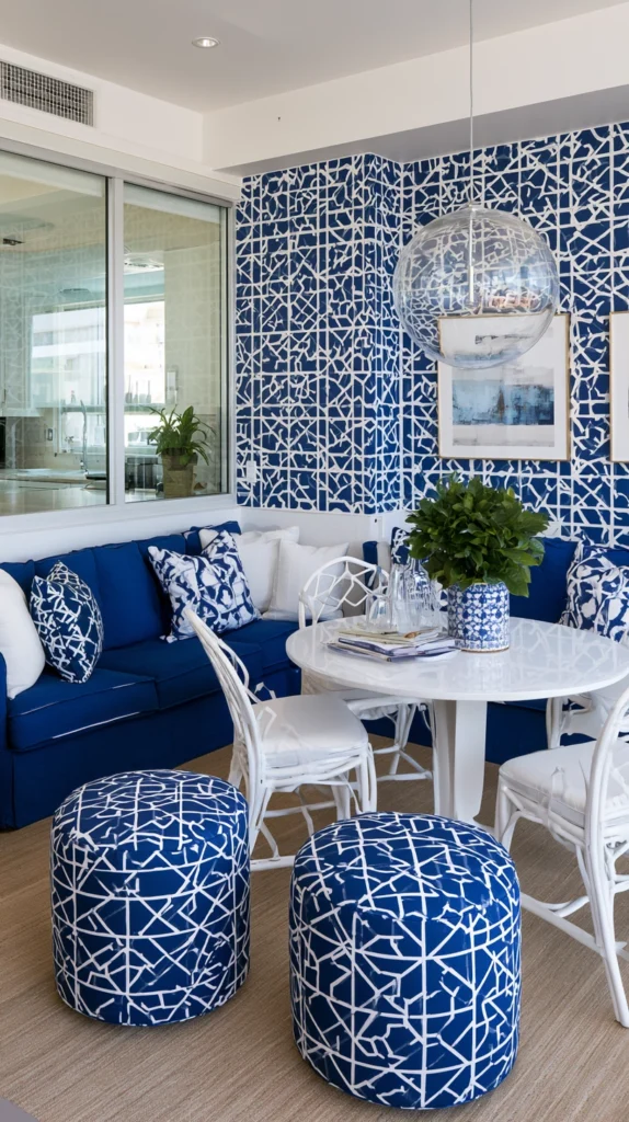
The cobalt and white geometric combination is one of the most enduring and most beautiful colour combinations in any pattern tradition.
Tiles in cobalt and white geometric patterns. Fabric in cobalt and white stripes or chevrons. Wallpaper in a cobalt and white geometric repeat. These patterns have the visual clarity of maximum contrast combined with the graphic intelligence of geometric design.
A cobalt and white striped wallpaper on a dining room feature wall. A cobalt and white chevron tile floor in a bathroom. A cobalt and white geometric cushion on a warm-toned sofa. Each of these applications uses the specific energy of the cobalt-white combination in a different format and scale.
The pattern vocabulary available in cobalt and white is extensive. The Moroccan geometric. The Portuguese tile repetition. The Turkish Iznik-inspired floral. The Delft figurative. The contemporary graphic stripe. Every pattern tradition has a cobalt and white version.
11. Cobalt Blue in a Home Office
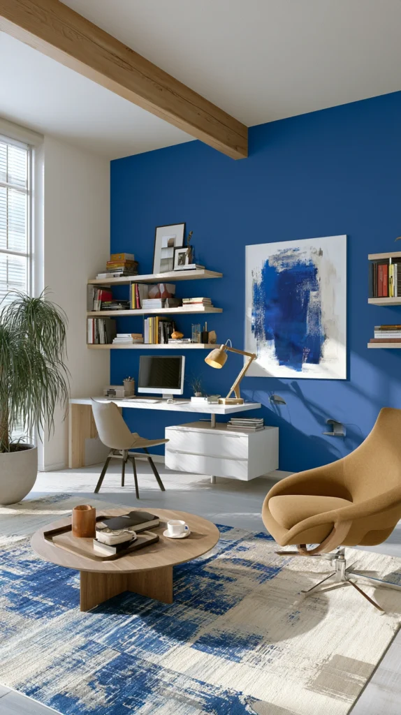
The home office is the room where cobalt’s specific psychological effect, its quality of creating alertness and mental energy, is most functionally appropriate.
A cobalt home office is not a restful environment. It is a productive one. The vivid blue of the walls or the cobalt painted desk is energising in a way that the calm neutrals of the standard home office are not. The person who needs the room to feel like a place where work happens rather than a place where work is tolerated will find cobalt in a home office genuinely functional.
A single cobalt wall behind the desk, with the remaining walls in a warm neutral or a lighter blue, creates the directional energy of a room that organises itself toward a specific point. The work happens at the desk. The cobalt behind the desk is the work’s visual background. The whole room is oriented toward the right activity.
12. Cobalt Blue Exterior on a Garden Building
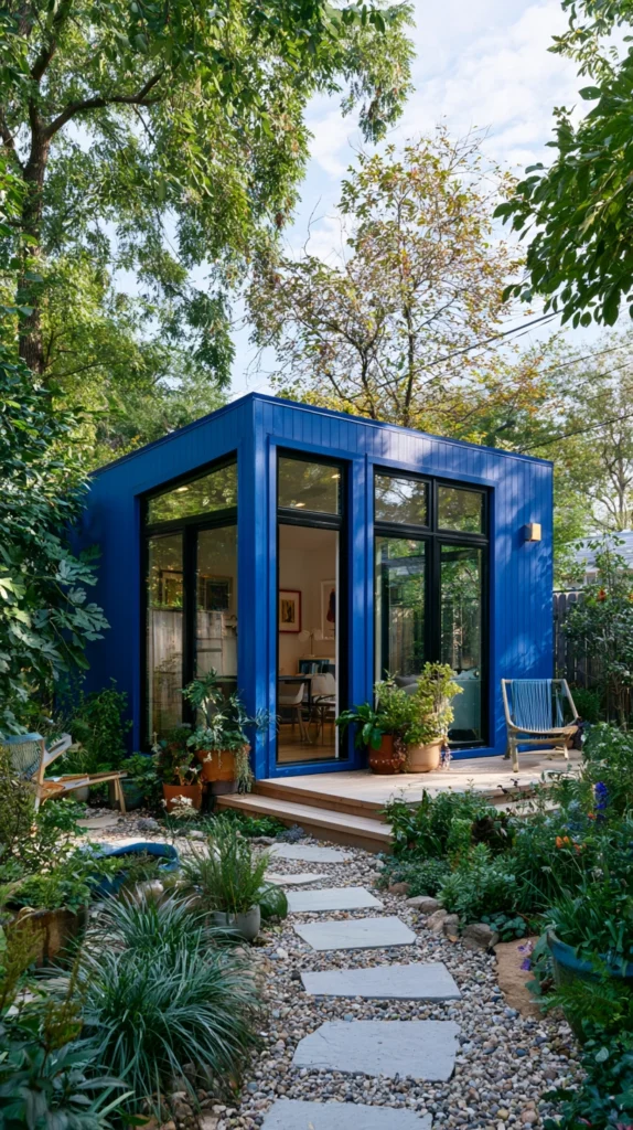
The garden shed, workshop, office pod, or studio building in cobalt blue is the garden feature that is visible from the house’s main windows and that transforms the garden’s visual character from a single decision.
A cobalt blue exterior on a garden building against a backdrop of green garden planting creates one of the most vivid colour contrasts available in any outdoor space. The warm green of the garden vegetation and the cool saturated blue of the building are complementary colours on the colour wheel, which means they each make the other appear more vivid.
The cobalt garden building also creates a destination. In a garden without a visual focal point, the cobalt building is immediately visible from every part of the garden and from every window of the house that overlooks the garden. The eye goes to it. The garden has a centre.
13. A Cobalt Blue Dining Room
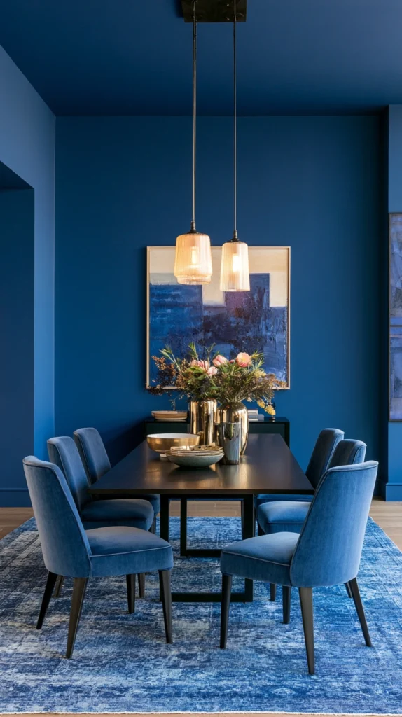
The dining room is the room where cobalt’s combination of visual energy and depth is most appropriate to the activity it serves.
Dinner is not a passive activity. It is social, convivial, and energetic. The room where dinner happens should feel alive and active rather than calm and restful.
Cobalt walls in a dining room create the theatrical quality of a room that makes every meal feel like an occasion. The vivid blue around the table. The candlelight that enriches the cobalt in the evening. The white of the tablecloth and the china against the blue walls.
The cobalt dining room is the room that guests mention when they leave. The colour is too present and too vivid to be ignored. The conversation about the colour is inevitable. The dinner is remembered partly because the room was extraordinary.
14. Cobalt Blue With Warm Copper and Brass
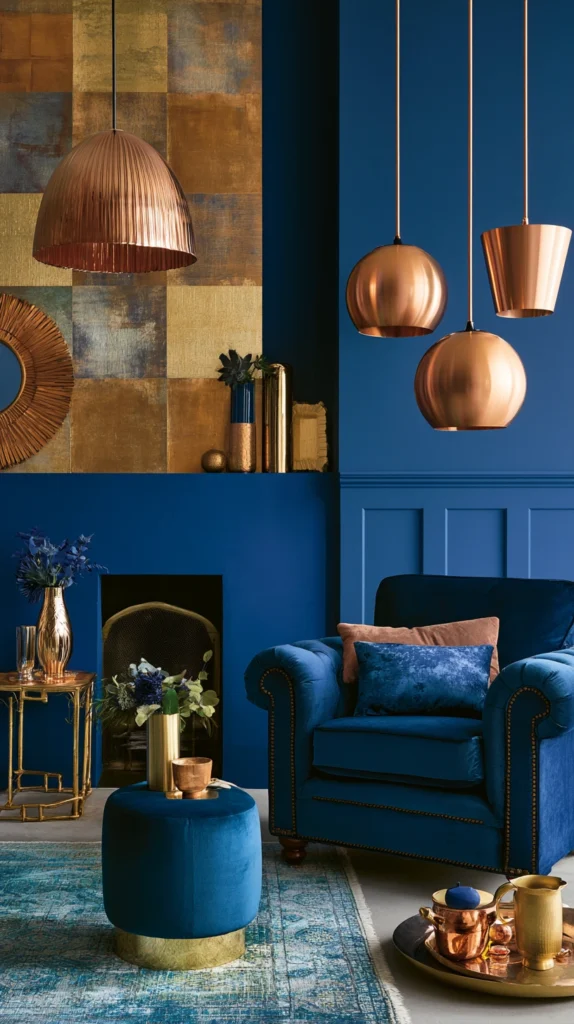
The combination of cobalt blue and warm copper or brass is among the most consistently beautiful colour and metal combinations available in contemporary interior design.
The coolness of the cobalt and the warmth of the copper create a tension that makes each element look more vivid than it would beside a more neutral partner. The cobalt deepens the orange warmth of the copper. The copper enriches the blue saturation of the cobalt.
This combination appears in nature in the specific visual effect of a twilight sky, the vivid blue of the high atmosphere above the warm orange of the sunset on the horizon. It appears in the mineral world in azurite, the deep blue copper carbonate mineral, beside native copper and malachite.
In a room the cobalt and copper combination can be as simple as cobalt walls with copper pendant lights. Or cobalt painted cabinets with copper handles. Or a cobalt ceramic vase on a copper-toned table. The relationship works at any scale and in any format.
15. Full Cobalt Immersion in One Room
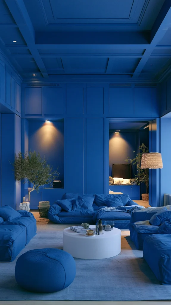
The most committed and most rewarding cobalt application is the single room that is given entirely to the colour.
Not one wall. All four walls. The ceiling. The trim. Everything in the same vivid cobalt.
This full immersion approach produces a room that is categorically different from any other room in the home. The person standing inside it is surrounded by cobalt in every direction. The depth of the colour creates the sense of being inside the colour rather than looking at it.
The room that receives this treatment should be chosen specifically. A powder room where the immersive experience is appropriate because guests spend only a few minutes in it and the intensity is a pleasure rather than a sustained imposition. A study where the mental energy of the colour serves the work that happens there. A hallway where the passing experience of vivid cobalt is a transition between the neutral exterior and the home’s interior.
Full cobalt immersion requires the right lighting to work at its best. In natural daylight the cobalt is vivid and alert. In warm evening lighting it deepens and becomes more jewel-like. In cool white lighting it becomes slightly harsh. Warm lighting is non-negotiable for a full cobalt room.
How to Choose the Right Cobalt Blue Paint
Not all paint labelled cobalt blue is truly cobalt.
Some shades marketed as cobalt have too much grey in them and read more like a sophisticated steel blue than a vivid saturated cobalt. Some have too much green and read as teal. Some have too much purple and read as violet-blue.
True cobalt for a room that wants the specific cobalt quality, the vivid, luminous, pure blue, should be tested in the actual room in the actual light conditions before any full-room application. A paint chip on a white card in the paint shop is not an adequate test.
Apply a large test patch of at least thirty by thirty centimetres on the wall to be painted. Observe it at different times of day and under different artificial light conditions. In morning light, in afternoon light, in the warm evening lamplight that the room normally uses. Only in these conditions will the specific quality of the cobalt be apparent.
Paint companies with accurate cobalt representations include Farrow and Ball’s Pitch Blue, Little Greene’s Cobalt, and Dulux’s Heritage range which includes accurate period cobalt references.
Common Mistakes When Using Cobalt Blue
Using a toned-down or muted version of cobalt. Cobalt that has been reduced in saturation by the addition of grey or white becomes a different colour. It may be a beautiful colour but it is not cobalt and it does not produce cobalt’s specific visual effect.
Using cool white lighting with cobalt. Cool white light makes cobalt surfaces appear harsh and slightly garish. Warm lighting at 2700K or below is essential for cobalt to read correctly as beautiful rather than aggressive.
Combining cobalt with other saturated colours of similar intensity. A room with cobalt walls, a vivid red sofa, and bright yellow curtains is not a room of bold colour. It is a room of competing bold colours. Cobalt works best against warm neutrals, against deep tones of other colours, or against white.
Neglecting contrast. Cobalt without sufficient contrast to other elements in the room disappears into uniformity. The white of the china against the cobalt wall. The cream of the linen against the cobalt sofa. These contrasts are what allow the cobalt to be read as vivid rather than simply as a ground colour.
Underestimating the commitment. Cobalt is not a colour that disappears into the background of a room. The decision to use cobalt is a decision to make that colour the room’s defining characteristic. If you are not prepared for the colour to be the room’s most discussed element, cobalt is not the right choice.
Quick Summary
- A full cobalt feature wall creates a focal point of extraordinary presence without requiring full room commitment to the colour
- Cobalt kitchen cabinets with white countertops and warm hardware create the kitchen that stops visitors in the doorway
- Cobalt accessories accumulated in a neutral room use the colour’s eye-commanding quality at any scale and in any format
- A cobalt velvet sofa is one of the most rewarding and most demanding living room decisions available
- Cobalt zellige or glazed tiles in a kitchen or bathroom splashback reference the colour’s most beautiful historical ceramic applications
- A gallery of artworks on a cobalt wall enhances every colour in every artwork through the contrast of vibrant blue behind them
- A cobalt front door establishes the house’s character to the street from the furthest visible distance
- Cobalt bedding in a neutral bedroom introduces energy and visual presence into the room where most bedrooms choose calm
- A piece of furniture painted in cobalt creates a single powerful focal point without wall surfaces requiring the colour
- Cobalt and white geometric patterns in tiles, fabric, or wallpaper use the maximum contrast of the two-colour combination
- A cobalt home office uses the colour’s specific quality of creating alertness as a functional design decision
- A cobalt exterior on a garden building creates a vivid focal point in the garden visible from the house’s main windows
- A cobalt dining room creates the theatrical, alive quality that makes dinner feel like an occasion
- Cobalt combined with warm copper or brass creates the specific tension of complementary temperatures in colour and metal simultaneously
- Full cobalt immersion on all four walls and ceiling creates a room that is categorically different from anything else in the home
- Always test cobalt paint in the actual room under actual light conditions before committing to the full application
Cobalt blue is not a supporting player.
It is always the lead.
In any room where cobalt appears, cobalt is what the room is about. Everything else is context.
This is either the problem with cobalt or the entire point of it, depending on who you are.
For the person who wants a room to be about something, who wants the colour to do something rather than simply to be there, cobalt is as good as it gets.
Use it knowing what it is.
And the room will be worth looking at for as long as it exists.