
14 Yellow Living Room Ideas That Energize Your Space
Yellow living rooms celebrate optimism through this inherently cheerful color, where strategic applications ranging from subtle buttery accents to bold saturated walls create spaces that energize, uplift, and demonstrate confident design choices embracing color’s psychological power.
This versatile hue spans a vast spectrum from soft pale creams through vibrant sunny tones to deep golden mustards, each intensity creating distinctly different atmospheric effects requiring thoughtful selection matching intended moods and existing light conditions.
Strategic yellow integration, incorporating appropriate shade selection, balanced application, preventing overwhelming saturation, and complementary color pairings, enhancing rather than competing with yellow’s inherent brightness, creates living rooms that feel intentionally designed rather than accidentally loud.

Understanding which yellow tones suit specific design styles, how to balance this advancing color with neutralizing elements, and what constitutes appropriate dosage, ensuring cheerfulness without visual fatigue, ensures yellow enhances rather than overwhelms living spaces.
These fourteen yellow living room ideas demonstrate practical approaches from accent wall statements to comprehensive color immersion, each proving that thoughtful yellow application creates warm, inviting spaces that elevate moods while showcasing design confidence that many homeowners admire but hesitate to attempt themselves.
1. Sunny Yellow Accent Wall
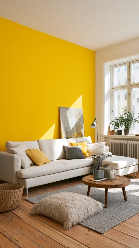
Create immediate impact through single yellow accent walls providing color drama without overwhelming entire rooms through complete saturation, allowing easier modification if preferences change. Paint walls behind sofas creating decorative backdrops, select walls opposite entries delivering immediate visual impact, or choose walls receiving abundant natural light, amplifying yellow’s inherent brightness.
The accent approach delivers cheerful color, while the remaining walls are in neutral whites or soft grays to prevent sensory overload. The limited application reduces paint investment, making premium yellows more accessible, while the focused color creates intentional focal points.
Choose yellow intensity carefully, testing samples in actual lighting conditions, since yellow appears dramatically different in various light exposures. The single-wall approach suits commitment-cautious homeowners wanting color impact without total room transformation.
2. Butter Yellow Walls Soft Warmth
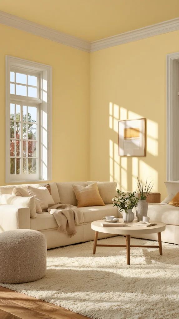
Establish gentle warmth through soft buttery yellow walls, creating the kind of subtle sunshine glow that feels perpetually cheerful without the intensity that bright yellows demand. Choose pale buttery shades reading almost neutral while adding perceptible warmth, pair with white trim creating clean, crisp contrast, and appreciate how the soft yellow creates welcoming warmth without bold color statements.
The gentle approach suits those wanting yellow’s psychological benefits without a dramatic visual impact. The subtle shade coordinates easily with varied furniture colors and decorative styles, while the warm undertone prevents the coldness that pure white walls sometimes create. The soft intensity works beautifully in rooms with abundant natural light where brighter yellows might become overwhelming, while the gentle warmth adds cozy character.
3. Yellow and Gray Sophisticated Pairing
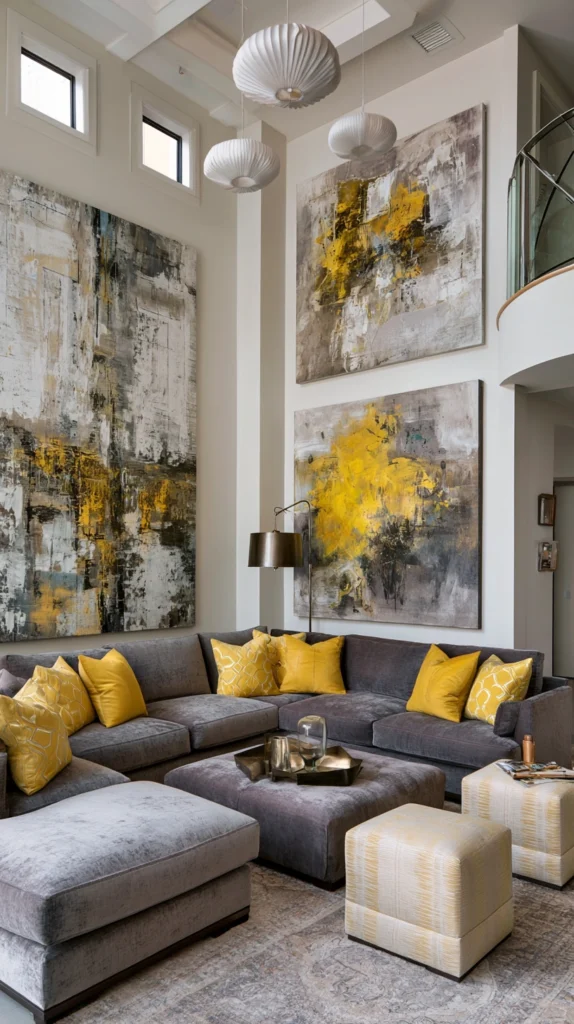
Develop sophisticated contemporary palettes pairing yellow with various gray tones, creating the kind of refined balance where yellow’s warmth prevents gray from feeling cold while gray’s neutrality tempers yellow’s intensity. Use soft gray walls, allowing yellow furniture, pillows, or accessories to pop as colorful accents, or reverse with yellow walls and substantial gray upholstered pieces, creating anchoring neutral masses.
The yellow-gray combination feels modern and sophisticated, while the contrasting temperatures create visual interest. The pairing works across yellow’s entire spectrum from pale butters to deep mustards, depending on desired drama levels. Include white as an additional neutral, preventing the yellow-gray combination from feeling too restricted. The sophisticated pairing demonstrates that yellow successfully inhabits contemporary, refined spaces beyond cottage or traditional styling.
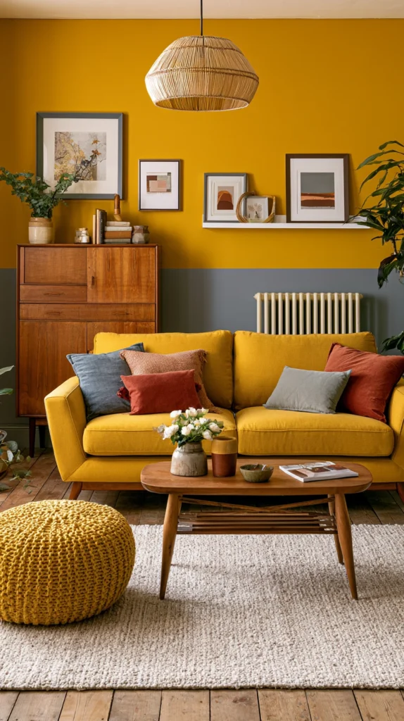
4. Mustard Yellow Statement Furniture
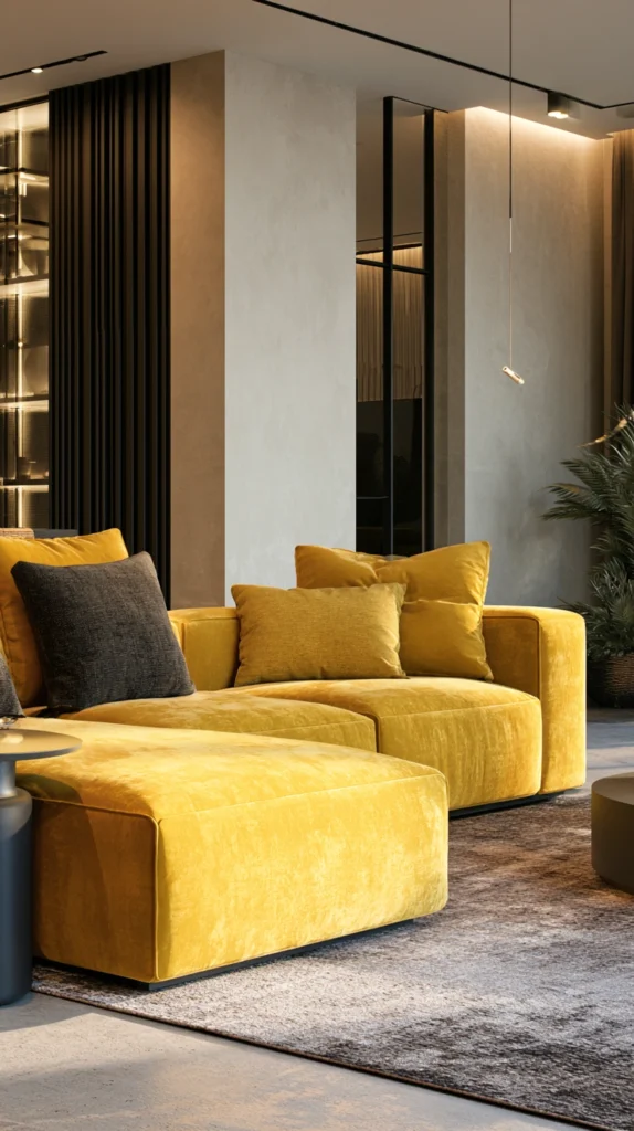
Introduce rich mustard yellow through substantial furniture pieces, including sofas, accent chairs, or ottomans, creating bold color statements while the deeper tone feels more sophisticated than bright primary yellows. Choose quality upholstered pieces in luxurious mustard velvets or textured fabrics, adding tactile richness, pair with neutral wall colors, preventing color competition, and appreciate how the golden undertones create warmth and vintage character.
The mustard shade feels currently trendy, while the earthy golden quality suggests timeless rather than quickly dated appeal. The substantial furniture investment represents a commitment but delivers dramatic impact and substantial seating comfort, justifying the expense. The rich tone coordinates beautifully with natural woods, metals, and varied neutral palettes, creating versatile combinations.
5. Yellow and Navy Classic Combination
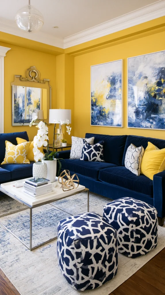
Create classic preppy aesthetics pairing yellow with navy blue, establishing the kind of timeless combination that feels perpetually fresh, energetic, and confidently traditional. Use yellow walls with navy upholstery, creating bold contrast, or reverse with navy walls and yellow accents, creating moodier, more sophisticated spaces.
The yellow-navy pairing references nautical themes without requiring literal coastal decoration, while the high contrast creates visual energy and clear definition. Include white as the third neutral, preventing the two colors from fighting for dominance, while crisp white adds brightness. The classic combination suits traditional and transitional styling while feeling energetic and youthful. The pairing works across seasons, feeling summery and fresh while maintaining adequate warmth for winter comfort.
6. Pale Lemon Ceiling Unexpected
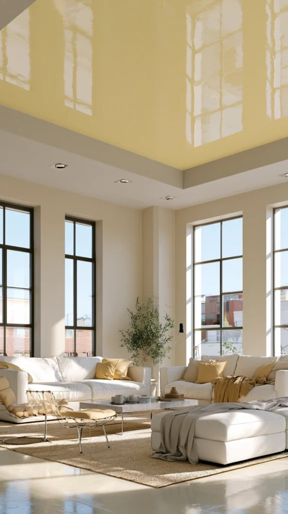
Apply unexpected yellow to ceilings, creating the kind of surprising color placement that demonstrates design confidence, while the elevated position prevents yellow from overwhelming despite its advancing nature. Paint ceilings in soft lemon or butter yellow, creating a gentle overhead glow, pair with neutral walls preventing excessive color saturation, and appreciate how the unexpected placement creates memorable designed environments.
The ceiling application draws eyes upward, making rooms feel taller, while the yellow reflects light, creating brighter spaces. The unconventional placement demonstrates design sophistication and a willingness to embrace unexpected applications. Choose softer yellows for ceiling application since intense shades overhead can feel oppressive, while gentle tones create a pleasant ambient glow.
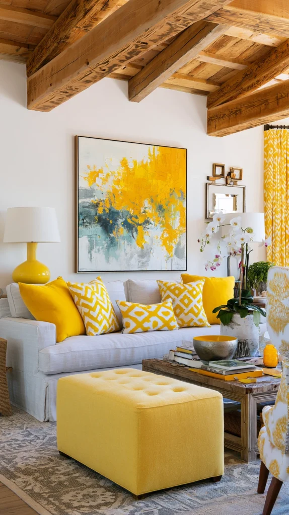
7. Yellow Textile Layering
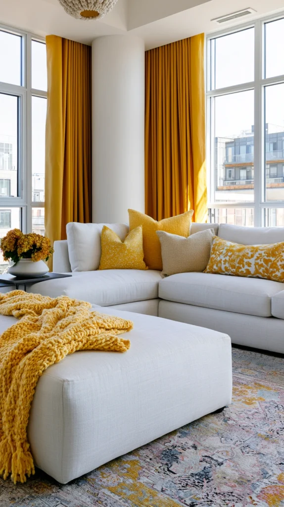
Introduce yellow gradually through layered textiles, including throw pillows, blankets, curtains, and area rugs, creating flexible color that adjusts seasonally or as preferences evolve. Start with yellow throw pillows in varied patterns and textures, add yellow throws providing additional color and cozy comfort, and include yellow curtains or area rugs, making larger color statements.
The textile approach allows color experimentation without permanent commitment, while the layered accessories create the kind of collected, decorated appearance that feels intentional. The flexible nature allows seasonal rotation, introducing yellow during spring and summer, while switching to different palettes for fall and winter if desired. The accessible investment allows premium yellows in smaller quantities rather than requiring budget yellows in larger permanent applications.
8. Goldenrod Vintage Character
Embrace deeper goldenrod or marigold yellows, creating vintage 1970s-inspired character and the kind of earthy warmth that feels currently relevant while referencing historical design periods. Choose rich golden yellows with orange undertones, creating a warm, earthy character, pair with natural woods and vintage furniture embracing retro styling, and appreciate how the deeper tones feel sophisticated and grounded rather than childishly bright.
The vintage reference feels currently trendy, while the warm, earthy quality suggests lasting rather than fleeting appeal. The goldenrod shade coordinates beautifully with olive greens, burnt oranges, and other earthy tones, creating cohesive vintage-inspired palettes. The deeper saturation creates the kind of enveloping warmth that makes rooms feel cozy and intimate.
9. Yellow and White Crisp Fresh
Develop bright, fresh aesthetics pairing yellow with abundant white, creating the kind of clean, energetic spaces that feel perpetually summery and optimistic regardless of actual season. Use predominantly white backgrounds, allowing yellow accents to sparkle against clean backdrops, maintain crisp white trim and architectural details, and appreciate how the high-contrast combination creates visual clarity and energetic character.
The yellow-white pairing feels clean and fresh, while the abundant white prevents yellow from overwhelming. The combination suits coastal, cottage, and contemporary farmhouse styling, while the bright character makes even small spaces feel open and airy. Include natural textures through jute rugs, linen fabrics, or wood accents, preventing the yellow-white combination from feeling too stark or cold.
10. Subtle Yellow Undertone Neutrals
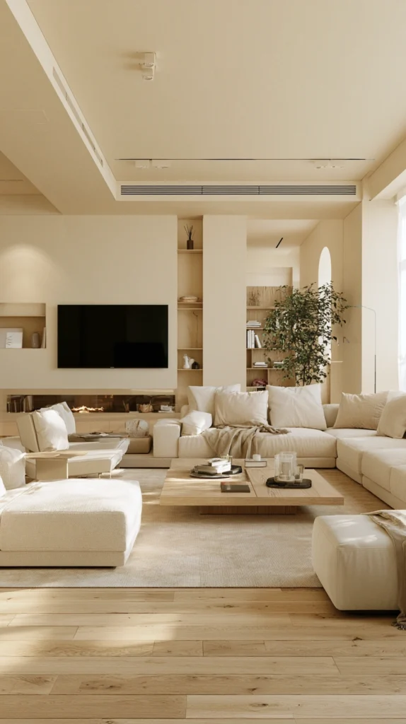
Choose neutral paint colors with perceptible yellow undertones, creating the kind of barely-there warmth that influences space character without reading as obviously colored walls. Select warm whites, creams, or beiges with yellow rather than gray or pink undertones, creating gentle warmth, appreciate how the subtle influence affects room atmosphere without obvious color presence, and understand that undertone selection significantly impacts neutral success.
The subtle approach suits those wanting yellow’s warming benefits without actual yellow walls, while the nearly-neutral appearance coordinates with any furniture or decorative palette. The warm undertones prevent the stark coldness that pure or cool-toned neutrals sometimes create while maintaining neutral versatility. Test carefully since undertones often appear more obvious on walls than on small paint chips.
11. Yellow Artwork Gallery Walls
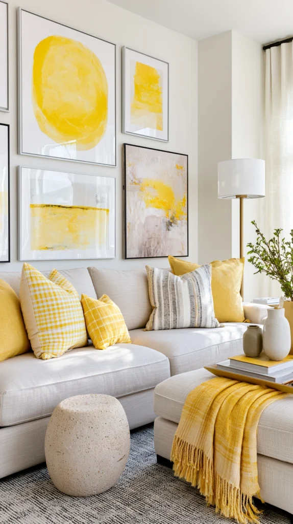
Introduce color through curated yellow artwork, creating a flexible color presence that changes easily compared to painted walls, while the art provides both color and cultural sophistication. Collect yellow-dominant artwork, including abstract pieces, botanical prints, or photography, creating gallery walls, framing consistently, creating cohesive presentations, and appreciating how the concentrated color creates impact without permanent wall painting.
The art approach allows yellow introduction in rental situations where painting isn’t permitted, while the cultural content adds sophistication beyond pure decoration. The flexible nature allows seasonal rotation or complete removal if yellow preferences change. The collected gallery creates the kind of personal character that makes spaces feel genuinely inhabited rather than professionally staged.
12. Pale Yellow Reading Nook
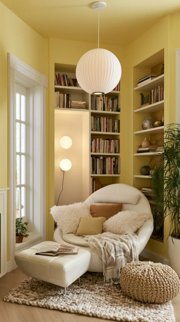
Create cozy, dedicated zones using yellow in concentrated areas like reading nooks, window seats, or conversation corners, where the cheerful color supports specific activities and comfort. Paint small alcoves or nooks in soft yellow, creating defined intimate zones, add yellow cushions and throws creating inviting seating, and position where natural light activates yellow’s inherent brightness.
The concentrated application creates special moments without requiring an entire room commitment, while the activity-specific placement supports reading, relaxation, or intimate conversation. The yellow influence creates the kind of cheerful, optimistic environment that makes these dedicated zones genuinely inviting and frequently used rather than becoming ignored decorative gestures.
13. Mixed Yellow Tone Layering
Layer varied yellow tones from pale butters through bright lemons to deep mustards, creating dimensional color interest and the kind of sophisticated monochromatic palette that demonstrates design confidence.
Use multiple yellow shades in single rooms through varied textiles, furniture, and accessories, creating tonal variation, maintain overall yellow theme while the varied intensities prevent monotonous uniformity, and appreciate how the layered approach creates sophisticated depth.
The monochromatic discipline creates cohesion while the tonal variation prevents flatness. The approach suits those committed to yellow, wanting maximum color impact through layered applications. Include abundant neutrals, preventing the multiple yellows from creating overwhelming saturation, while the white or gray anchors maintain visual rest.
14. Yellow Kitchen Pass-Through Connection
Extend yellow from adjacent kitchens into connected living rooms creating visual flow and cohesive color journeys through open-plan spaces rather than treating rooms as isolated color environments. Continue yellow from kitchen cabinets, backsplashes, or walls into connected living areas through coordinating accessories or accent walls, create intentional color progression maintaining some yellow presence throughout connected spaces, and appreciate how the continued palette creates cohesive, flowing environments.
The connected color creates larger perceived spaces while the visual flow prevents the choppy disconnected feeling that abrupt color changes create in open plans. The coordinated approach requires careful planning ensuring yellow applications feel intentional rather than accidental throughout flowing spaces.
Successfully incorporating yellow in living rooms requires testing paint colors extensively in actual room lighting conditions understanding that yellow appears dramatically different in varied light exposures and intensities, balancing yellow’s inherent warmth and advancing nature with cooling neutralizing elements preventing overwhelming sensory experiences, and understanding that yellow intensity significantly impacts room mood with pale shades feeling gentle and welcoming while saturated tones create dramatic energetic character.
Consider room size and natural light understanding that small spaces with limited light might feel overwhelmed by intense yellows while generous rooms with abundant windows handle saturated applications successfully. Include adequate neutral elements providing visual rest preventing yellow fatigue despite initial enthusiasm. Consider long-term livability ensuring yellow choices remain pleasant during extended daily exposure rather than creating the kind of intense environments that exhaust over time.
Most importantly, embrace yellow confidently understanding that this optimistic color creates the kind of cheerful energetic living spaces that elevate daily moods and demonstrate design courage, proving that thoughtful color application transforms houses into homes reflecting personality and the kind of joyful optimism that makes yellow perpetually appealing despite or perhaps because of the confidence its successful application requires.