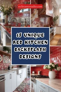
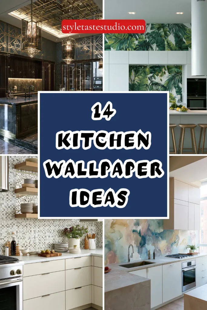
14 Kitchen Wallpaper Ideas for a Stylish Modern Refresh
Wallpaper in the kitchen has historically been treated with suspicion — the room’s particular combination of steam, grease, moisture, and the inevitable proximity of small children and their various food-related activities positioning it as a hostile environment for a material more typically associated with the controlled conditions of a living room or a bedroom.
That suspicion, while not entirely without basis, has been substantially overtaken by the developments in modern wallpaper technology — the vinyl-coated and washable surfaces, the moisture-resistant adhesives, the scrubbable finishes that handle the kitchen environment with genuine competence — and by the growing recognition that the kitchen is the room where a well-chosen wallpaper delivers more visual impact, more personality, and more instant design transformation than in almost any other domestic space.
The kitchen wallpaper that is chosen with intelligence — applied to the right surface, in the right pattern and scale, in deliberate relationship to the cabinetry, the countertop, and the hardware it sits alongside — is the kitchen design decision that guests notice first, remember longest, and ask about most consistently. These fourteen ideas demonstrate exactly how to make it work.
1. The Botanical Print on a Single Feature Wall
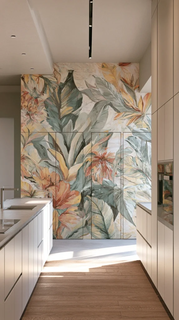
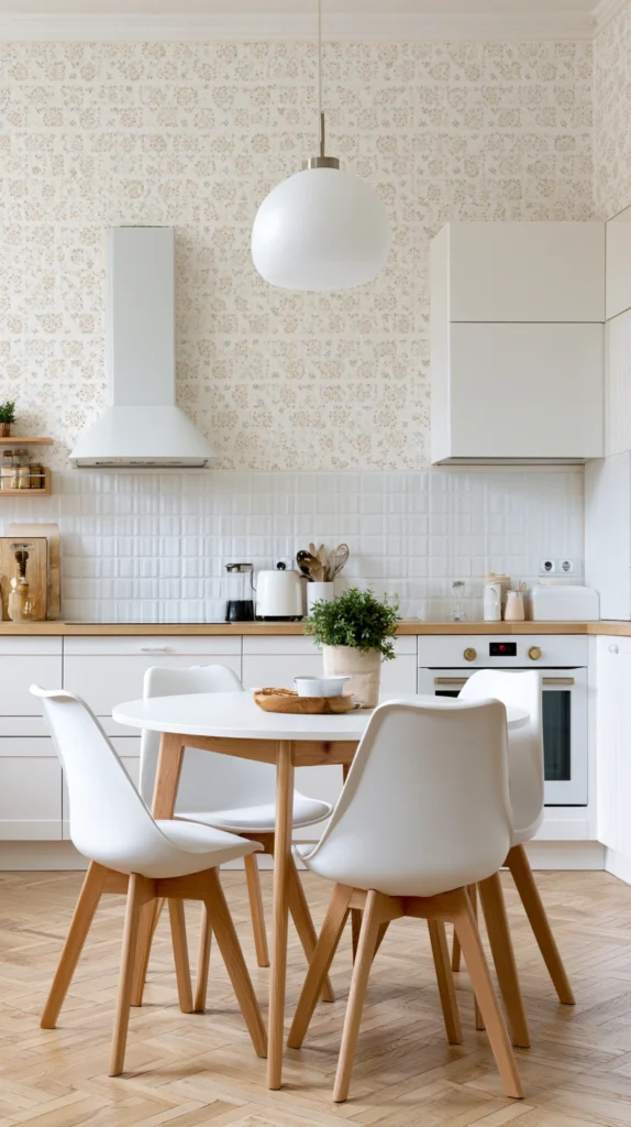
A botanical wallpaper — large-scale leaf prints, overblown florals, or detailed herbarium-style illustrations of fruits and vegetables — applied to a single feature wall in the kitchen creates an immediate visual focal point of considerable beauty and considerable personality that connects the kitchen space to the natural world in the most direct and most decorative way available. The feature wall approach is the correct strategy for a bold botanical print in the kitchen .
One wall of genuine visual drama against three walls of the complementary paint colour pulled from the wallpaper’s palette creates impact without the visual saturation that all-four-walls application of a complex pattern can produce in a room that is experienced from close proximity during daily use. Choose a botanical with a warm background — cream, terracotta, warm grey — rather than a white ground that reads as clinical rather than decorative in kitchen light.
2. The Geometric Pattern Behind Open Shelving
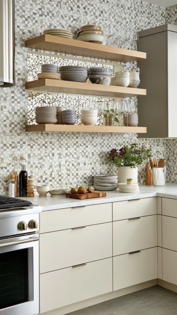
Open kitchen shelving — the timber or metal floating shelves that have replaced upper cabinets in countless contemporary kitchen designs — creates a display opportunity in the wall surface visible behind the shelved objects that most kitchens completely waste by leaving it in the same paint colour as the surrounding walls.
A geometric wallpaper — a simple repeat in two or three tones, a bold graphic pattern, a Moroccan-inspired tile effect, or a subtle diamond or chevron — applied to the wall section behind the open shelves creates a composed, layered visual display in which the ceramics, glassware, and objects on the shelves read as a curated arrangement against a designed backdrop rather than a collection of kitchen items placed in front of a bare wall.
Choose a pattern whose scale is large enough to be visible between the shelved objects but whose colour palette complements rather than competes with the objects it will display.
3. The Vintage-Inspired Toile de Jouy
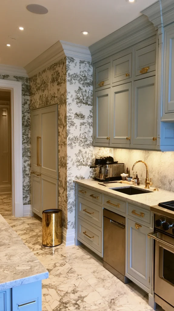
A toile de jouy wallpaper — its characteristic detailed narrative scenes in a single colour on a contrasting ground, its associations with the French decorative tradition and the particular quality of historical charm it carries regardless of the kitchen aesthetic surrounding it — brings a quality of genuine character and genuine wit to the kitchen space that few other wallpaper styles deliver with the same completeness or the same confidence.
The kitchen toile works particularly well in a traditional or transitional kitchen — alongside Shaker cabinetry, natural stone countertops, and aged brass hardware — where its period associations connect naturally to the broader design language of the space. Choose the classic navy on cream, terracotta on white, or the warmer black on buff colourway that suits kitchen palettes most consistently, and apply to the wall section most visible from the kitchen’s primary entry point.
4. The Textured Grasscloth Effect
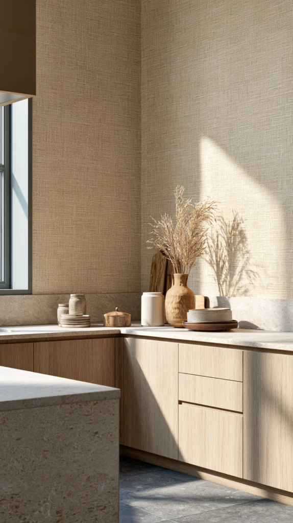
A grasscloth or grasscloth-effect wallpaper — its woven natural fibre surface or its printed simulation of that surface creating a warm, organic texture that reads as simultaneously natural and refined — brings the material richness of a woven surface to the kitchen wall without the practical vulnerability of genuine grasscloth, which handles moisture poorly in genuinely humid kitchen environments.
The textured grasscloth-effect in a warm honey, natural buff, or warm grey tone creates the kitchen wall surface that contributes material warmth and visual depth without pattern complexity, making it the ideal wallpaper choice for the kitchen where a strong pattern would compete with the cabinetry or the countertop material the design has already committed to. It works particularly well in kitchens with natural timber cabinetry, concrete countertops, and the warm material palette that grasscloth’s organic character most naturally complements.
5. The Bold Maximalist Jungle Print
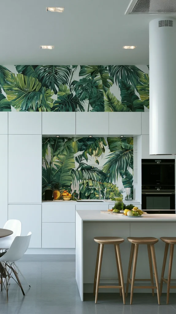
A maximalist jungle wallpaper — dense tropical foliage at large scale, the print covering every centimetre of the wallpapered surface with leaves, fronds, and botanical complexity of extraordinary richness — is the kitchen wallpaper decision that requires the most confidence and delivers the most memorable result, transforming the kitchen’s most visible wall into a statement of design personality so complete and so committed that no additional decoration is necessary or appropriate on the same surface.
The jungle print works in the kitchen because the room’s typically generous wall-to-cabinet ratio — the areas of wall above the counter and below the ceiling that are not occupied by cabinetry — provides sufficient continuous surface area for the pattern’s scale to read properly and to build the layered, immersive quality that makes maximalist botanical prints so compelling at full application. Keep the surrounding surfaces — cabinetry, countertop, floor — in simple, quiet tones that allow the wallpaper to be the kitchen’s undisputed visual hero.
6. The Subtle Linen or Paper Texture
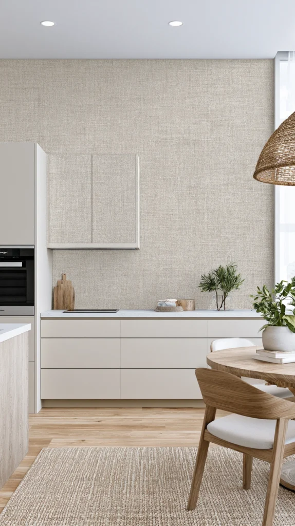
A wallpaper with the visual character of natural linen, textured paper, or a fine woven surface — its pattern so subtle that it reads primarily as texture rather than design from a normal viewing distance — is the kitchen wallpaper for the designer who wants the material warmth and the surface depth that wallpaper provides without the commitment to pattern that most wallpaper choices require.
This category of wallpaper is the most versatile and the most consistently successful in kitchen applications because it works with every cabinetry colour, every countertop material, and every kitchen aesthetic without risk of pattern conflict or visual competition .
It simply upgrades the wall’s surface quality from flat paint to something richer and warmer without asserting its own design personality above that of the surrounding elements. Specify in a warm white, a natural oatmeal, or a soft warm grey for the most universally applicable kitchen result.
7. The Art Deco Geometric in Gold and Deep Tone
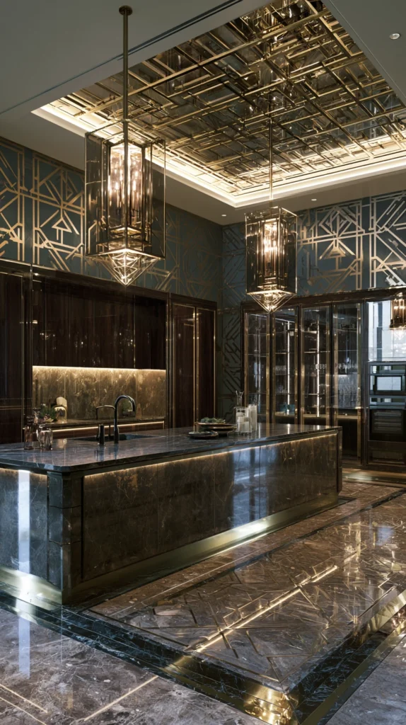
A kitchen wallpaper in the Art Deco tradition — bold geometric forms in gold, brass, or warm metallic tones against a deep background of navy, forest green, deep terracotta, or rich burgundy — creates a kitchen design moment of genuine glamour and genuine sophistication that connects the space to one of the most enduringly beautiful design vocabularies in the decorative arts tradition.
The Art Deco kitchen wallpaper works best in the kitchen’s most contained and most intimate spaces — the dining alcove within the kitchen, the short wall between two cabinet runs, the wall visible at the kitchen’s entry point — where its depth of colour and the richness of its metallic patterning can be experienced at close range and appreciated in their full detail. Pair with brushed brass or unlacquered brass hardware, deep-toned cabinetry, and a stone countertop with warm undertones for a kitchen of considerable decorative ambition and genuine visual authority.
8. The Simple Stripe in a Kitchen-Appropriate Scale
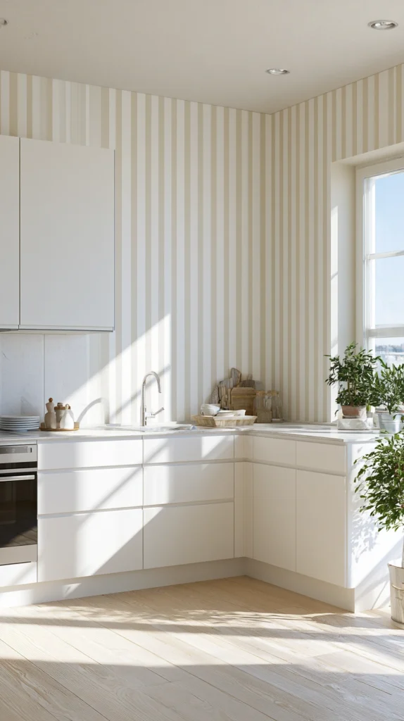
A striped wallpaper in the kitchen — vertical stripes of a width and a colour combination chosen in deliberate relationship to the kitchen’s ceiling height, its cabinetry colour, and its overall palette — is the pattern decision that provides the most reliable and most consistently beautiful result of any wallpaper type in the kitchen environment, because the stripe’s simplicity prevents it from competing with the complexity of the kitchen’s other surfaces while its directionality and its colour contribution transform the wall quality significantly.
Vertical stripes that reinforce the ceiling height perception — in a combination of warm white and the cabinetry colour, or in warm white and a complementary accent tone — are the kitchen stripe application most consistently worth considering. Wide stripes in two tones of the same colour — a tonal stripe rather than a contrasting one — create the subtlest and most sophisticated version of this idea, adding visual interest without the strong graphic quality of a high-contrast stripe.
9. The Hand-Painted Effect Mural Wallpaper
A mural wallpaper — a single large-scale image covering an entire wall without a repeating pattern, its content ranging from a landscape scene to an abstract composition to a detailed architectural view — creates the kitchen design moment of greatest scale and greatest visual ambition available to a wallpaper application, treating the kitchen wall as a canvas rather than a surface and the wallpaper as art rather than decoration.
The mural wallpaper is ideal for the kitchen’s end wall — the wall at the far end of the room that is seen in its entirety from the kitchen’s entry point and that provides sufficient continuous surface area for the image to be read without interruption by cabinetry or appliances.
Choose a subject with personal resonance — a botanical illustration of plants that matter to the household, a landscape of a meaningful place, an abstract composition in the kitchen’s precise palette — rather than a generic beautiful image, and the mural becomes a piece of genuinely personalised kitchen art.
10. The Classic Tile Effect in an Updated Palette
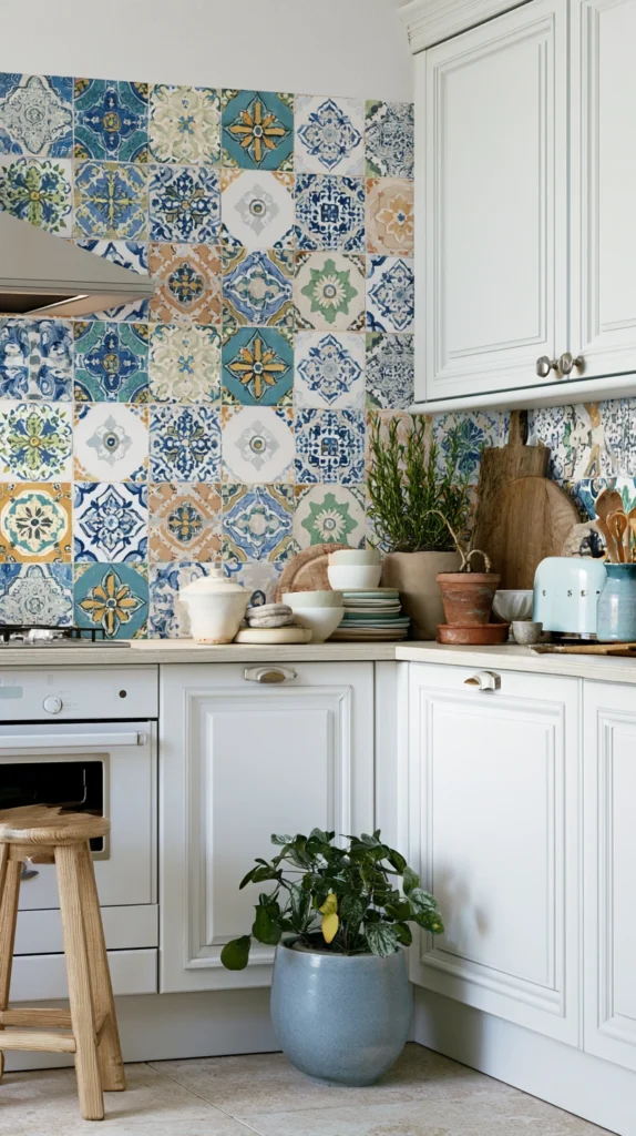
A tile-effect wallpaper — the visual character of encaustic cement tile, Moroccan zellige, Victorian geometric tile, or Spanish hand-painted tile replicated in a printed surface that is both more practical and more economical than the genuine material — creates the kitchen backsplash or feature wall aesthetic of considerable decorative richness without the installation complexity, the grout maintenance, or the cost of genuine tile application.
The tile-effect wallpaper works most convincingly behind open shelving, in a dining zone within the kitchen, or on a wall section that does not receive direct water or grease exposure — the cooking zone immediately behind the range requires a genuinely water and grease-resistant surface that even the best quality kitchen wallpaper cannot provide as reliably as actual tile.
Choose an updated palette — dusty terracotta with warm white, deep teal with natural cream, warm sage with aged ivory — rather than the standard colour combinations of the tile type’s original tradition for a wallpaper that reads as contemporary rather than historically derivative.
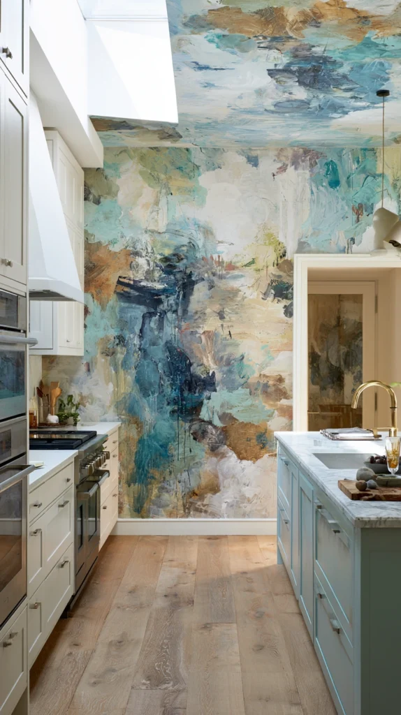
11. The Abstract Watercolour Print
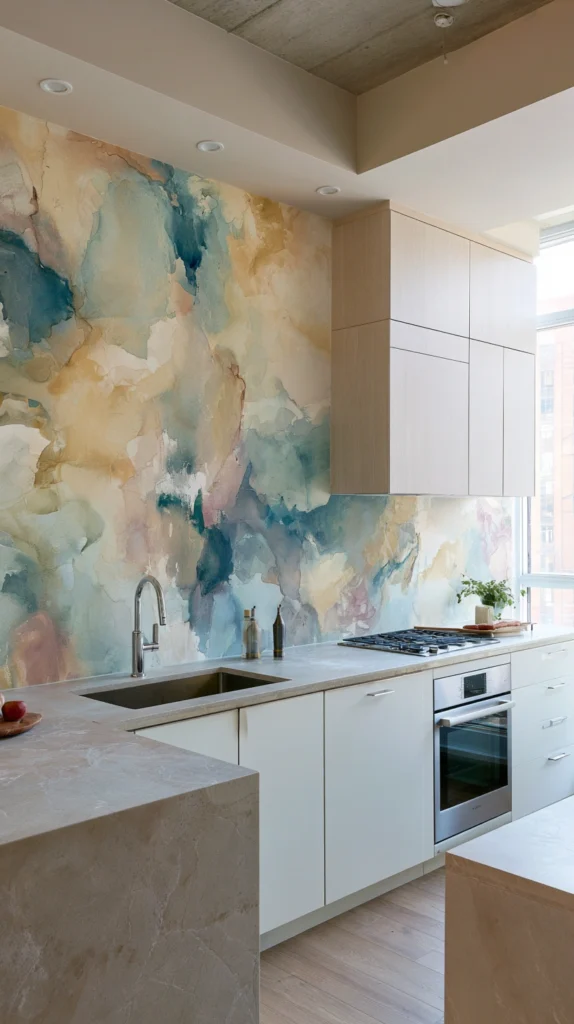
An abstract watercolour wallpaper — its soft, bleeding colour washes and organic shapes creating the impression of a painted surface rather than a manufactured pattern — brings an artistic, studio quality to the kitchen wall that no other wallpaper category delivers with the same sense of genuine painterly sensibility and genuine aesthetic ambition.
The watercolour pattern’s edges are soft rather than precise, its colour distribution irregular rather than uniform, its overall effect one of hand-made imperfection that suits the warm, organic kitchen aesthetic far more naturally than the hard-edged precision of geometric or tile-effect alternatives.
Choose a palette drawn from warm, earthy tones — amber, terracotta, warm grey, dusty sage — rather than the cool watercolour palettes that read as too delicate and too bedroom-appropriate for the kitchen’s warmer material environment, and apply to the wall most visible from the kitchen’s dining or social zone.
12. The Dark Ground Floral for Drama
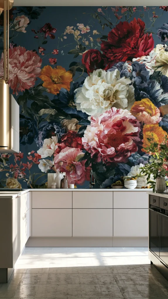
A dark-ground floral wallpaper — large overblown blooms in warm, painterly tones against a deep background of ink black, forest green, or deep navy — creates the kitchen design moment of greatest dramatic impact available to a wallpaper application, its deep ground colour and its generous botanical pattern combining to produce a surface of extraordinary visual richness that transforms the kitchen’s atmosphere completely and immediately.
The dark ground floral requires confidence and requires the surrounding surfaces to be specified in relationship to it rather than independently — the cabinetry colour, the countertop tone, and the hardware finish all become supporting decisions to the wallpaper’s visual authority when the dark floral is the kitchen’s primary design statement.
Pair with warm-toned cabinetry in cream, warm white, or natural timber that reflects light back into the room and prevents the dark wallpaper from making the kitchen feel heavy rather than dramatically beautiful.
13. The Scandi-Inspired Simple Print
A Scandinavian-inspired kitchen wallpaper — clean, simple graphic patterns in two or three tones, its geometric or nature-inspired motifs at a modest scale that suits the intimate viewing distances of kitchen use, its colour palette restrained and warm .
It is the wallpaper option for the kitchen that wants personality and freshness without the commitment or the visual intensity of a bolder pattern choice. The Scandi-style kitchen wallpaper in a warm white with a single accent colour — dusty terracotta, warm sage, or a muted ochre — works with almost every kitchen cabinetry colour and almost every countertop material, making it the most practically accessible wallpaper choice on this list for the widest range of existing kitchen conditions.
Its simplicity is its strength — it refreshes the kitchen’s visual character without requiring any other change to the surrounding design to make it work, which is precisely the quality that makes it the most genuinely practical kitchen wallpaper idea available.
14. The Metallic Wallpaper for Evening Glamour
A metallic wallpaper — its surface incorporating genuine or simulated metallic elements that catch and reflect artificial light with a quality of shimmer and warmth that changes dramatically between day and evening, between natural light and the warm artificial light of the kitchen in the evening hours .
It is the kitchen wallpaper that performs most differently and most beautifully after dark, transforming from a relatively subdued daytime surface into a genuinely glamorous evening one as the kitchen’s lighting transitions from natural to artificial and the metallic elements in the wallpaper surface begin to respond to the warm artificial light with a quality of warm, moving luminosity that flat surfaces entirely lack.
Specify in a warm gold, a soft copper, or a warm champagne metallic tone rather than a cool silver or chrome that reads as cold in kitchen light conditions, and position behind a section of counter that is lit by pendant or undercabinet lighting that will directly activate the metallic surface’s reflective quality through the kitchen’s most socially active evening hours.
Final Thoughts: Choosing Kitchen Wallpaper With Conviction
The kitchen wallpaper that genuinely refreshes the space is the one chosen with genuine conviction rather than cautious hedging — the bold botanical committed to fully rather than the restrained pattern selected as a compromise, the dark ground floral embraced completely rather than the safer version chosen because the first choice felt like too much.
Specify a moisture-resistant or vinyl-coated product appropriate for kitchen conditions, apply to the surface with the most visual impact and the least practical exposure to steam and grease, and commit to the pattern and the palette that genuinely excites rather than the one that merely pleases. The kitchen wallpaper applied with complete commitment is always the one worth talking about — and the one that makes every other element in the kitchen look more considered and more intentional as a result of its confident presence on the wall beside them.