
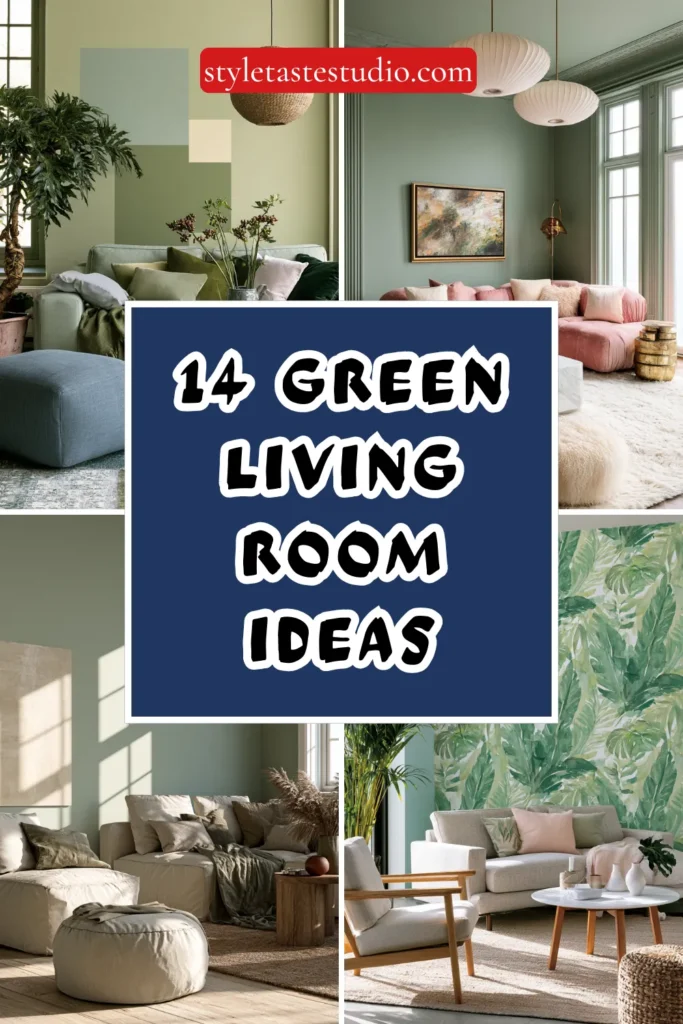
14 Green Living Room Ideas for Refreshing Natural Spaces
Green living rooms harness nature’s most prevalent color creating spaces that simultaneously energize and calm through this psychologically complex hue, spanning from vibrant lime through sophisticated sage to deep forest tones.
This versatile color family references the natural world, establishing an inherent organic connection while offering a remarkable range, allowing applications from subtle neutral-like presence through bold saturated statements, depending on shade selection and application intensity.
Strategic green integration, incorporating appropriate tone selection matching intended atmosphere, balanced application preventing overwhelming saturation, and complementary material choices enhancing green’s natural character, creates living rooms that feel fresh, grounded, and deliberately designed.
Understanding which green shades suit specific design intentions, how this color behaves in varied lighting conditions, and what constitutes successful green application, ensuring sophistication rather than dated appearance, requires careful consideration beyond simple color preference.
These fourteen green living room ideas demonstrate practical approaches from accent applications through comprehensive color immersion, each proving that thoughtful green implementation creates refreshing spaces that connect interiors to nature while showcasing the design confidence that successful color application requires.
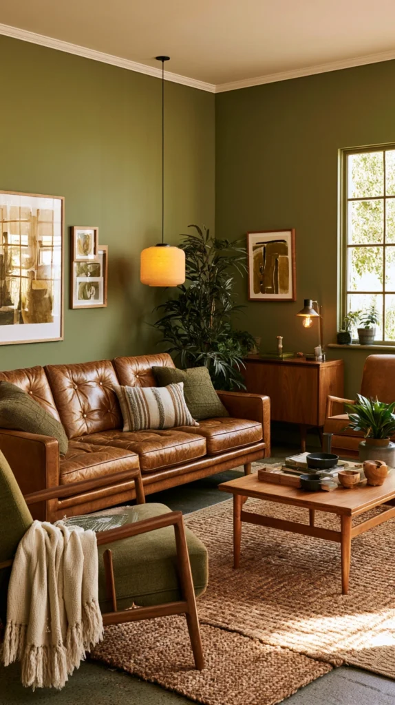
1. Sage Green Walls Sophisticated Calm
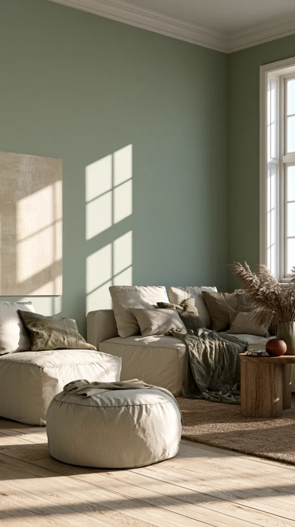
Establish serene, sophisticated environments through soft sage green walls, creating the kind of muted natural color that reads almost neutral while providing perceptible warmth and organic character. Choose desaturated sage tones with gray undertones, creating sophisticated restraint, pair with natural wood furniture and organic textures, reinforcing nature connection, and appreciate how the subtle green influences the room atmosphere without demanding attention.
The sage shade creates calming environments while the muted intensity coordinates easily with varied furniture styles and decorative palettes. The sophisticated tone suits contemporary and transitional interiors, while the natural reference prevents the coldness that pure gray sometimes creates. The gentle shade works beautifully across varied lighting conditions, maintaining consistency unlike some greens that shift dramatically.
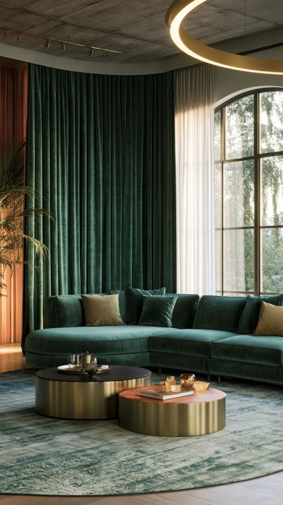
2. Emerald Velvet Sofa Statement
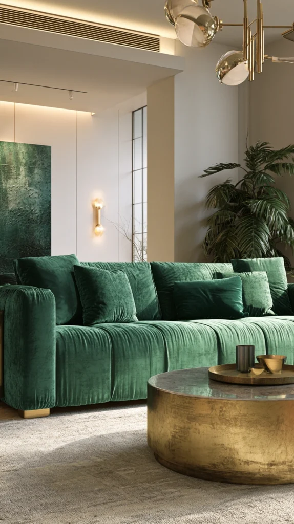
Introduce luxurious jewel-tone drama through emerald green velvet sofas, creating the kind of bold, sophisticated statement that establishes immediate room character and demonstrates design confidence. Choose quality emerald velvet in rich saturated tones, creating depth and luxury, pair with metallic accents in gold or brass, enhancing the jewel-like quality, and position against neutral wall colors, preventing color competition.
The emerald shade feels currently relevant, while the rich saturated tone suggests timeless sophistication rather than trendy application. The velvet texture adds tactile luxury while the substantial furniture investment delivers both seating comfort and dramatic visual presence. The bold color creates focal points while the jewel tone coordinates beautifully with varied neutrals and accent colors.
3. Forest Green Accent Wall
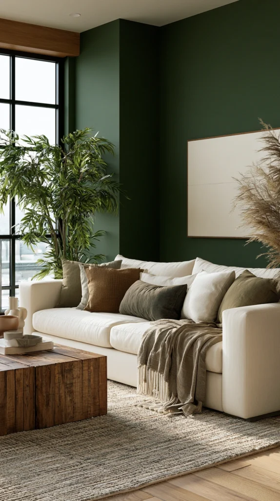
Create moody, dramatic environments through deep forest green accent walls, establishing rich color presence and the kind of enveloping character that makes rooms feel intimate and sophisticated.
Paint walls behind sofas or media centers, creating dramatic backdrops. Choose deep saturated forest tones with blue or gray undertones, avoiding yellowy olive greens, and pair with lighter furnishings, preventing spaces from feeling cave-like. The dark green creates sophisticated drama, while the single wall application contains the intensity, preventing overwhelming darkness.
The deep tone works particularly well in rooms with abundant natural light, where the darkness creates a welcome contrast. The forest shade coordinates beautifully with natural woods, leather, and organic materials, creating cohesive natural palettes.
4. Olive Green Vintage Character
Embrace earthy olive tones, creating vintage 1970s-inspired character and the kind of warm organic presence that feels currently relevant while referencing historical design periods. Choose muted olive greens with brown or gold undertones, creating a warm, earthy character.
Pair with natural materials, including wood, rattan, and jute, reinforcing organic aesthetics, and incorporate vintage or vintage-inspired furnishings, completing the retro reference.
The olive shade feels sophisticated and grounded, while the warm undertones create inviting, comfortable environments. The vintage reference feels intentional and stylish, while the earthy quality ensures lasting rather than fleeting appeal. The muted saturation coordinates easily with varied accent colors, creating versatile foundations.
5. Mint Green Fresh Accent
Introduce light, refreshing color through mint green accents, creating the kind of fresh, optimistic presence that brightens spaces without the intensity that darker greens demand. Use mint through throw pillows, artwork, or small furniture pieces, adding cheerful color pops, pair with whites and soft grays, creating fresh, clean combinations, and appreciate how the pale green adds personality without overwhelming.
The mint shade feels youthful and fresh while the light value maintains airiness and brightness. The cheerful tone works particularly well in spaces needing energy and optimism, while the pale intensity suits small rooms where darker greens might feel oppressive. The fresh shade coordinates beautifully with coastal, cottage, and contemporary styling.
6. Green and Pink Unexpected Pairing
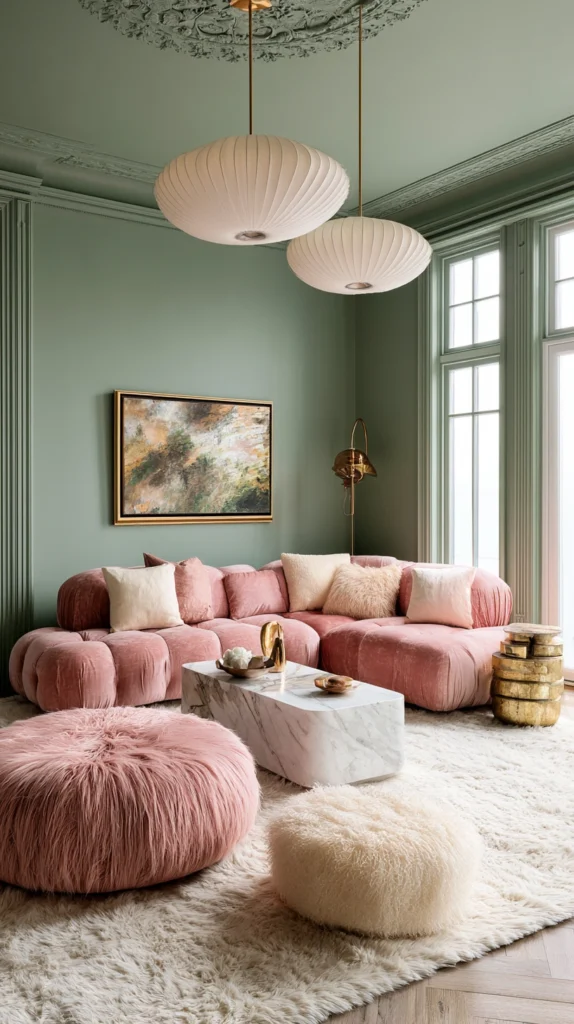
Create sophisticated, unexpected combinations pairing various greens with soft pinks, establishing the kind of nature-inspired palette that references gardens and florals while feeling fresh and contemporary. Use sage or olive green walls with blush pink upholstery, creating soft romantic combinations, or pair emerald with coral, creating more vibrant energetic pairings.
The green-pink combination references natural flower and foliage relationships while the unexpected pairing demonstrates design sophistication. The combination works across intensity levels from pale sage and blush through saturated emerald and fuchsia, depending on desired drama. Include cream or white as neutral bridge, preventing the two colors from competing, while the soft neutral expands the palette.
7. Botanical Print Wallpaper
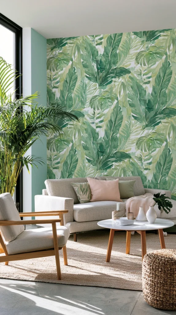
Incorporate green through lush botanical wallpapers featuring tropical leaves, garden florals, or jungle patterns, creating immersive natural environments and maximizing green presence without paint commitment. Choose dramatic palm or monstera prints creating tropical character, select traditional botanical illustrations for classical elegance, or embrace abstract leaf patterns for contemporary styling.
The wallpaper approach delivers substantial green presence while the pattern adds visual complexity and interest beyond solid color. The nature imagery creates clear organic reference while the varied green tones within patterns add dimensional interest. Apply to single accent walls for impact or comprehensive coverage, creating immersive environments.
8. Hunter Green Built-Ins
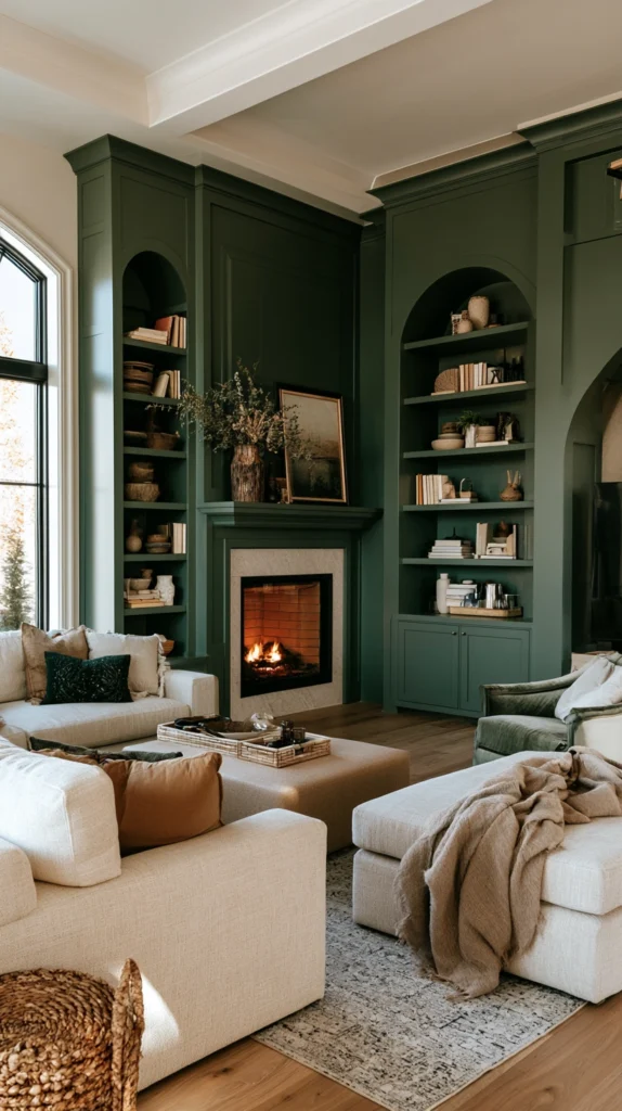
Paint built-in shelving, cabinetry, or millwork in rich hunter green creating sophisticated architectural presence and the kind of designed detail that elevates standard construction into custom features.
Choose deep hunter green with blue undertones creating sophisticated richness, paint interiors coordinating or contrasting for additional interest, and style shelves thoughtfully displaying curated objects against the colored background.
The painted built-ins create architectural interest while the deep green adds sophisticated character transforming standard features into design elements. The permanent application demonstrates commitment while the architectural integration feels intentional and considered. The rich background color makes displayed objects pop creating gallery-like presentations.
9. Green Velvet Curtains Luxury
Add sumptuous texture and color through green velvet curtains creating light control, sound dampening, and the kind of luxurious presence that elevates room sophistication and comfort. Choose velvet drapery in emerald, forest, or sage depending on desired intensity, install ceiling-height panels creating maximum impact and perceived height, and appreciate how the substantial fabric adds warmth and acoustic dampening.
The velvet texture creates luxury while the green color adds natural character, preventing the heaviness that dark neutral curtains sometimes create. The light-blocking qualities create comfortable viewing environments while the substantial presence adds architectural weight. The green introduction through textiles allows seasonal rotation if desired.
10. Chartreuse Modern Pop
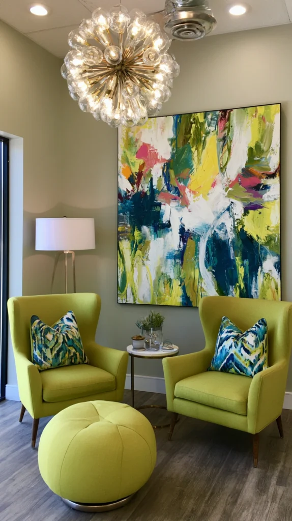
Inject vibrant contemporary energy through chartreuse accents, creating the kind of unexpected lime-yellow green that demonstrates design confidence and contemporary sensibility.
Use chartreuse through contemporary artwork, modern accent chairs, or decorative accessories, adding vibrant pops, pair with neutrals and metallics, creating sophisticated contexts for the bold accent, and appreciate how the unexpected shade creates memorable moments.
The vibrant tone feels modern and fresh while the unusual shade demonstrates sophisticated color confidence. The high-visibility color works best in limited doses as genuine accents rather than dominant presences. The contemporary character suits modern interiors while the nature reference prevents a purely artificial feeling.
11. Sage and Cream Soft Combination
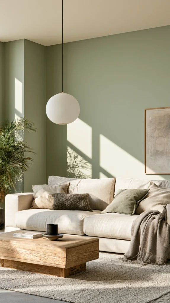
Develop gentle, sophisticated palettes pairing soft sage greens with warm creams, creating the kind of subtle natural combination that feels restful and perpetually appropriate. Use sage walls with cream upholstery, creating soft tonal combinations, incorporate both colors through varied textiles and accessories, creating layered cohesive presentations, and appreciate how the limited palette creates calm, unified spaces.
The sage-cream combination feels sophisticated and restrained, while the natural tones create organic character. The soft combination coordinates with natural materials, including wood, stone, and natural fibers, creating comprehensive organic aesthetics. The gentle palette creates backgrounds allowing artwork and decorative objects proper appreciation.
12. Teal-Green Blue Undertone
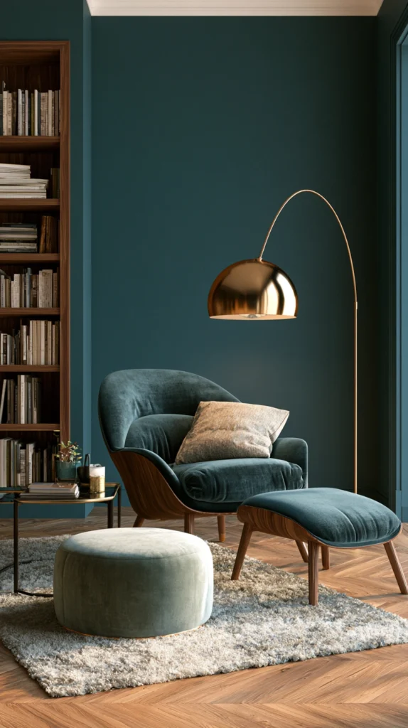
Embrace blue-leaning greens, including teal, turquoise, or peacock shades, creating the kind of complex color that bridges green and blue families, offering unique character. Choose greens with strong blue undertones creating distinctive teal character, appreciate how the blue influence creates cool, sophisticated tones, and pair with warm woods or metals, balancing the cool color temperature.
The teal-green shades feel distinctive and memorable, while the blue influence creates sophistication, preventing the yellowy appearance that some greens develop. The complex color creates interest while the unique shade demonstrates color sophistication. The cool tone works particularly well in warm climates or sun-exposed rooms where cooling color influence proves beneficial.
13. Green Ceiling Unexpected Drama
Apply green to ceilings, creating unexpected color placement that demonstrates design confidence, while the elevated position prevents overwhelming despite green’s presence. Paint ceilings in soft sage or deeper forest, depending on desired drama, pair with neutral walls preventing excessive color saturation, and appreciate how the overhead color creates distinctive character.
The ceiling application draws eyes upward, making rooms feel taller, while the green creates a nature reference and organic character. The unconventional placement demonstrates sophisticated design thinking, while the surprising application creates memorable environments. Choose softer shades for lower ceilings, preventing oppressive feelings, while deeper tones work beautifully in tall rooms.
14. Mixed Green Tone Layering
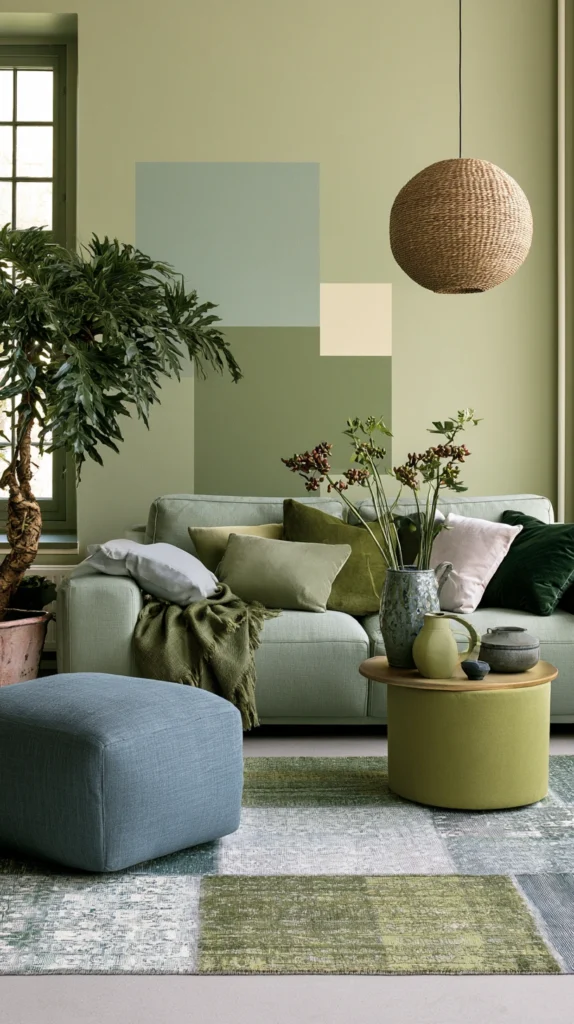
Layer varied green shades from pale mint through medium sage to deep forest, creating sophisticated monochromatic environments demonstrating color mastery and deliberate curation.
Use multiple green tones through walls, furniture, textiles, and accessories, creating tonal variation, maintain an overall green theme while the varied intensities prevent monotonous uniformity, and include generous neutral elements preventing green overload. The monochromatic discipline creates cohesion while the tonal variation adds dimensional interest.
The layered approach suits those committed to green, wanting maximum impact through comprehensive application. The varied tones create the kind of sophisticated color environments that demonstrate serious design consideration.
Successfully incorporating green in living rooms requires testing colors extensively in actual room lighting understanding that green shifts dramatically in varied light exposures appearing quite different in morning versus afternoon versus artificial lighting, balancing green’s natural character with complementary materials and textures that reinforce organic qualities rather than fighting against green’s inherent nature reference, and understanding that green families span enormous range from cool blue-greens through neutral sage-greens to warm olive-greens requiring careful selection matching intended atmospheres.
Consider room orientation and natural light, understanding that north-facing rooms might benefit from warm olive greens while south-facing spaces handle cooler blue-greens successfully. Include adequate neutral elements providing visual rest and preventing green fatigue despite initial enthusiasm. Choose green shades carefully, avoiding dated yellow-greens that reference specific historical periods unless deliberately embracing vintage character.
Most importantly, embrace green confidently, recognizing this versatile natural color creates the kind of refreshing organic living spaces that connect interiors to nature while demonstrating the color confidence that makes green applications successful when approached thoughtfully rather than tentatively, proving that this natural shade creates environments that simultaneously energize and calm, making green perpetually relevant for those seeking the psychological and aesthetic benefits this complex versatile color family reliably delivers.