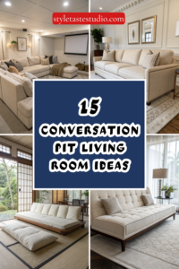
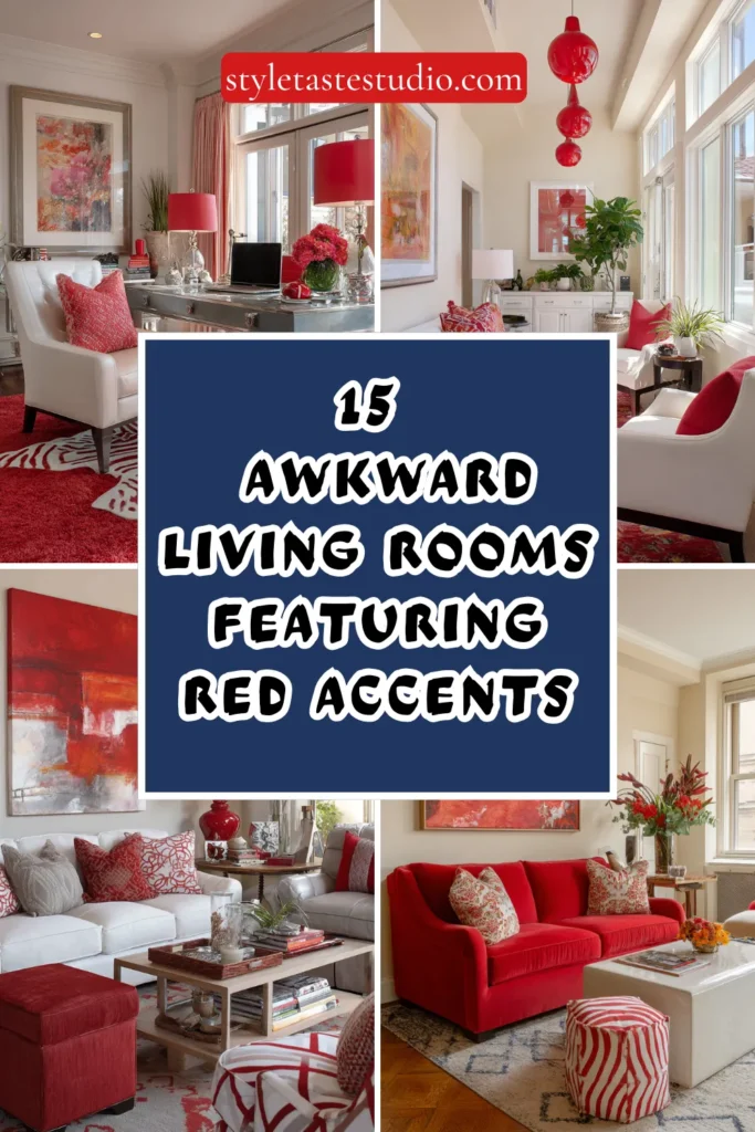
15 Smart Solutions for Awkward Living Rooms Featuring Red Accents
Every house has at least one room that resists easy decoration — a room whose proportions, architectural features, or spatial configuration consistently defeats the conventional furniture arrangements and standard styling approaches that work perfectly well in more straightforwardly shaped spaces.
The awkward living room is the most common variant of this problem: the room that is too long and narrow, too square and small, has windows in the wrong place, a fireplace off-center on its wall, a ceiling of uncomfortable height, or a door placement that makes every furniture arrangement feel compromised.
These rooms are not failures of architecture — they are puzzles that reward genuine design thinking rather than the application of standard solutions, and the homeowner willing to engage with the specific challenges of their specific awkward room rather than fighting against them will consistently produce a more interesting and more personal result than the one who simply buys a conventional three-piece suite and hopes for the best.
The addition of red accents to the problem-solving toolkit is not an arbitrary aesthetic choice — red, deployed with intelligence, is one of the most powerful spatial tools available to the interior designer, capable of drawing attention toward features that deserve emphasis, redirecting attention away from features that do not, creating warmth in a cold-feeling room, defining zones in an undifferentiated space, and generating the visual energy that makes an awkward room feel dynamic and considered rather than simply problematic.
Here are fifteen smart solutions that combine genuine spatial intelligence with the specific power of red.
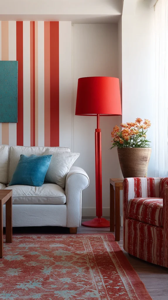
1. Use Red to Define Zones in a Long Narrow Room
The long narrow living room — a room whose length is significantly greater than its width, creating a space that feels more like a corridor than a room — is one of the most common awkward living room configurations, and the standard approach of placing a sofa at one end and the television at the other exacerbates the problem by emphasizing the room’s length without addressing its width deficit.
Red can be used as a spatial organizing tool in this configuration by defining distinct zones within the room’s length — a seating zone, a reading zone, perhaps a workspace corner — each anchored by a red element that gives it visual identity.
A red rug under the primary seating zone, a red pendant light above a reading chair at the room’s far end, and red cushions creating the visual connection between the two zones creates a long room that reads as a sequence of defined destinations rather than a single elongated space.
The eye travels from red element to red element, creating the perception of a varied, intentionally organized interior rather than a room stretched uncomfortably beyond its natural proportions.
2. Draw Attention Away from an Off-Center Fireplace with Red Flanking
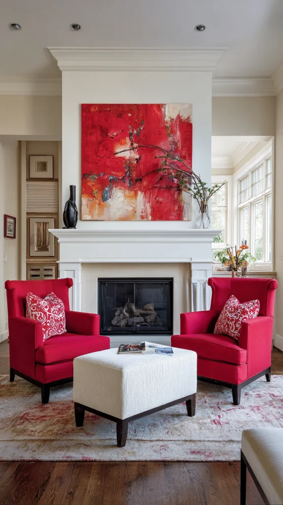
The off-center fireplace — a fireplace positioned not at the midpoint of its wall but to one side, creating an asymmetric room composition that defeats the conventional symmetric mantel arrangement — is a source of persistent decorating frustration because every furniture arrangement that treats the fireplace as the room’s focal point produces an asymmetry that the eye finds slightly wrong.
The solution is to stop treating the fireplace as the room’s center and to create a new visual center through the deliberate deployment of red accents that draw the eye to a different organizing point.
A large red artwork hung on the wall adjacent to the fireplace, positioned at the optical center of the wall rather than above the fireplace, redirects the room’s visual attention to a point that is symmetrically placed relative to the furniture arrangement.
Flanking the fireplace with two red accent chairs of equal visual weight creates a symmetrical composition around the off-center fireplace that reads as resolved despite the architectural asymmetry it accommodates.
3. Lower a Too-High Ceiling with a Deep Red Painted Ceiling
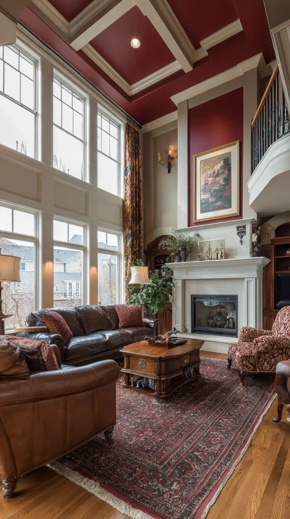
The room with an uncomfortably high ceiling — a room whose vertical dimension significantly exceeds the horizontal dimensions, creating a space that feels more like a shaft than a room — is a spatial problem that painting and furniture cannot address if the ceiling itself is left in its standard light color.
A ceiling painted in a deep, warm red — a burgundy, a deep crimson, or a rich terracotta — brings the visual weight of the ceiling downward, creating the perception of a ceiling that is lower and more comfortable relative to the room’s floor area.
The red ceiling’s warmth also addresses the coldness that very high-ceilinged rooms frequently exhibit — the large volume of air above the furniture arrangement creates a thermal and visual coldness that the red ceiling counteracts with the specific warmth that red introduces regardless of temperature.
The ceiling color should be carried down onto the upper section of the walls — to a picture rail height or to approximately two-thirds of the wall height — for maximum ceiling-lowering effect.
4. Create Visual Width in a Narrow Room with a Red Feature Wall
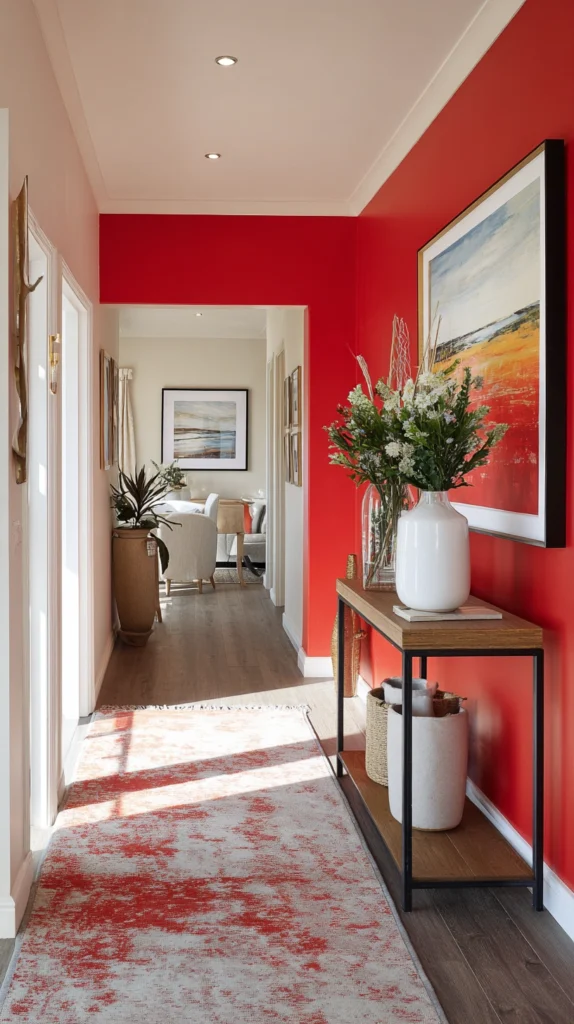
The narrow room benefits from the design trick of making its short walls — the walls that span the room’s width — more visually prominent than its long walls, because the eye’s attention to a strong short wall creates the perception of greater width.
A red feature wall on one of the room’s short ends — either painted in a deep, saturated red or wallpapered in a red-ground pattern — creates a focal point that the eye travels to across the room’s width rather than along its length, which effectively shifts the perceptual emphasis from the dimension that is deficient to the dimension that is adequate.
The red wall should be the room’s most visually complex and most deliberately styled surface — a gallery of art, a beautifully furnished console table, a mirror that reflects the room’s depth — to ensure that the eye’s attention lingers on this surface long enough to create the spatial perception it is intended to produce.
5. Anchor a Floating Furniture Arrangement with a Red Rug
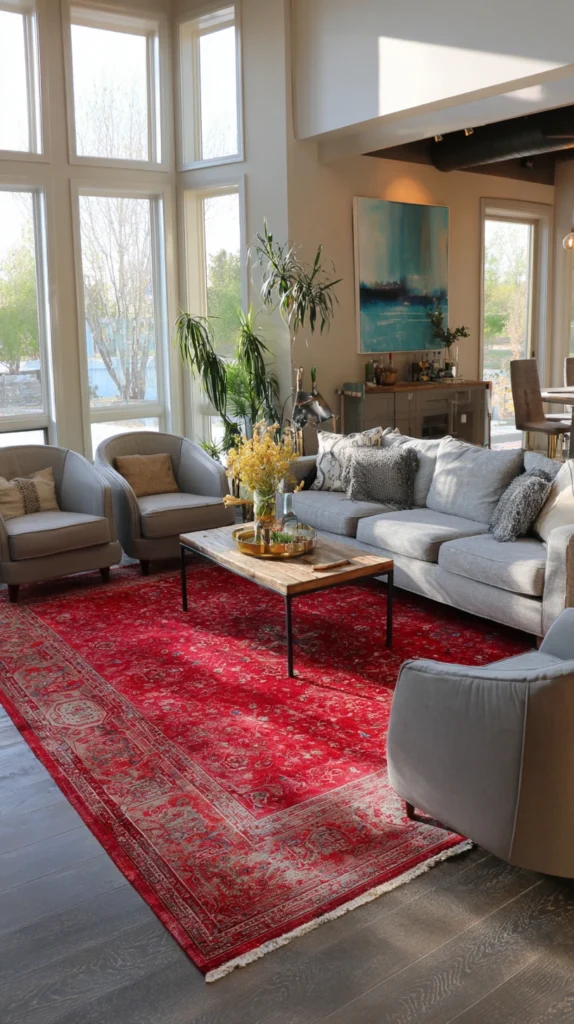
The room whose furniture arrangement feels unresolved — chairs and sofas that seem to float in the space without connecting to each other or to the room’s architectural features — is often suffering from the absence of a defined floor zone that pulls the furniture together into a cohesive grouping.
A red rug of sufficient scale — large enough that all the primary seating pieces have their front legs on the rug’s surface — anchors the floating arrangement to a specific zone of the floor and creates the visual boundary that transforms a collection of disconnected furniture into a coherent seating group.
The rug’s red should be chosen to relate to the room’s existing palette rather than to introduce a new color element — a Persian rug with red as its ground color suits a room with warm, traditional tones; a contemporary flatweave in a saturated red suits a more modern palette. The rug’s pattern and pile height should be appropriate to the room’s overall material language.
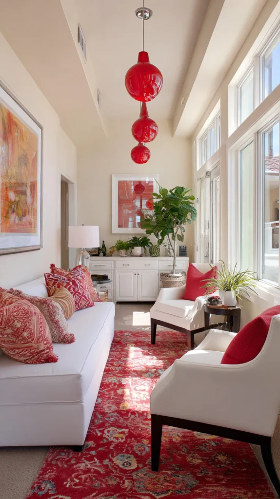
6. Use Red Curtains to Correct a Window That Is Too Small
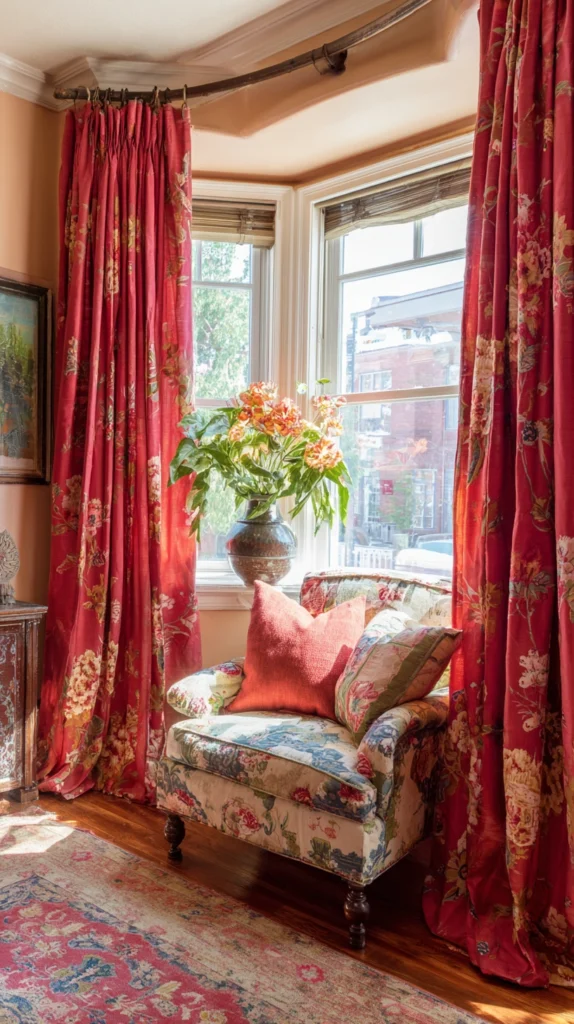
The window that is too small for its wall — the room’s main window whose glazed area is insufficient to provide the visual connection to the outside and the admission of natural light that the room’s scale requires — is a spatial disappointment that no amount of furniture arrangement can remedy.
The curtain treatment, however, can create the impression of a larger, more generous window by extending well beyond the window’s actual dimensions.
Full-length red curtains installed on a pole that extends thirty to forty centimeters beyond the window frame on each side, and that drop from ceiling height to floor, create a framed curtain opening that appears much larger than the window within it.
The red of the curtains provides a visual mass that the small window’s glazing cannot — the eye perceives the red-framed opening as the window’s total presence rather than the glazing alone, which makes the room feel more generously lit and more architecturally resolved.
7. Redirect Attention from an Awkward Door Placement
The living room with a door in an unhelpful position — entering the room at a point that creates an awkward circulation path through the furniture arrangement, or that places the door visually at odds with the room’s other architectural features — creates a spatial disruption that standard decorating cannot address without first drawing the eye’s attention away from the problematic feature and toward something more rewarding.
A deliberate red accent placed at the room’s most visually satisfying point — a red sofa on the room’s principal wall, a large red painting at the far end of the room — gives the eye an immediate, compelling destination that it travels to on entering the room before the door’s awkward placement registers.
The red accent serves as the room’s primary focal point and effectively competes with and defeats the visual prominence of the problematic door by being simply more interesting and more visually powerful.
8. Use Red to Unite a Chopped-Up Open Plan Space
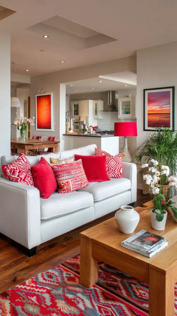
The open-plan living area that has been partially divided — by a structural column, a half-wall, a change in ceiling height, or an awkward architectural intrusion — into sections that feel neither properly open nor properly enclosed is among the most challenging living spaces to decorate effectively.
Red accents that run consistently through all sections of the divided space — the same red in cushions on the sofa in one section, in a lamp on the table in the adjacent section, in an artwork visible from both sections — create a visual thread that the eye follows through the architectural divisions, stitching the awkward space together through color consistency.
The red element in each section should be different in form but consistent in tone, so that the eye recognizes the connection without the arrangement feeling deliberately matched.
9. Solve the Problem of the Badly Placed Radiator with Red Styling
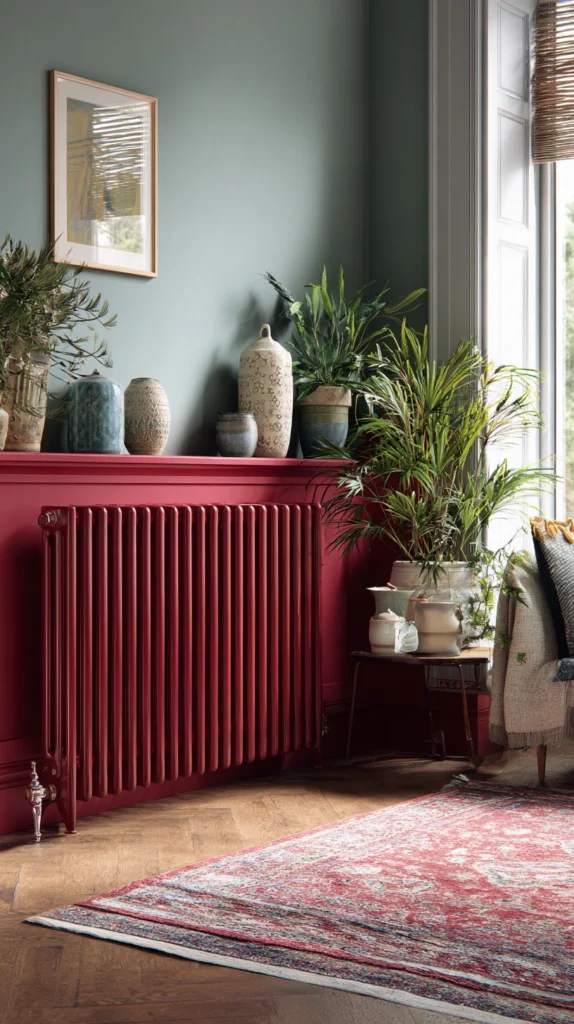
The living room radiator positioned on the room’s main wall — the wall that would ideally accommodate the sofa or a significant piece of furniture — is a practical installation that creates a perpetual decorating problem: the wall is too important to leave empty but the radiator prevents the furniture placement that would make most sense.
A radiator cover that incorporates the red accent — a custom cover with red-painted panels, or a simple timber cover dressed with red decorative objects on its top surface — converts the problematic fixture into a designed element of the room rather than a practical intrusion.
The red styling of the radiator cover draws the eye to the wall as a feature rather than as a compromise, and the horizontal surface of the cover creates a console table equivalent that can be dressed with lamps, plants, and art.
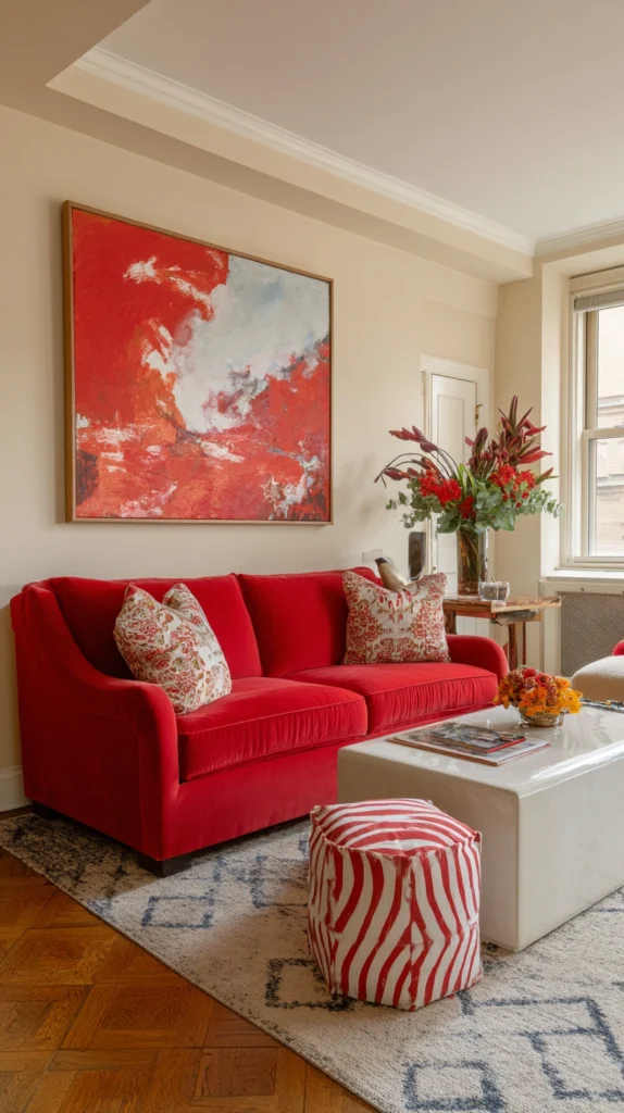
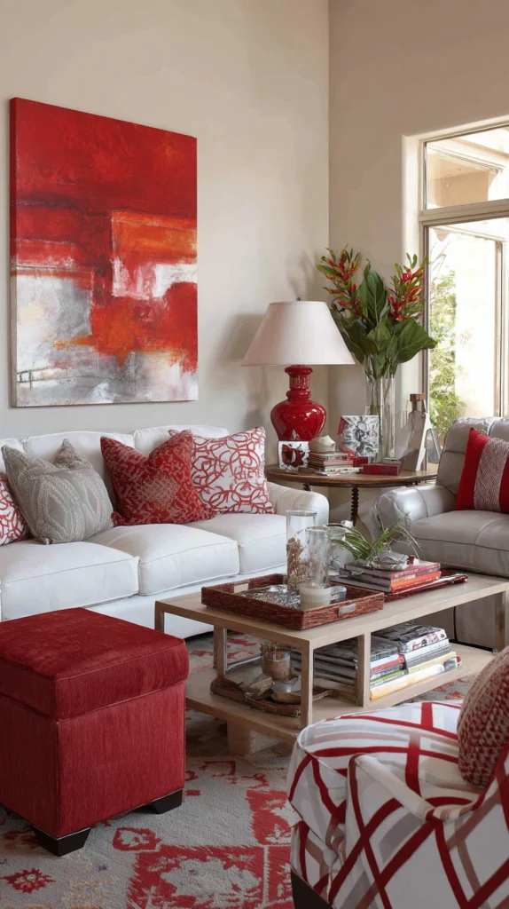
10. Create a Focal Point in a Room Without a Fireplace
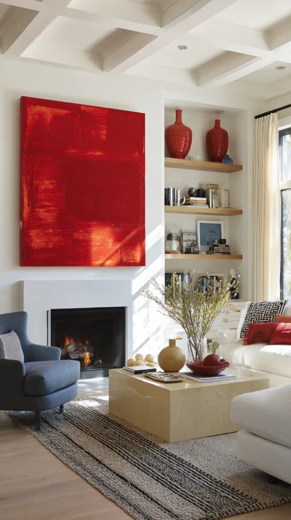
The living room without a fireplace — particularly common in modern construction — has no natural organizing focal point around which the furniture arrangement can be anchored, and the television, while functionally central, rarely creates the visual warmth and social magnetism that a fireplace provides.
A deliberately designed red focal point — a large red statement artwork on the room’s principal wall, flanked by symmetrically placed shelf units and lit with a picture light above — creates the equivalent of a non-functional chimney breast: a visual destination that anchors the furniture arrangement, creates the symmetrical composition that the formal living room requires, and generates the visual warmth that the absent fireplace would otherwise provide.
The red of the artwork should be sufficiently saturated and sufficiently large to read from across the room as the primary visual feature.
11. Use Red Accents to Distinguish a Multifunctional Space
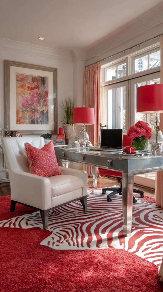
The living room that must also serve as a home office, a playroom, a dining room, or some other function in addition to its primary living purpose is spatially challenged by the competing furniture and organizational demands of multiple activities occupying a single room.
Red accents can be used to create visual distinctions between the different functional zones — red desk accessories in the office corner, a red rug under the dining table, red cushions defining the seating zone — that give each function its own visual identity within the shared space.
The red is consistent enough across all zones to maintain the room’s overall visual coherence, and distinct enough in its specific application in each zone to suggest a purposeful distinction between areas that the room’s architecture cannot provide.
12. Solve a Ceiling That Is Too Low with Vertical Red Accents
The room with a low ceiling — a common problem in older properties, basement conversions, and some modern builds — creates a spatial compression that makes the room feel smaller and more confined than its floor area actually warrants.
Vertical red accents — tall, slim red floor lamps, a red-striped wallcovering with a strong vertical emphasis, or a series of tall red vases arranged at the room’s periphery — draw the eye upward along their vertical extent and create the perception of a ceiling that is higher than it physically is.
The eye’s upward travel along a vertical element creates a spatial impression that the ceiling is located at the top of that vertical element rather than at its actual position, and this perceptual effect is amplified when the vertical element is in a visually strong color that commands the eye’s attention confidently.
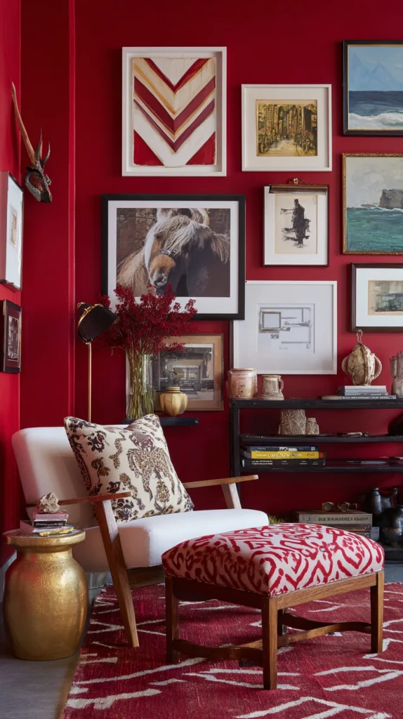
13. Use a Red Gallery Wall to Disguise Uneven Wall Surfaces
The living room wall that is not flat — the wall with plaster repairs, slight surface irregularities, or the patchy quality of a wall that has been painted over multiple times without adequate preparation — creates a background for furniture and art that is quietly but persistently unsatisfying.
A gallery wall that covers the problematic surface — a deliberately composed arrangement of framed art, photographs, and objects that uses red as the unifying element through red frames, red mounts, or artwork with red as the dominant color — disguises the wall’s surface imperfections behind a composition of sufficient visual interest that the background is never visible beneath it. The gallery wall’s compositional richness and the red’s visual energy ensure that the eye is engaged by the content rather than the background.
14. Warm a North-Facing Room with Red Textile Layering
The north-facing living room — the room that receives no direct sunlight and whose light quality is consistently cool and flat regardless of the season — creates a particular decorating challenge because its light deficiency cannot be addressed through window treatment or furniture arrangement: it is a fixed condition of the room’s orientation.
Red textile layering — a red rug, red cushions, a red throw, perhaps red lampshades on the room’s table lamps — introduces a warmth of color that the room’s natural light cannot provide, creating the psychological warmth of a red palette that functions as an effective substitute for the thermal and visual warmth of direct sunlight.
Red’s known psychological effect of raising perceived temperature in the observer means that a room dominated by red textile accents will be consistently experienced as warmer than an equivalent room without them, regardless of the actual thermal conditions.
15. Create Cohesion in a Proportionally Challenged Room with Red as a Through-Line
The final solution addresses the living room that is challenged not by a single specific spatial problem but by a general sense of incoherence — a room that has been furnished and decorated over time without a consistent organizing principle, and whose accumulation of individual decisions that seemed reasonable at the time has produced a whole that feels fragmented and unresolved.
Introducing red as a consistent through-line — a color that appears in small but deliberate quantities in every section of the room, connecting disparate furniture pieces, different wall surfaces, and competing decorative styles through a single chromatic thread — creates the visual coherence that an eclectic room requires without demanding that any existing element be removed or replaced.
The red elements should be modest individually — a cushion here, a lamp there, a small artwork in a corner — and powerful collectively, their combined presence creating the sense that the room was organized around a deliberate color decision rather than assembled without a plan.