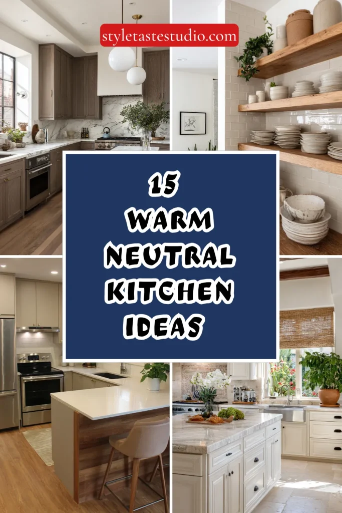
15 Warm Neutral Kitchen Ideas That Never Feel Trendy
Warm neutral kitchens possess a timeless quality that transcends fleeting design trends, creating spaces that feel inviting, sophisticated, and perpetually relevant.
Unlike stark white kitchens that can feel clinical or bold colored schemes that date quickly, warm neutrals offer a foundation that ages gracefully. They adapt effortlessly to evolving personal style, ensuring your investment remains beautiful for decades.
Understanding Warm Neutrals
Warm neutrals contain undertones of yellow, red, or orange that create psychological warmth and visual coziness. These shades include greige, taupe, sand, cream, warm gray, caramel, and soft browns. They feel calming rather than bland and effortlessly elevate a space.
Their versatility is unmatched, complementing nearly any accent color or material. Warm neutrals work across farmhouse, transitional, modern, and classic kitchens. This flexibility is what makes them truly timeless.
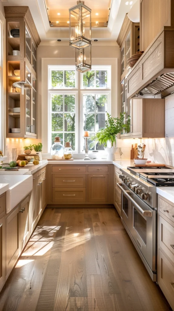
1. Creamy White Cabinets with Natural Wood Tones
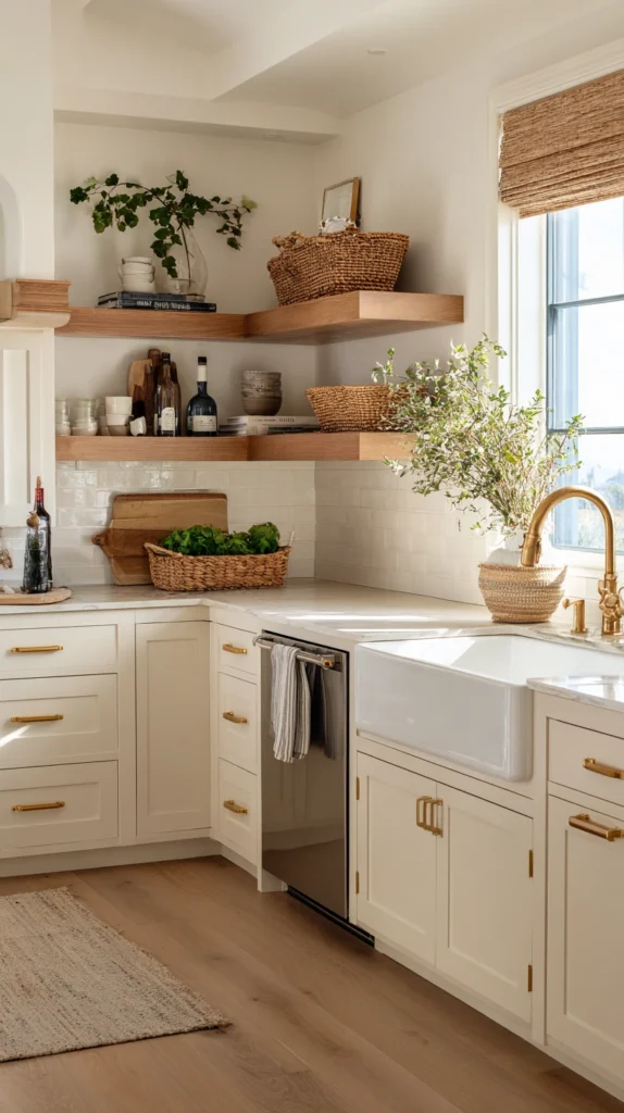
Cabinets in warm cream feel softer and more inviting than stark white. Pair them with oak, walnut, or maple accents on islands or open shelving. The wood grain adds depth while keeping the palette grounded and timeless.
2. Greige Everything Approach
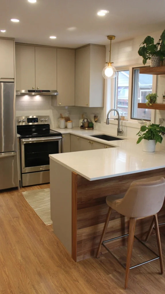
Greige blends gray and beige into one sophisticated neutral. Use tonal layering—light greige walls, medium cabinets, and deeper flooring. This creates dimension without relying on contrast or trend-driven colors.
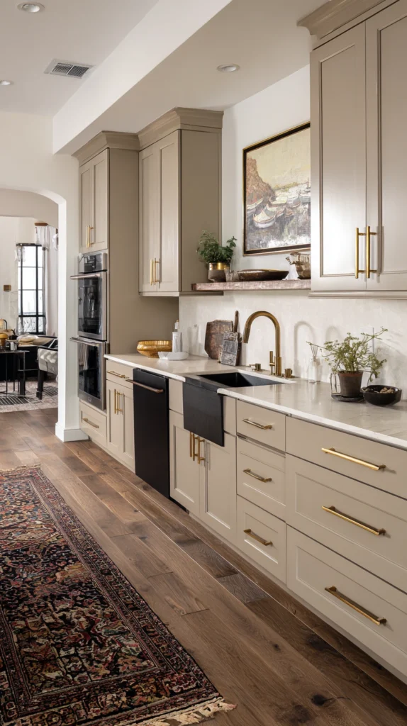
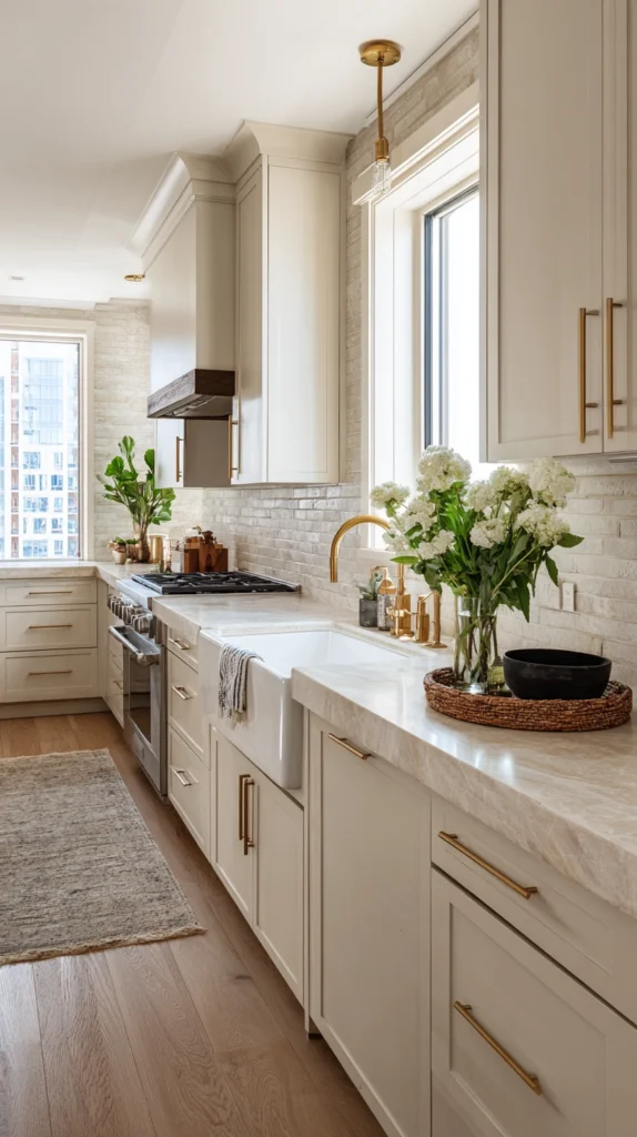
3. Warm Gray Cabinets with Brass Hardware
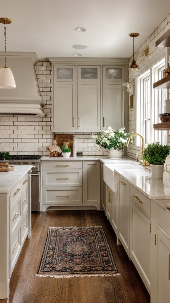
Choose warm gray cabinets with brown undertones rather than cool blue hues. Pair them with unlacquered brass or aged bronze hardware. The subtle patina that develops over time adds charm and authenticity.
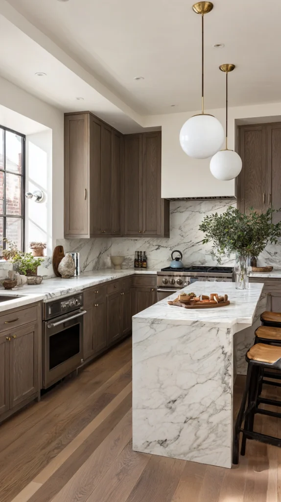
4. Natural Stone and Neutral Palettes
Design the kitchen around warm-toned marble, quartzite, or granite. Let the natural veining create movement and interest. Surround it with complementary neutrals to maintain balance and elegance.
5. Beige Cabinets with Contrasting Island
Use soft beige cabinets along the perimeter and a slightly darker taupe island. This tonal contrast creates focus without overpowering the room. The result feels layered yet harmonious.
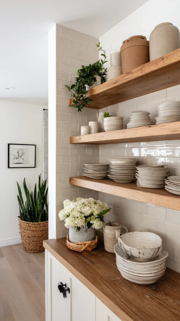
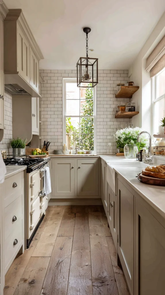
6. Textured Neutral Backsplash
Introduce handmade ceramic tile, stacked stone, or plaster finishes in warm hues. Texture replaces bold color as the design statement. Light shifts throughout the day, adding subtle movement and warmth.
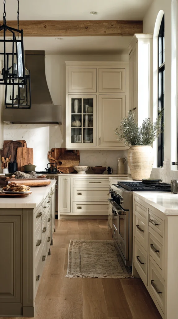
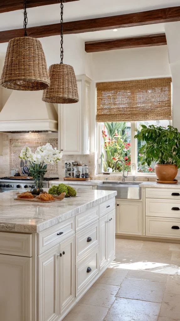
7. Warm White with Wood Beam Ceiling
Warm white walls and cabinets keep the space bright and airy. Exposed wood beams introduce architectural character and richness. The blend feels rustic yet refined and never overly trendy.
8. Limestone and Linen Aesthetic
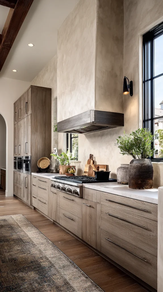
Limestone counters paired with linen-toned cabinetry create European-inspired charm. The matte stone finish feels organic and enduring. Soft gray-beige tones ensure the space remains adaptable over time.
9. Taupe Lower Cabinets with Cream Upper
Ground the kitchen with deeper taupe lowers and lighter cream uppers. This classic division has historical roots and practical benefits. The warm neutral palette keeps the look welcoming rather than formal.
10. Travertine and Warm Oak Combination
Travertine tile introduces natural variation and character. Pair it with warm oak cabinets to create a cohesive, Mediterranean-inspired palette. The combination has endured beautifully for centuries.
11. Plaster-Finish Walls with Natural Materials
Textured plaster or limewash walls add old-world charm. Pair them with wood cabinetry and warm stone surfaces. The handcrafted look feels authentic and timeless.
12. Warm Concrete and Whitewashed Wood
Concrete counters in warm gray tones feel modern yet grounded. Whitewashed oak cabinets soften the industrial edge. The contrast relies on material texture rather than color trends.
13. Shaker Cabinets in Mushroom Tones
Classic Shaker cabinets never lose relevance. Painted in soft mushroom or gray-brown hues, they feel current yet traditional. The simplicity ensures lasting appeal.
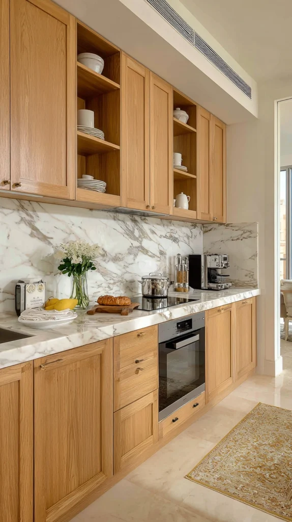
14. Warm Marble with Honey-Toned Wood
Choose marble with creamy backgrounds and golden veining. Pair it with honey-toned maple or oak cabinetry. Both materials age gracefully and grow more beautiful over time.
15. Layered Neutrals with Natural Light
Layer warm whites, greige, taupe, and cream together. Let natural light highlight the subtle differences between tones. This approach prevents monotony while maintaining timeless harmony.
The Psychology of Warm Neutrals
Warm colors feel inviting and comfortable on a psychological level. They create kitchens where family and friends naturally gather. The soft palette reduces visual stress and encourages calm.
Selecting the Right Warm Neutral Tone
Consider your natural light when choosing shades. North-facing kitchens benefit from creamier tones, while south-facing rooms can handle softer greiges. Always test samples throughout the day.
Avoiding the Bland Trap
Use multiple complementary neutral shades instead of one flat color. Incorporate varied materials like wood, stone, and metal. Texture and layering create interest without bold color.
Hardware and Fixture Selection
Warm metals such as brass, bronze, and copper complement neutral cabinetry beautifully. Choose simple, classic shapes rather than ornate or ultra-modern designs. Timeless hardware enhances longevity.
Countertop Considerations
Select countertops that complement rather than sharply contrast cabinetry. Warm marble, quartzite, or taupe-toned quartz work well. Avoid overly busy patterns that may date quickly.
Flooring That Endures
Wide-plank hardwood in warm oak tones remains a favorite for good reason. Limestone or warm concrete also offer durability and character. Choose materials that age gracefully rather than show wear harshly.
Backsplash Balance
Subway tile in cream or warm white remains eternally appropriate. Natural stone adds organic variation without overwhelming the space. Keep patterns subtle for lasting appeal.
Lighting as a Design Element
Unlacquered brass pendants or aged bronze fixtures enhance warmth. Classic silhouettes such as domes or globes stand the test of time. Layer lighting for both beauty and function.
Incorporating Natural Elements
Display wooden cutting boards and ceramic serveware in neutral tones. Add greenery or fresh flowers for seasonal variation. These organic touches reinforce warmth and authenticity.
Window Treatments and Textiles
Choose linen Roman shades or woven blinds in soft neutrals. Keep patterns subtle and within the warm family. Textiles can shift seasonally without disrupting the foundation.
The Role of Paint Finish
Eggshell or satin walls provide gentle sheen and durability. Cabinets benefit from satin or semi-gloss finishes. The subtle luster enhances undertones without feeling glossy.
Long-Term Value and Resale
Neutral kitchens consistently appeal to buyers. They provide a flexible foundation for different styles. This makes them both aesthetically timeless and financially wise.
Maintenance and Aging Gracefully
Warm neutrals hide wear better than stark whites. Brass develops patina, wood deepens in tone, and stone gains character. These changes enhance beauty rather than diminish it.
Conclusion
Warm neutral kitchens succeed because they prioritize quality materials and natural tones. They balance sophistication with comfort. The result is a space that feels relevant year after year.
Whether you prefer creams and soft whites or deeper taupes and warm grays, these ideas prove neutral never means boring. Through layering, texture, and thoughtful material selection, warm neutral kitchens remain enduringly beautiful.