15 Shower Tile Color Combos Designers Love
The shower is the bathroom’s most intensely experienced space — a small, enclosed environment that surrounds the body on three or four sides with its material surfaces, that is experienced at close range and in intimate proximity, and that creates its specific sensory quality through the combination of its material, its color, and the particular way it handles the light that enters it from the bathroom beyond.

The color combination of a shower’s tiles is, in this context, not simply an aesthetic decision — it is the determination of a daily environment whose specific qualities will be felt every morning and every evening for as long as the tiles remain installed.
The shower tile color combination that a designer selects is arrived at through the consideration of several simultaneous variables: the direction and quality of the bathroom’s natural light, the color relationships between the shower and the surrounding bathroom, the material qualities of the specific tiles in question and the way those materials interact with the chosen colors, and the specific atmospheric quality — energizing, calming, warming, cooling — that the shower’s occupant wants to begin and end their day within.
Here are fifteen shower tile color combinations that designers return to consistently, with the reasoning behind each selection and the specific conditions under which each performs at its best.
1. White and Warm Brass — The Timeless Classic
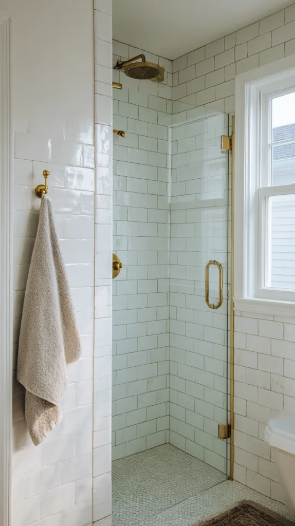
The combination of white ceramic or porcelain tile with warm brass fixtures — the showerhead, the controls, the rail, and the niche shelving all in unlacquered or brushed brass — is the shower tile color combination with the widest range of stylistic application and the longest track record of consistent critical approval.
The white tile provides the shower’s clean, bright ground — the surface that reflects light most effectively and creates the visual freshness that the shower’s cleansing function most naturally suggests — while the warm brass introduces the metallic warmth that prevents the all-white shower from feeling clinical or cold.
The white tile’s specific tone matters significantly in this combination: a cool, pure white suits the brass less well than a warm white with cream or ivory undertones, and the selection of a white tile with the right warmth for the specific bathroom’s light quality is the combination’s most critical specification decision.
The brass’s finish also matters: unlacquered brass develops a warm patina over time that becomes more beautiful with age, while lacquered brass maintains a consistent, brighter finish that does not develop in the same way.
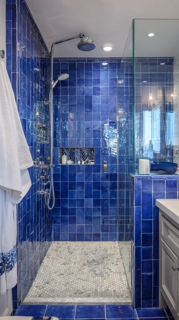
2. Navy and White — Graphic Sophistication
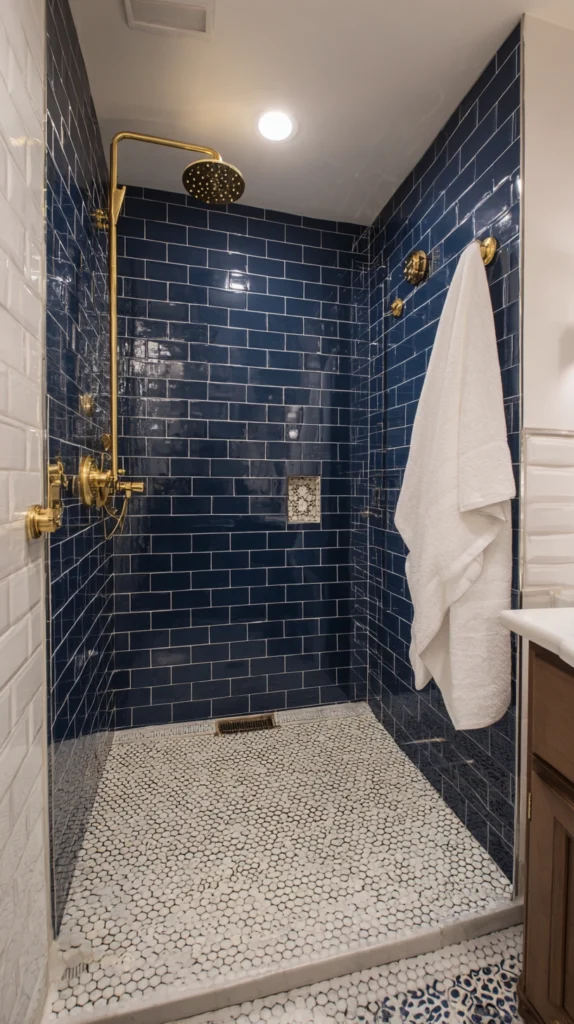
The navy and white shower — navy tile on the primary shower walls with white tile on the floor or as a contrasting accent in the niche or the bench — creates a graphic, sophisticated shower environment whose deep blue-black tone creates the enveloping, intimate quality of a dark-walled room applied to the shower’s small, enclosed volume.
Navy in the shower works most powerfully in a format that reinforces its graphic quality — the subway tile’s clean rectangular grid in navy reads with particular authority, and the penny round mosaic in navy creates a shower floor of intricate, detailed pattern beneath the strong wall color.
The white in the combination provides the contrast that the navy’s depth requires to prevent the shower from becoming too dark — white grout on navy tiles, white tiles on the shower floor, white ceramic fixtures — and the specific tone of the white determines the combination’s warmth: a warm cream white softens the contrast, a pure cool white maximizes the graphic impact.
Brass fixtures in this combination create a three-material palette of navy, white, and gold that is among the most resolved and most universally admired shower color combinations available.
3. Sage Green and Cream — Organic Warmth
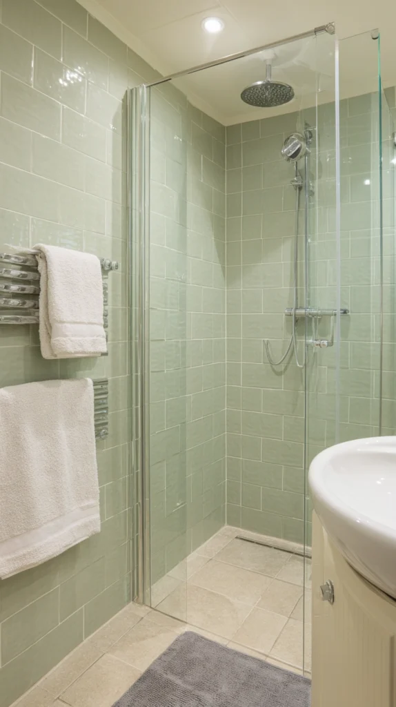
The sage green and cream shower — sage tile on the walls in a soft, slightly gray green, with cream or warm white grout and cream-toned ceramic accessories — creates a shower of extraordinary organic warmth that the bathroom’s typical white-and-chrome palette entirely lacks.
Sage green in the shower references the botanical world — the gray-green of the herb leaf, of the Eucalyptus branch, of the Nordic and British painted furniture tradition — with a tone that is simultaneously fresh and calming, sufficiently saturated to read clearly as a designed color choice without the intensity that more saturated greens create in the shower’s enclosed volume.
The cream in the combination — in the grout, in the ceramic accessories, in the towels visible beyond the shower screen — maintains the combination’s warmth and prevents the sage from reading as too cool or too gray in bathrooms with limited natural light. Chrome or brushed nickel fixtures in a warm tone suit this combination for a contemporary result; unlacquered brass creates a warmer, more botanical aesthetic.
4. Charcoal and White — Dramatic Contrast
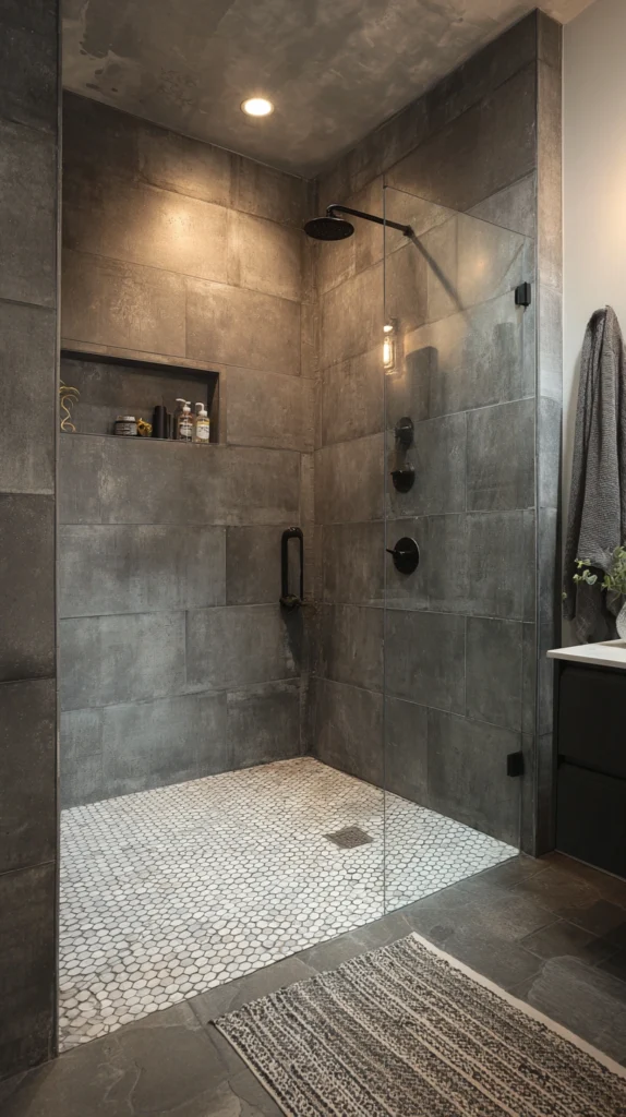
The charcoal and white shower — large-format charcoal tile on the walls with white penny round or small mosaic tiles on the floor — creates a shower of considerable dramatic impact whose dark walls and pale floor create the maximum possible tonal contrast within the shower’s enclosed space.
The charcoal tile’s specific tone matters enormously in this combination: a charcoal that is too warm reads as brown in certain lighting conditions and loses the cool sophistication that makes the combination effective; a charcoal that is too cool reads as an attempt at black and creates a shower that is darker than is comfortable.
The correct charcoal — a balanced, slightly warm dark gray that reads as charcoal in all lighting conditions — creates a shower wall of confident, architectural authority that the white floor directly beneath it makes more powerful by contrast. Matte black fixtures in this combination create a monochromatic black-and-charcoal effect of complete sophistication; brushed silver or chrome creates a cooler, more graphic result.
5. Terracotta and White — Mediterranean Warmth
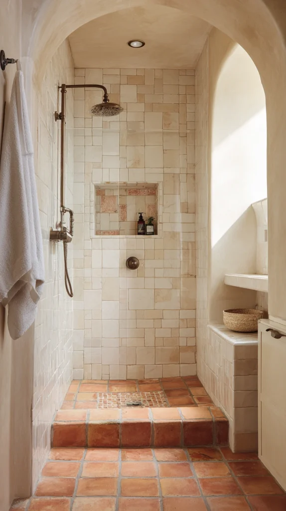
The terracotta and white shower — terracotta encaustic or plain terracotta tiles on the shower floor and lower walls with crisp white tiles above — creates a shower of immediate Mediterranean warmth and material authenticity that the standard bathroom tile palette entirely lacks.
Terracotta’s specific quality in the shower — its warm orange-red tone that deepens when wet, its clay material that relates to the earth with a naturalness that ceramic and porcelain tile references only indirectly — creates a shower floor and lower wall of genuine material character that the plain white alternative cannot approach.
The white above the terracotta datum line — either a clean subway tile or a simple large-format white — creates the contrast that the terracotta’s warm tone requires for the combination to read as designed rather than simply warm, and the height of the datum line between terracotta and white determines the combination’s character: low terracotta with predominantly white walls creates a bright, airy shower that references the Mediterranean courtyard; terracotta to the full height creates a more enveloping, cave-like warmth.
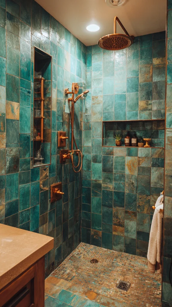
6. Deep Green and Aged Brass — Botanical Luxury
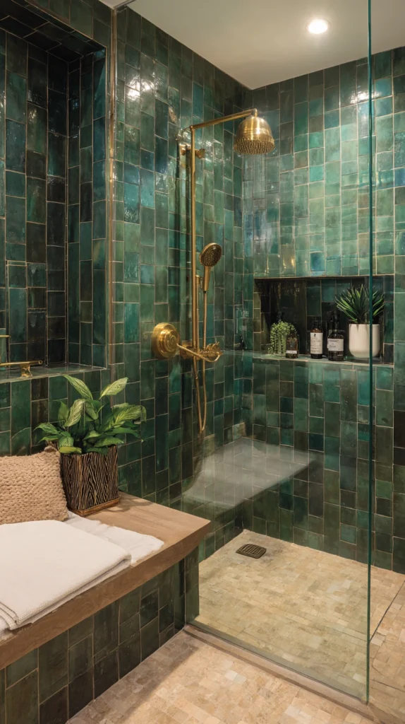
Deep green — the dark, saturated forest green of botanical illustration, of the Victorian fernery, of the specific green that reads simultaneously as natural and as luxurious — combined with aged or antique brass fixtures creates a shower environment of extraordinary material richness and botanical atmosphere.
This combination references the most admired hotel spa environments of the contemporary luxury hospitality industry — the green-and-brass shower has become the signature aesthetic of the boutique hotel bathroom of significant design ambition — and its translation to the domestic shower requires the same commitment to material quality that the hotel context brings: proper tile of genuine ceramic depth, quality brass in an aged or unlacquered finish, and the restraint of a tile format that is simple enough to let the color do the work.
Zellige tile in deep green creates the most texturally rich version of this combination; large-format ceramic in a deep matte green creates the most architecturally minimal version. Both suit the aged brass fixture with equal elegance.
7. Black and Warm Timber — Industrial Warmth
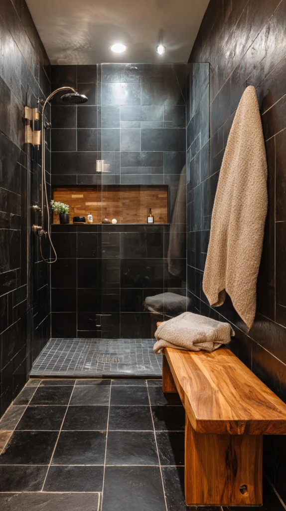
A black tile shower — walls in a matte black ceramic or porcelain of adequate quality to read as rich rather than flat — combined with warm timber elements within the shower: a teak bench, a timber shower niche, a timber shower mat at the floor — creates a shower of industrial warmth whose dark tile and natural wood create the specific material tension of the loft aesthetic applied to the bathroom’s most intimate space.
The timber’s warmth is critical in this combination: without the timber’s organic material presence, the all-black shower risks the cold austerity of a space that is dramatic at first encounter but fatiguing as a daily environment. With the timber, the black becomes a backdrop against which the wood’s natural grain and warm tone create a combination of industrial precision and natural warmth that is genuinely and consistently pleasurable to inhabit.
The timber used within the shower must be a species and finish appropriate to the wet environment — teak, western red cedar, or ipê in a properly sealed finish or left to weather naturally in the shower’s warm, humid conditions.
8. Blush Pink and Marble — Soft Luxury
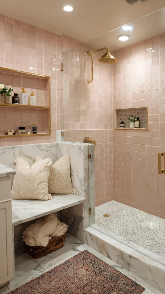
Blush pink tile — a ceramic or encaustic tile in the soft, slightly gray pink that occupies the chromatic territory between white and rose — combined with marble detailing on the shower niche, the bench, or the floor creates a shower of soft luxury whose warmth and femininity are resolved by the marble’s geological authority and material complexity.
The blush tile’s tone should be genuinely blush — not the pale pink of a nursery but the sophisticated, slightly faded rose of the finest interior design photography, a pink that reads as warm white in some lighting and as clearly rose in others — and its surface should be matte or slightly textured rather than glossy, which would push the combination toward the precious rather than the sophisticated.
The marble in this combination should be a variety with warm veining — a Calacatta with gold or rose veining, or a pink Portuguese marble — rather than the cool gray of standard Carrara, to maintain the combination’s warmth throughout. Rose gold or brushed gold fixtures create the metallic note that completes the combination’s soft luxury palette.
9. Cobalt Blue and White — Maximalist Energy
A cobalt blue shower — its walls in the saturated, clear blue of Mediterranean azulejos, of Moroccan zellige, of the specific blue that carries maximum chromatic energy without the coolness of navy or the indirection of teal — with white grout and white ceramic accessories creates a shower of immediate, energizing vitality that the most color-committed bathroom owners choose for the specific quality of visual and psychological stimulation it provides each morning.
Cobalt is a color that few people are neutral about — its full intensity in the enclosed volume of a shower creates a chromatic immersion that is either exactly what the shower’s occupant wants or considerably more than they can comfortably begin each day within. For the person who is genuinely energized by strong, saturated color, the cobalt shower is the most completely committed and most completely rewarding color choice available.
For everyone else, the cobalt shower in a small format — penny round mosaic rather than large-format tile — creates the color’s energy at a slightly lower saturation level that most people find more comfortable as a daily environment.
10. Greige and Gold — Quiet Sophistication
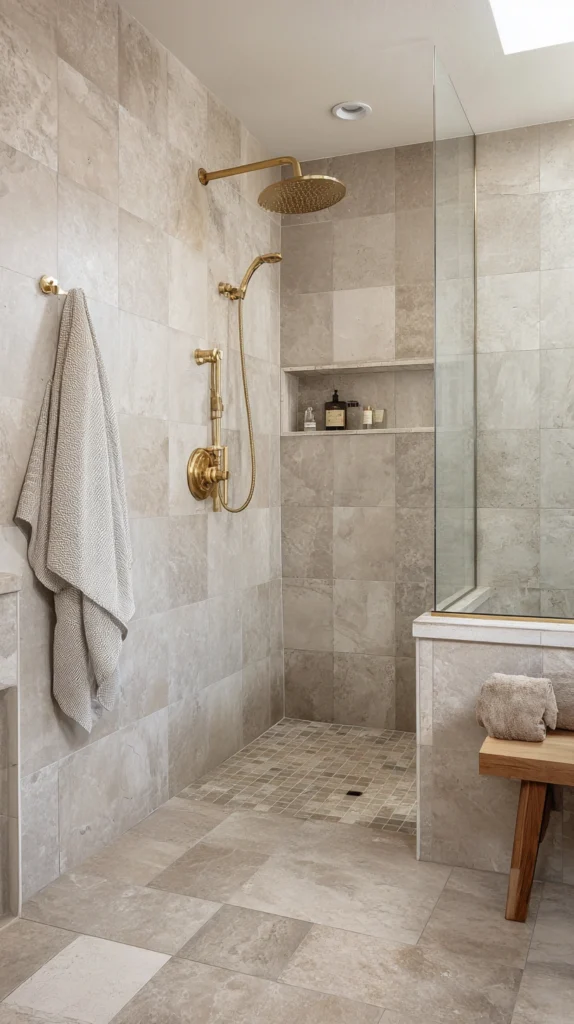
Greige — the warm gray-beige that occupies the neutral palette’s most sophisticated and most livable position, relating to both warm and cool surrounding colors without committing fully to either — in a matte, large-format tile with gold or champagne brass fixtures creates a shower of quiet, consistent sophistication that neither announces itself dramatically nor recedes into anonymity.
The greige tile’s neutrality is its strength in the shower: it relates naturally to every wood tone, every stone color, and every fixture finish in the surrounding bathroom, and its warmth prevents the coolness that a more purely gray tile creates in a bathroom with limited natural light.
The gold or champagne brass fixture provides the combination’s warmth note without the strength that unlacquered brass’s more orange tone brings — a slightly more sophisticated, slightly more restrained version of the warm metal accent that creates the combination’s distinguishing detail. Greige and gold suit every bathroom orientation and every natural light quality with equal effectiveness.
11. Black and White Geometric — Graphic Pattern
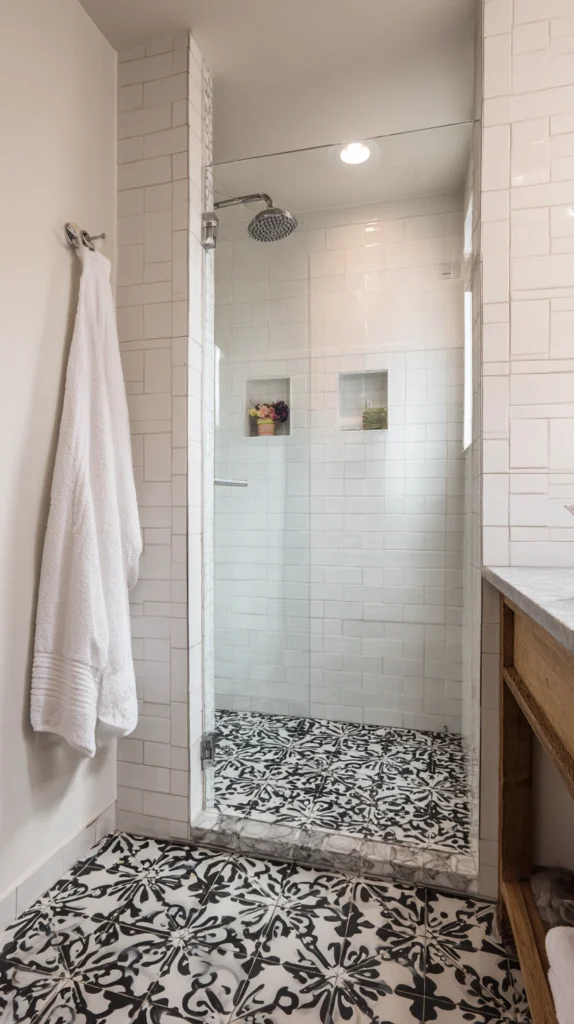
A black and white geometric tile — a hex, a diamond, a chevron, or a more complex geometric pattern — covering the shower floor or, in a bolder application, the shower walls, creates the most graphically assertive shower tile color combination available, one whose impact comes from the pattern’s energy rather than from the color palette’s depth.
The black and white geometric combination is not strictly a two-color palette in the conventional sense — it is the use of maximum contrast within the simplest possible color range to create a pattern that generates visual interest through geometry rather than through chromatic variety.
The pattern’s scale relative to the shower’s dimensions is the critical design decision: too small a pattern in a small shower creates a visual complexity that is exhausting; too large a pattern in a small shower creates awkward partial tiles at the perimeter.
The designer’s rule of thumb for geometric tile scale — the repeat should fit at least six times within the smallest shower dimension — is the starting point for the pattern scale calculation that creates the most visually resolved result.
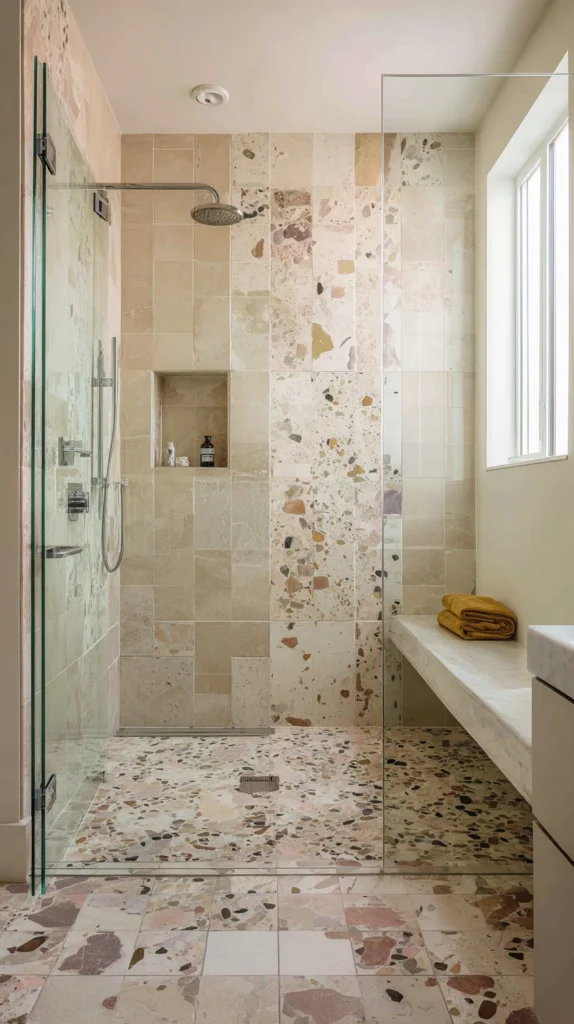
12. Warm White and Natural Stone — Understated Elegance
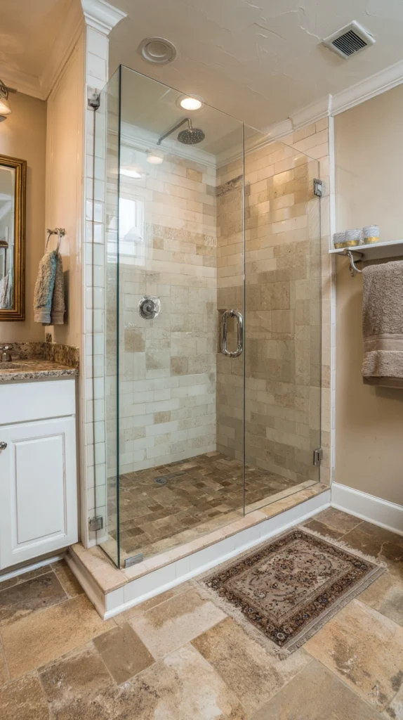
The combination of warm white ceramic subway tile with a natural stone floor — limestone, slate, or a tumbled travertine in a neutral warm tone — creates a shower of understated elegance whose material variety within a restrained tonal range creates the sophistication of a composition that is more considered than any single-material application.
The white subway tile’s warmth should be calibrated to the stone floor’s specific tone — a tile with cream undertones for a warmer limestone floor, a tile with pink undertones for a stone with rose-toned variation, a tile with gray undertones for a slate floor.
The stone floor’s natural surface variation creates the texture and tonal complexity that the regular subway tile’s uniform surface cannot provide, and the combination of the two materials within a single warm neutral palette creates a shower that is simultaneously simple and materially rich.
Natural stone in the shower requires sealing for water and stain resistance, and the specific sealer chosen should be appropriate to the stone species and the shower’s water exposure level.
13. Teal and Copper — Eclectic Warmth
The teal and copper shower — teal or peacock blue-green tile on the shower walls with copper fixtures and copper-toned accessories — is the combination that draws from the Arts and Crafts and Art Nouveau color traditions most directly, referencing the specific pairing of blue-green and warm copper that characterizes the finest decorative arts of those periods with an eclecticism and a material warmth that more conventional combinations cannot approach.
Teal’s specific tone — neither quite blue nor quite green, saturated with the depth of both — creates a shower of considerable visual complexity whose interaction with copper’s warm, pinkish-red metallic creates a color combination of genuine artistic sophistication.
The copper fixtures in this combination must be in a living, unlacquered finish that develops its patina naturally in the shower’s warm, humid environment — the developing patina of the copper over months and years creates a fixture finish of increasing beauty and material depth that the lacquered alternative, frozen in its initial finish, cannot develop.
14. Warm Nude and Terrazzo — Contemporary Artisan
A warm nude tile — the pale, body-warm tone that reads as the skin’s color applied to a matte ceramic surface — combined with a terrazzo floor in a mix of warm pinks, creams, and gold fragments creates a shower of completely contemporary artisan quality whose material vocabulary references the Italian craft traditions of terrazzo with a design sensibility that is entirely of the present moment.
The nude tile’s body-warm tone creates a shower of unusual intimacy — a surface whose color relates to the human body in the space in a way that no other tile color does — and the terrazzo floor’s aggregated, variegated surface provides the pattern and material complexity that the nude wall tile’s simplicity requires.
This combination is among the most personally distinctive and most completely resolved shower tile color pairings available, and its appeal is specific enough that the person for whom it is exactly right will recognize it immediately and feel no uncertainty about its selection.
15. All-White With Textured Tile — Sophisticated Simplicity
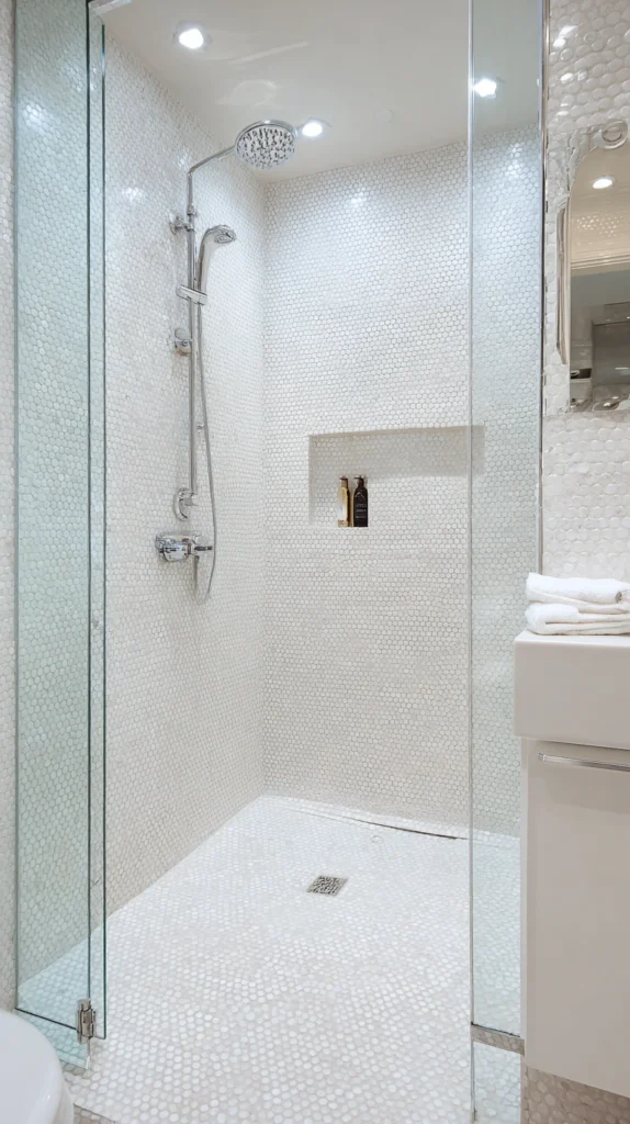
The final shower tile color combination is not technically a color combination at all — it is the commitment to a single color applied across the shower’s full surface in two or more different tile formats and textures, creating a shower whose interest comes entirely from the variation of surface texture and tile format within a monochromatic white scheme.
A smooth, large-format white tile on the shower walls combined with a white textured mosaic or a white encaustic pattern on the floor, with white ceramic accessories and polished chrome fixtures, creates a shower of sophisticated simplicity whose restraint is itself the design statement.
The texture variation between the smooth wall tile and the textured floor tile creates the visual and tactile interest that color contrast provides in less monochromatic combinations — the raking light across the textured floor surface creating shadow patterns that change as the light changes, the smooth wall tiles reflecting the light with a uniform brightness that the textured floor’s matte, varied surface does not replicate.
This is the shower tile combination for the designer who understands that the most difficult and the most sophisticated color choices are often the ones that choose not to add color but to do more with less.