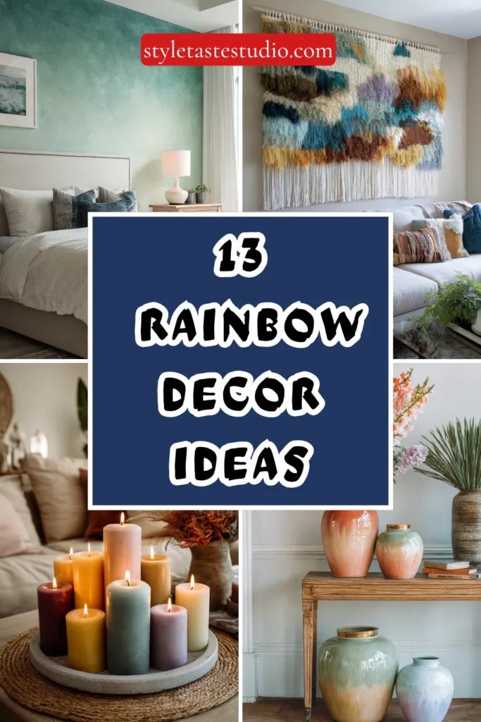
13 Rainbow Decor Ideas That Are Stylish
Rainbow decor occupies a peculiar position in the interior design conversation — simultaneously one of the most instinctively joyful and one of the most frequently mishandled decorative concepts available to any home.
When it goes wrong, it goes spectacularly wrong: every surface competing for chromatic dominance, every colour present at maximum saturation, every room reduced to the visual equivalent of a noise so loud it becomes incomprehensible.
When it goes right — when rainbow colour is deployed with genuine restraint, genuine compositional intelligence, and the specific understanding that the most powerful colour statements are almost always the most disciplined ones — it produces interiors of extraordinary warmth, extraordinary personality, and a quality of joyful sophistication that no single-colour palette can ever fully replicate.
The secret, as with all the best things in interior design, is knowing not merely what to include but what to leave out. Here are 13 rainbow decor ideas that are genuinely stylish, genuinely considered, and — crucially — not the slightest bit overwhelming.
1. The Tonal Rainbow Bookshelf
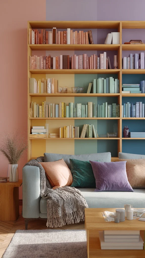
The rainbow-organised bookshelf is the interior decor idea that launched a thousand Instagram posts and has since become so ubiquitous that its execution requires genuine care and genuine restraint to produce a result that feels considered rather than copied.
The key distinction between a bookshelf that looks designed and one that looks merely arranged is tonal discipline — the commitment to a specific, curated version of each colour that shares the same level of saturation, the same level of warmth or coolness, and the same overall visual weight across the full spectrum.
Dusty rose into terracotta into amber into sage into slate into lavender. Not primary red into primary orange into primary yellow. The tonal rainbow bookshelf is the version that works in every room and with every existing palette — and it works because it is a rainbow that has been edited by someone with genuine colour knowledge and genuine decorative confidence.
2. The Single Spectrum Textile Arrangement
A rainbow deployed through textiles alone — through the cushion covers, throws, and decorative pillows of a living room or bedroom — is the softest, most reversible, and most genuinely liveable approach to rainbow decor available in any interior.
The key is to work within a single, consistent section of the spectrum rather than attempting to represent every colour simultaneously. Warm spectrum textiles in terracotta, amber, gold, and dusty rose create a rainbow effect of extraordinary warmth and extraordinary coherence. Cool spectrum textiles in sage, slate, teal, and lavender create a rainbow arrangement of considerable calm and considerable sophistication.
The single spectrum textile rainbow is the approach that feels genuinely curated — that communicates colour knowledge rather than colour enthusiasm — and that works in any room regardless of its existing decorative character.
3. The Gradient Ceramic Collection
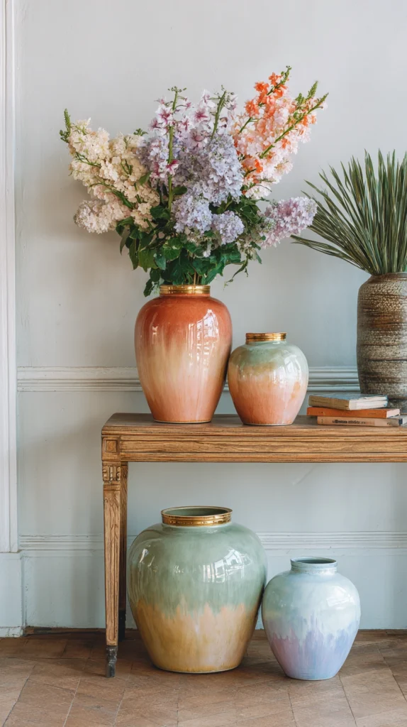
A collection of ceramic objects — vases, bowls, planters, and vessels of varying sizes and forms — arranged across a shelf, mantelpiece, or sideboard in a deliberate colour gradient from one end of the spectrum to the other creates a rainbow display of extraordinary refinement and extraordinary material beauty.
The gradient ceramic collection works because ceramics carry colour with a depth and a surface richness that no printed or painted material can match — the clay body itself responds to the glaze in ways that give each colour a unique, specific, and utterly irreproducible quality of light and warmth.
Arrange the pieces in a sequence that transitions gradually and smoothly from the warmest to the coolest tones, vary the heights for visual rhythm, and allow the gradient to do its quiet, beautiful, unhurried work across the surface it inhabits.
4. The Rainbow Gallery Wall in Neutral Frames
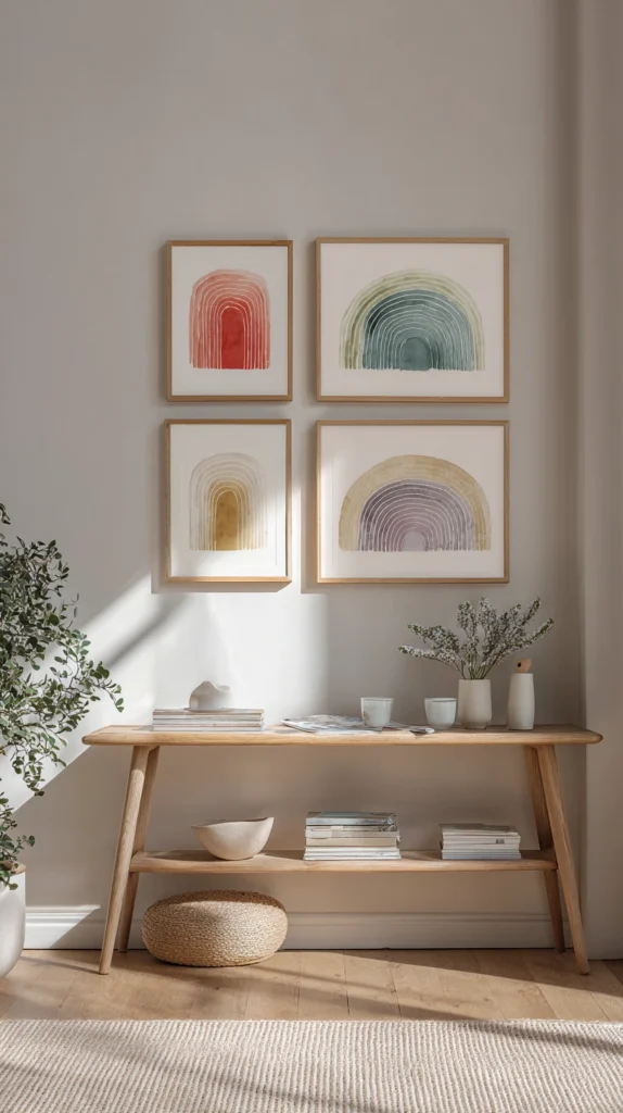
A gallery wall whose prints and artworks are chosen for their colour rather than their subject — arranged in a sequence that moves through the spectrum from one edge of the wall to the other, framed consistently in simple natural timber or matte white for visual coherence — creates a rainbow decorative statement of considerable gallery-quality sophistication and considerable chromatic joy.
The neutral frames are non-negotiable. They are the element that elevates the rainbow gallery wall from a collection of colourful prints into a considered, curated, designed composition — the frame that tells every viewer that the colour was chosen deliberately and arranged with genuine aesthetic intelligence. Without the consistent neutral frame, the rainbow gallery wall competes with itself. With it, it sings.
5. The Ombre Paint Effect on a Single Wall
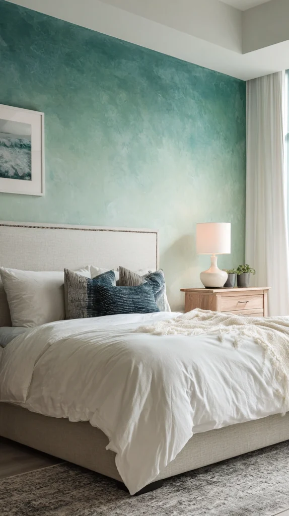
An ombre paint effect — a single accent wall painted in a smooth, carefully blended gradient from one colour at the top to a related but distinctly different colour at the bottom — creates a rainbow-inspired feature wall of extraordinary painterly beauty and extraordinary visual sophistication.
The ombre wall works best when the colours chosen are closely related rather than dramatically contrasting — deep teal blending into sage green, warm terracotta dissolving into dusty rose, rich indigo transitioning into soft lavender.
The closer the colours, the more refined and the more genuinely beautiful the gradient. The more dramatic the contrast, the more the effect risks the visual overwhelm that all the best rainbow decor consistently and carefully avoids.
6. The Coloured Glassware Collection
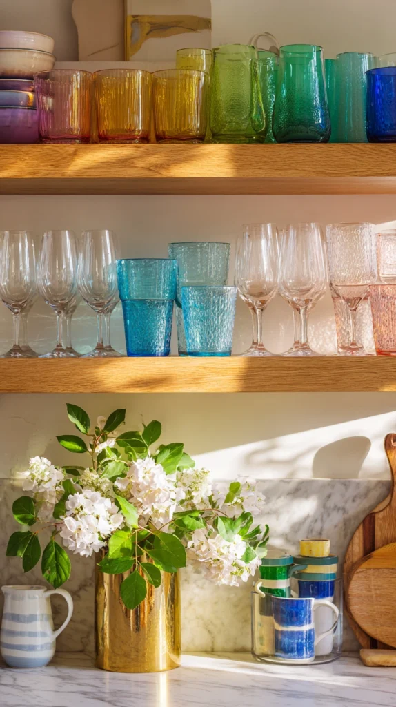
A collection of coloured glassware — wine glasses, tumblers, bud vases, and decorative vessels in a considered selection of spectrum colours — displayed on an open kitchen shelf, a bar cart, or a dining table sideboard creates a rainbow decorative moment of extraordinary lightness, extraordinary translucency, and extraordinary chromatic richness that no opaque material can replicate.
Coloured glass carries light in a way that is entirely and uniquely its own — refracting, concentrating, and transforming the ambient light of any room it inhabits into pools of coloured warmth on the surrounding surfaces. A collection of coloured glassware arranged in a thoughtful gradient across an open shelf is rainbow decor at its most genuinely, effortlessly beautiful — a display that improves with every change of the light throughout the day.
7. The Woven Wall Hanging in Spectrum Yarns
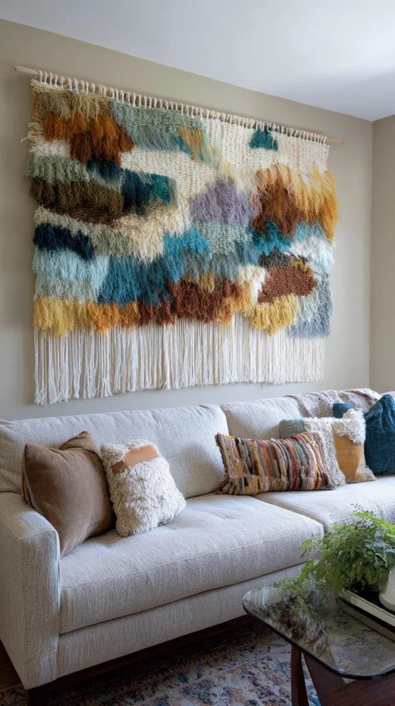
A large woven wall hanging — created in a hand-spun, hand-dyed selection of yarns that move through the spectrum from warm to cool in a deliberate, unhurried gradient — creates a rainbow textile artwork of extraordinary tactile richness and extraordinary decorative presence.
The woven wall hanging works as rainbow decor because weaving is a medium that inherently softens and integrates colour — the intersecting threads of different hues create a visual blending effect at the point of contact that produces a rainbow far more nuanced, far more natural, and far more genuinely beautiful than any flat printed or painted surface can achieve.
Commission one from a textile artist whose colour sensibility matches your own, or invest in a quality artisan piece from a maker working seriously with natural dyes and natural fibres.
8. The Potted Plant Colour Sequence
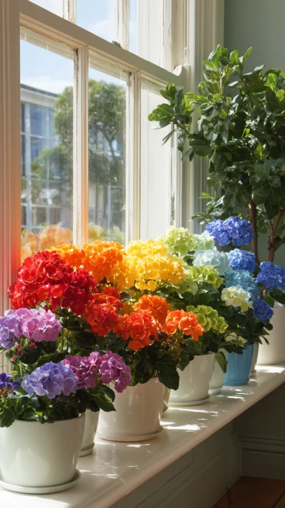
A sequence of potted plants arranged along a windowsill, a mantelpiece, or a set of open shelves — chosen specifically for the colour of their flowers and arranged in a deliberate spectrum sequence from warm reds and oranges through yellows and greens to cooler blues and purples — creates a living rainbow of extraordinary natural beauty and extraordinary seasonal dynamism.
The potted plant colour sequence is the rainbow decor idea that improves continuously rather than remaining static, that responds to the light and the season in ways that no manufactured decorative object can replicate, and that introduces into the interior environment the specific quality of living, growing, organically beautiful colour that only plants can provide. Tend them with genuine care and the living rainbow tends itself.
9. The Painted Stair Riser Gradient
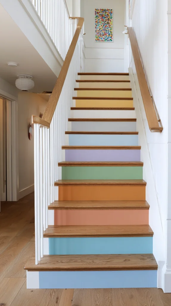
A staircase whose risers are painted in a smooth, sequential colour gradient — each step a single, solid colour that advances one position along the spectrum from the step below and the step above — creates a rainbow architectural feature of extraordinary visual drama and extraordinary playful sophistication that transforms one of the home’s most functional elements into one of its most genuinely joyful.
The painted stair riser gradient works best in a home whose overall palette is relatively neutral — white walls, natural timber floors, simple furnishings — where the rainbow staircase can perform its colour magic without competing with any other chromatic statement in the surrounding space. Paint each riser in a matte finish of genuine quality for a result that photographs beautifully and wears gracefully.
10. The Coloured Candle Arrangement
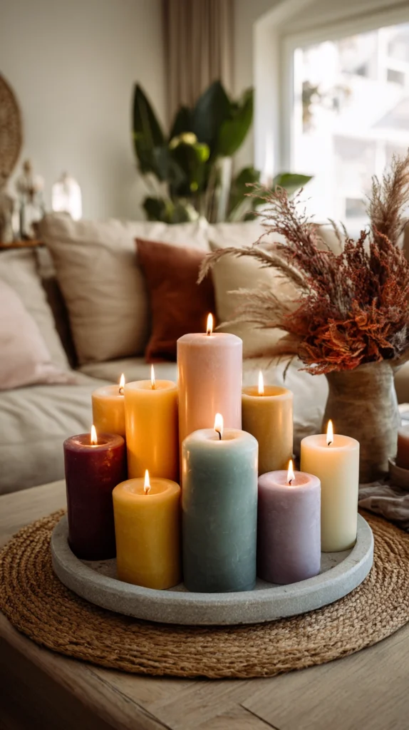
A grouped arrangement of pillar candles in a considered selection of spectrum colours — placed together on a timber board or a stone tray on the dining table, the coffee table, or the mantelpiece — creates a rainbow decorative moment of considerable warmth, considerable intimacy, and considerable chromatic joy that costs very little, requires very little space, and delivers a disproportionate amount of decorative impact for both.
Choose candles in muted, sophisticated versions of each spectrum colour — dusty rose, warm amber, sage green, soft teal, muted lavender — rather than primary or fluorescent shades, group them in a cluster of varying heights, and light them together for an arrangement that glows with a warmth and a colour richness that only candlelight, in its specific and irreplaceable way, can produce.
11. The Rainbow Ribbon Curtain
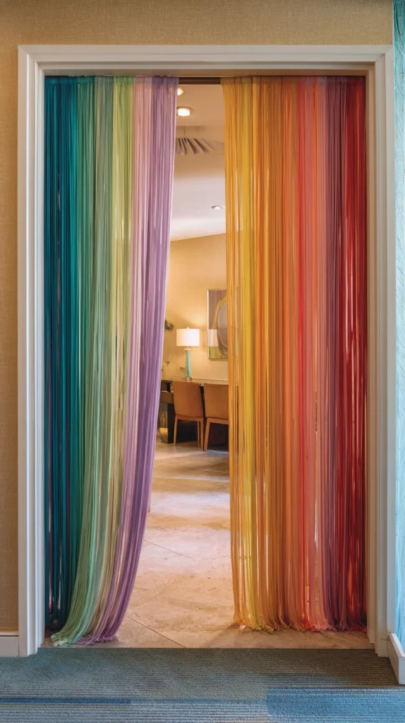
A doorway or window dressed with a rainbow ribbon curtain — lengths of quality grosgrain or satin ribbon in a full spectrum of muted, sophisticated colours, hung vertically from a slim timber or metal rod at the top of the opening and allowed to fall freely to the floor — creates a rainbow architectural intervention of extraordinary lightness, extraordinary movement, and extraordinary decorative originality.
The ribbon curtain moves with every breath of air that passes through the opening, creating a constantly shifting, constantly rearranging chromatic display of genuine kinetic beauty. It works as a room divider, as a wardrobe door treatment, as a dramatic window dressing, and as a photographic backdrop of considerable appeal — and it can be assembled in an afternoon from materials available at any haberdashery.
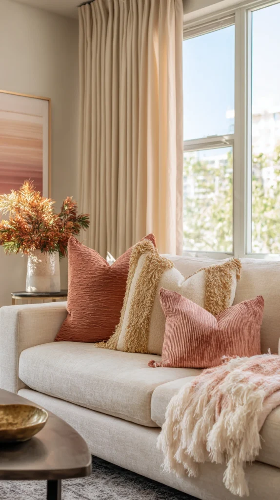
12. The Spectrum Throw Pillow Gradient on a Neutral Sofa
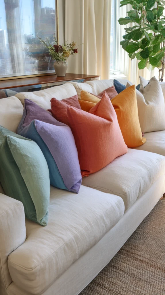
A neutral sofa — cream, oatmeal, warm white, or natural linen — dressed with a carefully sequenced gradient of throw pillows moving through the full spectrum from one arm to the other creates a rainbow decorative statement of remarkable elegance and remarkable restraint that works in virtually any living room regardless of its existing colour scheme or its existing level of decorative formality.
The neutral sofa is the canvas that makes the rainbow pillow gradient possible — without it, the colour sequence has nowhere to breathe, no contrast against which to perform its chromatic magic.
Keep the pillow forms and sizes consistent for a gradient that reads as a single, considered composition rather than a random accumulation. Change the covers seasonally — warmer tones for autumn and winter, cooler tones for spring and summer — for a rainbow that responds to the year.
13. The One Colour That Contains Them All
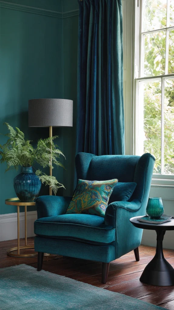
The most sophisticated rainbow decor idea available to any home is ultimately the one that deploys a single, carefully chosen colour of such depth, such complexity, and such internal chromatic richness that it contains the full suggestion of the rainbow within its single presence.
A deep teal that shifts between green and blue in different lights. A rich terracotta that carries undertones of amber, rose, and ochre simultaneously. A complex sage that reads as grey in shadow and as pure green in full sun.
These are colours that do not need the company of other colours to create a sense of chromatic abundance — they generate it themselves, through the inherent complexity of their pigment and the extraordinary sensitivity of the human eye to the subtle spectrum contained within a single, perfectly chosen, perfectly applied hue. It is the rainbow edited to its most essential and its most beautiful — which is, as any great designer will confirm, the rainbow at its most powerful of all.
Colour With Confidence, Style Without Surrender
Rainbow decor done with genuine restraint, genuine compositional intelligence, and the specific understanding that joy and sophistication are not opposing values but natural companions produces interiors of extraordinary warmth, extraordinary personality, and a quality of visual pleasure that no single-colour palette can ever fully replicate.
The rainbow is always there, in every room and every palette, waiting to be acknowledged with enough confidence to include it and enough wisdom to edit it. Find that balance, commit to it completely, and the colour you bring into your home will be joyful, beautiful, and — in the very best sense — completely, irreducibly, and magnificently yours.