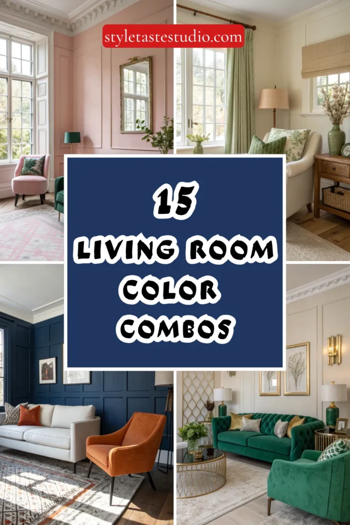
15 Living Room Color Combos Designers Are Loving Right Now
Color has the remarkable ability to completely transform a space, shifting moods, altering perceptions of size, and creating atmospheres that range from energizing to deeply calming.
In the world of interior design, color combinations are constantly evolving, reflecting broader cultural shifts, our relationship with our homes, and an ever-growing understanding of how hues interact with light, texture, and our daily lives.
Right now, designers are moving away from the safe neutrals that dominated the past decade, embracing combinations that feel both sophisticated and emotionally resonant.
The current moment in color is characterized by courage tempered with restraint. Designers are pairing unexpected hues with confidence, creating living rooms that feel collected, layered, and deeply personal. These aren’t the matchy-matchy color schemes of decades past, but rather nuanced combinations that allow multiple tones to coexist in harmonious tension.
Whether you’re planning a complete room refresh or simply looking to understand where design is heading, these fifteen color combinations represent the cutting edge of living room style.
1. Terracotta and Sage Green
This earthy pairing brings the outside in with a warmth that feels both ancient and completely contemporary. Terracotta, with its sun-baked clay tones, provides grounding warmth, while sage green introduces a botanical freshness that prevents the combination from feeling heavy.
Designers are using deeper terracottas on accent walls or in large furniture pieces like sofas, then layering in sage through pillows, plants, and smaller upholstered items. The combination works beautifully in rooms with natural wood elements and plenty of texture, creating spaces that feel organic and lived-in without sacrificing sophistication.
2. Deep Navy and Burnt Orange
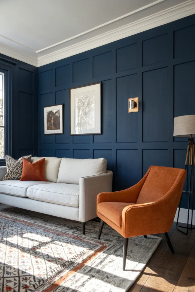
For those seeking drama with surprising accessibility, navy and burnt orange delivers in spades. Navy provides the depth and stability traditionally associated with classic interiors, while burnt orange injects energy and personality.
This combination works particularly well in living rooms with good natural light, where the navy can anchor without overwhelming and the orange can glow without appearing garish. Designers often use navy as the dominant color on walls or in large sectionals, punctuated with burnt orange in artwork, throw pillows, or a single statement chair that becomes the room’s focal point.
3. Warm White and Caramel
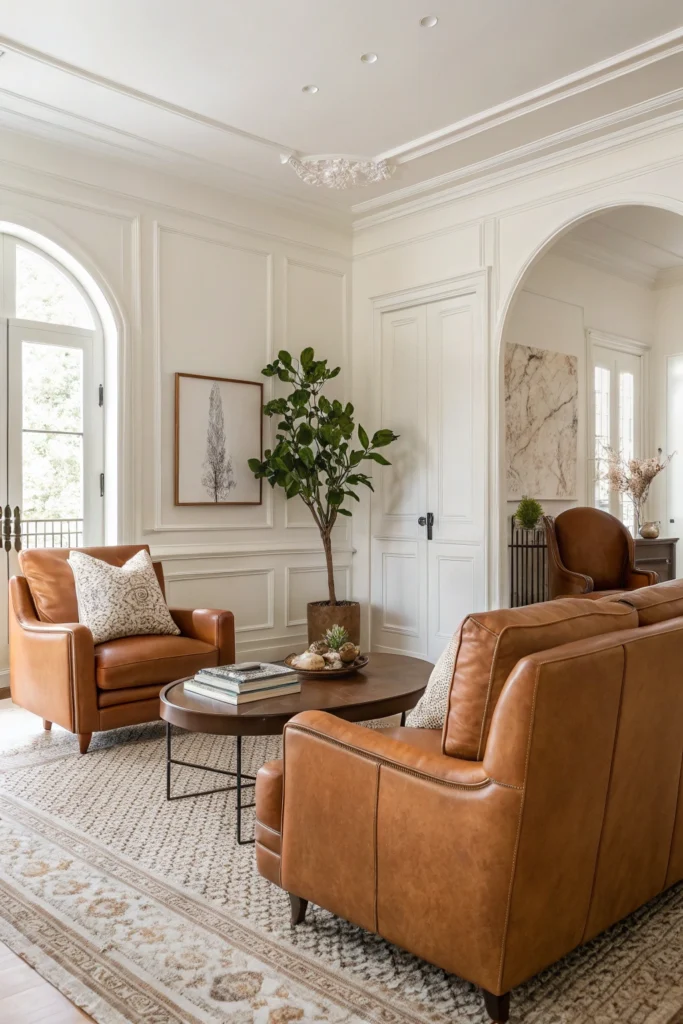
Monochromatic doesn’t mean boring, as this warm-toned combination proves. The pairing of creamy whites with rich caramel creates a sophisticated, enveloping atmosphere that feels both minimal and luxurious.
This palette relies heavily on texture for interest, incorporating elements like bouclé sofas, chunky knit throws, smooth leather accents, and natural wood tones. Designers are gravitating toward this combination for living rooms meant to feel like sanctuaries, places where visual calm allows for mental rest. The key is varying the saturation of your caramels from pale toffee to deep cognac, creating depth through tonal variation.
4. Charcoal Gray and Mustard Yellow
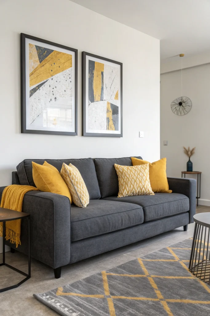
This high-contrast pairing balances cool sophistication with warm optimism. Charcoal provides a contemporary neutral base that’s more interesting than basic gray, while mustard yellow adds a shot of personality that’s more grounded than brighter yellows.
Designers love this combination for its versatility, it works equally well in modern, mid-century, and even traditional spaces. The proportion matters here; typically, charcoal dominates through large furniture pieces or wall color, with mustard appearing in smaller doses through accent chairs, artwork, or textiles that can be easily swapped as trends evolve.
5. Dusty Rose and Forest Green
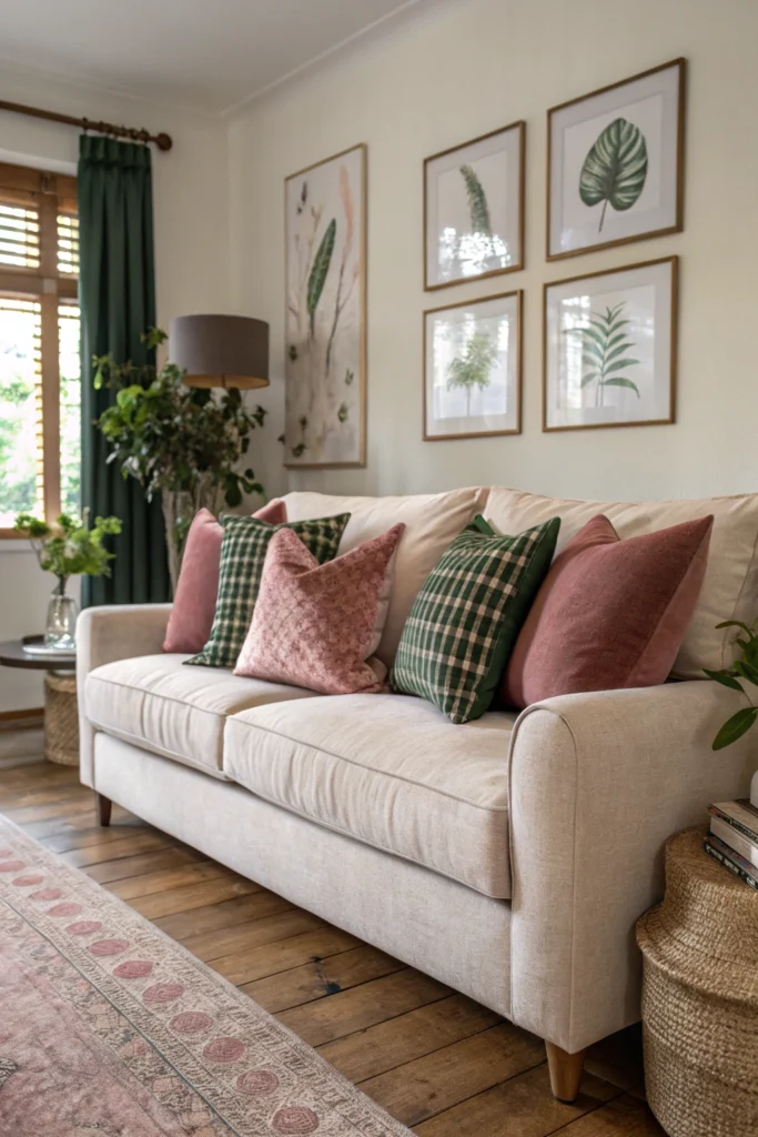
This unexpected pairing feels both vintage and completely fresh, tapping into a romantic sensibility without veering into overly feminine territory. Dusty rose brings subtle warmth and softness, while forest green grounds the combination with its connection to nature.
Interior designers are particularly drawn to this palette for living rooms that need to balance multiple functions and appeal to various tastes. The colors work beautifully with brass or gold metallics, velvet textures, and both dark and light wood tones, making the combination remarkably adaptable to different furniture styles.
6. Cream and Olive Green
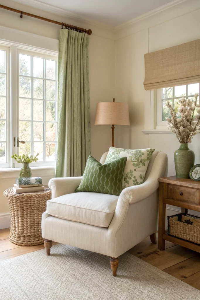
For those seeking sophistication with organic undertones, cream and olive deliver a combination that feels effortlessly elegant. This pairing works particularly well in living rooms with abundant natural light, where the cream prevents the olive from reading as too dark while the olive keeps the cream from appearing washed out.
Designers are using this palette in spaces meant to feel timeless, incorporating natural materials like linen, jute, and unfinished wood. The result is rooms that feel both current and classic, unlikely to feel dated as trends shift.
7. Chocolate Brown and Ivory
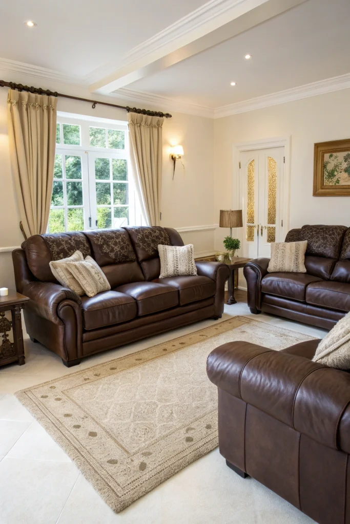
Brown is experiencing a major renaissance, and this pairing with ivory represents its most refined expression. Rich chocolate tones bring warmth and sophistication that feels far more interesting than standard beige, while ivory provides the necessary lightness to keep spaces from feeling cave-like. Designers are incorporating chocolate through leather sofas, wood furniture with deep finishes, and even painted accent walls, balancing with ivory in larger surface areas like walls or area rugs. This combination pairs beautifully with greenery and works across various design styles from traditional to contemporary.
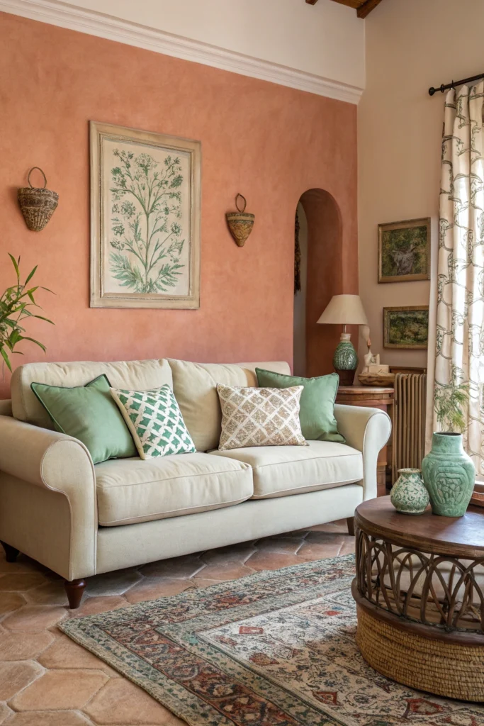
8. Soft Blue and Terracotta
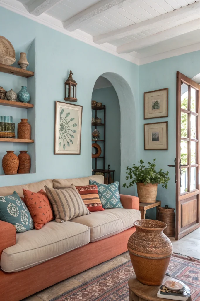
This combination captures the essence of Mediterranean living with a color palette inspired by sea and earth. Soft, weathered blues evoke water and sky, while terracotta grounds the space with its earthy warmth.
What designers love about this pairing is its inherent balance, neither color dominates, and both bring essential qualities to the space. The combination works particularly well in living rooms that receive warm afternoon light, where the blue can cool things down while the terracotta enhances the golden glow. Layer in natural textures like woven baskets, ceramics, and live plants to complete the look.
9. Charcoal and Blush Pink
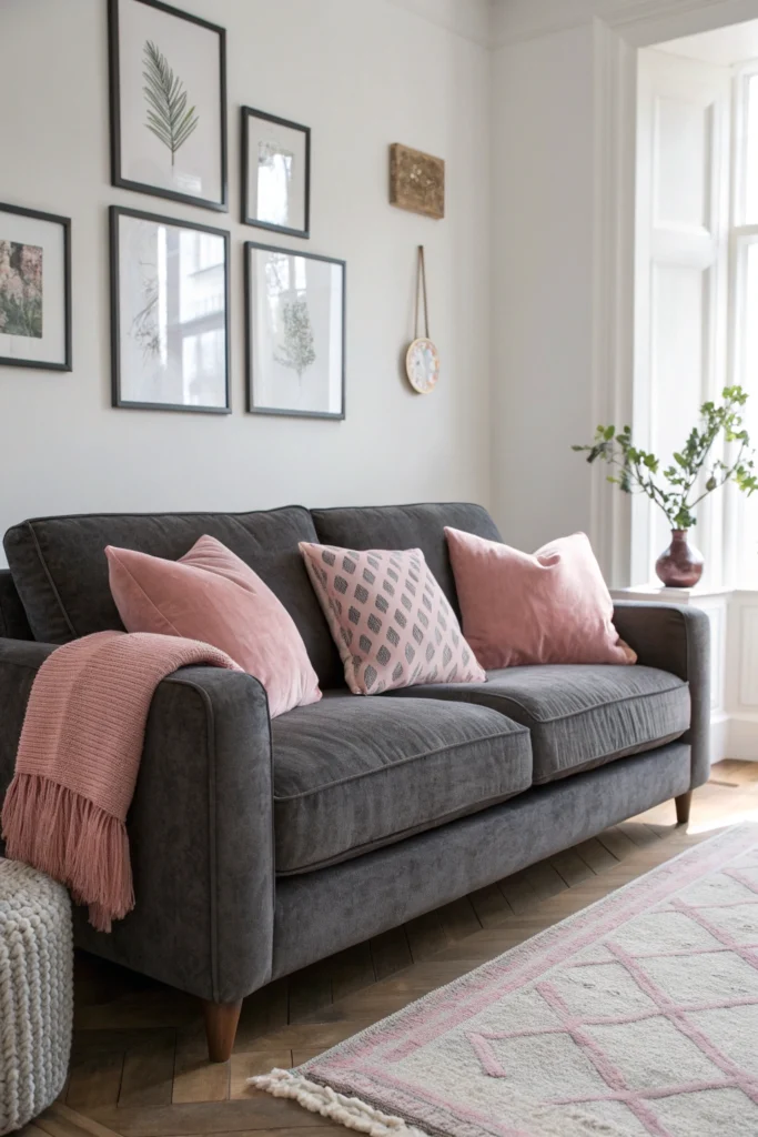
This sophisticated pairing proves that pink belongs far beyond nurseries and teenage bedrooms. When paired with charcoal, blush pink becomes a subtle, mature accent that adds warmth without feeling precious.
Designers use charcoal as the dominant neutral, often on walls or in large furniture pieces, then introduce blush through textiles, artwork, or a single upholstered piece. The combination works especially well with metallic accents in rose gold or copper, which bridge the two colors beautifully. This palette creates living rooms that feel both contemporary and inviting, balancing strength with softness.
10. Emerald Green and Gold
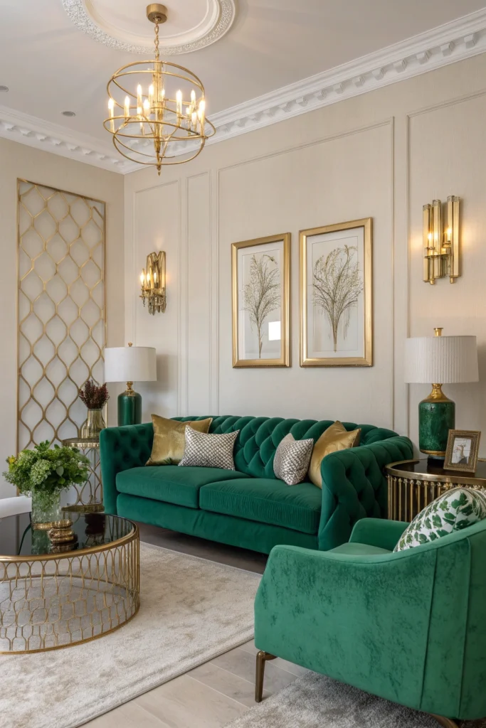
For maximalist sensibilities, emerald and gold creates a jewel-box effect that’s undeniably luxurious. Emerald brings richness and depth, a color associated with both nature and opulence, while gold adds shimmer and warmth.
Designers are using this combination in living rooms meant to make statements, often incorporating emerald through velvet upholstery or painted walls, then layering gold through picture frames, lighting fixtures, and decorative accessories. The key to keeping this combination from overwhelming is balancing it with plenty of white or cream to give the eyes places to rest.
11. Warm Gray and Rust
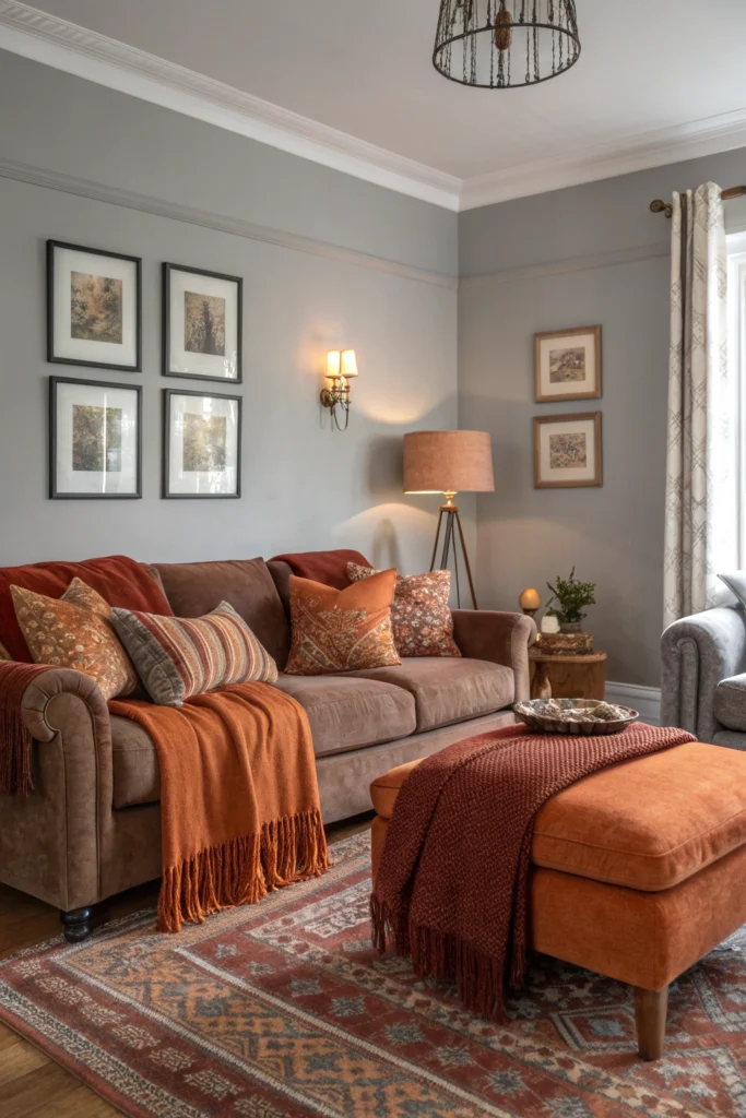
This pairing represents the evolution of gray from cool to warm, creating a foundation that’s both neutral and nuanced. Warm grays with slight brown or taupe undertones provide a contemporary backdrop, while rust brings earthy richness that prevents the space from feeling cold or sterile. Designers appreciate this combination for its ability to work with existing furniture and its adaptability across seasons. In winter, the rust tones feel cozy and grounding; in summer, they maintain warmth without heaviness. This palette works beautifully with natural materials like wood, leather, and stone.
12. Ivory and Black with Warm Wood
This classic combination gets a contemporary update through the introduction of warm wood tones that soften the high contrast. Ivory and black alone can feel stark, but adding natural wood elements creates a bridge between the extremes and introduces organic warmth.
Designers are using this palette in living rooms that embrace Scandinavian simplicity or Japanese minimalism, where the restraint in color allows form, texture, and spatial relationships to shine. The proportion typically favors ivory as the dominant color, with black in smaller doses through furniture legs, picture frames, or lighting fixtures, and wood throughout in furniture and accessories.
13. Lavender and Soft Gray
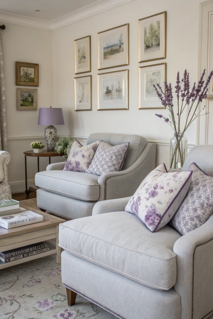
Lavender is emerging as a sophisticated alternative to more saturated purples, and when paired with soft gray, it creates an atmosphere that’s both calming and distinctive. This combination works particularly well in living rooms intended as retreats from busy lives, spaces designed for unwinding and restoration.
Designers use soft gray as the neutral foundation, typically on walls, then introduce lavender through upholstered furniture, window treatments, or artwork. The palette pairs beautifully with silver or pewter metallics and works across various design styles from contemporary to traditional.
14. Peacock Blue and Copper
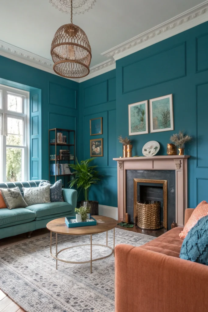
This rich, saturated combination brings drama and warmth in equal measure. Peacock blue, that perfect intersection of blue and green, provides depth and personality, while copper adds warmth and a touch of glamour.
Interior designers love this pairing for living rooms that need to make strong impressions, it’s bold without being overwhelming, sophisticated without being stuffy. The blue typically dominates through wall color or large furniture pieces, with copper appearing in lighting, hardware, decorative objects, and accent furniture. The combination works especially well with dark wood tones and natural fiber rugs.
15. Pale Pink and Deep Green
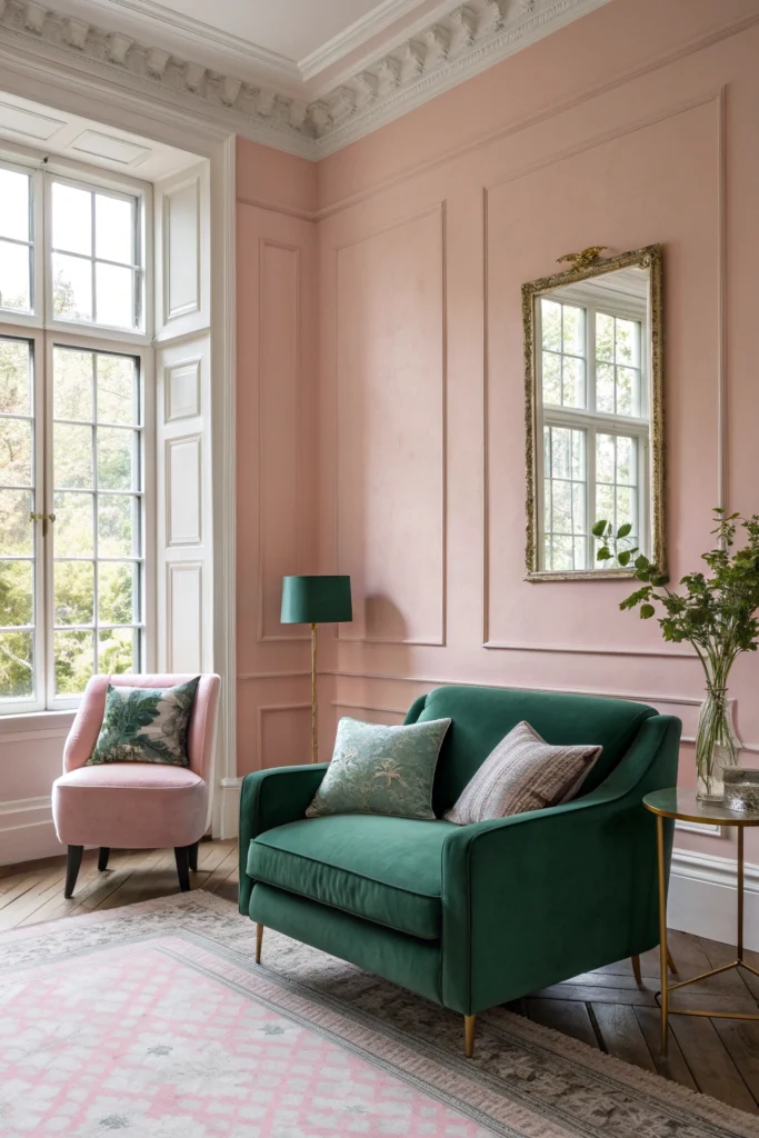
This soft yet grounded combination creates living rooms that feel both fresh and anchored. Pale pink brings subtle warmth and a touch of romance, while deep green provides the necessary weight to keep the space from feeling too sweet or insubstantial. Designers are particularly drawn to this palette for its versatility, it works in traditional settings with floral patterns and ornate furniture, but also succeeds in contemporary spaces with clean lines and minimal ornamentation. The key is using the pink as the lighter, more prevalent color with green in smaller but impactful doses through accent chairs, plants, or artwork.
The living room color combinations designers are embracing right now share common threads: they’re grounded in nature, they balance warmth with coolness, and they create depth through layering rather than relying on single-note color stories. These palettes reflect our collective desire for spaces that feel both personally meaningful and thoughtfully designed, rooms that provide comfort without sacrificing style.
What makes these combinations particularly relevant is their adaptability. None require complete room overhauls; most can be incorporated gradually through paint, textiles, and accessories. They work with various design styles and can be adjusted in intensity based on personal preference and the specific qualities of your space.
The most successful implementation of any color combination comes from understanding proportion, balance, and the interplay between color and texture. Designers rarely apply colors in equal measure, instead choosing one or two dominant tones and using others as accents.
They layer textures to create interest within similar color values and use the principles of light and shadow to allow colors to reveal different facets throughout the day.
These fifteen combinations represent more than fleeting trends; they reflect a broader shift toward living rooms that feel collected, personal, and emotionally resonant. The era of playing it safe with all-beige or all-gray spaces is giving way to more adventurous, joy-filled approaches to color.
The designers leading the way understand that our homes should reflect not just how we want spaces to look, but how we want to feel within them. These color combinations offer pathways to creating living rooms that accomplish both.