15 Accent Wall Colors That Go Perfectly With Grey
Grey is one of the most versatile neutrals in contemporary interior design — and one of the most frequently misunderstood when it comes to pairing it with an accent wall color. The challenge is not finding a color that works with grey in general.
The challenge is finding a color that works with your specific grey — because grey is an enormous family of tones, each with its own undertone that determines which accent colors will enhance it and which will create visual discord.

The fundamental rule is undertone matching. A grey with a blue undertone responds beautifully to cool accent colors. A grey with a warm taupe or brown undertone responds beautifully to warm ones. Understanding the undertone of your specific grey is the single most important step in choosing an accent wall color that will work beautifully alongside it.
Here are 15 accent wall colors that pair beautifully with grey.
1. Navy Blue
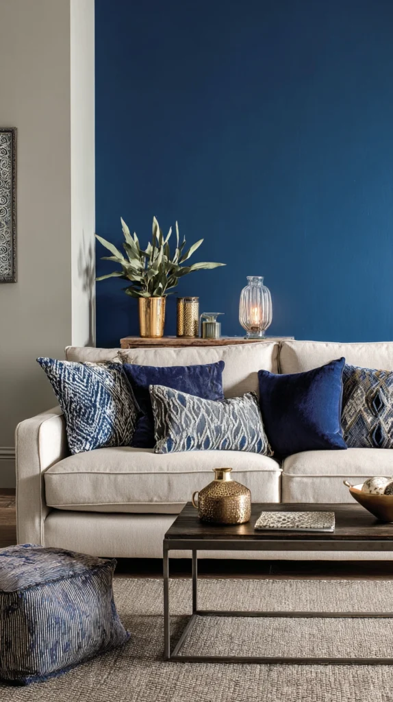
Navy alongside grey creates one of the most classically sophisticated interior combinations available. The deep rich tone of navy provides the bold color statement that grey alone cannot deliver while the grey provides the balanced neutral context that prevents navy from feeling overwhelming. Works most naturally alongside cool-toned greys with a slight blue or silver undertone.
Pro Tip: Choose a navy with a warm, slightly teal undertone rather than a pure cool blue-navy for a combination that works with the widest range of grey tones. Teal-navy sits where cool and warm qualities meet and creates a more universally compatible accent alongside greys of varying undertone.
2. Forest Green
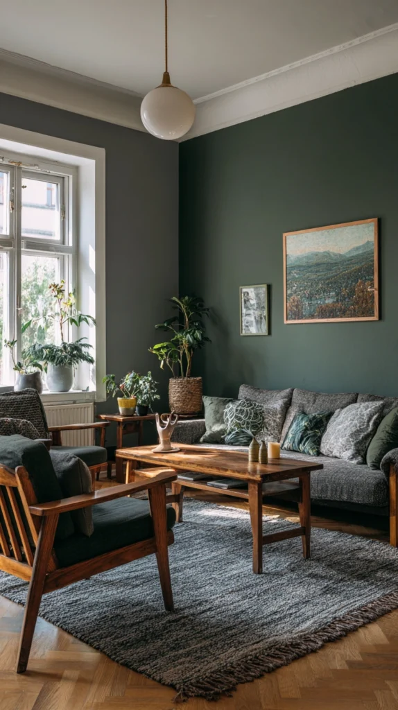
Forest green alongside grey creates a room of rich organic warmth that references the most beautiful tones of the natural landscape. Deep earthy green alongside restrained neutral grey creates a palette of considerable sophistication — warm enough to feel genuinely inviting, composed enough to feel genuinely elegant. Works most beautifully alongside warm grey tones with beige or taupe undertones.
Pro Tip: Bring forest green into the room beyond the accent wall through small accessory details — a green velvet cushion, a ceramic vase, a botanical print. This visual thread connects the accent wall to the wider room and prevents the green from appearing as an isolated statement disconnected from the rest of the interior.
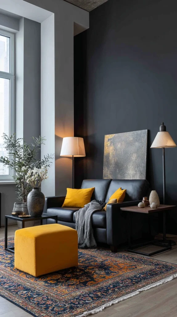
3. Mustard Yellow
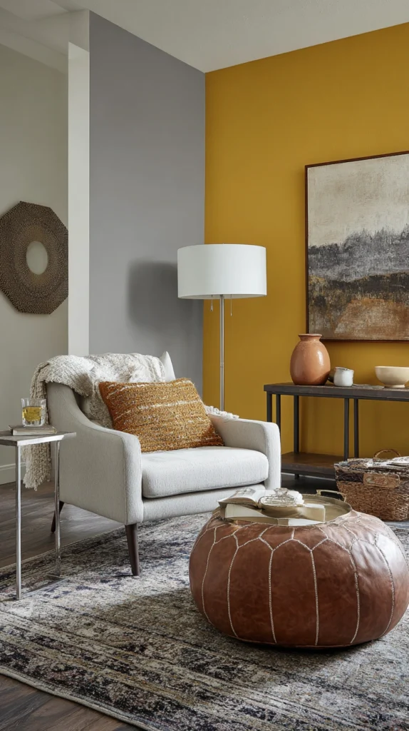
Mustard yellow alongside grey is a combination of genuine warmth and considerable visual energy — the rich earthy golden yellow providing warmth and personality that grey inherently lacks while the grey provides the grounding neutral context that prevents mustard from becoming exhausting. The two colors share an earthy slightly muted quality that makes them natural companions despite their significant tonal difference.
Pro Tip: Use mustard as the accent in a room where grey appears on the remaining three walls rather than as a single accent in a primarily white room. Mustard alongside a full grey context creates a more resolved and more beautiful combination than mustard introduced into a room where grey appears only incidentally in accessories.
4. Blush Pink
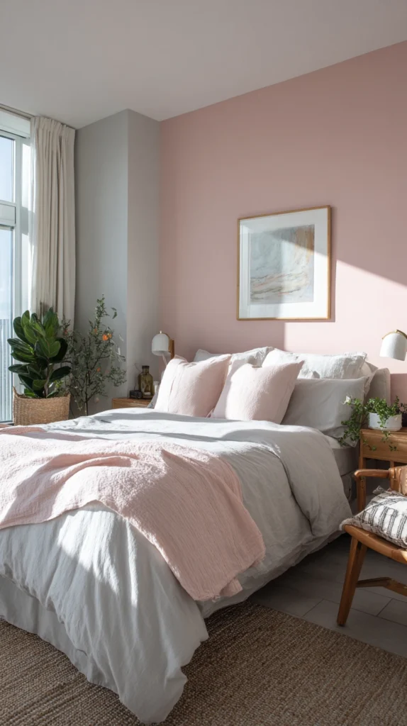
Blush pink alongside grey creates a palette of extraordinary romantic softness and quiet considered elegance. The warm peachy-pink of blush alongside the cool restraint of grey creates a temperature tension of genuine visual beauty — each color making the other appear more interesting than it would alongside a neutral companion. Works most naturally alongside cool to mid-toned silver and blue-grey tones.
Pro Tip: Choose a blush with a warm peachy undertone rather than a cool lilac-pink. Cool lilac-pink alongside grey can feel slightly cold and clinical rather than warm and romantically soft. The warm peachy undertone introduces the warmth that makes grey feel genuinely inviting rather than simply sophisticated.
5. Terracotta
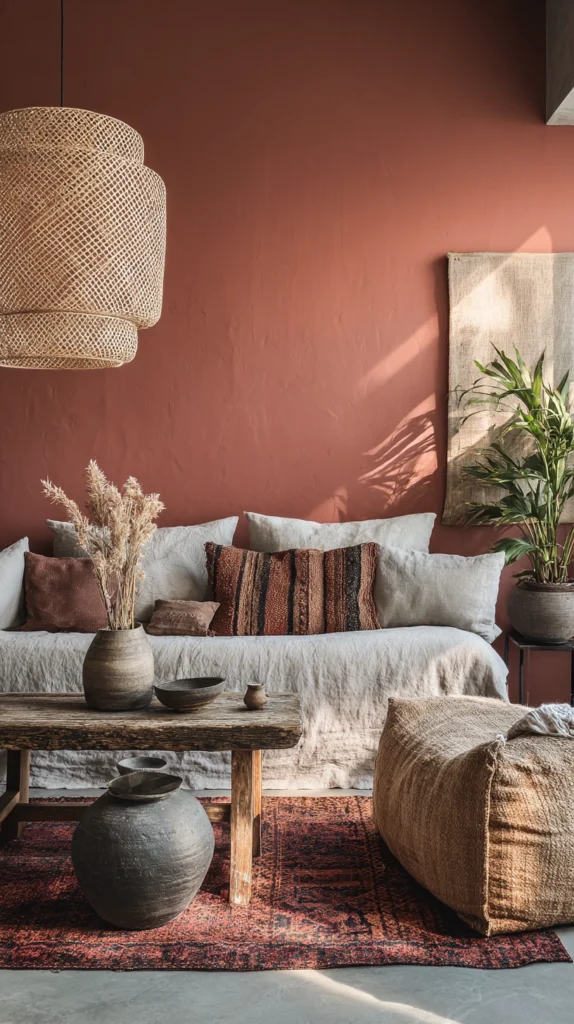
Terracotta alongside grey creates one of the most naturally beautiful interior color combinations available — the warm earthy red-orange of terracotta and the cool neutrality of grey referencing the ancient Mediterranean palette of warm earth and cool stone. The terracotta provides color, warmth, and personality. The grey provides restraint, balance, and the sophisticated context that prevents terracotta from feeling overwhelming.
Pro Tip: Use terracotta in a muted slightly brownish tone rather than vivid saturated orange alongside grey. The muted dusty version tending toward brown and clay shares the earthy restraint of grey most naturally and creates a combination of sophisticated warmth rather than high-energy contrast.
6. Deep Teal
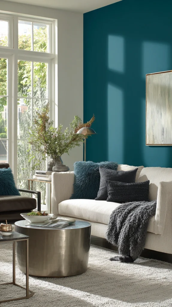
Deep teal alongside grey creates a room of cool distinctive elegance and considerable visual depth. Teal occupies the most beautiful intersection of blue and green — carrying the freshness of both simultaneously. Works beautifully alongside cool blue-grey tones and also remarkably well alongside warm greige where the contrast creates a more dynamic and visually interesting tension.
Pro Tip: Anchor a teal and grey combination with warm metallic accessories — brushed brass or aged bronze. Without any warm accent teal and grey can feel slightly clinical in artificial evening lighting. Warm metallics provide the temperature balance that makes the palette feel richly beautiful rather than simply sophisticated and slightly cold.
7. Burgundy
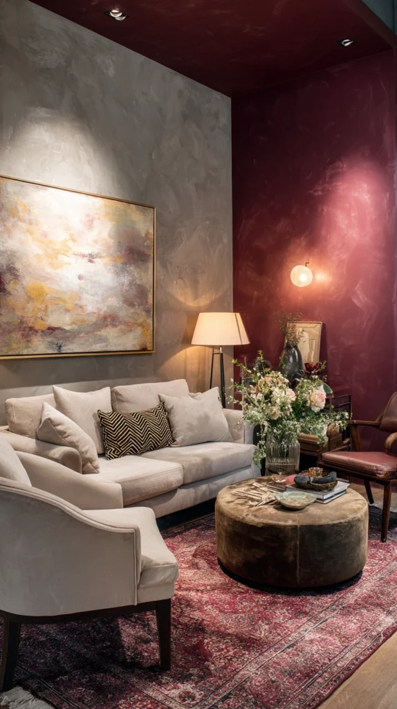
Burgundy alongside grey creates a room of rich wine-dark opulence and genuine considered luxury. The deep red-wine tone provides the warmth and drama grey alone cannot achieve while the grey surrounds it with the sophisticated neutral context that allows burgundy to read with full depth without overwhelming the room. Works with a wide range of grey tones because burgundy’s depth gives it sufficient presence alongside both warm and cool companions.
Pro Tip: Position a burgundy accent wall in the room’s darkest or most intimate corner rather than on the most naturally lit wall. Burgundy reveals its full depth and richness in lower light levels — a position receiving less direct natural light allows the deep wine color to develop its most beautiful and most luxurious quality.
8. Sage Green
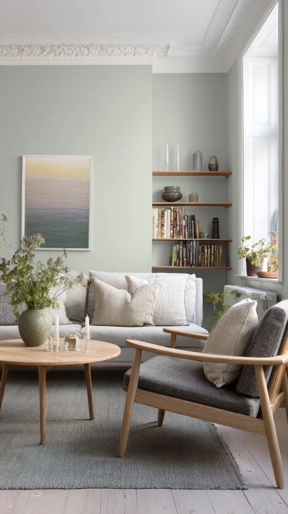
Sage green alongside grey creates a room of organic restrained beauty — the muted slightly grey-green of sage and the neutral restraint of grey sharing enough tonal quality to create a completely harmonious combination. Sage green is the most universally compatible of all greens for pairing with grey — its own grey undertone makes it a natural companion for virtually every grey tone without any undertone conflict.
Pro Tip: Choose a sage green accent wall in a finish one sheen level above the grey walls — an eggshell sage alongside flat grey. The slight sheen difference on the accent wall creates a subtle visual distinction that makes the accent read more clearly and more intentionally even in a combination where the two colors are tonally close.
9. Deep Charcoal
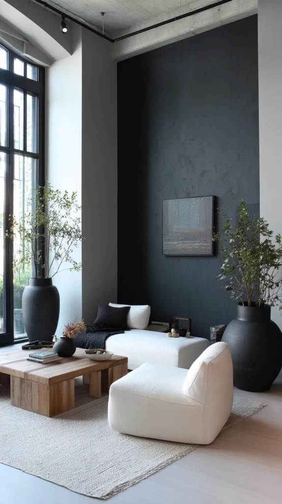
A deep charcoal accent wall alongside lighter grey walls creates a tonal monochromatic room of considerable depth and sophisticated elegance — built entirely within the grey family but with a dramatic depth variation that creates genuine visual interest without introducing any color outside the grey palette. The charcoal wall recedes visually, creating an impression of greater depth rather than less despite the dark color.
Pro Tip: Apply deep charcoal in a flat or very low sheen finish. Flat paint on a dark accent wall absorbs light and creates the deep enveloping quality that makes a charcoal feature wall so beautiful. Higher sheen finishes create visible light reflections that reveal every surface imperfection and significantly undermine the quality of the finish.
10. Cobalt Blue
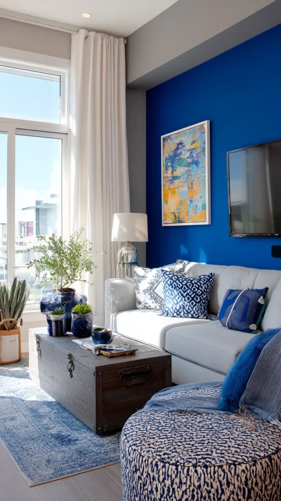
Cobalt alongside grey creates a room of bold energetic color confidence — the vivid saturated blue providing a strong clear statement against the neutral grey that is simultaneously striking and completely balanced. Works most naturally alongside cool grey where the shared cool quality creates a cohesive combination despite the significant difference in color saturation between vivid cobalt and muted grey.
Pro Tip: Use cobalt as an accent wall in a room with generous natural light. In a poorly lit or north-facing room cobalt alongside grey can feel cold and slightly aggressive without natural light to soften it. Natural light is the essential companion to vivid cobalt in any domestic interior setting.
11. Burnt Orange
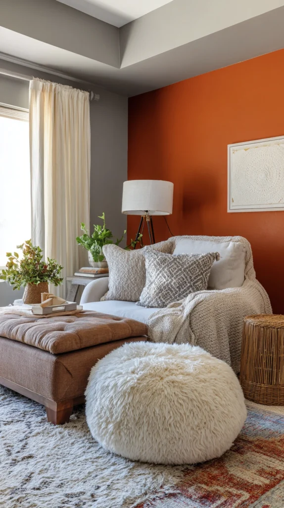
Burnt orange alongside grey is a combination of considerable warmth and genuine visual dynamism — the deep earthy orange providing the bold warm accent cool grey most needs while grey provides the sophisticated neutral anchor preventing burnt orange from feeling loud. The two colors sit in complementary relationships — the cool neutrality of grey and the warm energy of orange each making the other appear more vivid by contrast.
Pro Tip: Use burnt orange — the deep slightly brown-toned version — rather than bright vivid orange alongside grey. Bright orange alongside grey creates a high-energy graphic combination that can be difficult to live with domestically. Burnt orange has sufficient brown and earth in its makeup to feel grounded, sophisticated, and genuinely liveable as a daily home environment.
12. Dusty Lilac
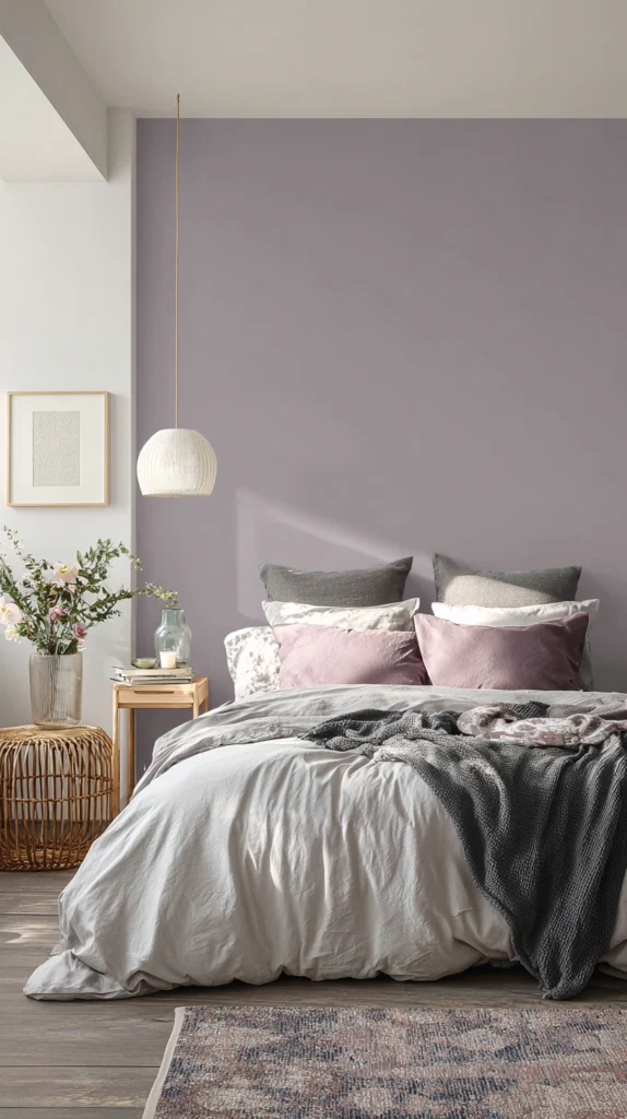
Dusty lilac alongside grey creates a bedroom or living space of unusual quietly beautiful sophistication. The muted slightly grey-toned version of purple sits in a tonal relationship with grey that makes the two colors appear almost to belong to the same color family while remaining visually distinct enough to create a genuine accent effect. Works with almost every grey tone because its own grey undertone creates a natural tonal connection regardless of the specific grey’s undertone.
Pro Tip: Choose dusty lilac in a warm slightly rosy version rather than a cool blue-toned version. Warm dusty lilac alongside grey creates soft romantic warmth. Cool blue-toned lilac alongside grey — particularly cool grey — can create a combination that feels slightly cold and melancholy rather than warm and romantically beautiful.
13. Deep Purple
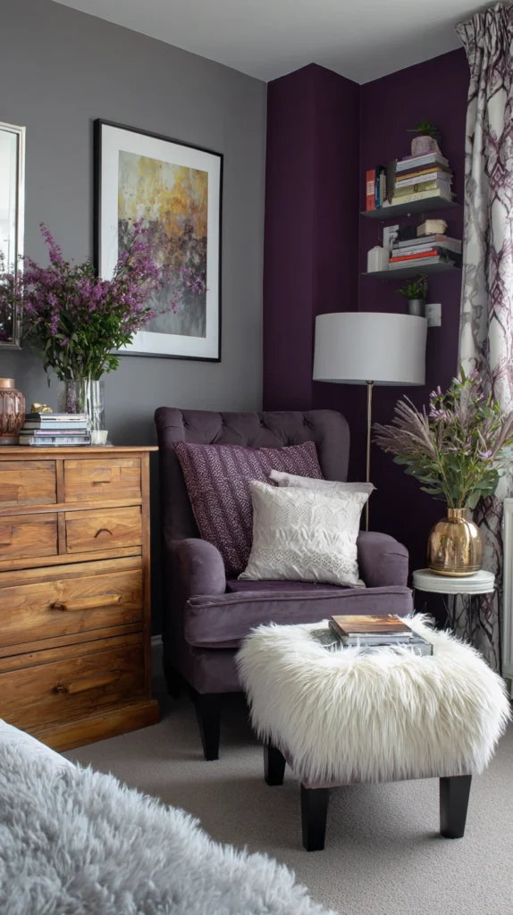
Deep purple alongside grey creates a room of dramatic luxurious beauty — the rich jewel-toned quality of deep purple alongside the sophisticated neutrality of grey creating genuine opulence and considerable visual depth. Works most beautifully alongside cool to mid-toned grey where the shared cool quality creates a cohesive base for the purple accent to sit within harmoniously.
Pro Tip: Introduce warm gold or aged brass accessories into a deep purple and grey room. Gold alongside deep purple creates one of the most opulent material combinations available and transforms a potentially cool palette into a room of genuine glowing warmth — the essential finishing touch that makes the combination feel luxurious rather than simply dramatic.
14. Warm White
A warm white accent wall alongside grey walls creates the most restrained and most subtle of all accent wall combinations — the color difference between warm white and grey creating just enough visual distinction to define the accent wall as a deliberate design decision without introducing any strong color into the room. Works most powerfully when the grey walls are in a medium to dark tone where the lightness of the warm white creates a readable contrast.
Pro Tip: Use warm white — with a slight yellow or cream undertone — rather than bright or cool white alongside grey. Bright white alongside grey creates a slightly harsh clinical contrast. Warm white creates a gentle warm contrast that enhances the sophistication of the grey and produces a room of complete quiet elegance.
15. Black
A black accent wall alongside grey creates the most dramatic and most definitively bold of all combinations on this list — the depth and authority of black alongside the sophisticated neutrality of grey creating a room of uncompromising design confidence. The grey provides the perfect preparation for the black — the tonal progression from neutral grey through to near-black makes the accent wall feel resolved and intentional rather than simply very dark.
Pro Tip: Use a very deep charcoal — a near-black with a slight warm undertone — rather than a pure cold black for a domestic accent wall alongside grey. Pure cold black alongside grey can feel harsh and slightly industrial. A near-black with warmth creates the depth and drama of black with a quality of livability that pure cold black in a domestic interior rarely achieves.
The Right Accent Makes Grey Extraordinary
Identify your grey’s undertone first. Choose your accent color in relationship to that undertone rather than to grey in general. And discover what the right accent does to a grey room — it makes the grey look better, makes the accent look better, and creates a room that is genuinely more beautiful than either color could create independently.